“From the very beginning, our Red Kite Design team didn’t just create a logo or a website. They helped us figure out who we were as a business.”
Kelly Leach
Co-Founder
Project overview
An escape room brand with room to keep playing
Vamoose Escape Rooms is a family-run escape room business at The Oasis in Broadbeach, named after a misheard family joke about a loose moose. Kelly and her family came to us before the doors opened, with three rooms in build and a very clear brief. Fun, tactile and inclusive, never dark, techy or babyish, and a long way from the colours the sector leans on. What they needed was a brand for a business whose rooms will keep changing in theme, so it had to be versatile, playful and fun enough to carry whatever comes next. We designed with that in mind, from the moose to the marketing material.
Every Red Kite project starts with a deep dive, and Vamoose came to us while the rooms were still being built. Kelly and her family were a joy to work with from the first call, a fun, playful, down-to-earth bunch, and we love escape rooms, so getting to help bring some to life was a treat. Together we worked through the room themes, the audience and the escape rooms around the Gold Coast, and what came back was a business built for families, teens, tourists and first timers rather than hardcore puzzlers.
The no list mattered just as much. No industry clichés, no cold minimalism, nothing scary and nothing so cartoonish it would put off a teenager. The moose was the easy part. We loved the story behind the name and went all in, taking the family joke and building it into a distinctive mascot that brings it to life. That gave us the whole brief in a sentence. Playful enough for a ten year old, sharp enough for a group of friends on a Friday night.
What we covered
Origin story
Target audience
Competitive landscape
Room themes & storylines
Points of difference
Signage & shopfront
Merchandise & apparel
Brand personality
Design requirements
& more
The logo: the first piece of the puzzle
A detective moose with the clues hidden in plain sight
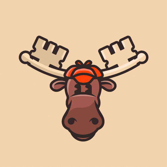
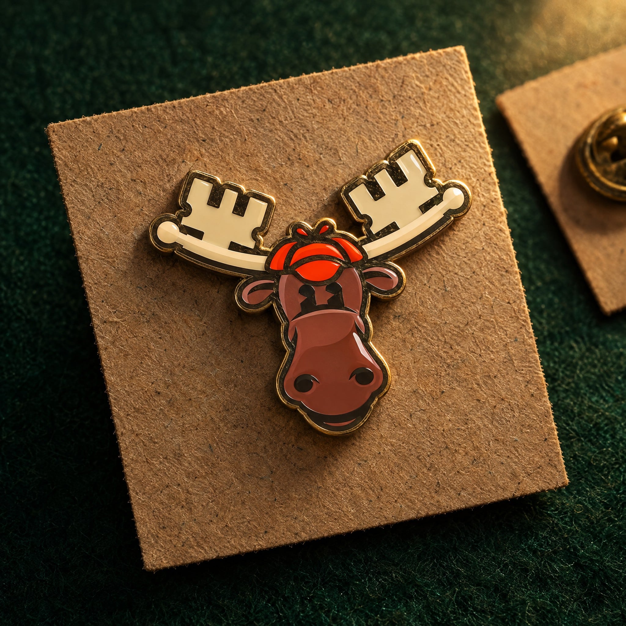
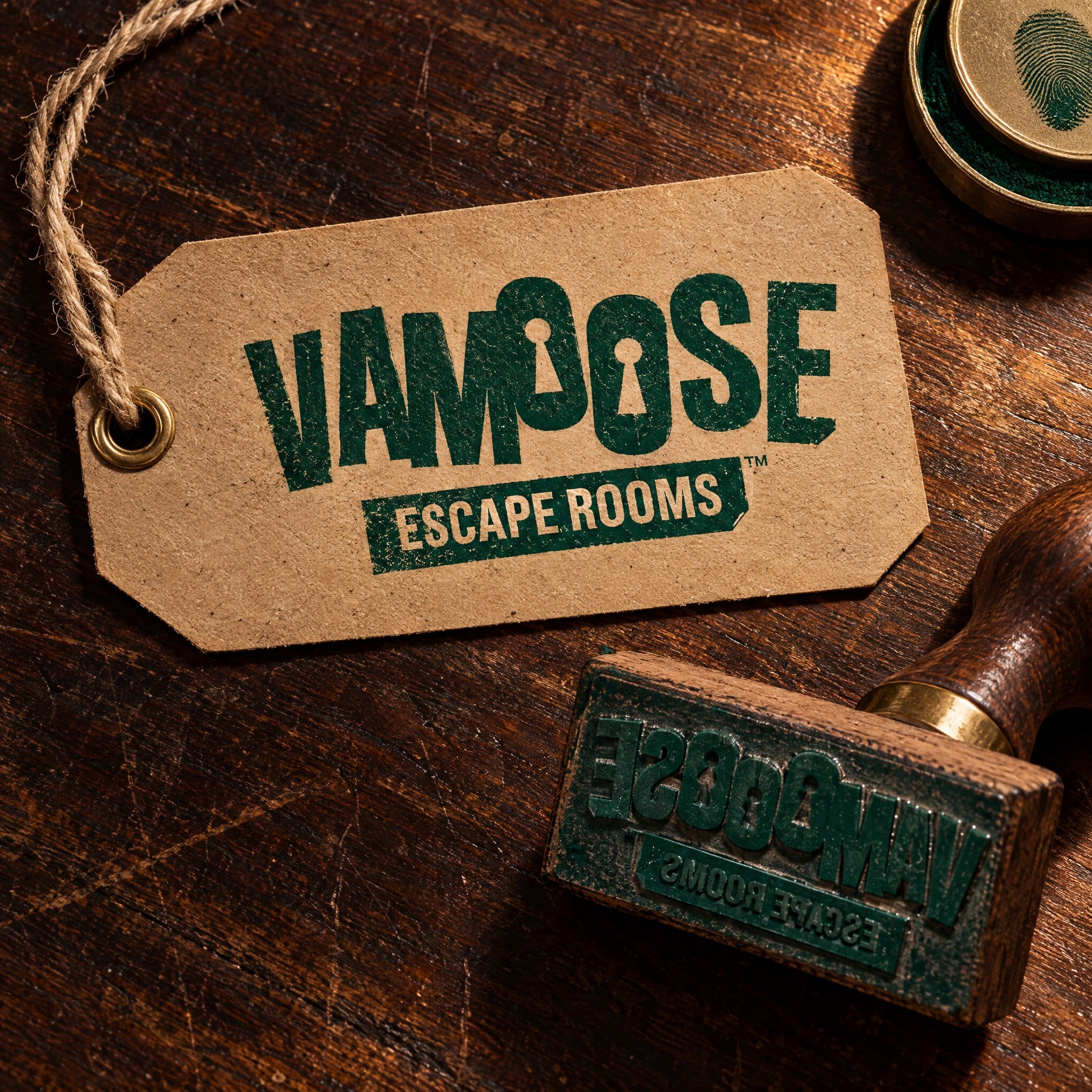
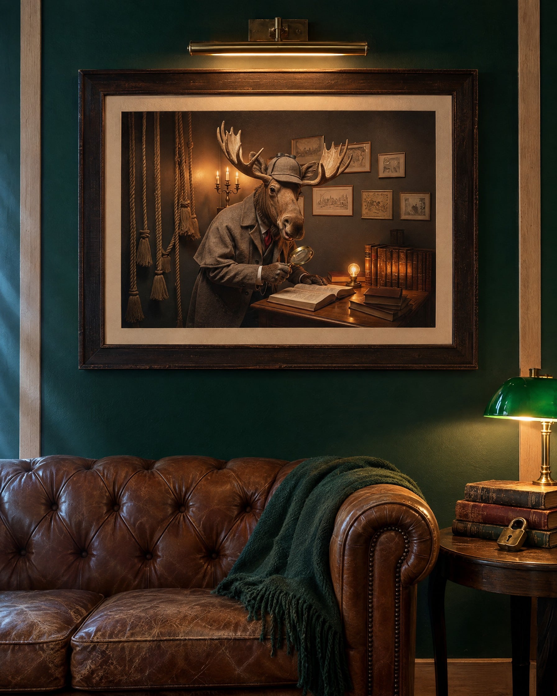
Vamoose the Moose is a detective through and through, Sherlock Holmes in a deerstalker with a moose’s good nature, and the whole logo plays along. Look closely and the clues are everywhere. His antlers form the ends of two keys, the O’s in the wordmark are cut as keyholes, and the Escape Rooms tab has a folded-over corner like a page from a detective’s notebook. The lettering is chunky and tilted so the name feels like it’s already on the move, with the M picked out in vermilion. We built the identity knowing his head could grow into a fully fledged mascot for the brand, so from the start there were stacked and horizontal lockups, the moose head on his own, the keyhole as an icon and inverted versions for the deep green the brand lives on.
Building the brand beyond the logo
A detective theme with plenty of room to play
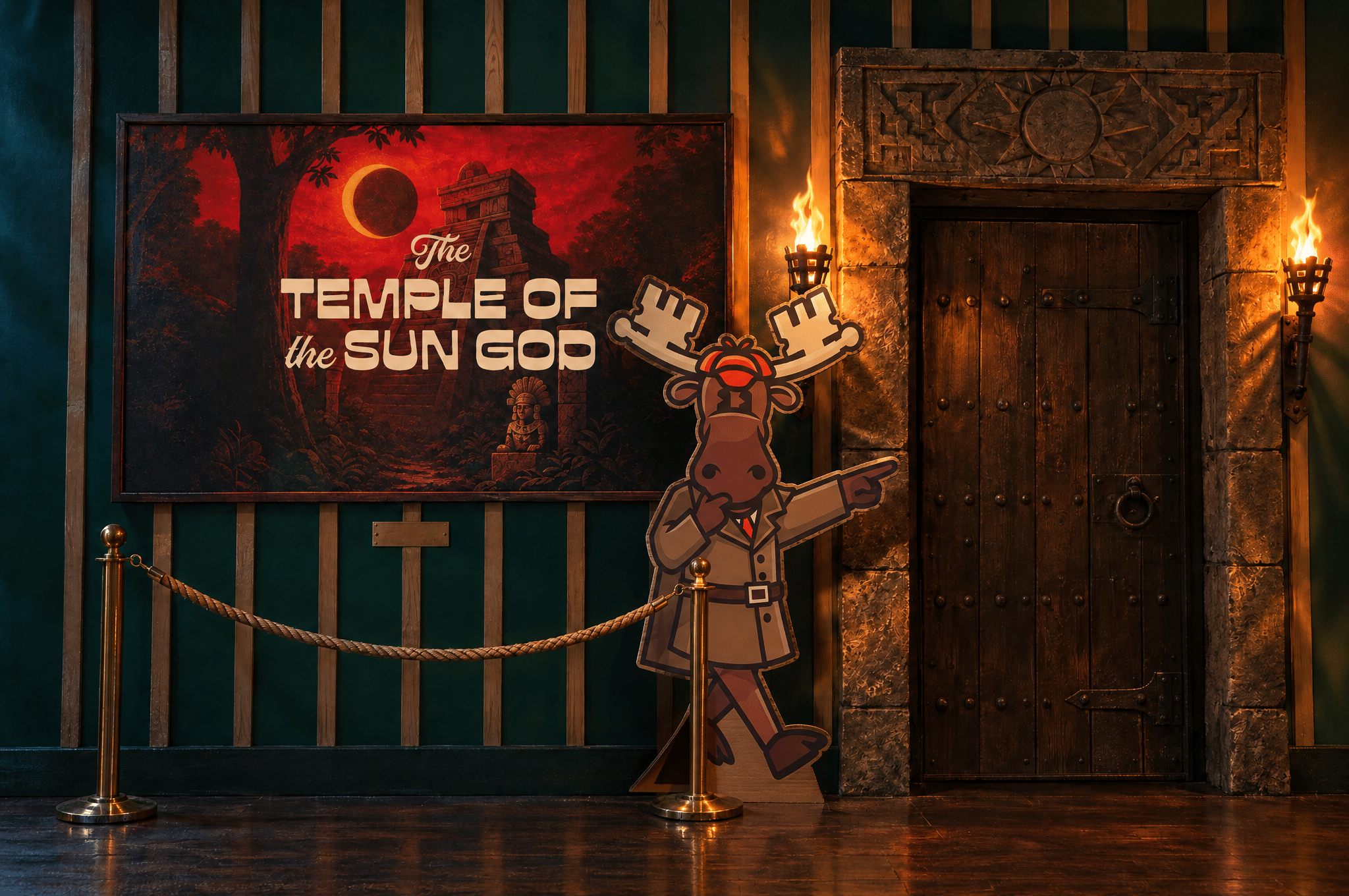
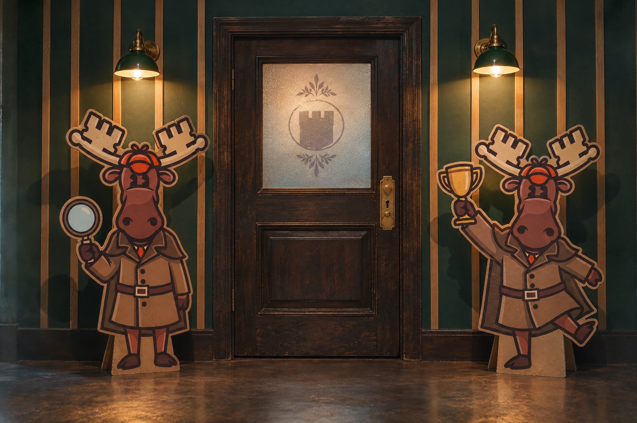
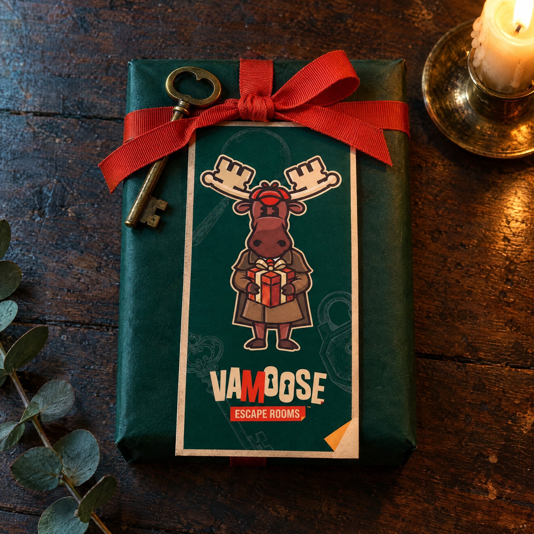
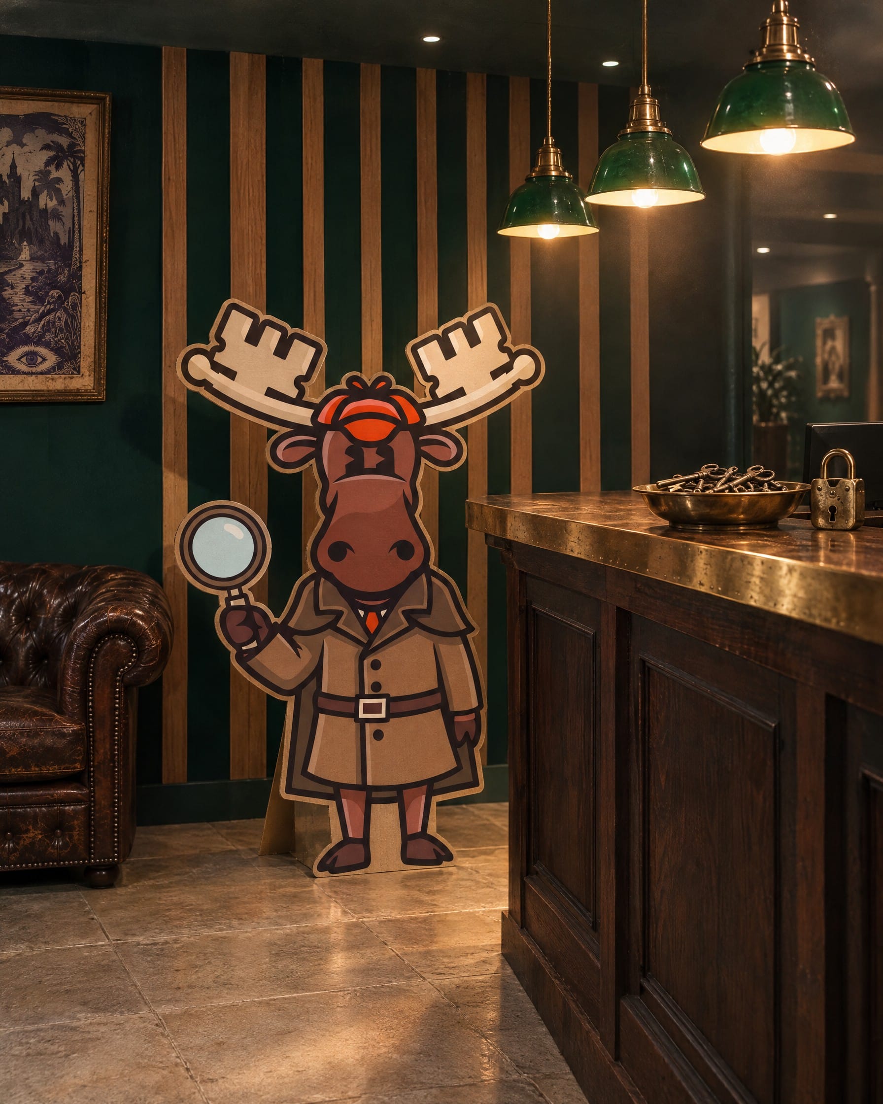
One moose was only the tip of the iceberg. To make the world distinctive we doubled down on the detective theme and gave Vamoose range, with a whole set of poses and expressions so he can turn up anywhere the brand does, celebrating, commiserating, pointing the way or handing over a gift. He’s versatile, emotive and instantly recognisable, and he’s become a real favourite with visitors. Kelly tells us people take endless photos with his cardboard cut-out out the front.
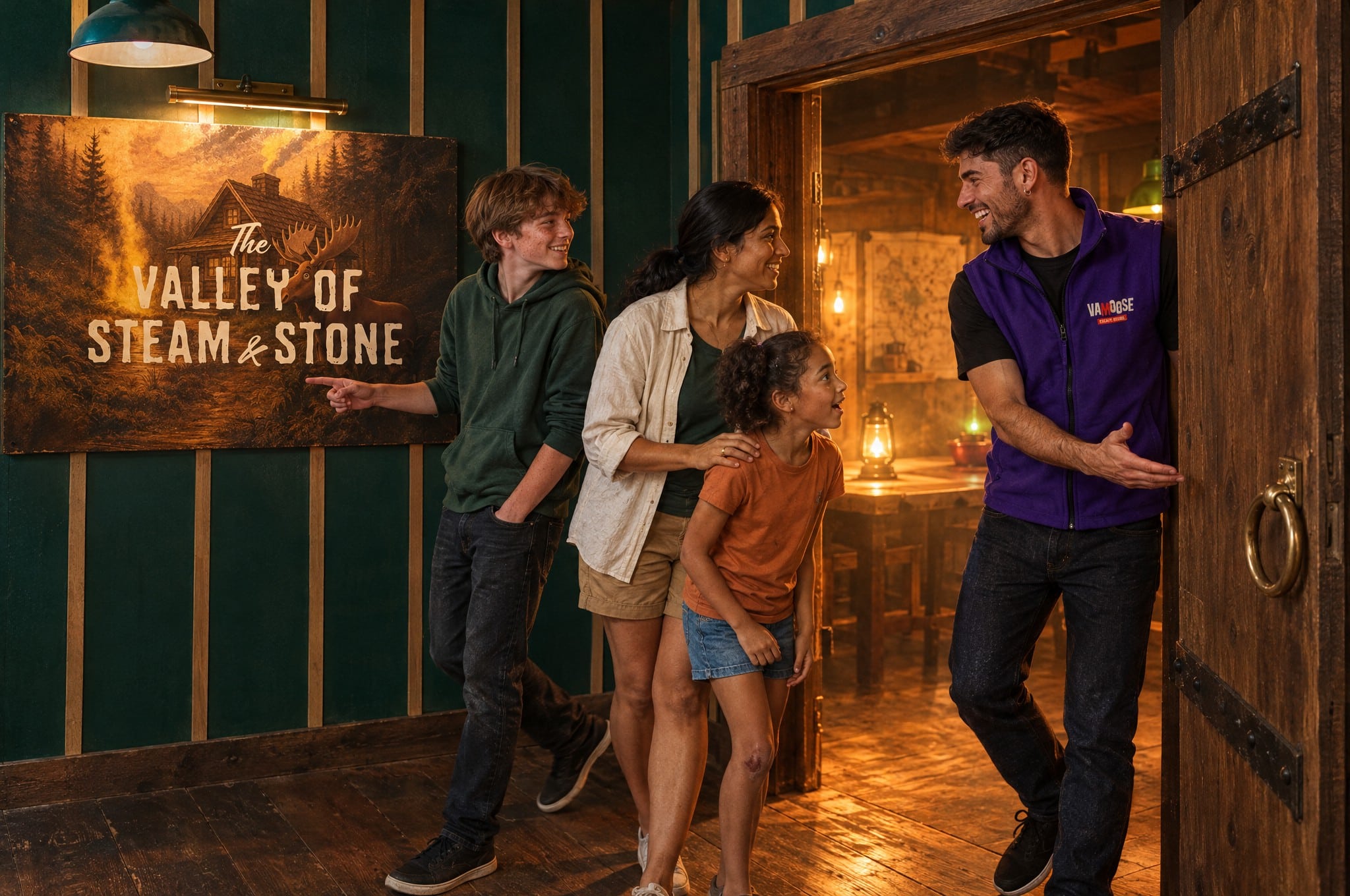
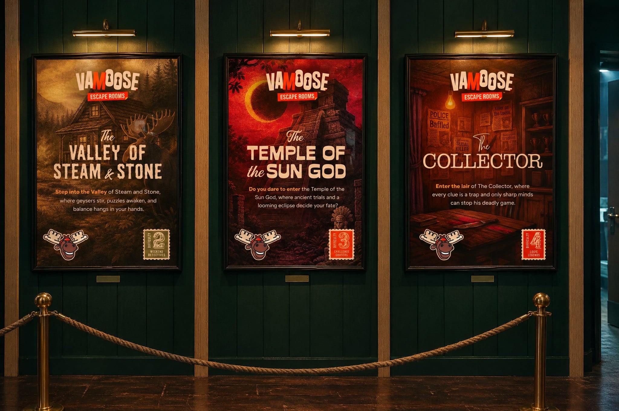
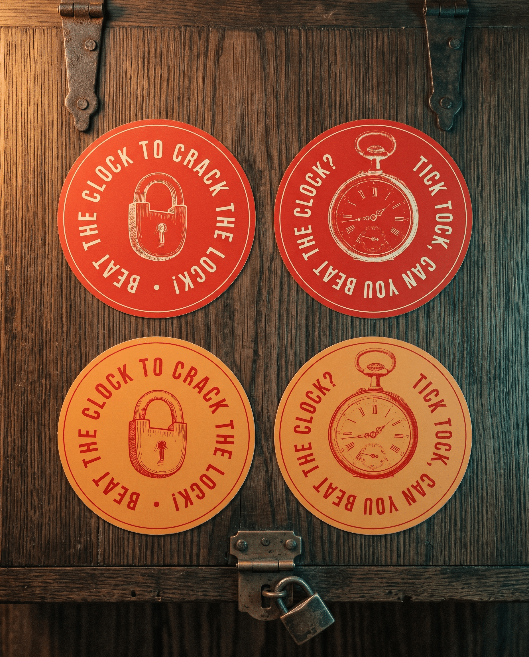
Around him sits a library of lilac engravings, keys, padlocks, pocket watches and magnifying glasses drawn like pages from an old case file, plus stamps, badges, ribbon banners and folded corner notes that borrow the tab from the logo. The palette avoids the sector’s clichés and builds a world that’s thematic but versatile, so it never clashes with a room. Every room also has its own themed poster, consistent in style and colour but unique to its story, which keeps the brand ready for the rooms and themes still to come.
Brand assets created
Mascot poses & expressions
Engraved illustration library
Brand icon set
Badges, stamps & ribbon banners
Room graphics & difficulty stamps
Brand colour palette
Typography system
Brand blueprint guidelines
Messaging that’s unmistakably Vamoose
Puns, wordplay & a brand that doesn’t take itself too seriously
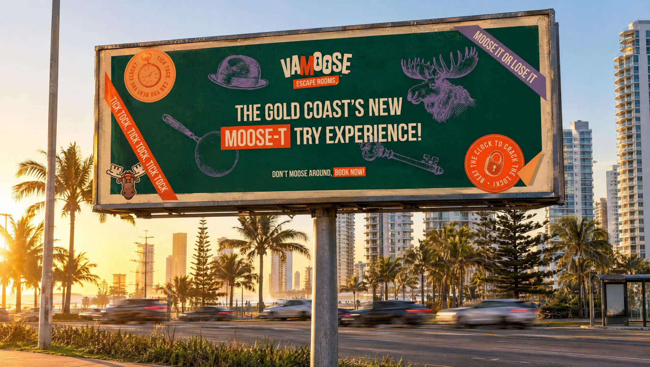
We didn’t write Vamoose a formal messaging strategy, but a name with a moose hiding in it was never going to stay quiet. Alongside the identity we worked up a tone that’s fun and playful, with puns used on purpose, almost dad-joke territory, for a brand that’s for everyone, for families, and allowed to be a little bit silly. Moose-based wordplay runs through everything from the posters to the flyers, so the copy is every bit as distinctive as the visuals.
Wordplay suits Vamoose because the brief was clear that it should never feel dark or intimidating. A pun tells a first timer, or a family with young kids in tow, that this is somewhere to laugh as much as think, and it keeps even the tensest room on the right side of fun. Just as importantly, it gave the family a system and a playful language of their own to pick up and run with, long after the launch pieces went out.
What was included
Poster & banner headlines
Pun-led taglines
Badge & stamp lines
Ribbon banner lines
Flyer & voucher headlines
Tone for every touchpoint
Touchpoints that tell the story
Everything a new venue needs to hit the ground running
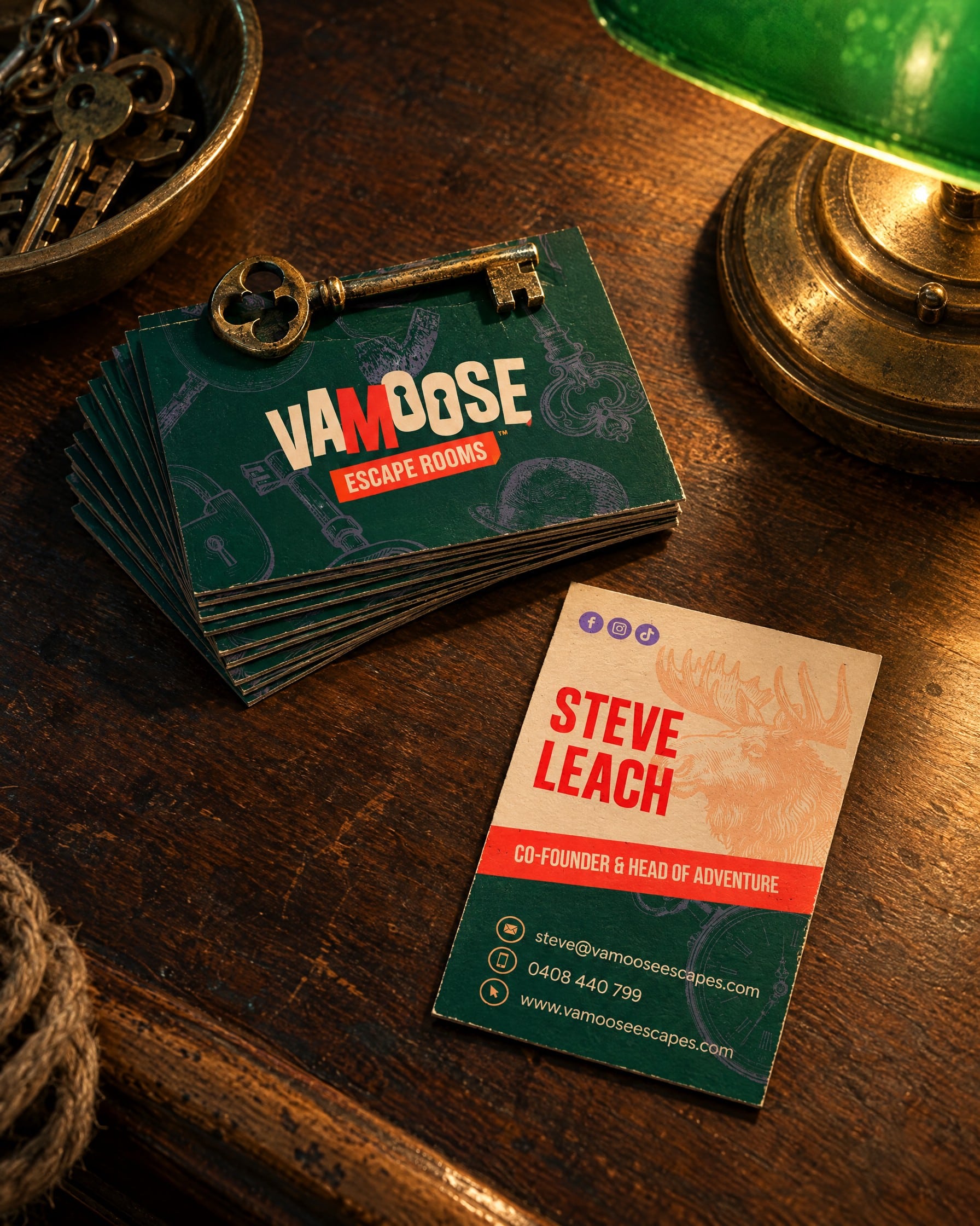
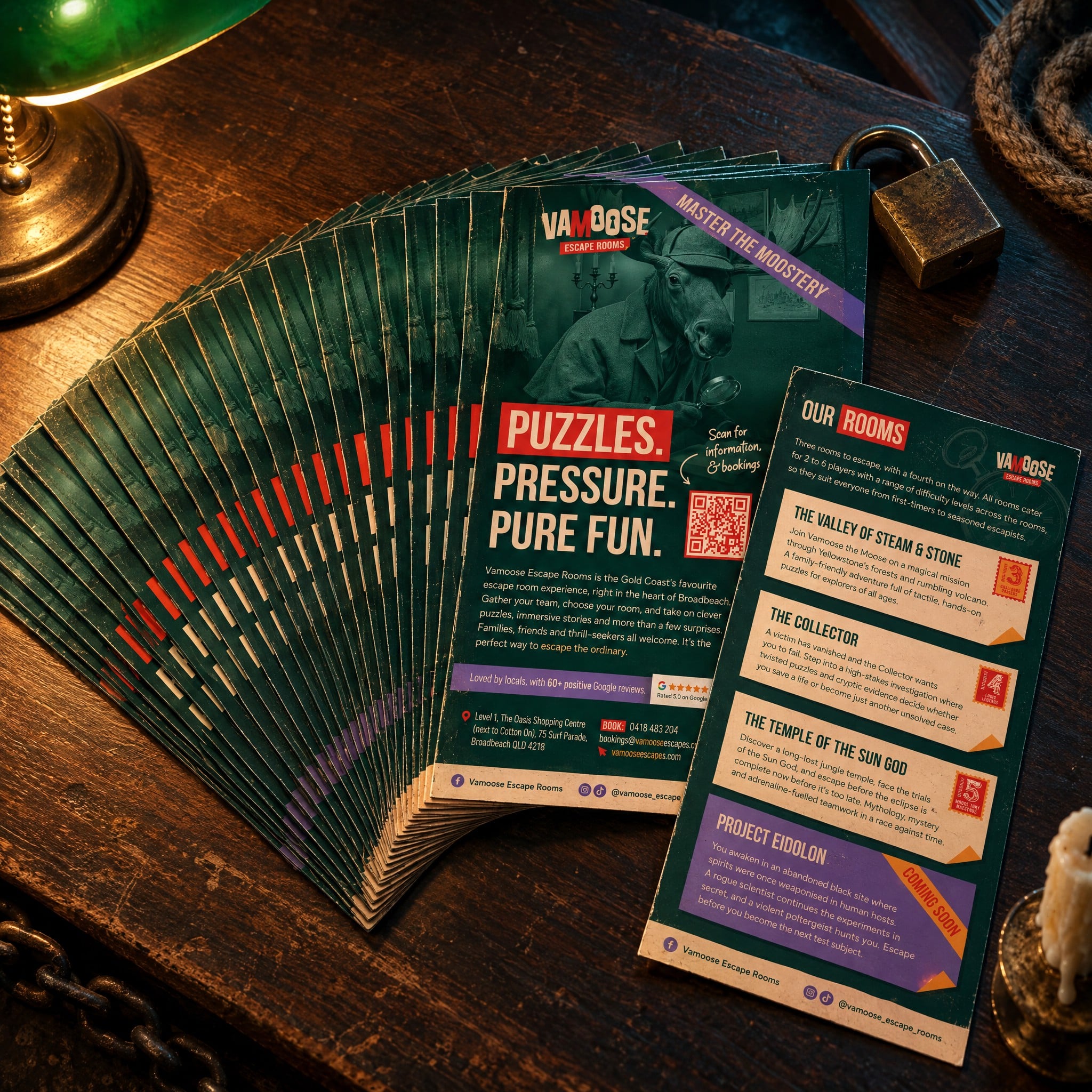
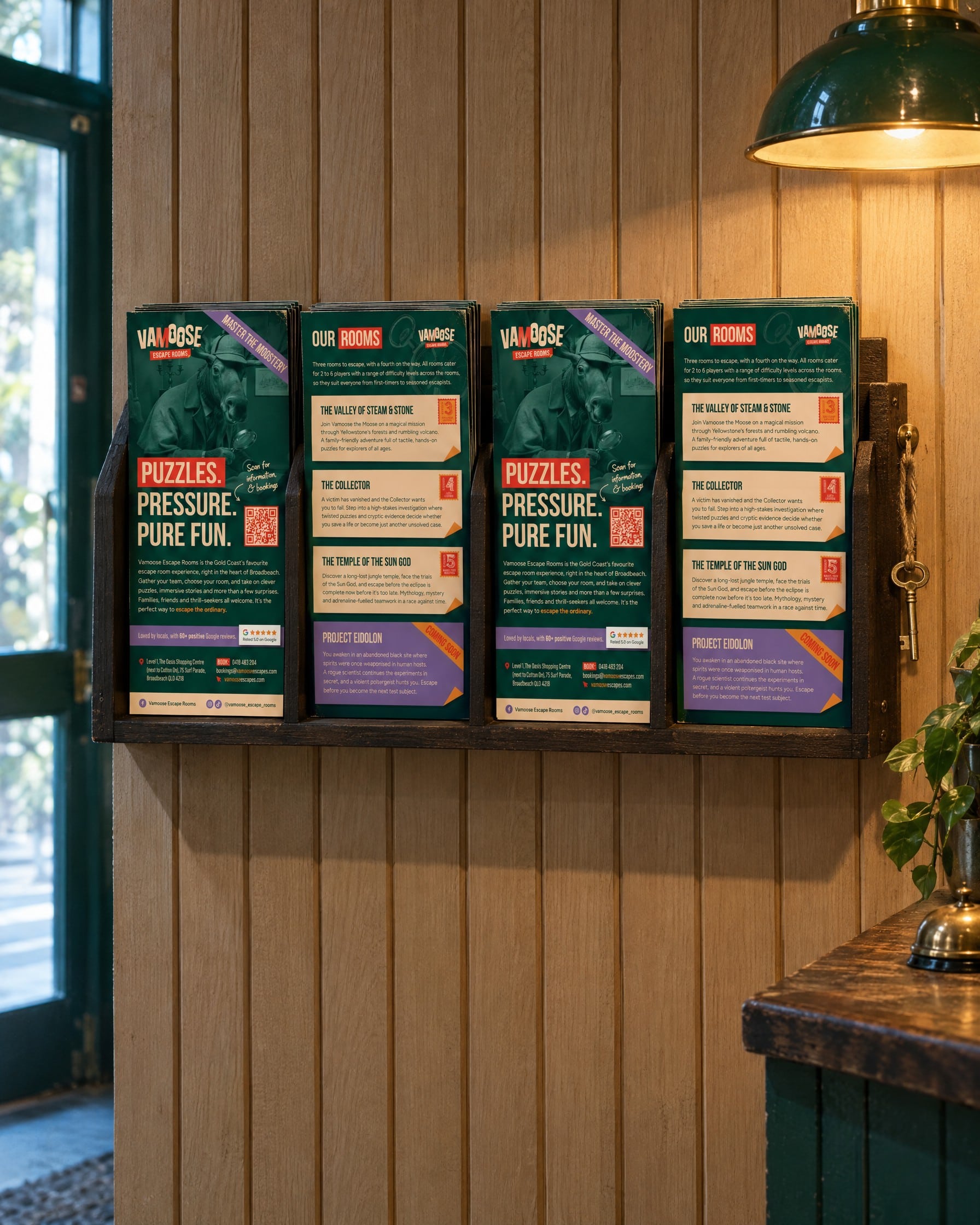
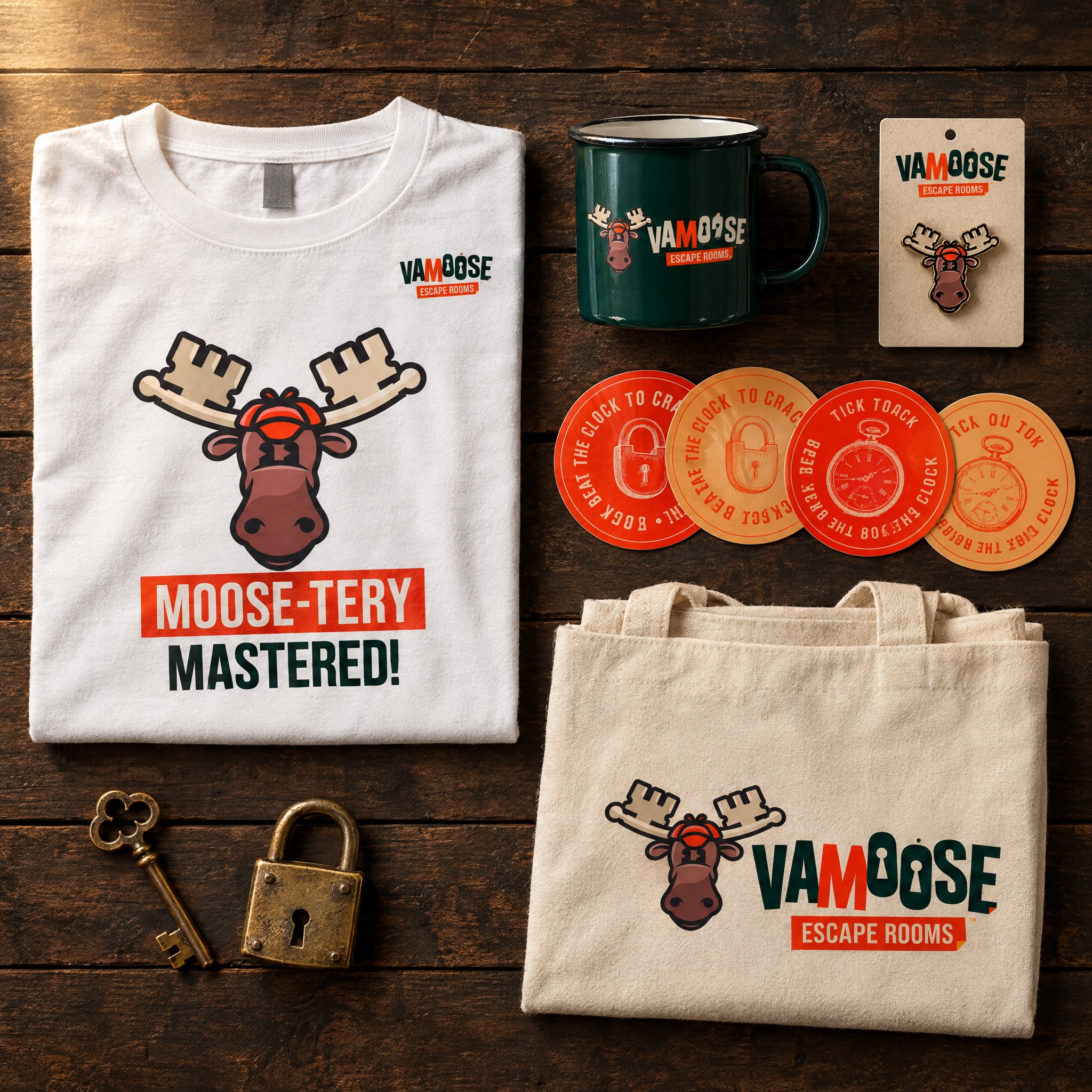
A new escape room on a busy tourist strip needs a lot before the doors open. Flyers in the local spots where holidaymakers pick them up, professional pieces to hand out, from presentation decks to business cards, merchandise for visitors to take home, and a social presence to get the name out there. So rather than stopping at the logo, we thought about the pieces the family would reach for every day, each one carrying the moose, the puns and the brand’s colours.
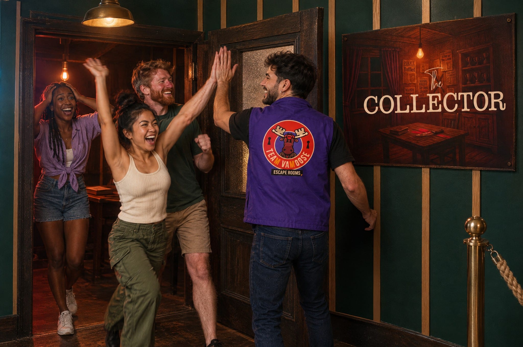
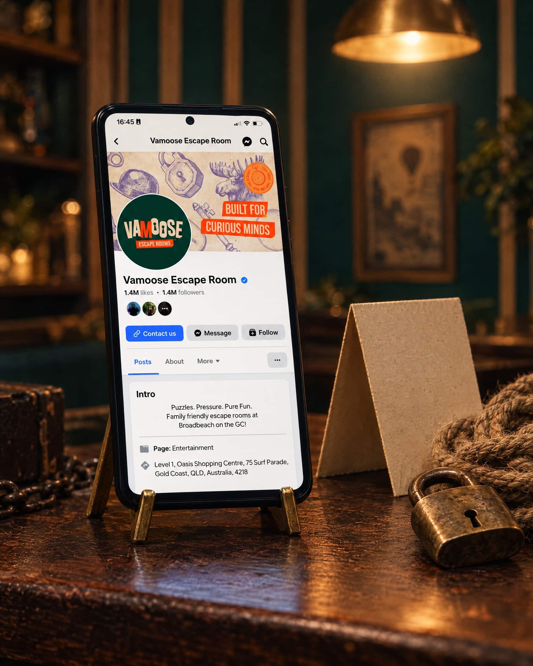
That meant stationery and email signatures for the team, vests for the game masters, a social media kit with templates the family can use themselves, then flyers and gift vouchers once the doors were open. Everything shares the same detective world, so a flyer picked up in a cafe and a card handed over at reception feel like they belong together. It gave Vamoose everything it needed to open with confidence and look established from day one.
Brand collateral crafted
Business cards
Letterhead
Presentation template
Email signatures
Team vests
Social media profile & banners
Social post templates
Instagram highlight covers
DL flyer
Gift voucher
Rolling it out to the real world
A moose front & centre at The Oasis
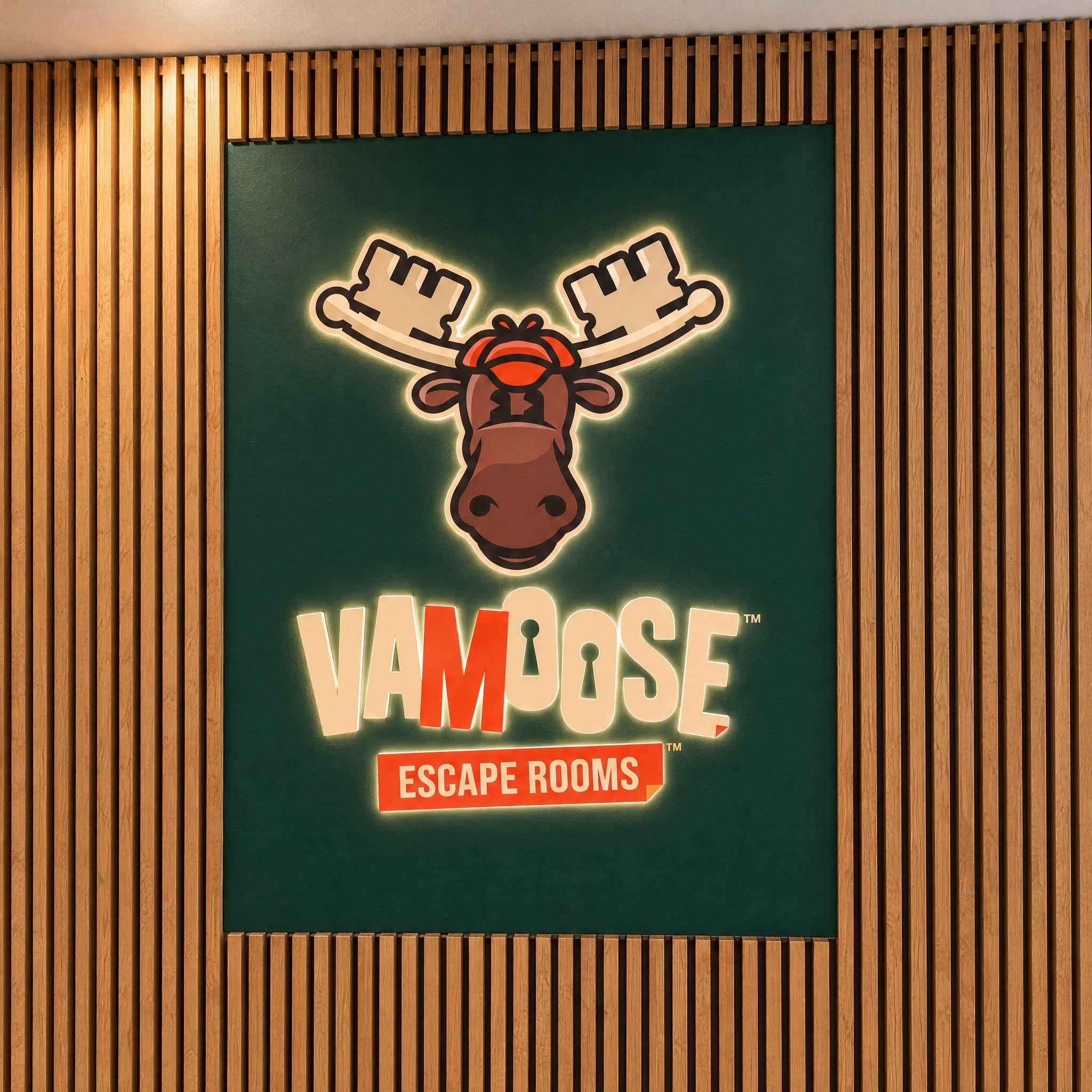
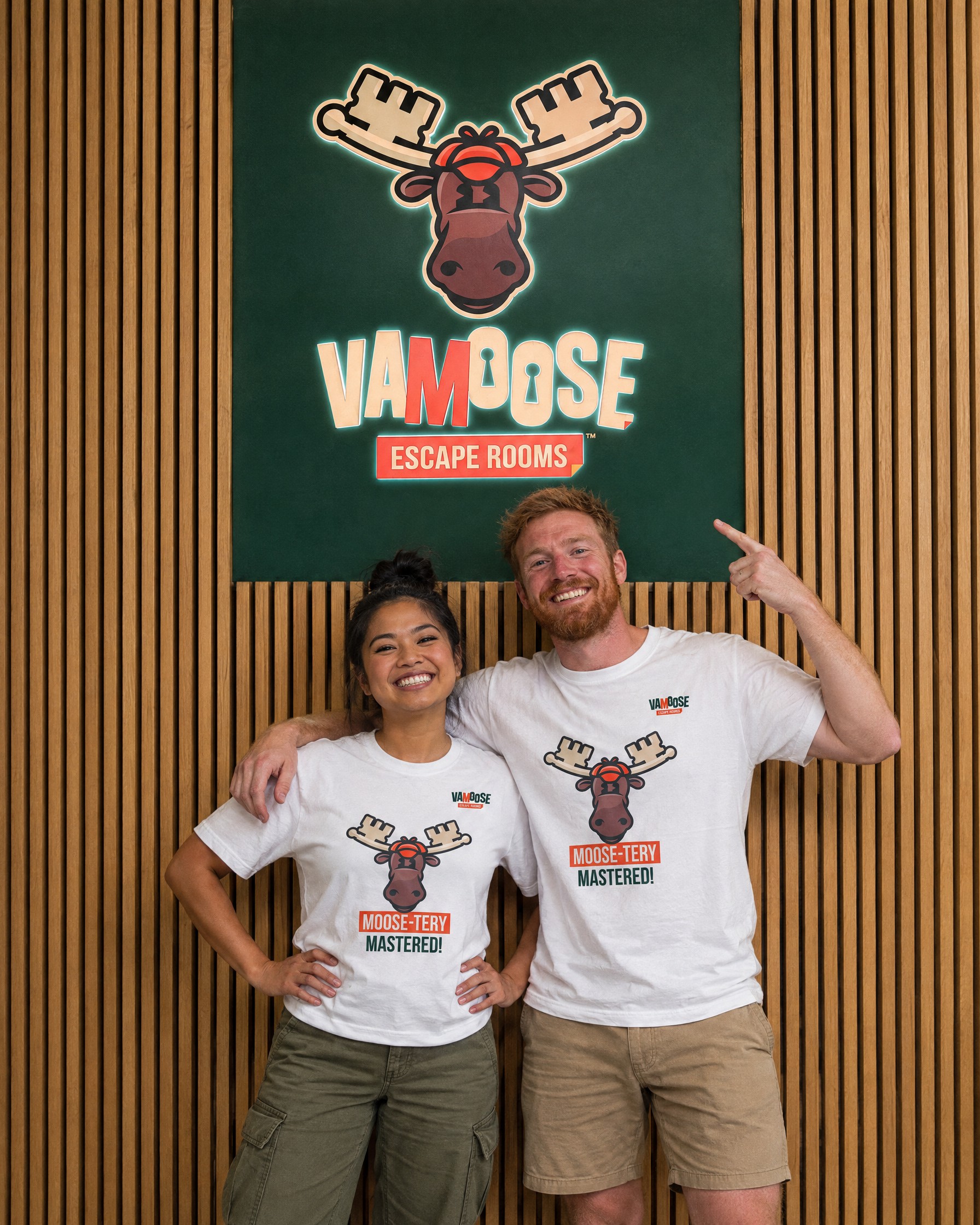
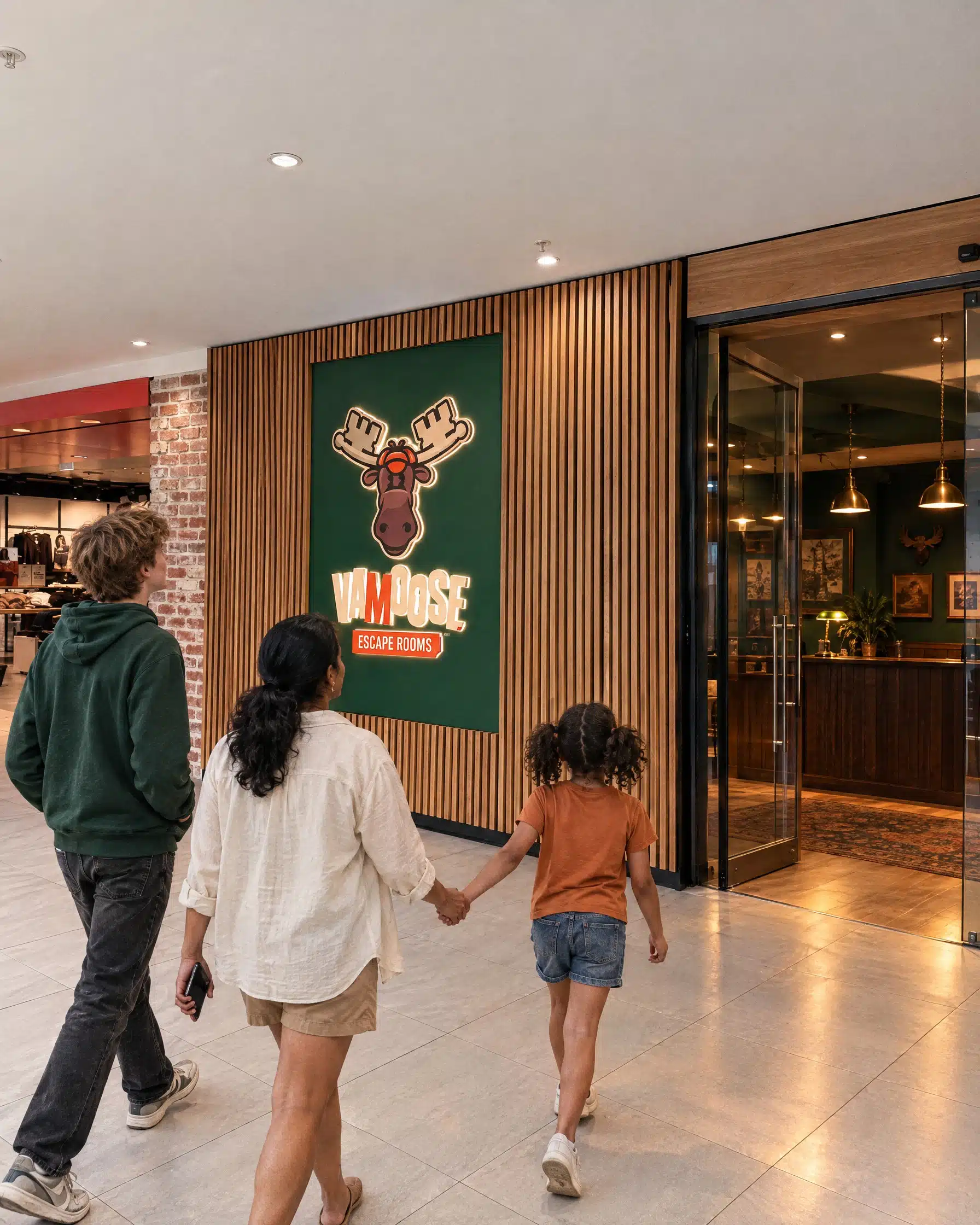
The frontage at The Oasis came with its own rules, so we designed the signage artwork to suit the space, a Bottle Green panel carrying the stacked logo, set into the centre’s timber battens. It’s also where the logo versus mascot question came to a head. A pared-back outline was on the table for a while, but Kelly felt it was impersonal and not them, and we agreed. The full moose went up instead, and he’s hard to miss.
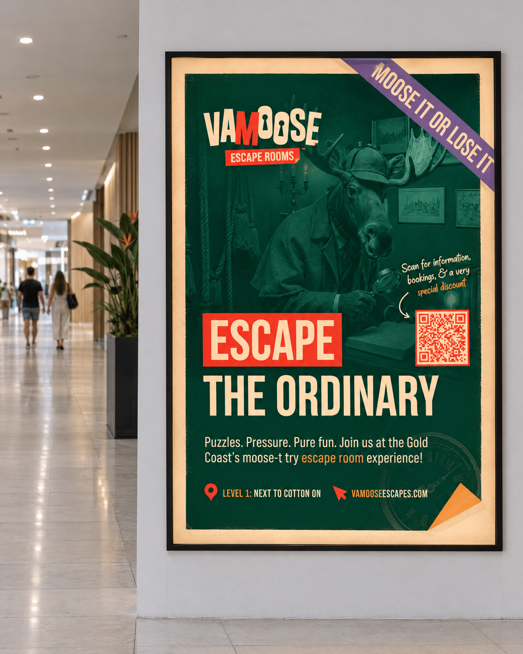
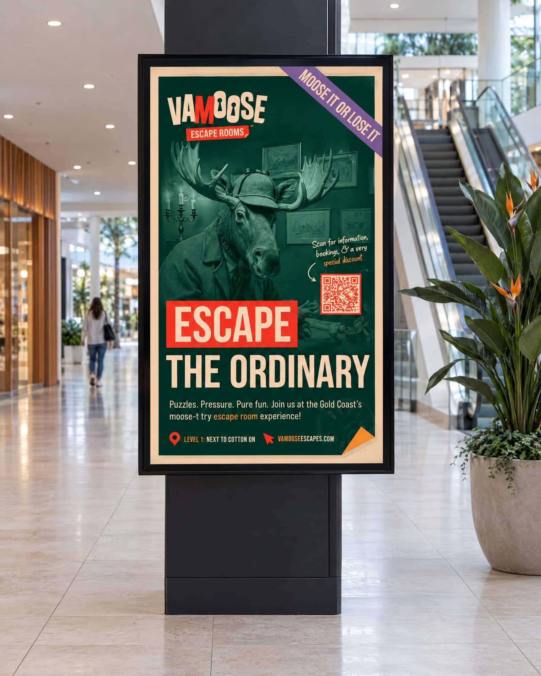
Inside and around the centre, the detective moose does the rest. We designed a hallway poster with a QR code that points to a page the family can update for any new offer, so the print never goes out of date, then adapted the artwork for the centre’s digital screens and the lift, and prepared a cut-out of Vamoose with his magnifying glass. The result is a venue that feels like the brand from the moment you spot the antlers.
Applied across
Shopfront signage artwork
Hallway entrance poster
Digital screen artwork
Lift poster
Mascot cut-out
Updatable QR promotion
A website built to fill the rooms
Rooms, bookings & payments in one place
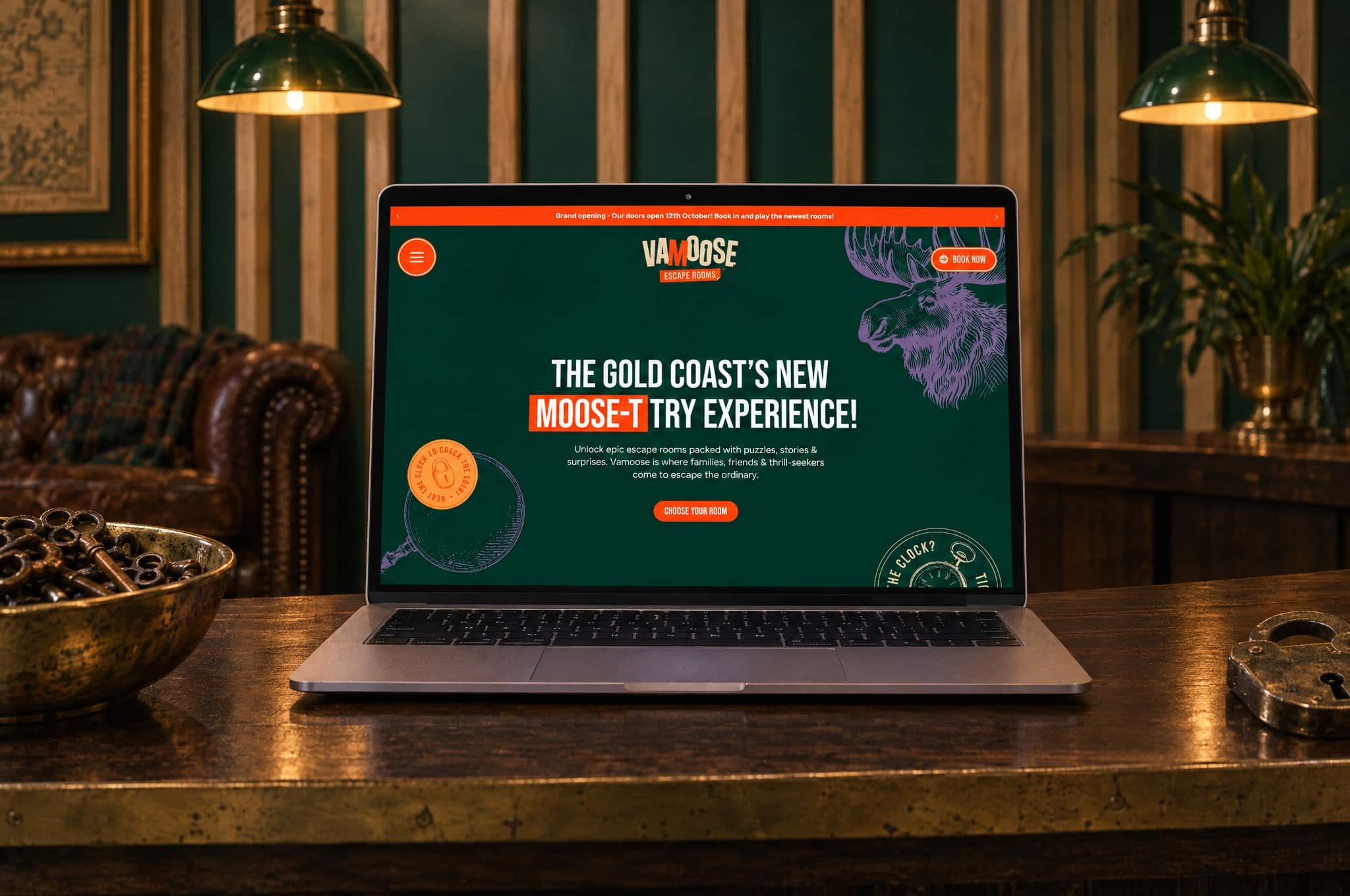
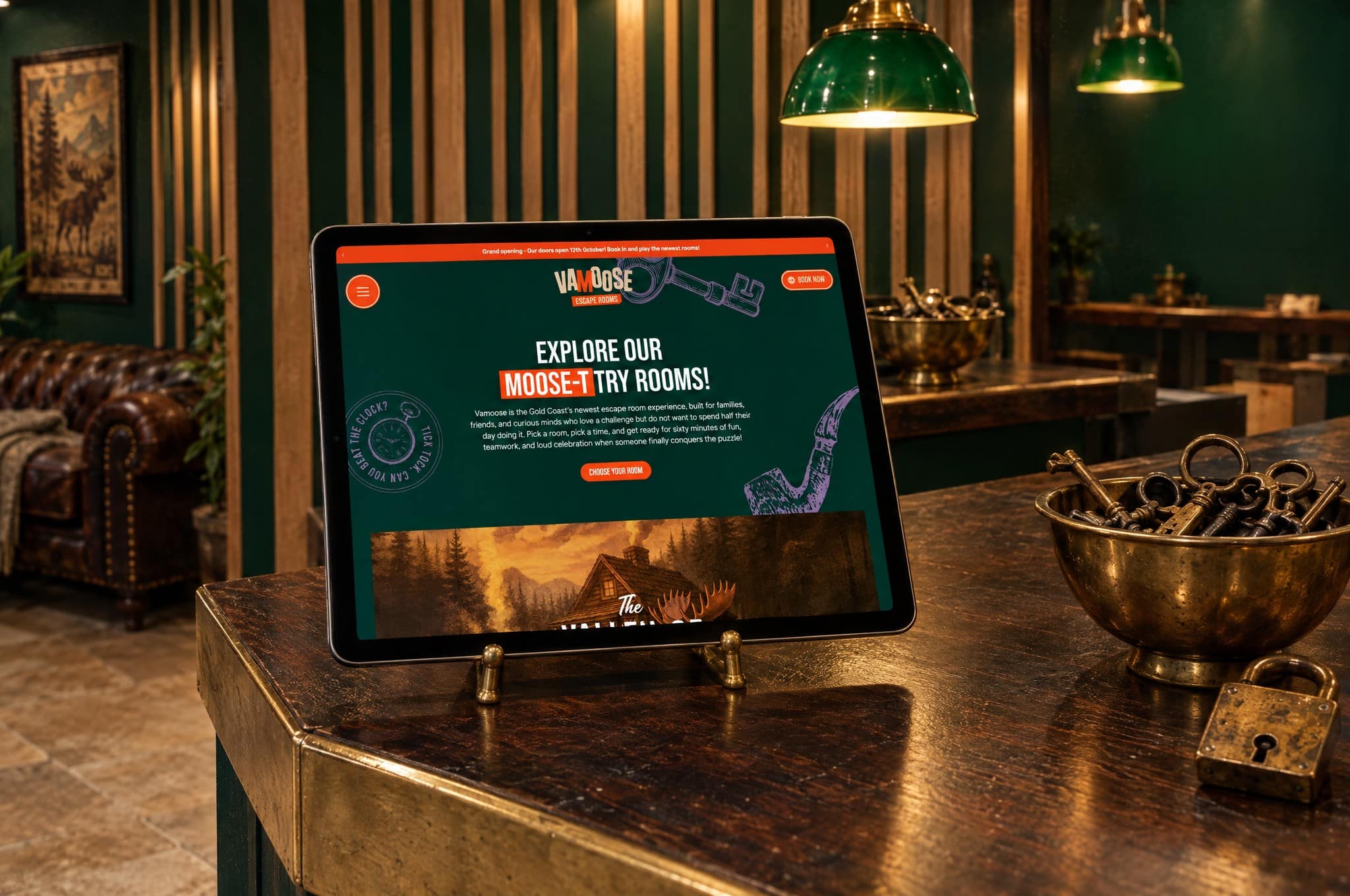
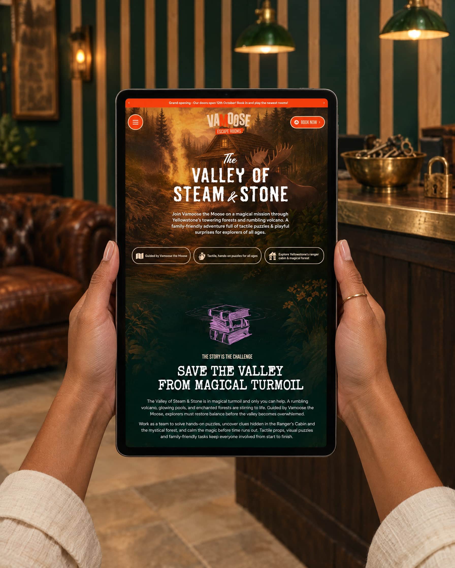
From her very first message, Kelly wanted a website that could say who they are and take bookings and payments properly. We mapped it out as a sitemap and wireframe, built an interactive prototype, had the copy professionally written in the brand’s playful voice, then designed every page inside the detective world we’d built. Each room has its own page with its difficulty, who it suits and what to expect, so a young family and a group of true crime fans can each find their room in a couple of clicks.
Bookings run through Resova with Square handling payments, and the book buttons go straight through to checkout. We set it up on managed hosting with our hosting partner and had it live two days before the opening weekend. It’s already doing more than taking bookings. Another escape room business found us through it, impressed enough by the site to get in touch about their own brand.
From concept to creation
Sitemap & wireframing
Interactive prototype
Professional copywriting
Custom page design
Individual room pages
Resova booking integration
Square payments
Hosting & launch
“Looking back now, choosing Red Kite Design was one of the best investments we made for our business. And it shows already… Every. Single Day. From the customers who take endless photographs with our front signage or see our advertising in the ‘wild’ and state that they feel naturally compelled to connect, to the regular compliments we receive from other industry owners about our website and overall ‘look’, the confidence we feel handing out our unique business cards… are all a direct result from our strong branding suite and it is a value that cannot be overstated. From the very beginning, our Red Kite Design team didn’t just create a logo or a website. They helped us figure out who we were as a business.”
 Vamoose Escape Rooms