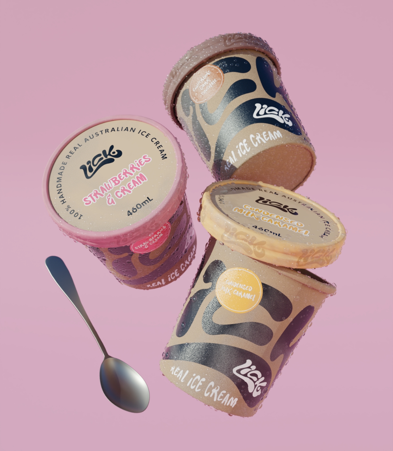
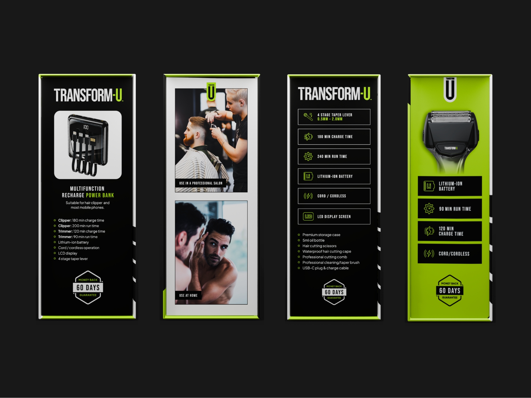
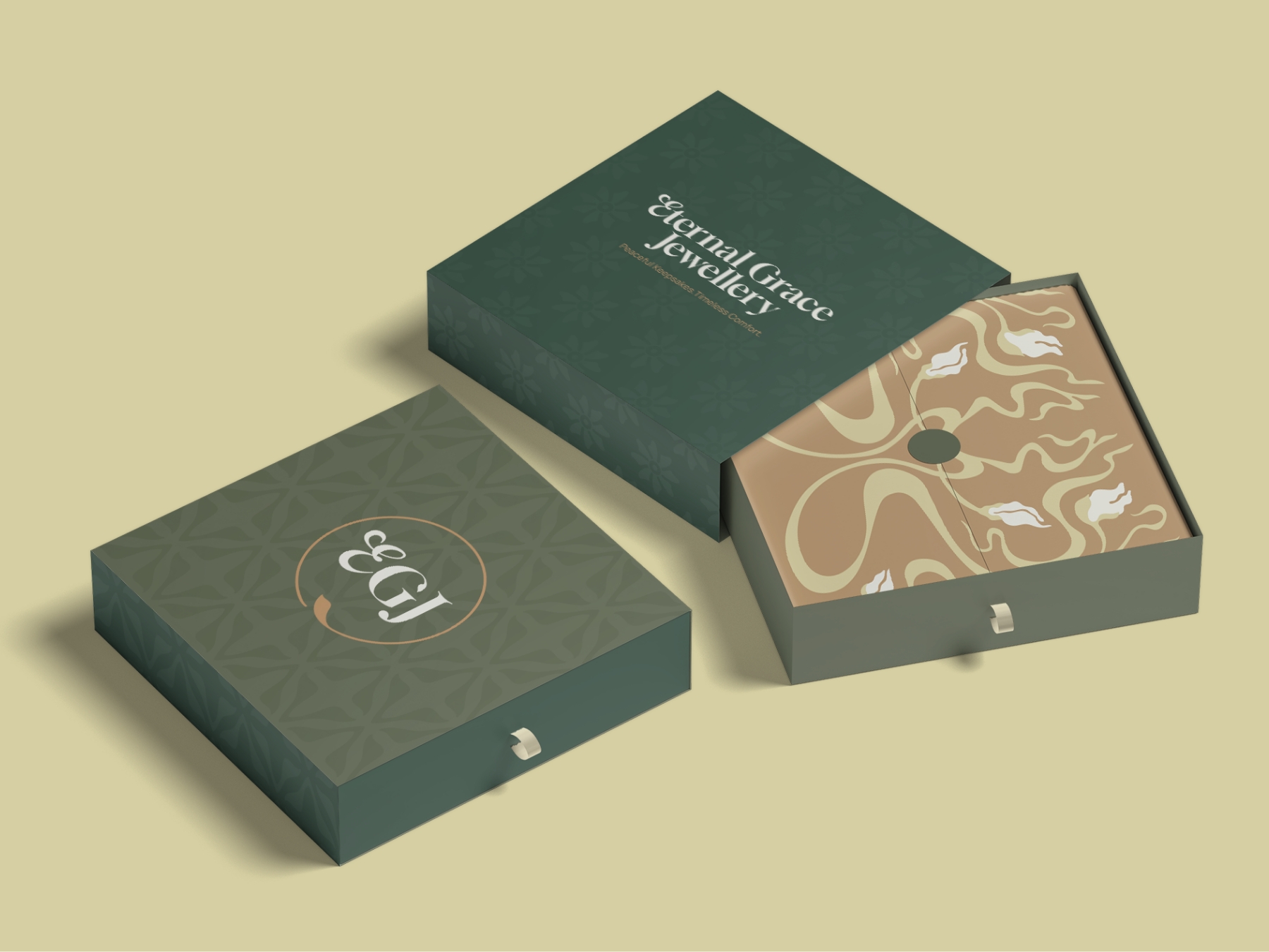
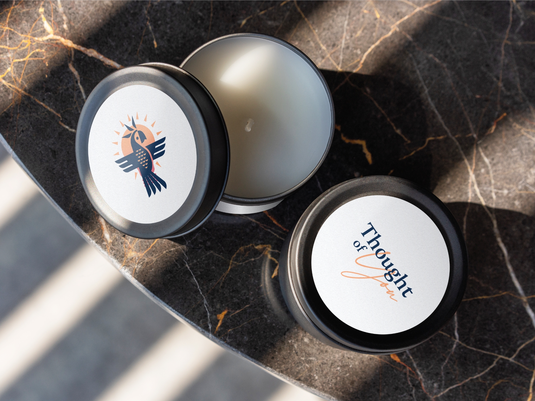
Packaging design that makes your product the one they reach for
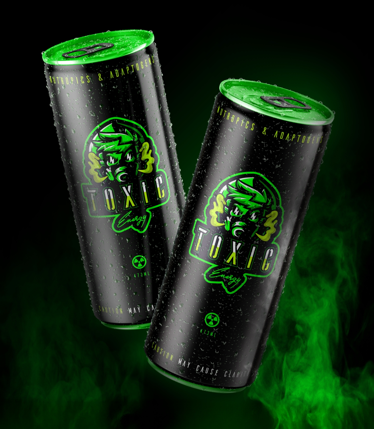
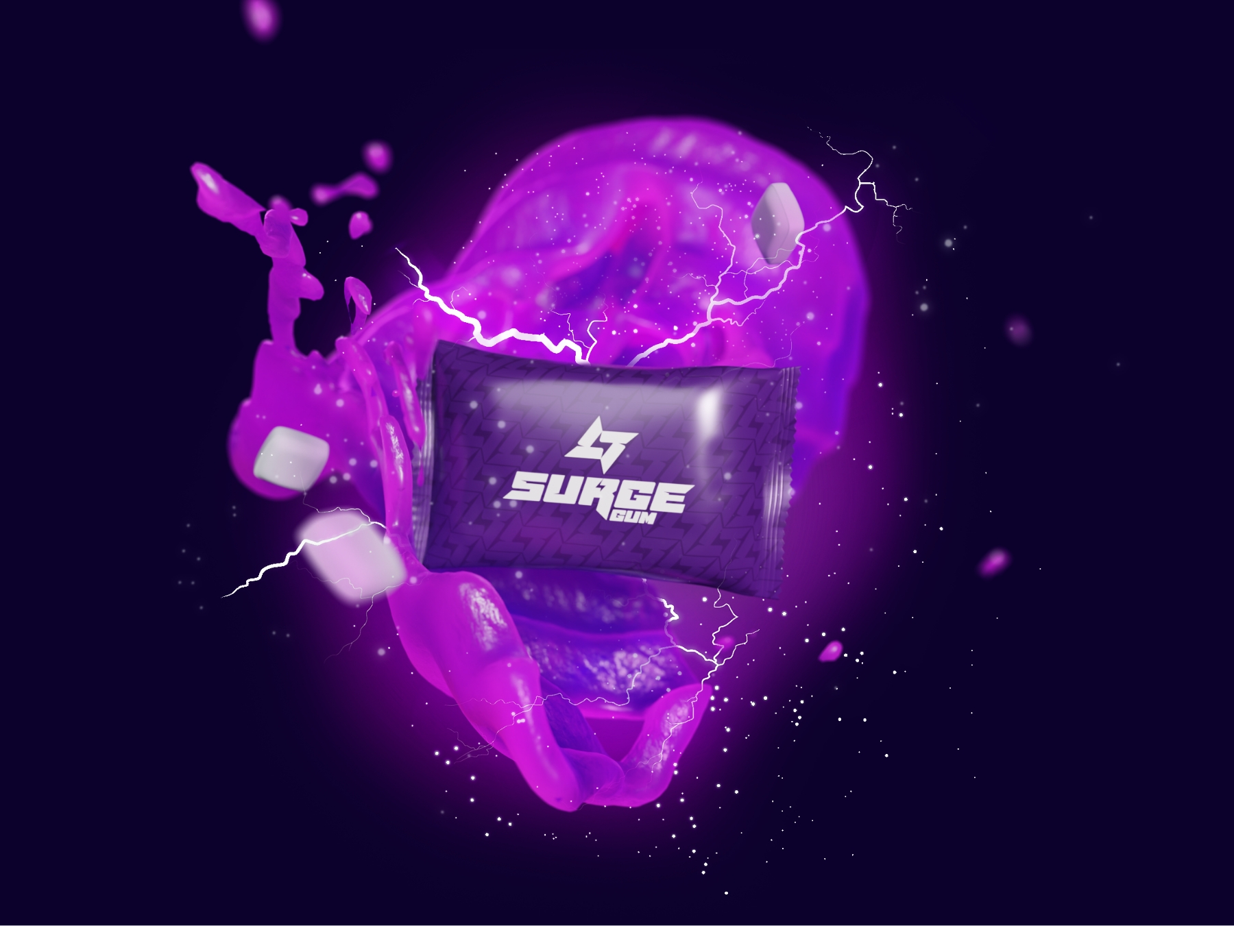
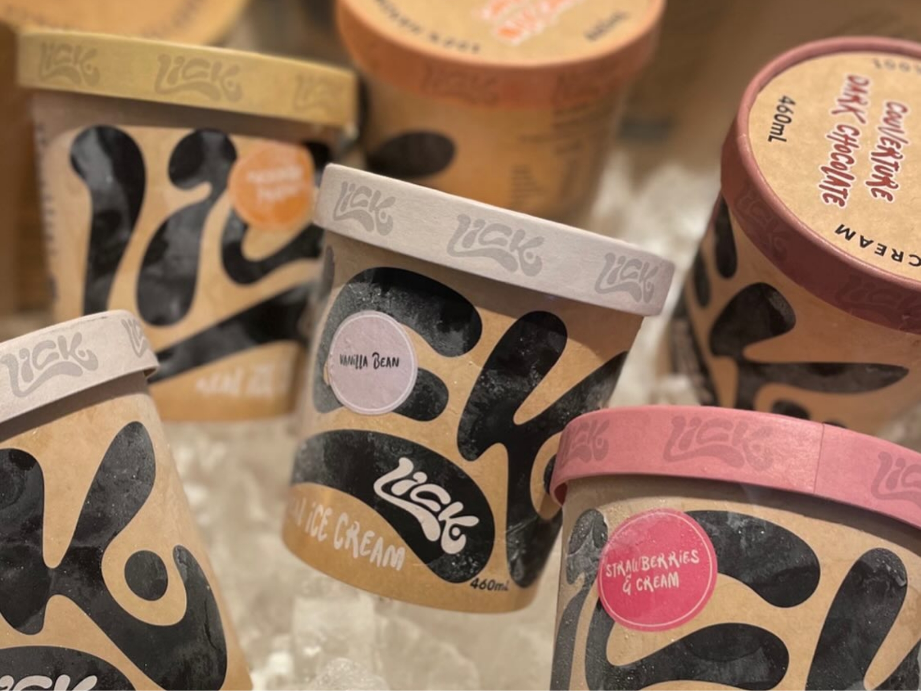
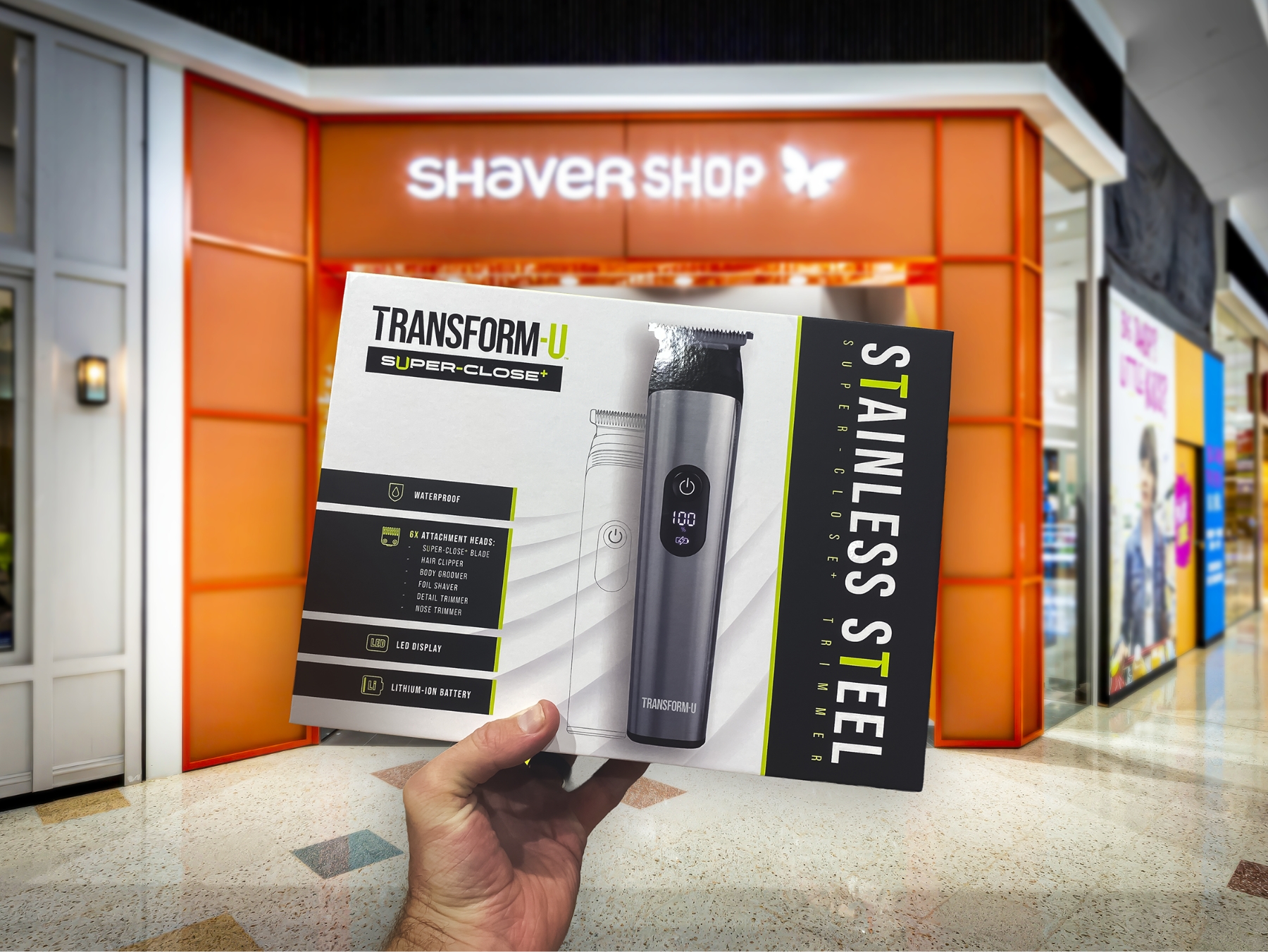
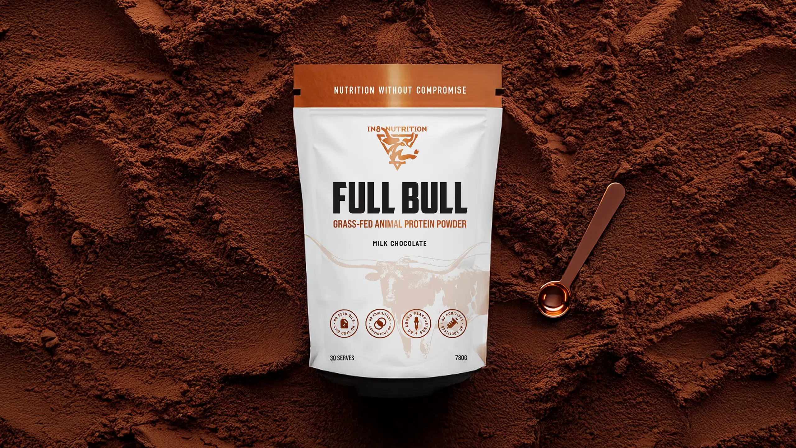
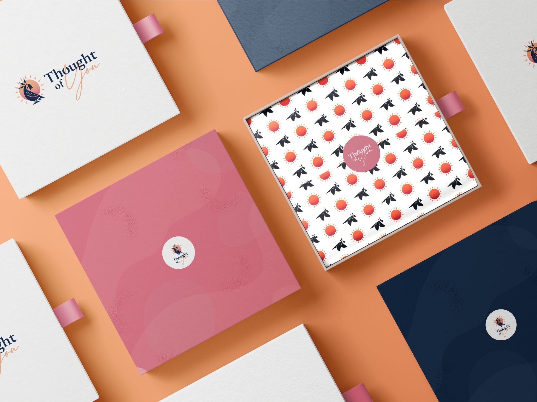
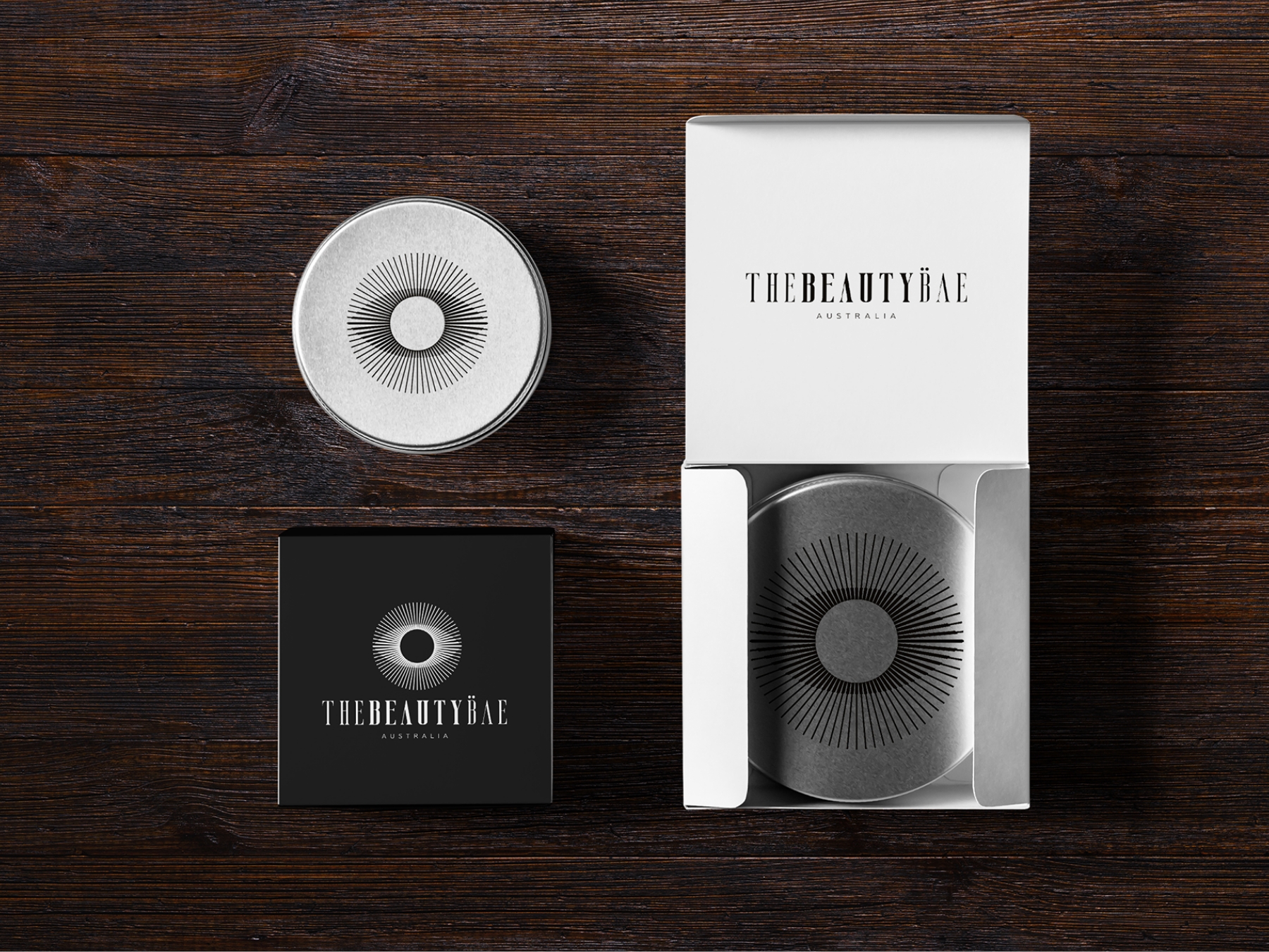
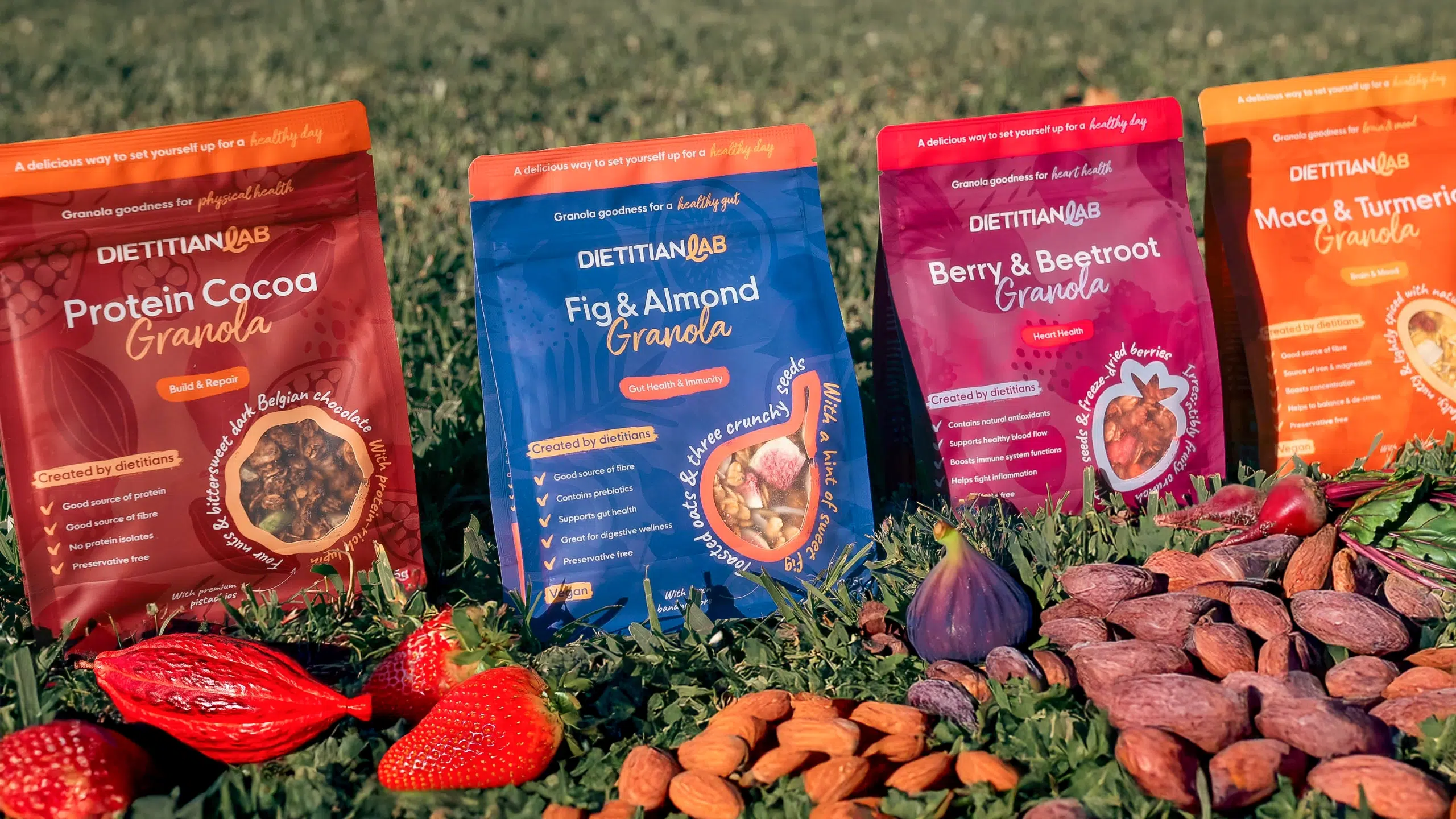
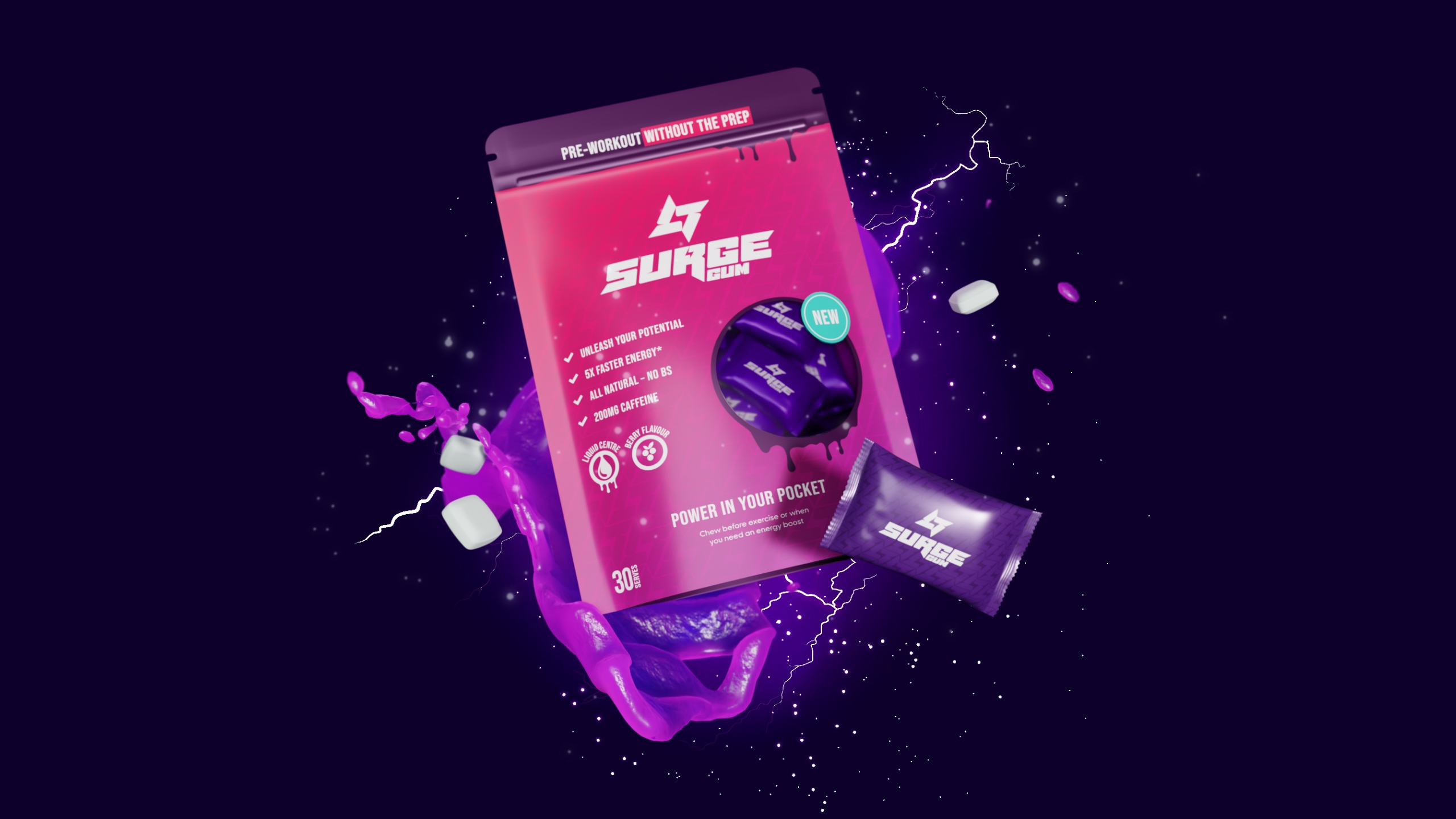
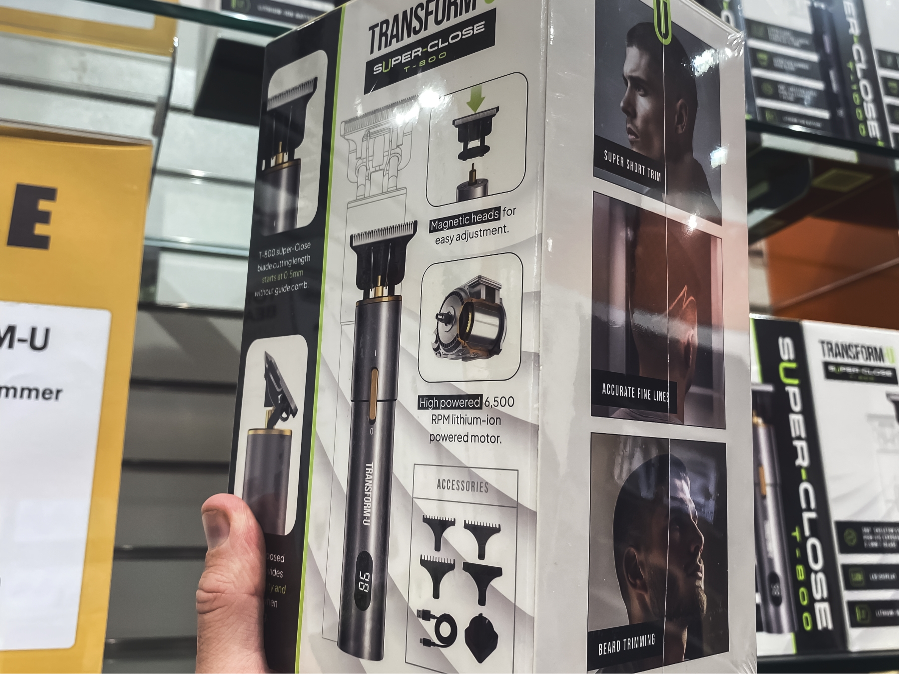
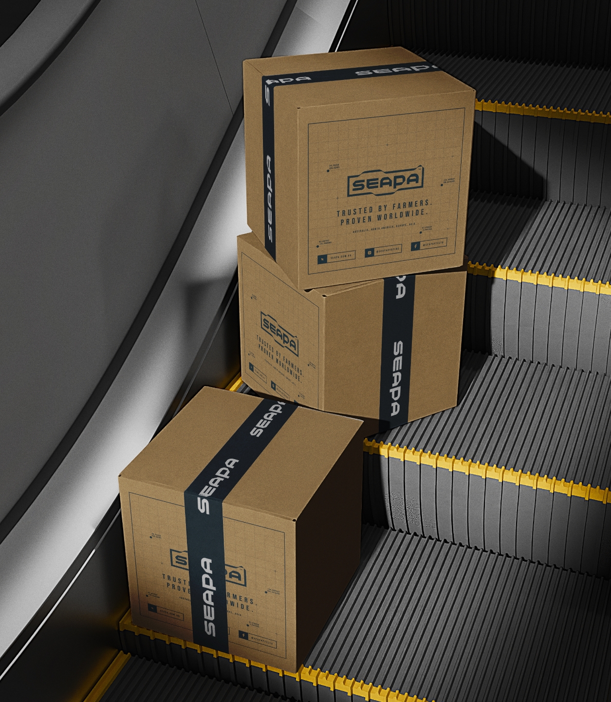
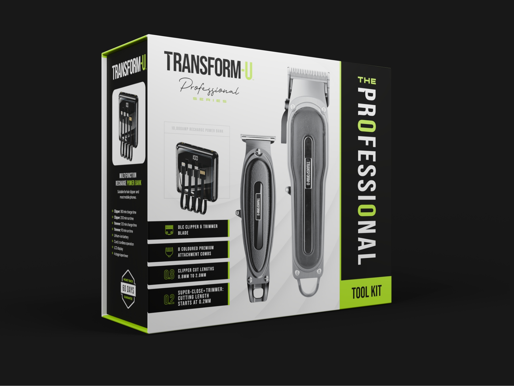
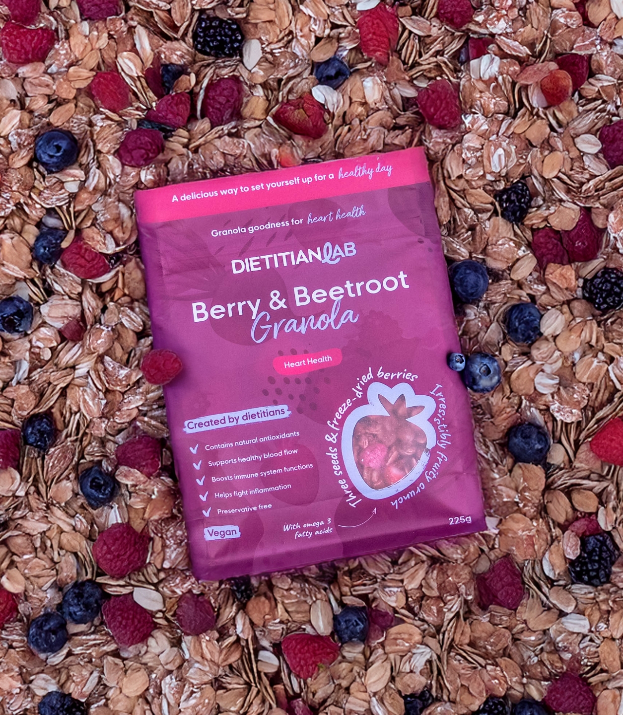
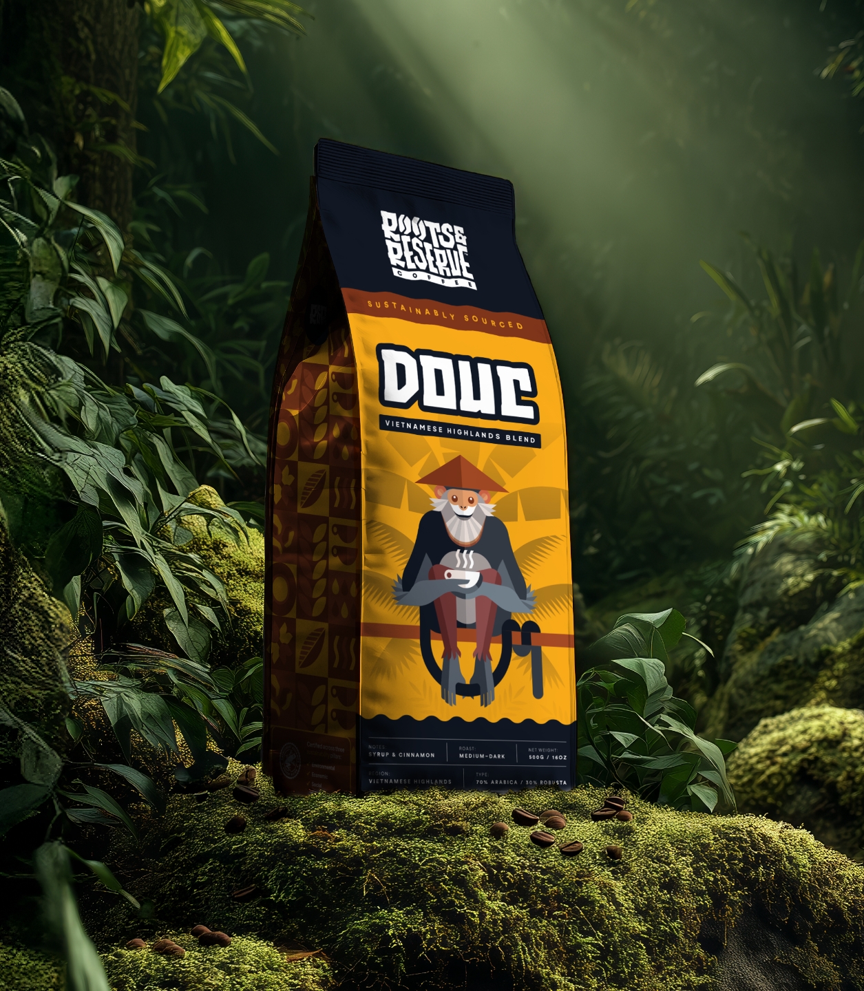
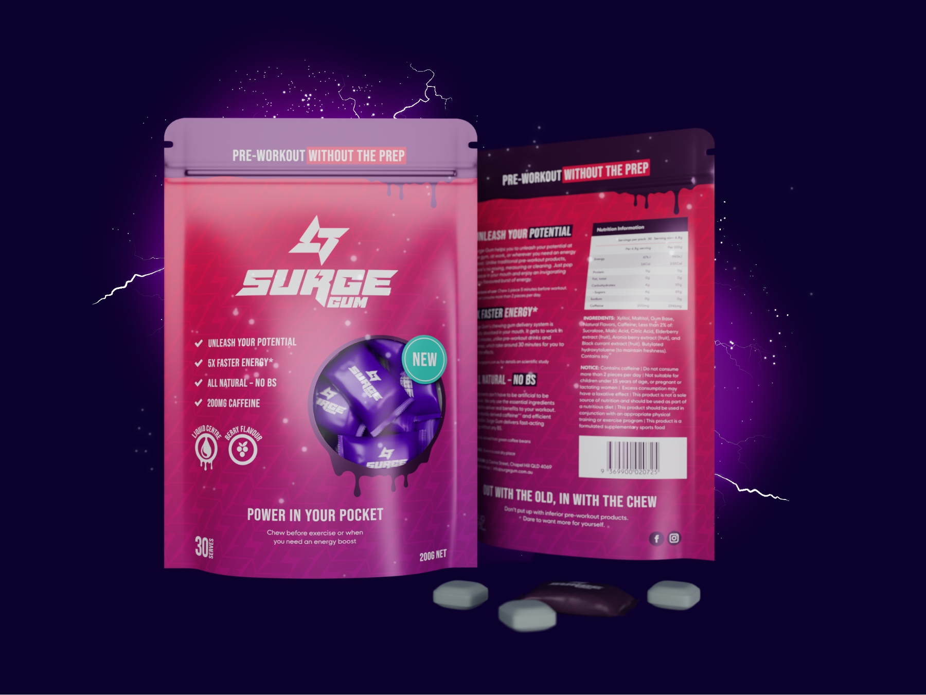
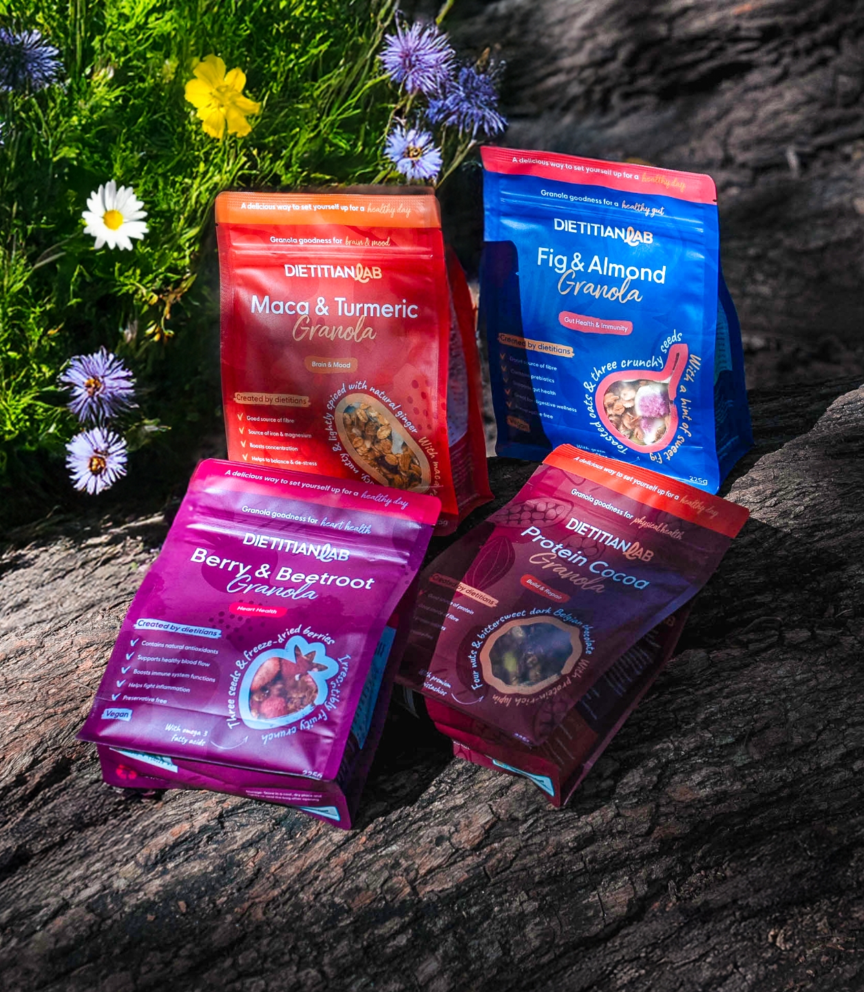
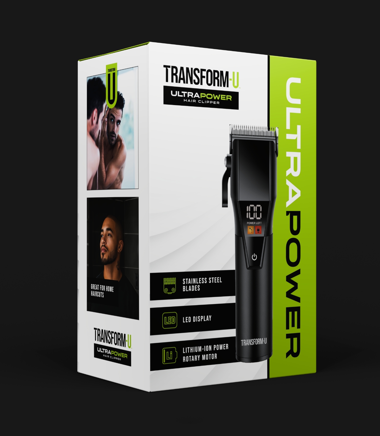
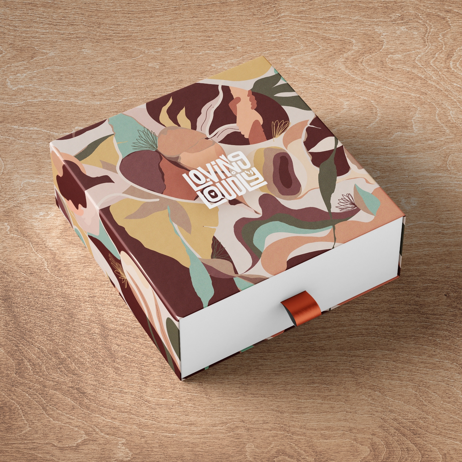
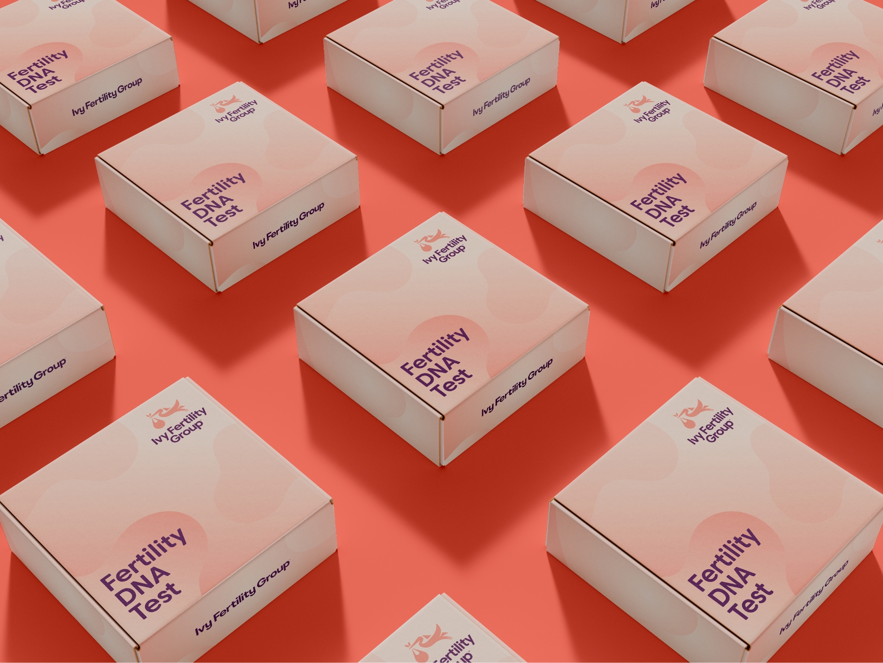
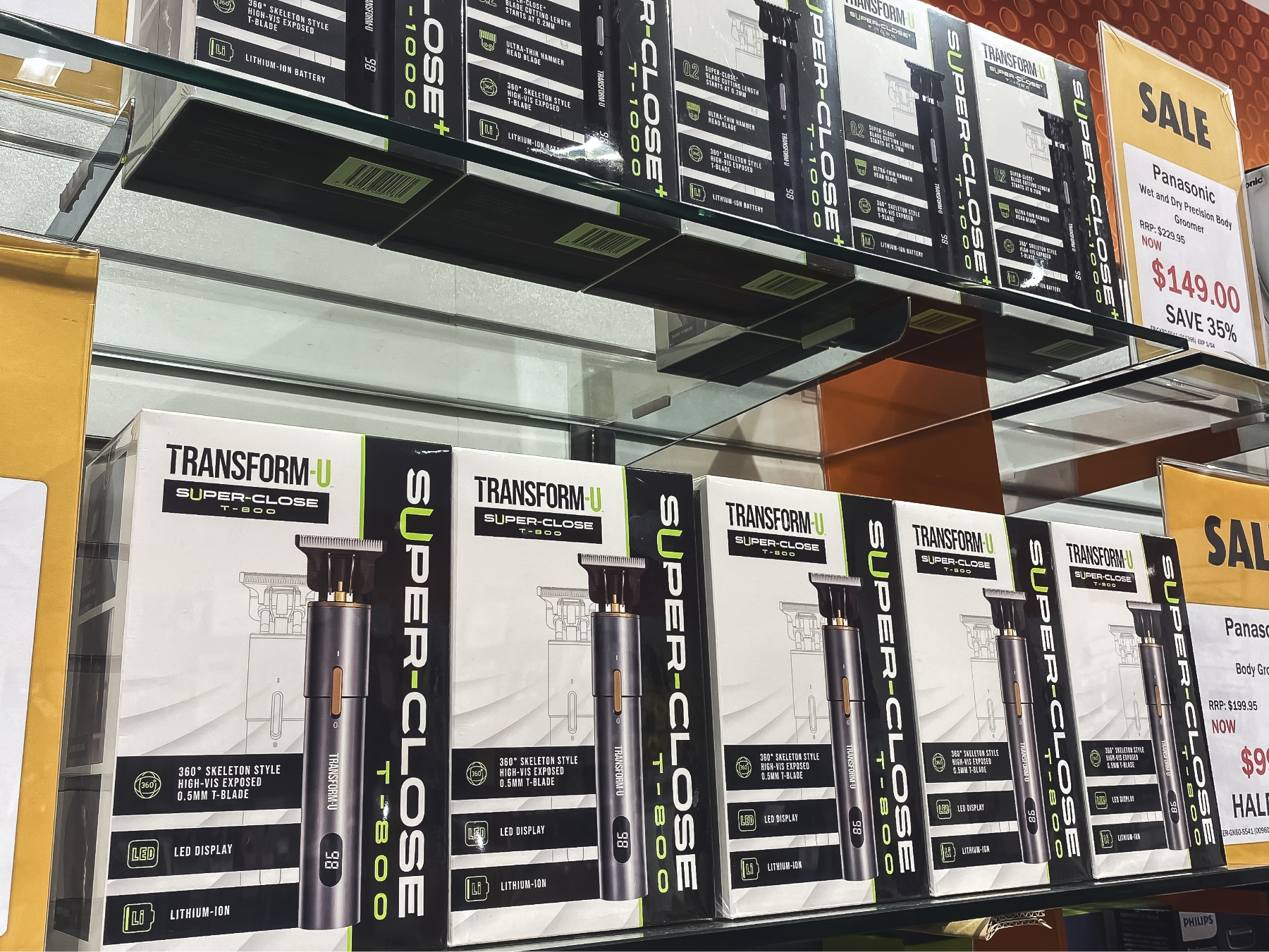
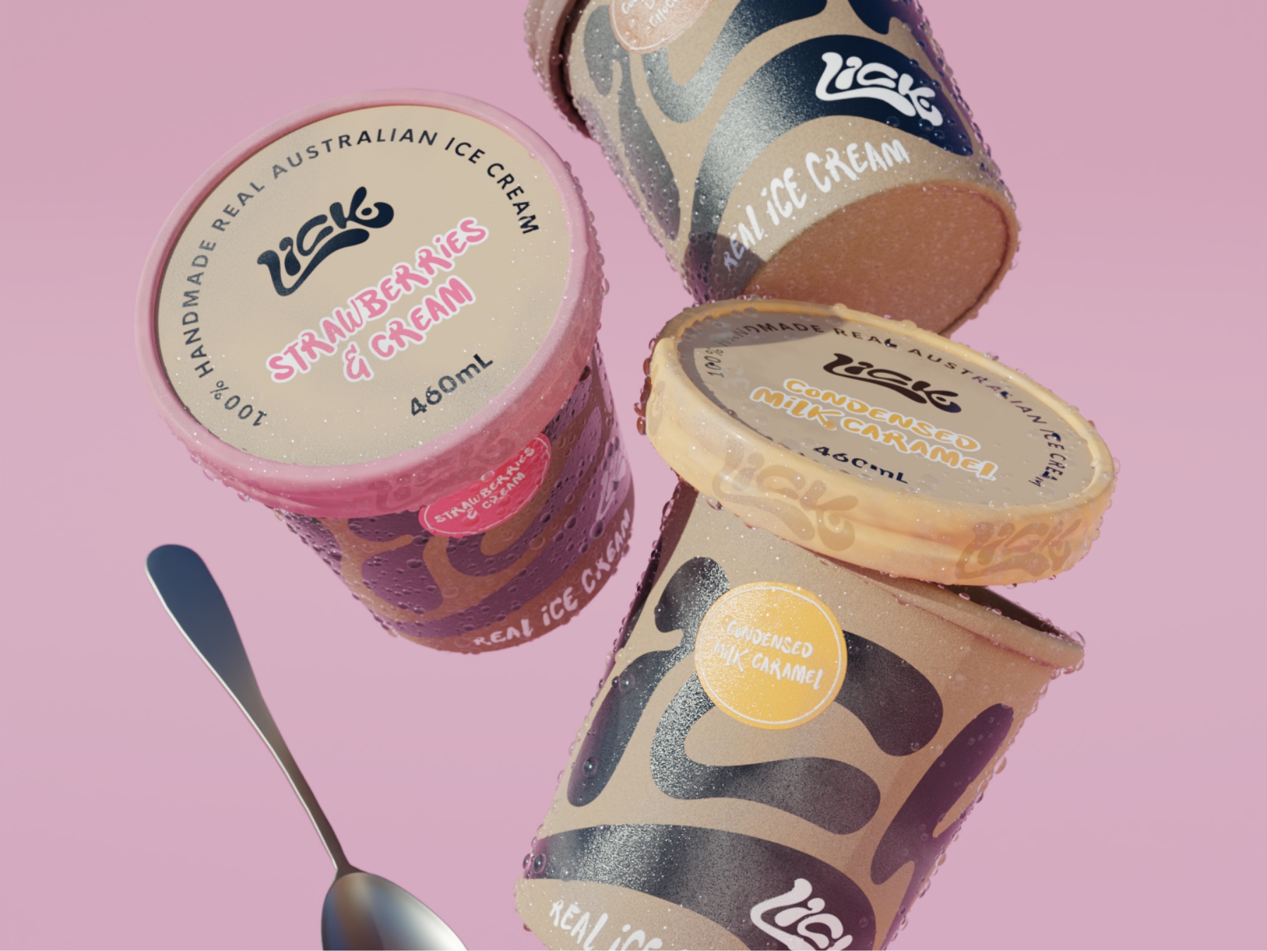
Packaging is your product’s first impression and its quickest trust builder. It decides whether a shopper picks it up in store or scrolls past it online. Our packaging design Melbourne service creates brand packaging, from labels and cartons to pouches and full ranges, that tells your brand story clearly, looks premium on the supermarket shelf and turns attention into purchases.
We design packaging that helps your brand win the shelf
Packaging design influences consumer perception in seconds. Shoppers decide what feels premium, trustworthy or forgettable before they’ve read a word, so every packaging design project we take on for a Melbourne brand starts with that decision. Category research and strategy first, then graphic design craft, with a collaborative process from first concept to final artwork.
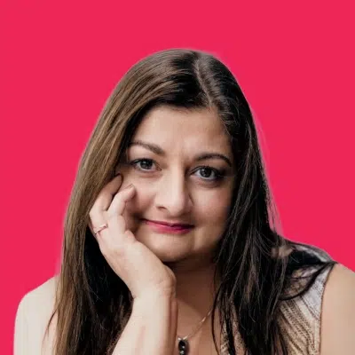
“Packaging is where people decide, fast. So we don’t just make it pretty. We look at your target consumer, your competitors, and the story your brand needs to tell, then design packaging that’s crystal clear, shelf-ready, and built for long-term success. That’s the goal!”
Chris Harris
Founder & Creative Director, Red Kite Design
Designed to stand out
The shelf is fast. We design for that first glance moment, when a customer decides what’s worth picking up, what’s easy to trust, and what gets ignored.
Brand first, always
Your packaging should look and feel like your brand, not like a template anyone could buy. We build brand identity into every label, box, and touchpoint.
Range ready systems
Flavours, sizes, bundles, variants. We create a consistent system across your product packaging, so it stays clear as you grow and stays cohesive as your range expands.
Print ready, supplier friendly
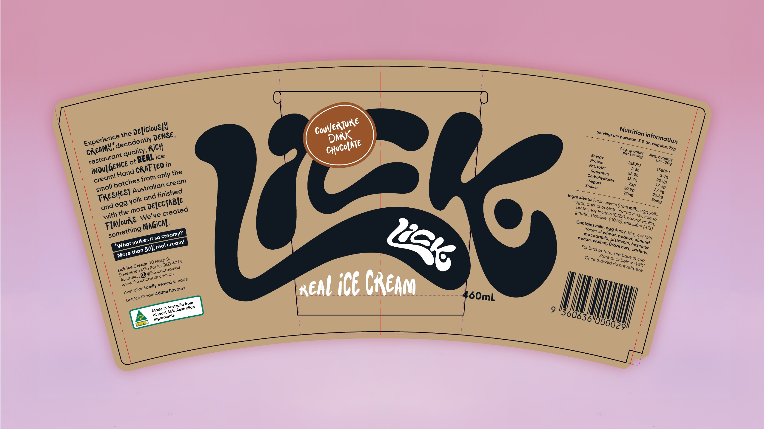
Dielines, specs, clean artwork, clear handover. We set label design and packaging files up properly, so production runs smoothly and your team isn’t left guessing.
We work with clients big & small
“I have been left speechless”
Stefanie Jones
Vida Style Solutions
“Red Kite has been an absolute delight from day one.”
Paul Carter
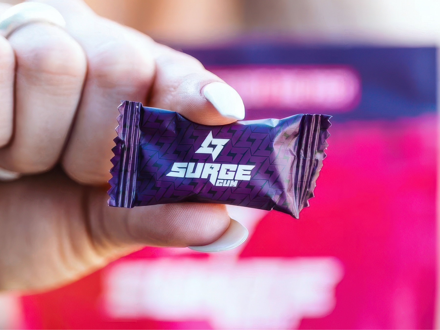
Surge Gum
“We couldn’t be happier with the finished product.”
Anthony Ikin
Glo Events
“The quality of their work is incredible”
Caroline Tapia
Mind Body Sleep
“Thank you from the bottom of my heart”
Lucy Casey
The Reluctant Coach
“Great service, communication and branding result”
Jacqui Louise
Best of the Wurst
“Red Kite Design is your answer.”
Simone Spryszynski
Zoomies
“Red Kite, I am so glad I found you”
Richard Gaze
Vizion
“Their team went above and beyond”
Gailene Hughes
Resurge Enterprises
“Redkite was an exceptional find.”
Kelsey Giarola
SingWhys
“Red Kite Design are outstanding to work with.”
Terry Ryan
Brisbane Bees
“Genuinely nice people.”
Karina McConville
Hawthorn Dental
“Exceptional rebranding experience!”
Michael Soden
SwipePT
“They were brilliant at bringing my vision to life.”
Chelsea Handley
Eternal Grace Jewellery
“Instrumental in achieving our vision.”
TJ Ergun
UltraSteam
“We couldn’t be more happy”
Jazmine Bartolic
Hop To It Plumbing
“A truly exceptional experience and end product.”
Decina English
Tim English Design
“They were able to bring my vision to life”
Billy Schiller
Nutrivize
“The outcome they produced exceeded expectations.”
Neil Emery
Chapel Hill Uniting Church
“From start to finish, the experience was fantastic.”
Charis Chan
Xenica Collective
Food packaging, skincare, coffee & more
Packaging we’ve created for every kind of product
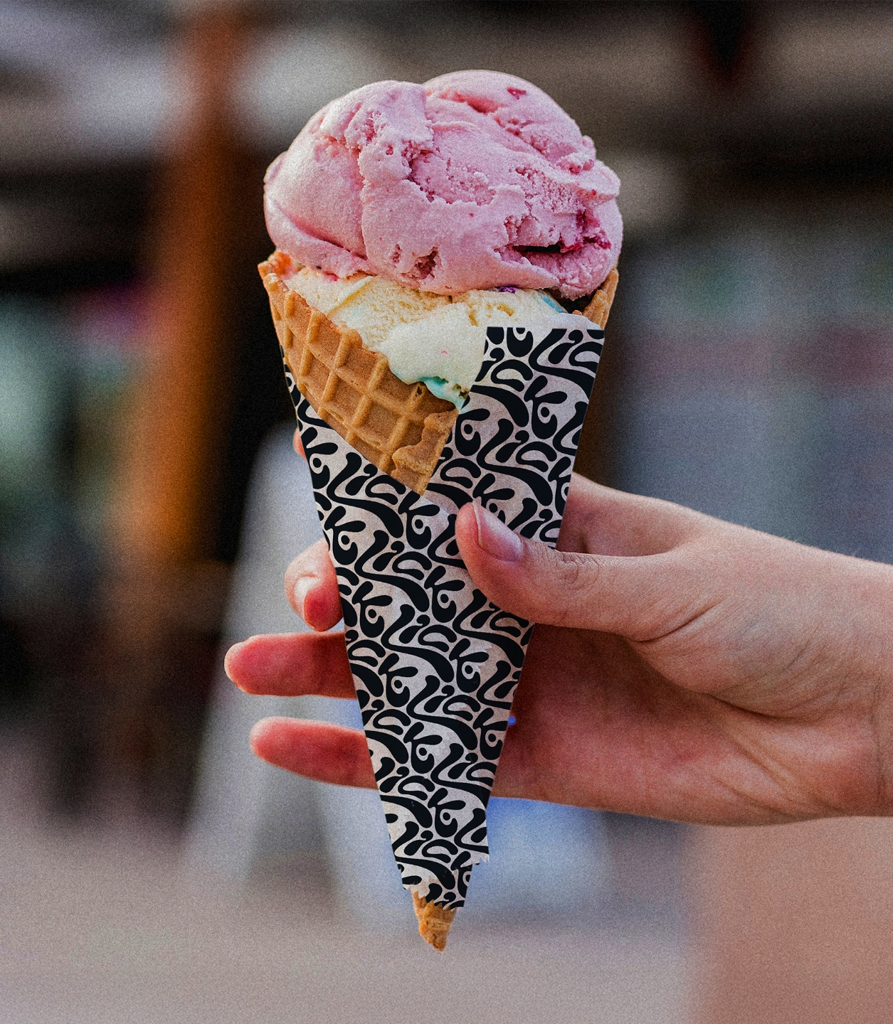
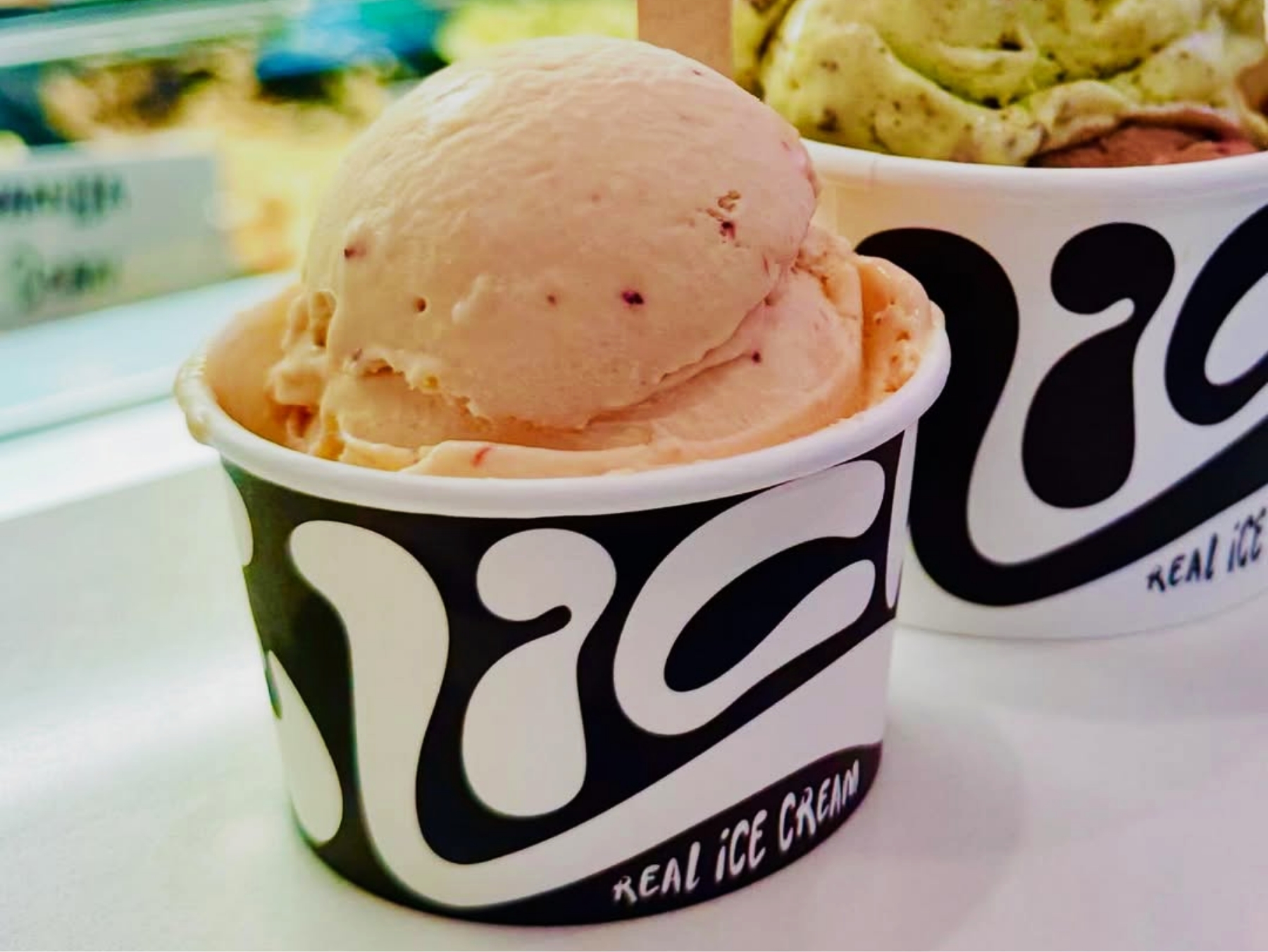
Labels, boxes, pouches, cartons, sleeves, shippers and whole range systems. Melbourne makes a lot of things worth putting on a shelf, from small-batch coffee, wine and craft drinks to skincare, supplements and everyday food packaging, and we’ve designed product packaging for most of them. Start ups launching a first product, established brands refreshing an existing range, and the same brand-led thinking behind every one.
Browse a few of our favourite packaging and product brand case studies from Melbourne and around Australia.
Everything your packaging needs to look the part and do its job
This isn’t a hand-over-the-files-and-disappear kind of design service. We combine strategy and craft with a collaborative process to create packaging that cuts through in retail and online, stays true to your visual identity and is built for print, as part of a system that supports long-term growth across your whole brand.
Brand-first packaging artwork & label design
Eye-catching packaging design that looks and feels like your brand identity, so every label, box or pouch is unmistakably yours.
Shelf & scroll strategy
We design for the supermarket shelf, the online thumbnail and the product page, so it has strong shelf presence and gets chosen with confidence.
Category & competitor research
Before we design, we study your category and your competitors to find the gaps and create a point of difference the market understands.
Audience-led copy & clear hierarchy
Consumers decide in seconds. We shape the messaging for your target market, then build a hierarchy so the important information reads instantly.
A packaging design system, not a one-off
Rules for layout, hierarchy and brand cues, so every format from primary packaging to secondary packaging and shippers still feels like you.
Range-ready variants
Flavours, sizes, seasonal drops and range extensions all fit one visual framework, so the range stays cohesive and easy to shop as it grows.
Print-ready, supplier-friendly files
Final artwork delivered to your packaging supplier’s spec, with clean production files and a clear handover. We’ll liaise with your printer when it helps.
We can also help with launch & rollout support
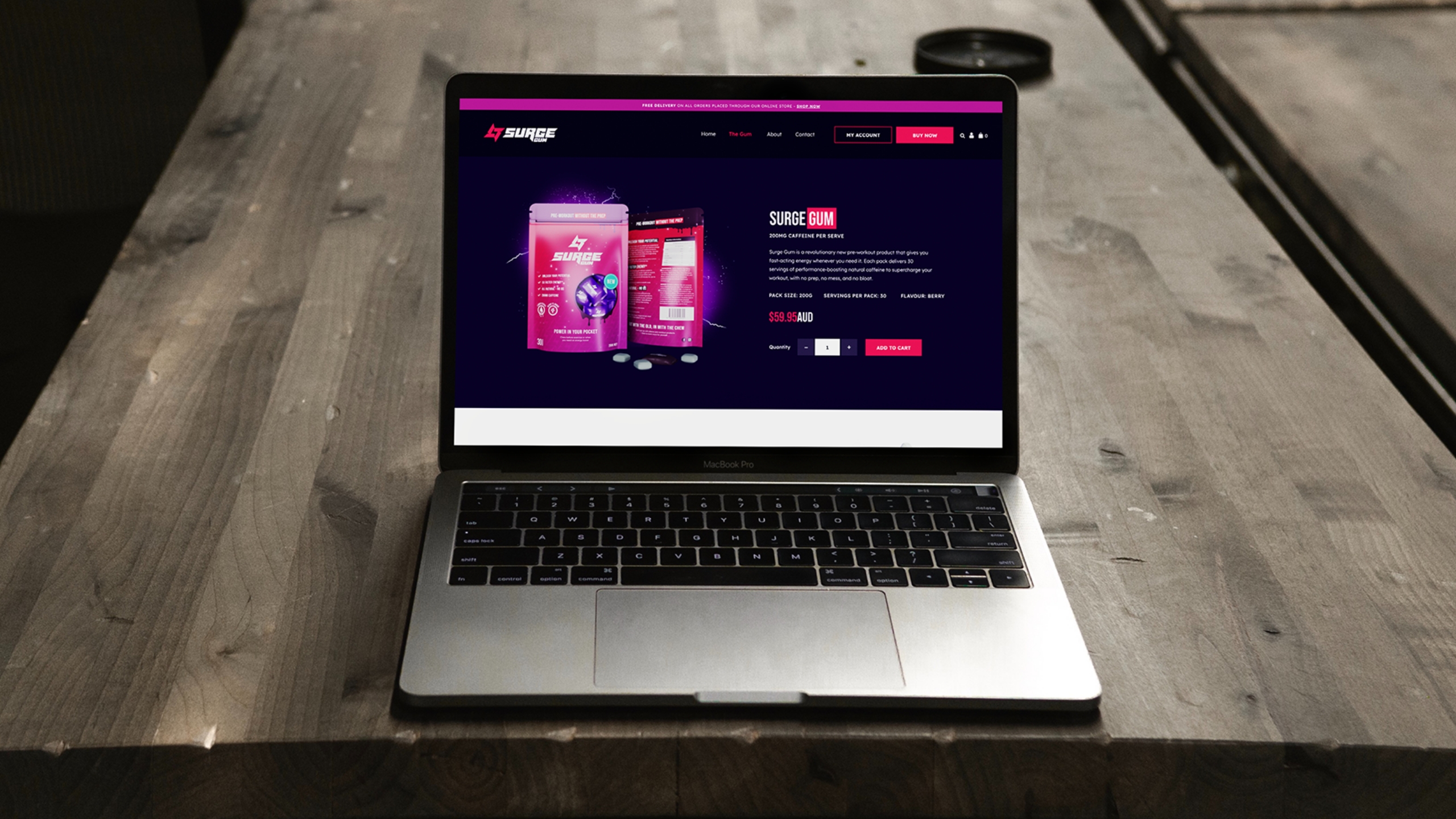
Once the packaging is sorted we can keep going with you. We design eCommerce websites and social launch material, then create the assets to fill them, from product renders and scene mockups to the sales material that gets your product ranged.
Send us rough photos, get back a full product shoot
Good photography is what makes a product look worth buying, and it has always been the expensive part. A studio day, a photographer, a stylist, then weeks of retouching. We work the other way round. Send us rough photos of your product from a few angles, the sort you could take on your kitchen table, and we build the whole shoot from there. Product shots, lifestyle scenes and the packaging itself, all from the same handful of images. Minimum input, maximum output, and it is how we shoot for Melbourne brands without anyone booking a studio.
Drag the slider to see what that looks like. What comes back:
Studio shots of the product on clean backgrounds, ready for your store and marketplace listings
Lifestyle scenes that put the product in a real setting, in use and in context
Your packaging photographed properly, on the shelf and in the hand
Shots strong enough to go on the packaging artwork itself, not just around it
Everything sized and cropped for your website, ads, email and social
Every file yours to keep, across print and digital
Your rough photoWhat we send back
Product packaging that shapes what consumers choose
Our Melbourne packaging design solutions
We design packaging for Melbourne businesses launching a new product, growing a range or giving existing packaging a proper upgrade. From the supermarket shelf to the online store, our packaging design service makes your product look sharp, read instantly and get chosen.
Just Packaging Design
For established brands ready to level up their shelf presence (& online).
Includes all the essentials for shelf-ready packaging:
Strategy-led category + competitor research
We get clear on your category, shelf context and what competitors are doing (and overdoing), so design decisions aren’t based on vibes alone.
High-impact packaging design built for shelf & scroll
We shape the direction together, then refine with you until it’s right, with no cap on revisions.
Packaging copywriting with personality
You provide the must-have details (ingredients, directions, claims, legals, barcodes) and we turn them into on-pack copy that reads well and sounds like you.
Layout + information design
We design hierarchy, flow and spacing so people instantly understand what it is, who it’s for and why it’s worth buying.
Range-ready system for SKUs and future growth
Flavours, sizes, bundles and future SKUs are planned for now, so you’re not reinventing the wheel later.
Print-ready production files to supplier specs
Dielines, bleed, finishes, barcode placement, legal panels and supplier requirements, all prepped properly. Nothing left to chance.
You'll also get:
Proofing checks + smooth supplier handover
Thorough proofing checks before anything goes to print, and we’ll liaise with your supplier to keep production moving.
Unlimited revisions + refinement until it’s right
We work back and forth with you until you’re confident to send it to print.
For product brands that want the full picture, not just a pretty pack.
A Comprehensive & custom product brand solution, which can include:
Brand discovery intensive
A deep-dive session to get clear on your goals, audience, category and what “winning” looks like: the brand development foundation for every decision that follows.
Logo design + full file suite
A slick new logo from our award winning team, plus a full suite of files for print, digital, packaging and socials.
Visual identity + comprehensive library of brand assets
Icons, patterns, textures, illustrations or mascots where they fit: the toolkit that gives your brand personality and staying power.
Typography + colour palette
Fonts and colours that feel like you and stay consistent across packaging, website and marketing.
Brand Blueprint guide + toolkit
A strategy and identity roadmap plus an organised toolkit of brand assets, so everything stays consistent as you grow.
Eye-catching packaging design
Packaging that turns heads and drives sales, cohesive with your brand and built to perform on shelf and online. Everything from the packaging design solution plus much, much more!
You can also add:
Product website (eCommerce-ready if needed)
A sleek, branded site to launch and sell your product properly, with the assets to populate it.
Social media pack
Editable templates or ready-made posts: launch packs, teaser series, feature tiles and campaign artwork that build momentum.
3D product renders + scene mockups
Photorealistic renders and lifestyle mockups so you can market the product before production lands, without an expensive shoot.
Promotional + sales materials
Pitch decks, brochures, POS, catalogues and launch assets, backed by our full graphic design expertise.
Graphic design details behind high quality outcomes
Six things we always factor in to our packaging design process
We borrow what's working, then filter it through your brand identity, your target market and where you're selling, so the product packaging looks sharp on shelf, builds brand recognition and still feels right when the next big thing rolls in.
Decision triggers
We design around the cues customers actually respond to in the first few seconds: trust, clarity, quality, and “this feels right for me”. That means we prioritise the information and visuals that reduce hesitation and make choosing your product feel like the easy option.
White-space & restraint
Good packaging isn’t louder, it’s smarter. We use space, hierarchy, and restraint to create confidence at a glance, so your product feels premium and considered rather than busy, cluttered, or trying too hard.
Brand personality centre stage
Packaging should sound and look like your brand, not a generic category template. We bring your tone of voice, story, and visual identity into the pack experience so it feels unmistakably you, even when it’s sitting next to ten similar products.
Information architecture
We map what must be seen first, second, and third, then build a layout that guides the eye naturally. The goal is instant understanding, with the important details landing in the right order without customers having to work for it.
Print integrity
We treat production as part of the design, not a handover step at the end. Colour, contrast, finishes, barcodes, legals, and supplier requirements are considered early so what you approve on screen is what arrives in real life, looking crisp and intentional.
Consistent now, scalable later
We don’t design packaging that only works for today. Even if you’ve got one hero product right now, we future-proof the look and structure so adding new variants later won’t turn into a redesign spiral. Same brand, same vibe, zero chaos.
Set your product's brand identity up for success
Show off your new packaging on an eCommerce site that sells it
Your packaging can't do all the selling on its own. We design eCommerce websites for Melbourne product brands that show the product at its best, get the benefits across fast and make checkout effortless, so the brand stays cohesive from the shelf to the screen to the unboxing.
What makes our websites special:
Built to highlight your hero product, its benefits, and what makes it worth choosing.
Custom-built by local Australian developers using the latest tech
Professionally written content to convert prospects into customers
Updates? You can make changes yourself (with zero experience)
SEO fundamentals are covered to help your site get discovered
Mobile-friendly and fully functional across all browsers and devices
eCommerce website design
Trend-smart, unique packaging design
New packaging design trends Melbourne brands are leaning into
Melbourne shelves are moving in two directions at once. Ultra-clean industrial design, with confident white space and sharp typography, sits next to dopamine branding, with vibrant retro palettes and playful shapes. Underneath both, especially in food packaging, is a shift to sustainable packaging, driven by Victoria's single-use plastics bans, the state's container deposit scheme and consumers who read the recycling label before they buy. Tactile uncoated stocks, local provenance stories and QR codes that link the pack to your marketing round it out. Your brand and your buying environment drive the design, not the trend cycle.
How we use trends (properly):
We borrow the right cues for your category without turning your product into a clone
We design for real buying environments, from the retail store to eCommerce scroll speed
We keep hierarchy and readability crystal clear so customers get it in seconds
We create a future-proof system so new sizes, flavours and SKUs still feel like one brand
Ready to get started?
Brand design and packaging for businesses across Melbourne and Victoria
Clarity before creativity. We take the time to understand your product, your consumer and the shelf it has to win on before a concept is created.
Dependable
A reliable service that puts your product first, work of the highest quality and deadlines met, launch after launch.
Collaborative
You know your product better than anyone, so we work as your partner, combining your knowledge with our graphic design expertise to shape a brand strategy that captures what matters to your customers.
Approachable
No jargon. We explain the thinking behind the packaging in plain language, so the logo, colour and layout decisions all make sense.
Proactive
The Melbourne market moves quickly. We keep an eye on what's selling here and around the world, so the thinking we bring you stays current.
Passionate
We don't disappear at handover. From print checks to the next flavour, we stay on hand for as long as you need us, which makes the investment worthwhile across the whole range.
Start your project today
Getting started is easy
At Red Kite the first step is the simple one. A packaging or brand identity project can be moving within days, whether your business is in Melbourne or anywhere else in Australia.
1. Request a quote
Get in touch with our Melbourne team or request a quote using our quick and easy form.
2. Access our pricing
After you submit your enquiry you'll get immediate access to our package pricing, to help you choose the right service for your business.
3. Create your brief
We'll chat about your product and your market to form a clear brief for your packaging designer, then come back with the first packaging design concept.
Find out more about what goes into every packaging design project we take on. Care, strategy and attention to detail are what make Red Kite the packaging design agency Melbourne brands come back to.
"Highly recommend investing in a professional service like Chris' - worth every penny"
"After trying several designers that weren't quite hitting the mark, I was so happy I was referred to Chris. He was the first one who took the time to pick up a call and get a solid understanding of what I was looking to achieve, communicated openly and professionally throughout the whole process and worked efficiently to get a beautiful job done in only a couple of weeks. And that's with my slow responses as I couldn't decide what I liked, due to everything he produced being fabulous. Not a bad problem to have lol. Highly recommend investing in a professional service like Chris' - worth every penny."
Carina
Carina Chirila Fitness
"I really enjoyed working with Chris and would highly recommend him to others"
"A big thank you to Chris for all of his hard work, guidance, support and patience. I came to him with a small vision and he really ran with it and went above and beyond. Chris made the whole process run smoothly and nothing was too much trouble. I really enjoyed working with Chris and would highly recommend him to others."
Lauren
Little Generation
"Working with Chris has been a pleasure and the results are spectacular"
"TrussCorp employed the services of RedKite to help us with a complete re-brand of all our material over the last six months. Working with Chris has been a pleasure and the results are spectacular. We could not recommend him more highly. His skill, creativity and speed are all amazing and he couldn't be more accommodating or helpful."
Have questions? Here's some answers to our most common inquiries
How much does packaging design cost in Melbourne?
Pricing depends on the format (a label, a box, a pouch or a full system), how many SKUs you have and how involved the print requirements are. A single label is a very different scope to custom packaging for a full retail range with several finishes.
Send an enquiry and you get instant access to our packages and pricing, so you can see what fits before we ever get on a call.
I have a product but no brand or logo design yet. Where do I start?
This is often the best time to bring us in. Branding and logo design are where Red Kite started, because we're a branding agency first, with graphic design support behind them. We build the foundations first, then do the brand design, logo and visual identity work, and the messaging your packaging can sit inside, so the pack builds a brand people remember rather than doing all the heavy lifting on its own. If the brand behind the pack needs work first, our branding agency in Melbourne can build it before the packaging starts. If you'd rather have the brand and the packaging built as one project, that is exactly what our Brand My Product solution is for.
What's included in your packaging design service, and which formats do you design?
Everything from strategy to print-ready artwork. Category and competitor research, concepts, custom packaging artwork, label design and packaging copy written from the details you supply, then the layout and hierarchy that make a pack read clearly.
We design labels, cartons, boxes, stand-up pouches, tubes, bottles, jars, sleeves, shippers and point-of-sale, so food packaging, beauty and other packaging formats are all covered, planned as one cohesive system.
How does your packaging design process work?
We start with the fundamentals, meaning your product, your target market, where it will be sold and what's happening in your category, so the pack has a clear job inside your wider brand identity.
Then comes concept development, where we present clear directions for your feedback, including tactile options like embossing or letterpress where a premium feel suits the brand. Once a concept is approved we lock in hierarchy, messaging, legals and colour, then build the final artwork to your supplier's dielines so printing runs smoothly.
Will my packaging be unique, or will it look like every other brand in the category?
We design to cut through, not disappear. Packaging is a silent salesman, and many customers judge quality off the pack alone, so anything generic gets judged that way too.
In Melbourne we see two directions a lot right now, ultra-clean industrial and dopamine branding, and both can work brilliantly if they fit your audience, your positioning and your category. That's why we start with your consumer and your competitor landscape rather than whatever is popular this week.
Can you write the copy that goes on my packaging?
Yes. We write your packaging copy from the details you supply (ingredients, instructions, claims, warnings, compliance information), then craft wording that scans in seconds, sounds like your brand and doesn't read like a template. We're not lawyers, but we're careful with regulated categories and will point out anything that looks like a compliance risk before it goes to print.
Will you make sure the files are print-ready and work with my supplier?
Absolutely. We build print-ready artwork to your supplier's dielines and specs, with correct bleed, colour setup, barcode placement, finishes and export settings. If you already have a printer we deal with them directly and run proofing checks so the handover is clean. If you don't have a packaging supplier yet, we'll point you in the right direction and tell you exactly what to ask for.
How long does a packaging design project take?
A single label usually takes two to three weeks from brief to final artwork, while a multi-SKU system with several formats and special finishes runs six to eight weeks, depending on how quickly we can lock in product details and supplier specs. Production adds its own lead time on top, often several more weeks for custom packaging. If you have a launch or on-shelf date, tell us upfront and we'll map the process backwards from your print deadline.
What if I don't like the designs, or need changes later on?
Fair question, and it's exactly why our process isn't a big reveal. The direction is grounded in research and strategy, then we keep refining with you, with no cap on revisions, until it feels right on shelf and online. Changes during the project, such as copy tweaks, barcode updates or a new format, are handled as part of it. After sign-off you can come back to us for range extensions and we'll quote or work hourly, whichever suits.
Can you help beyond packaging, like eCommerce websites and launch assets?
Definitely. Once the packaging is locked in we can take it live everywhere your product shows up, including an eCommerce website, product page graphics, email campaigns and launch social sets, plus product mockups and scene renders so you have strong visuals without an expensive photo shoot.
Can you design sustainable packaging?
Yes, and in Melbourne it's fast becoming a non-negotiable, with Victoria moving toward packaging that is 100% recyclable, reusable or compostable by 2026 and single-use plastic restrictions tightening. We treat sustainability as part of the brand story rather than just a material choice, right-sizing packs, simplifying components and designing for a more recyclable structure without losing the front-of-pack punch that sells.
On materials we can help you explore mono-material packaging, biodegradable alternatives like mycelium and bamboo pulp, refill systems and compostable options where your supplier can deliver them, with QR codes carrying the detail off the pack. The national targets also ask for an average of 50% recycled content, which we factor into material choices.
Should I hire a packaging design agency, or go direct to a packaging supplier or manufacturer?
It depends how settled your brand direction is. If you know exactly what you want and simply need packaging produced to spec, going straight to a supplier can make sense, because they're strong on materials, formats and print options.
If you're still working out how to stand out on the supermarket shelf, or you want the pack to sell the story properly, a packaging design agency earns its keep. We look at your target market and how customers decide in store, and we keep polish and consistency across the range, which is where brand nuance gets lost with offshore production. We design packaging for product brands right across the country, with dedicated pages for Brisbane, Sydney, Perth, Adelaide, the Gold Coast and the Sunshine Coast.
Does your Melbourne brand need packaging that stands out?
Good packaging keeps working long after the launch, from the first pick-up to the repeat purchase. We would love to hear about your product, where it's headed and how our Melbourne packaging design agency could help it get there. Hit the button below to get started with a free quotation.