“They didn’t just design a logo; they built a complete brand identity and it turned out better than anything I could have ever imagined.”
Erin Menhinnitt
Founder
Project overview
An urban club for dogs, designed to be seen
Erin Menhinnitt had used dog daycares for years and grown tired of how impersonal most of them felt. The Houndry is her answer, a premium daycare, grooming, training and pet taxi service in Fortitude Valley, built around glass walls, live camera feeds and an app that shows owners exactly what their dog is up to. She came to us before the doors opened, with a name, a sharp read on her audience and one firm instruction. Nothing cute. Our job was to build a brand that could carry all of it, from the mark to the shopfront.
Every Red Kite project starts with a deep dive, and The Houndry’s came before the fit-out had even begun. There was no existing brand to work around, no website and no shopfront. Just a name, a lease in Fortitude Valley and a very clear idea of the gap Erin was setting out to fill.
We worked through the services, the inner-city audience and the competitors she wanted to leave behind, along with the London dog club that had shaped her thinking. What came back was consistent. Premium, tech-led and transparent, closer to a members’ club than a kennel, and built for people who treat their dog as part of their lifestyle.
Brand ambitions
Target audience
Competitive landscape
Service offering
Points of difference
Signage & environment
Merchandise & apparel
Tone & personality
Design requirements
& more
The things she ruled out mattered just as much. No paw prints, no cartoon dogs, no smiling puppies, nothing bright and playful. That gave us the tension the whole identity runs on, warm and witty on one side, confident and urban on the other.
What we covered
Origin story
Products & services
Competitive landscape
Target audience
USPs
Marketing strategy
Future aspirations
Brand personality
Design requirements
& more
The logo: the first piece of the puzzle
A mark with personality, minus the clichés
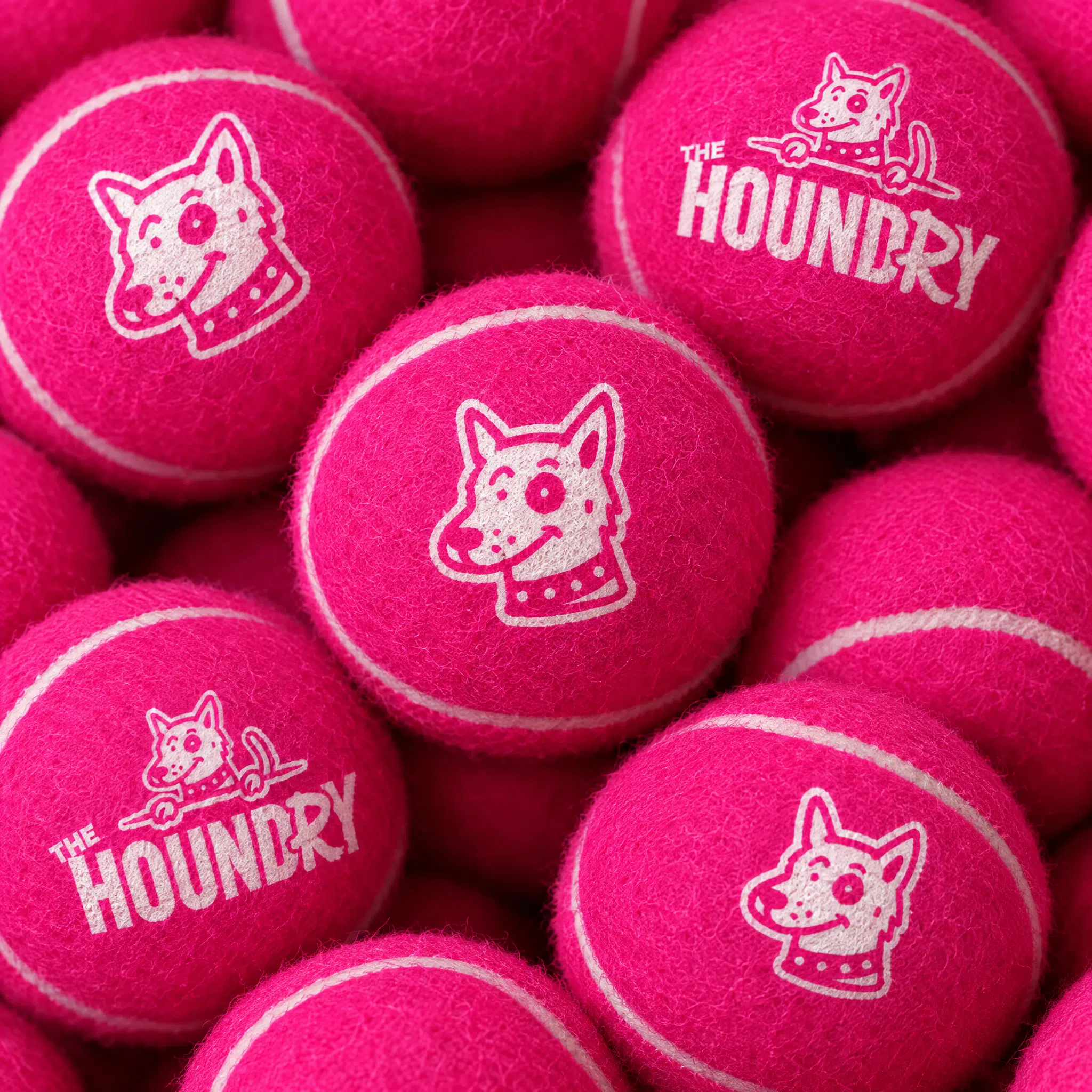
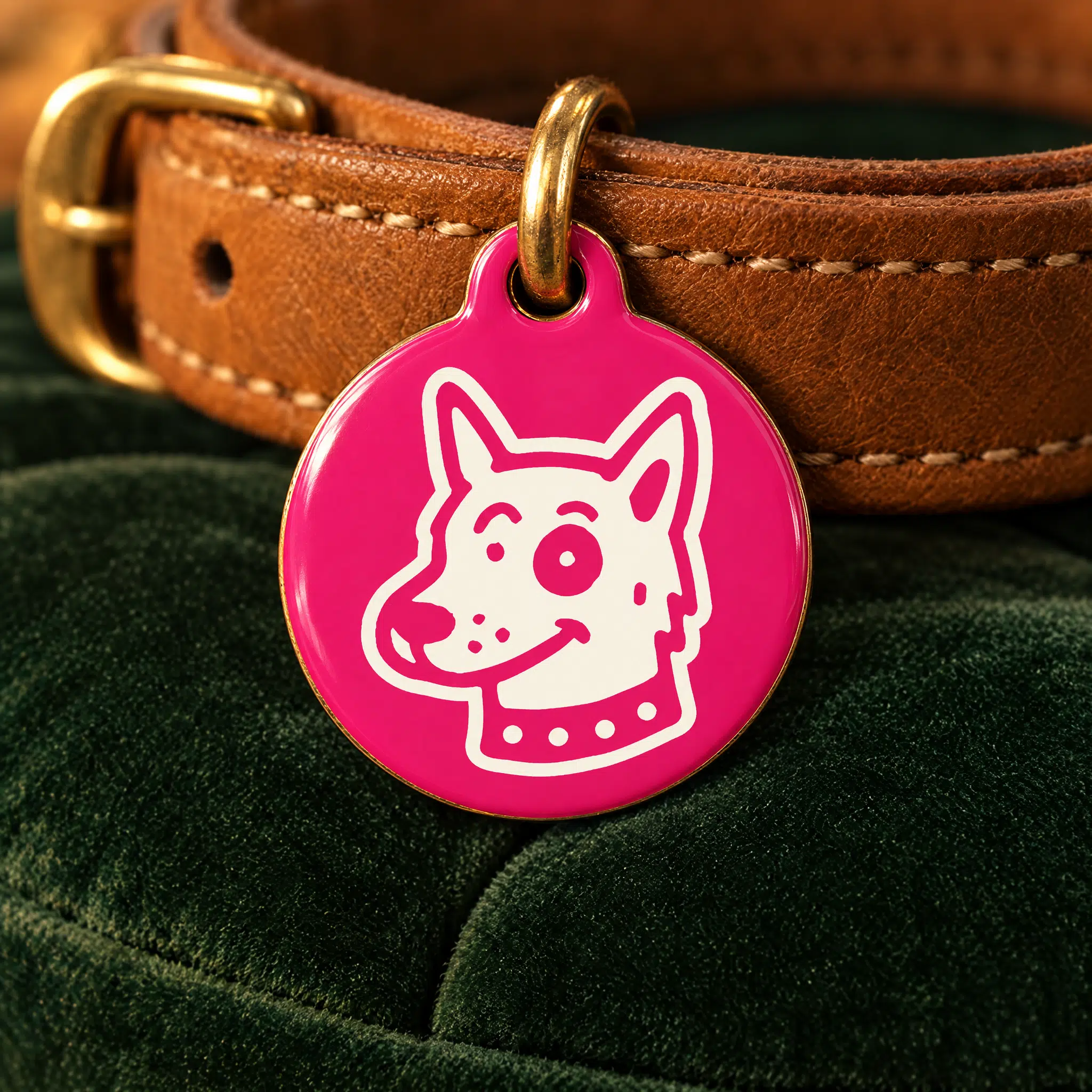
The wordmark is a customised Bebas Neue Pro Bold, redrawn for a more even rhythm, with Galano Grotesque Heavy on the word “The” to soften the lockup. The dog is drawn into the identity rather than dropped beside it, a hand-drawn head paired with the name and a tail curling out of the R. It reads as a dog straight away without a single paw print, and it holds up at report card size as well as it does lit up on a facade. From there we built out the full family, vertical and horizontal lockups, a standalone dog head, the R mark on its own, inverted versions and monochrome silhouettes, so the brand has an answer for every surface it lands on.
Building the brand beyond the logo
Hand-drawn character with a street-art edge
A logo on its own was never going to carry a brand this ambitious, so we built a full visual system around it. The illustrations are loose, single-weight and deliberately imperfect, dogs being dogs rather than dogs behaving. The icon set follows the same rule, no harsh edges and no perfect symmetry, and a circular badge version turns that linework into a way of signposting daycare, grooming, training and the taxi run.
The palette does the heavy lifting. Aqua Deep and Woodsmoke ground the layouts, Celery and Early Dawn open them up, and Violet Red and Wewak supply the punch. Bebas Neue carries the headlines, Plus Jakarta Sans handles the reading, and Amithen comes in as a brush accent on the words worth emphasising.
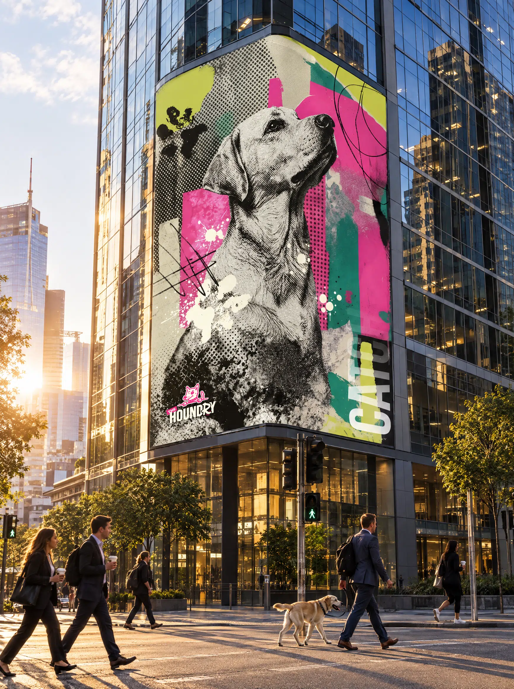
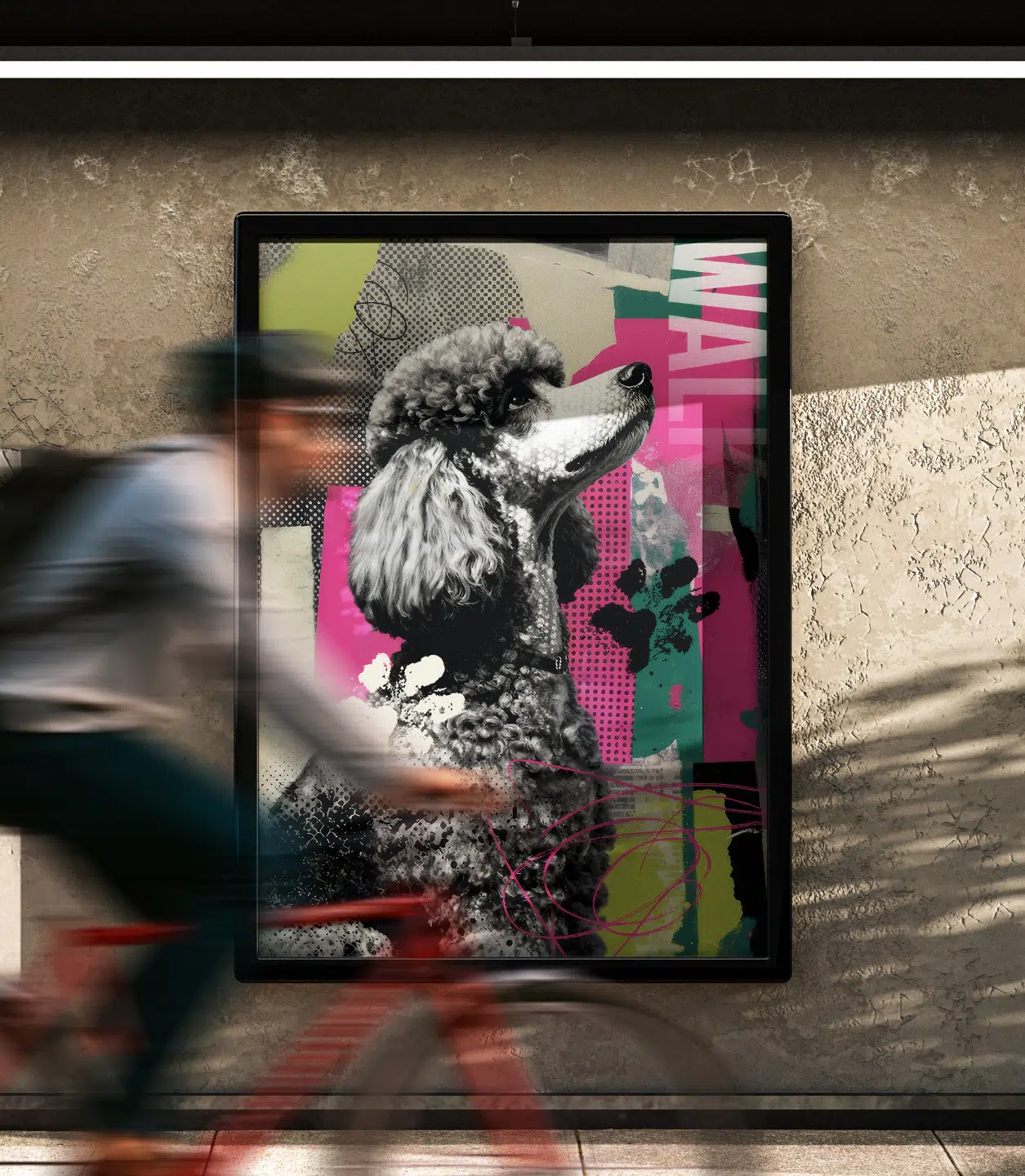
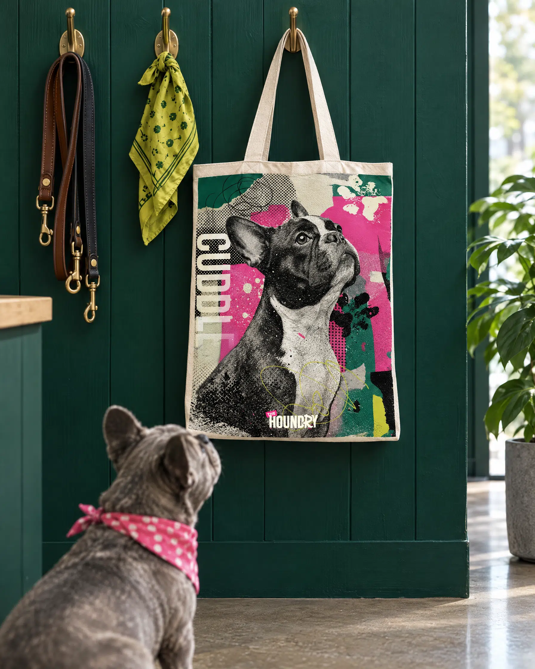
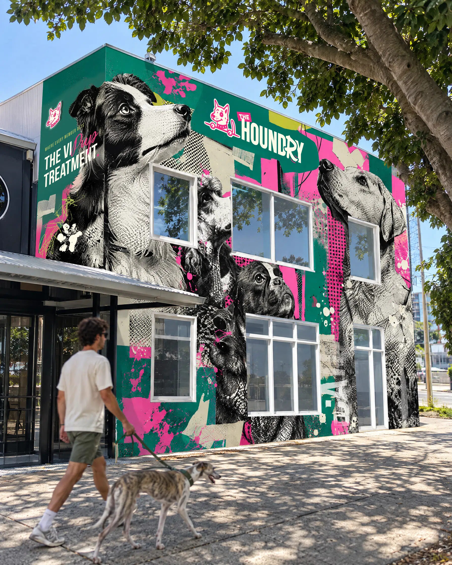
The photography treatment pushes it furthest. Every hero image is a black and white dog portrait layered with torn paper, halftone, pencil scribbles, paint splashes and muddy paw prints, all in brand colour. It’s the piece that makes The Houndry look like street art rather than signage, and it’s the reason the brand holds attention on a feed.
Brand assets created
Brand patterns
‘Electrified’ photography
3D product renders
Custom image treatments
Reusable ‘oozing’ elements
Typography treatments
Lightning assets
Touchpoints that tell the story
Everything a brand-new business needs on day one
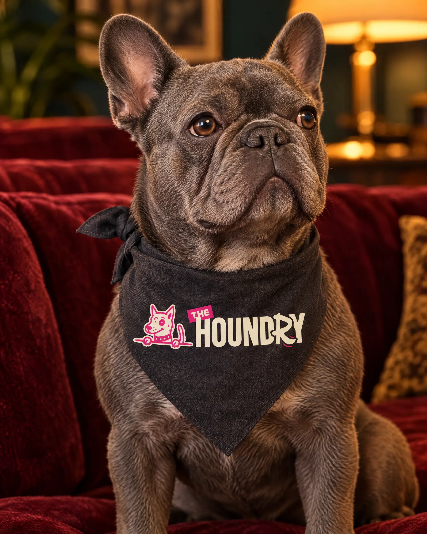
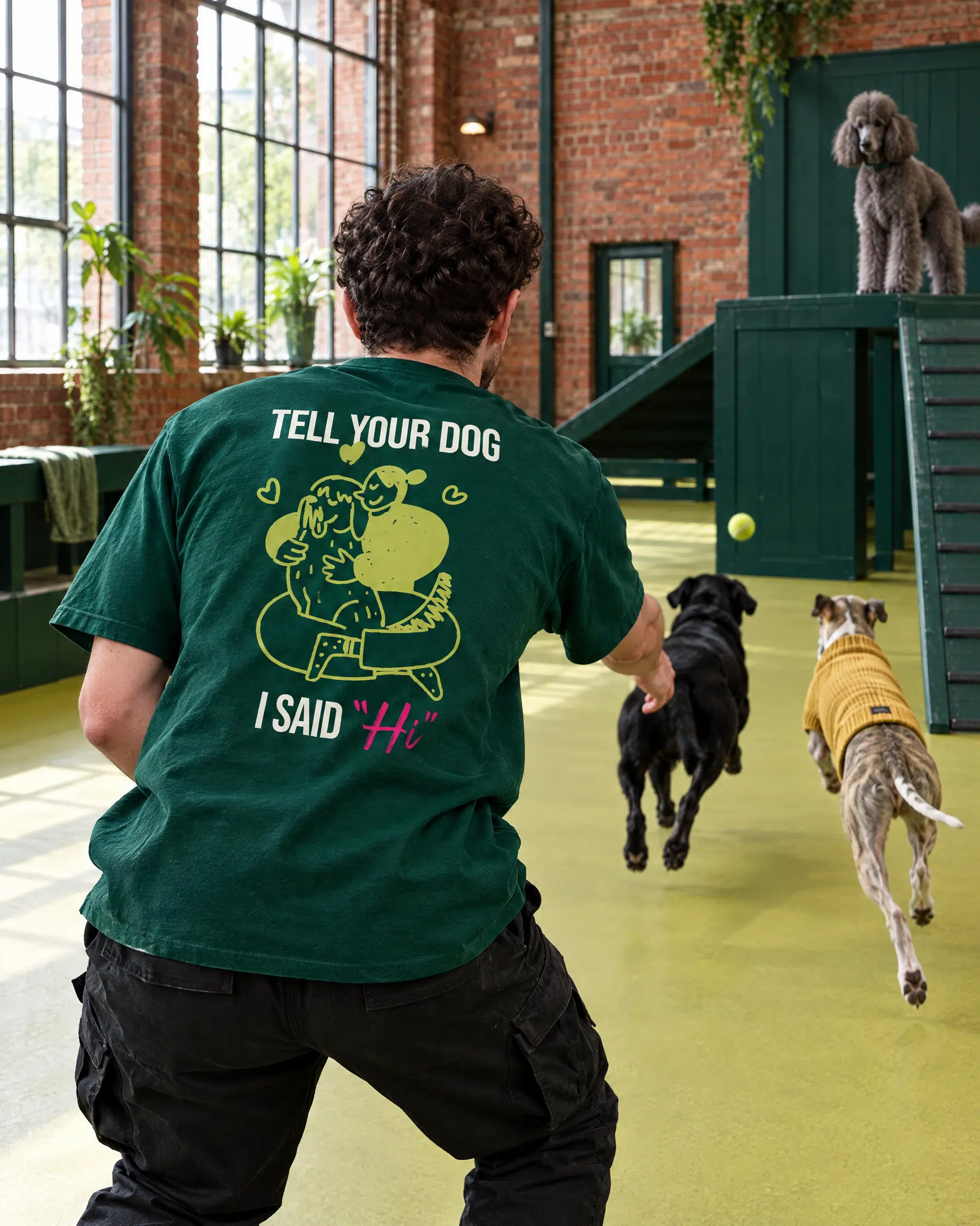
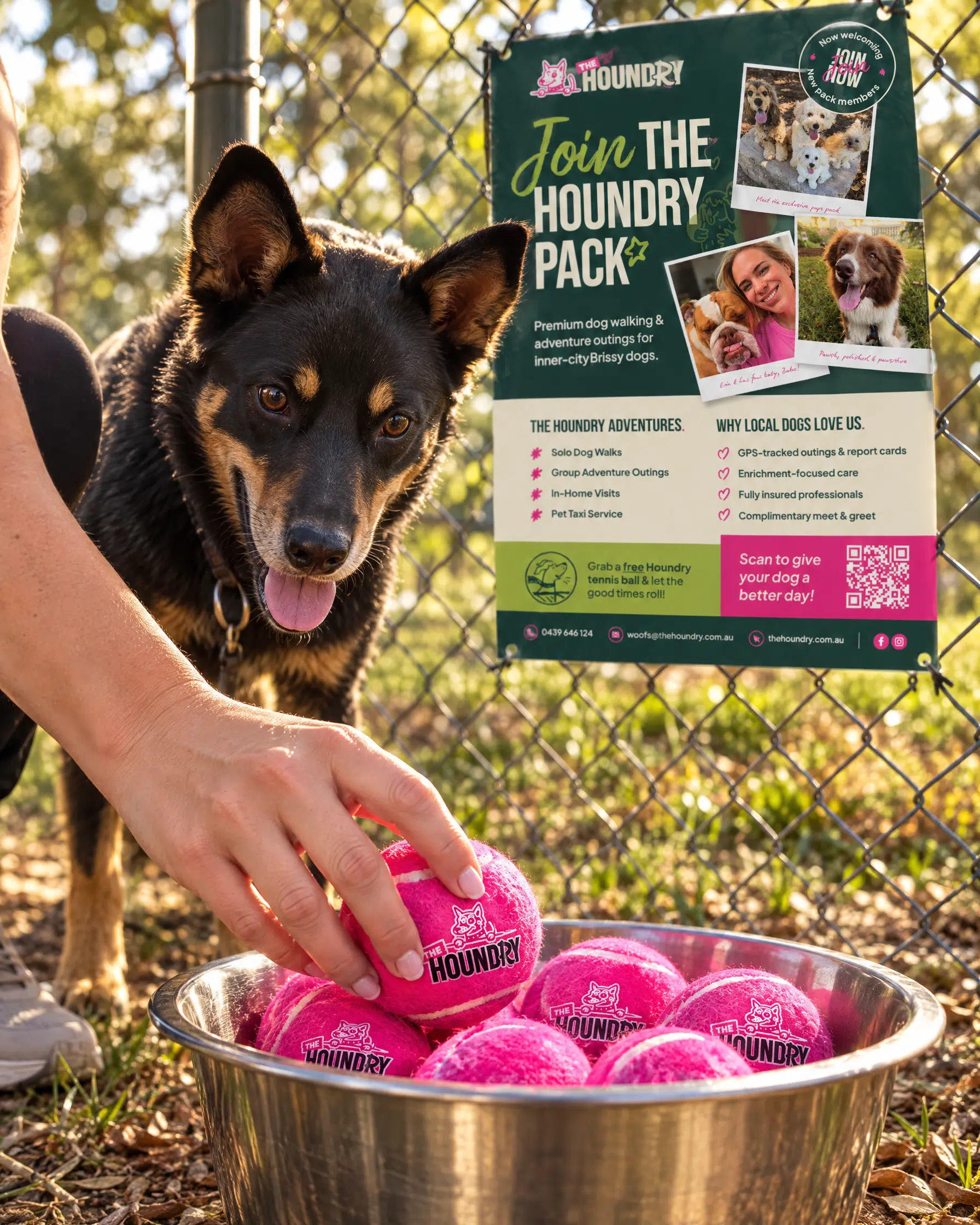
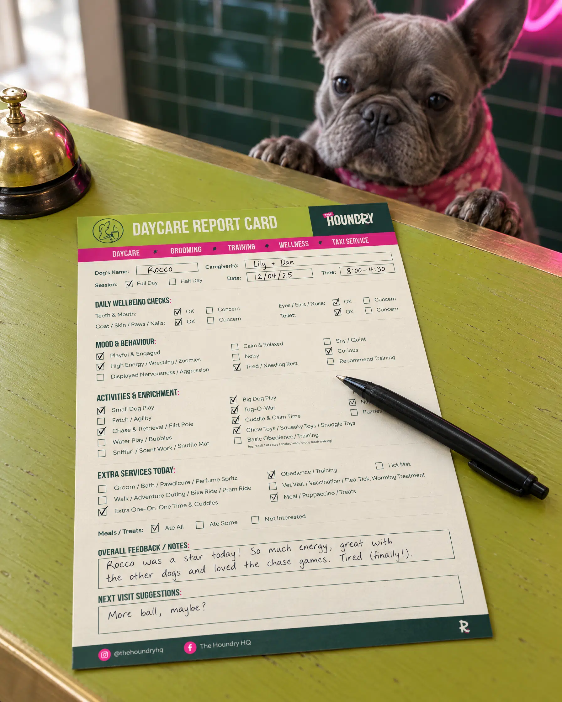
A business that hasn’t opened yet has to look established from its very first post, so we built the everyday pieces alongside the identity. A social media kit with page design and post templates, service report cards that staff fill in by hand and give back to owners after a daycare day or an adventure outing, apparel for the team, and a promo poster for the local park.
Social media page design
Social post templates
Service report cards
Editable Canva templates
Staff apparel
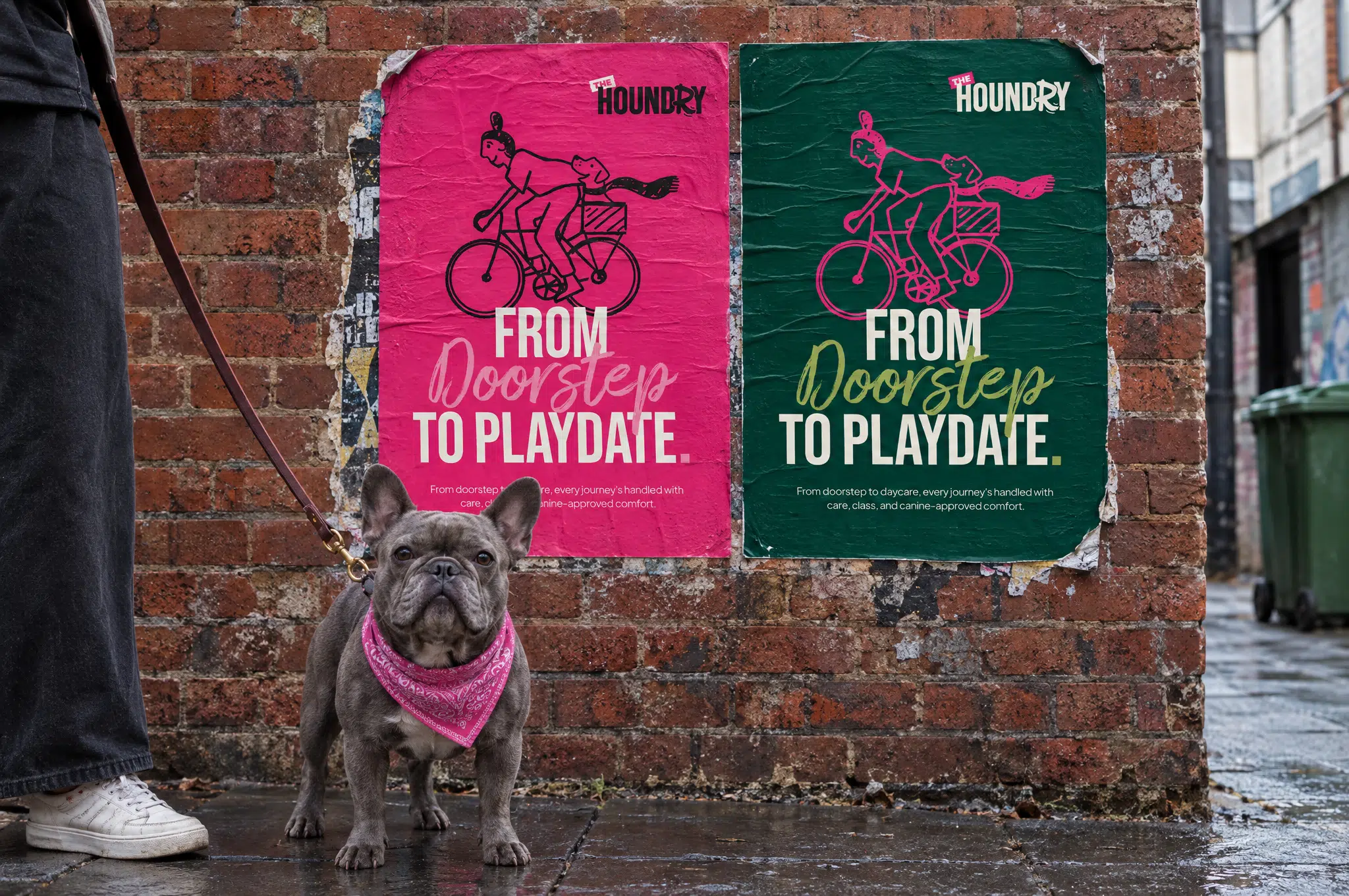
Park promo poster
Local mail drop flyers
Everything print-ready came with an editable Canva version, so The Houndry can add a service or change a date without coming back to us. That was deliberate. Erin is building a business, not managing a design queue, and the brand needed to work in her hands as well as ours.
Brand collateral crafted
Brand story
Purpose, vision & mission
Values
Archetype & personality
Voice
Attributes
Vocab
Key messages
Difference
Positioning
Taglines & slogans
& more
Rolling it out to the real world
A shopfront, a fleet & a corner of Fortitude Valley
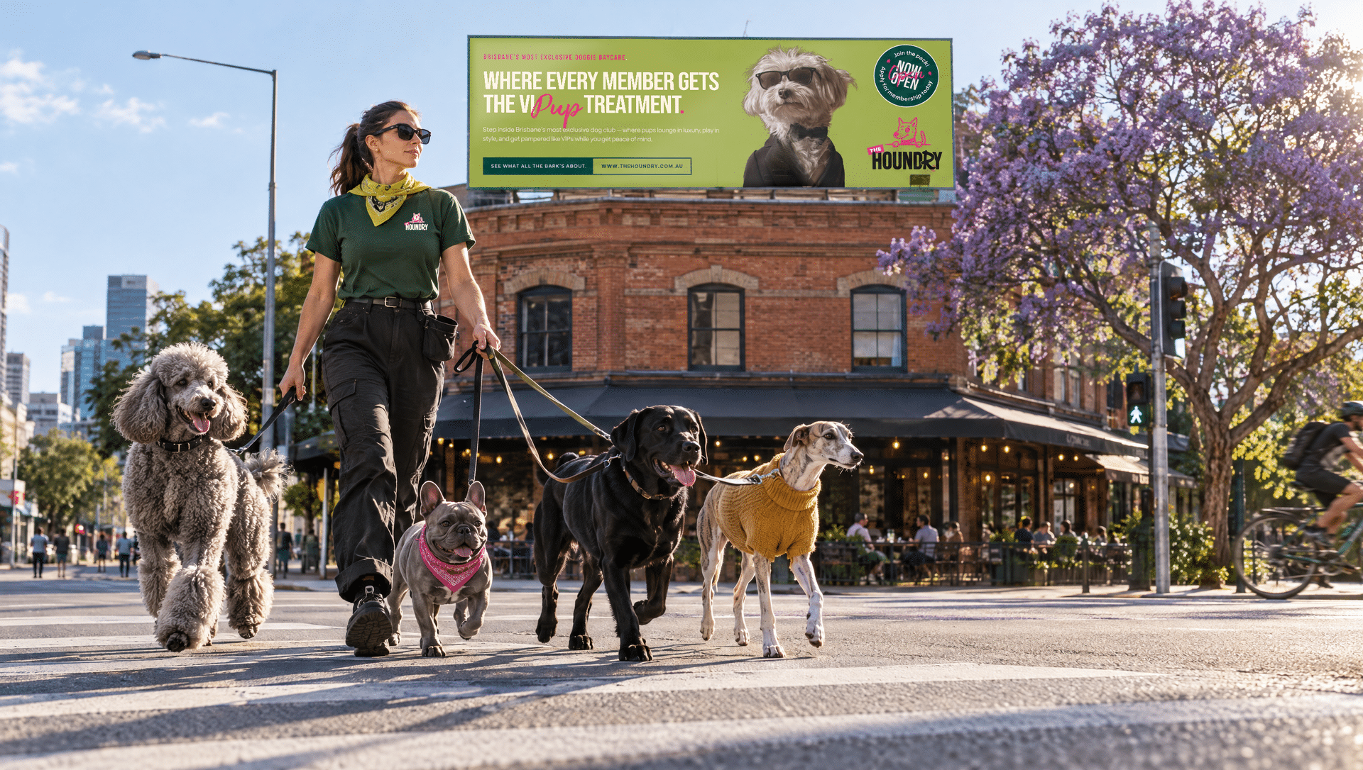
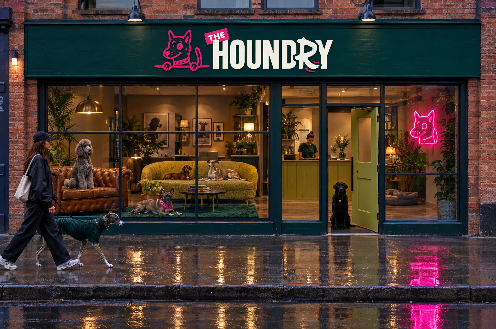
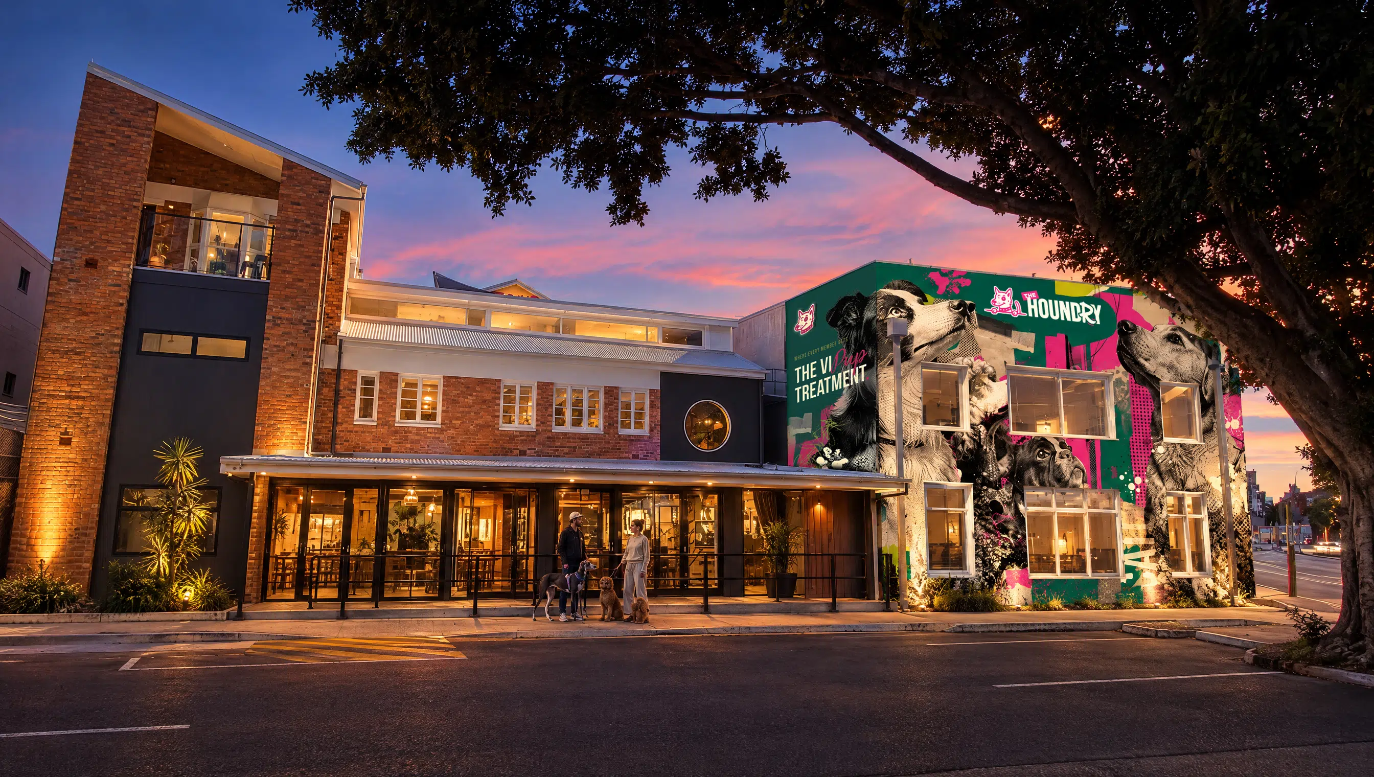
The building gave us two facades, one on Water Street and one on Brunswick Street, both facing traffic heading into the city. We designed for both, with an illuminated logo sign for the frontage, a neon piece for reception and large-format brand artwork across the grey panels, so the building reads as The Houndry long before anyone reaches the door.
Building facade artwork
Illuminated shopfront signage
Reception neon signage
Vehicle magnets
Full van wrap
Print-ready wrap artwork
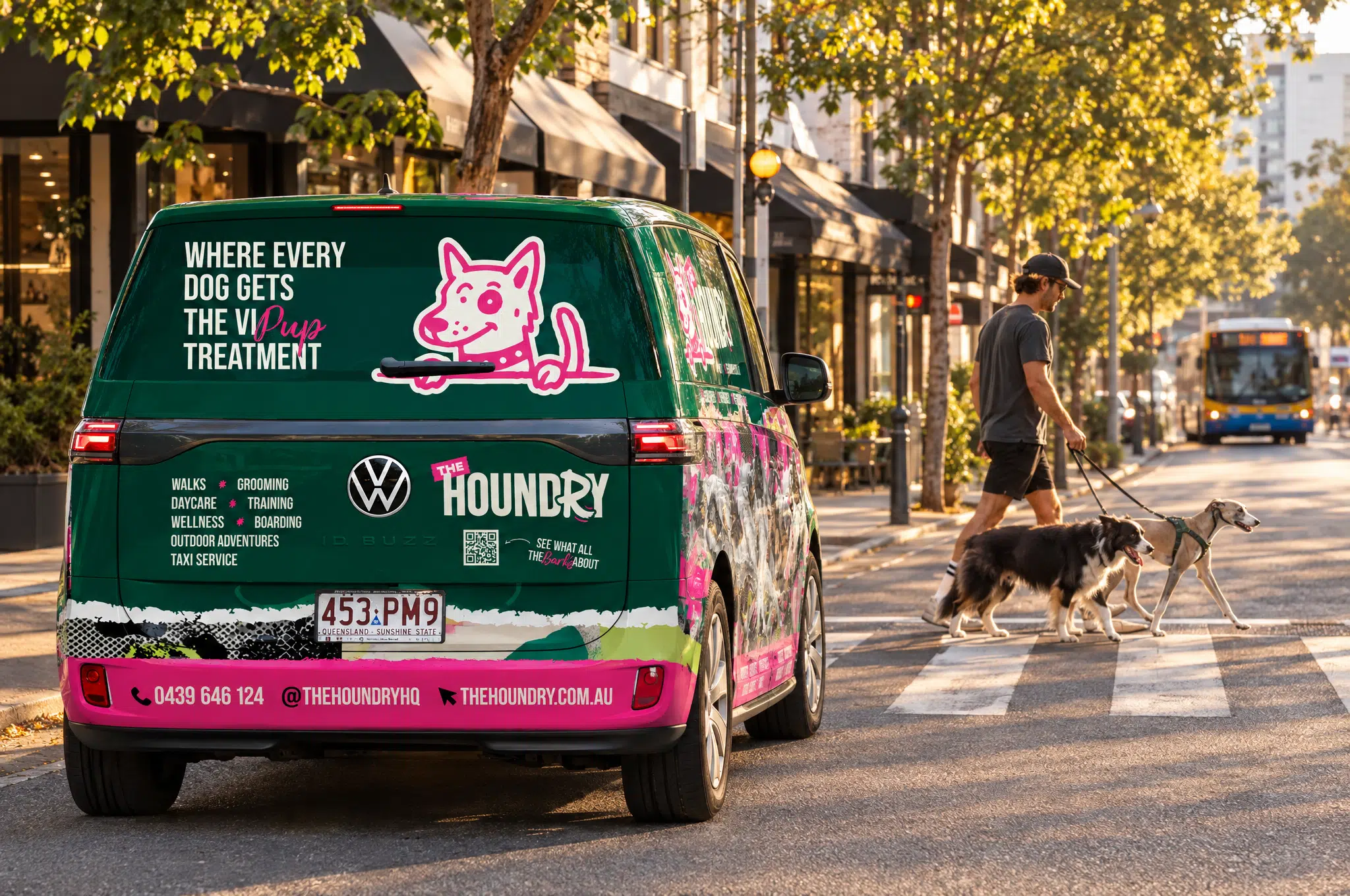
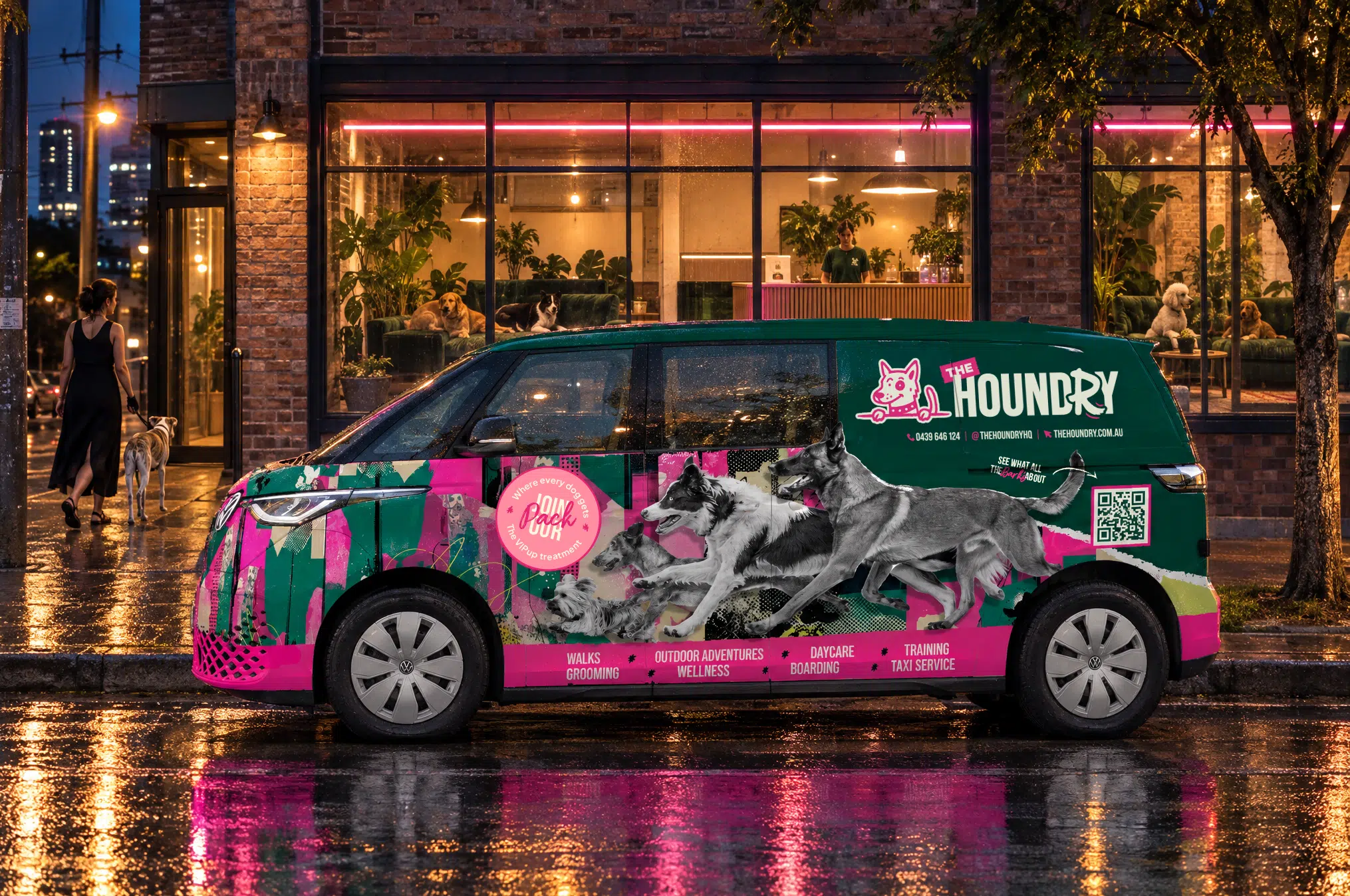
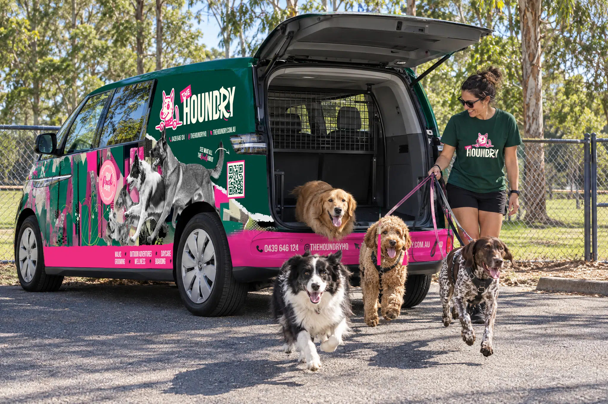
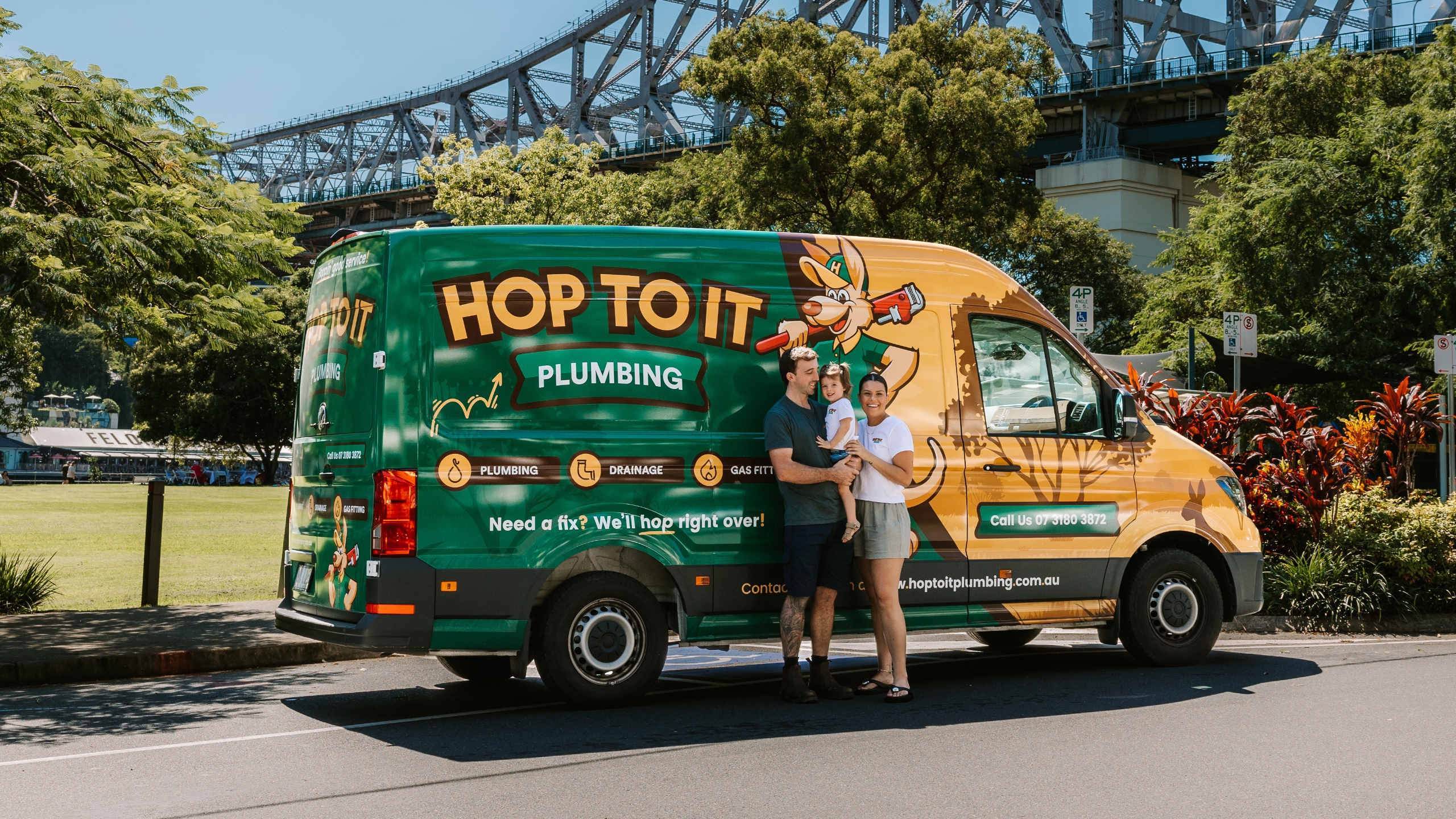
The taxi service got the same treatment. We started with magnets for the original van, then designed a full wrap for the VW ID Buzz Cargo that replaced it, mapped panel by panel around the sliding doors and the rear. It’s the part of the brand that moves through the suburb every day, so it had to look deliberate from every angle.
Applied across
Product packaging
Social media kit
Social media post designs
Social media launch ads
POS designs
Email marketing materials
Promotional & marketing collateral
& more
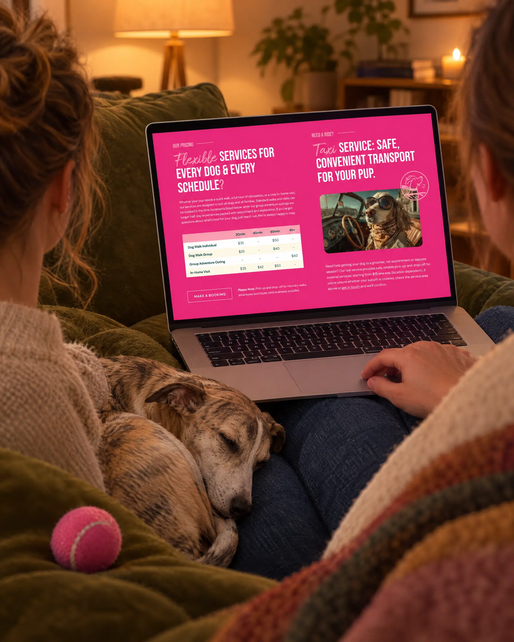
A website to open the doors early
A landing page first, the full site second
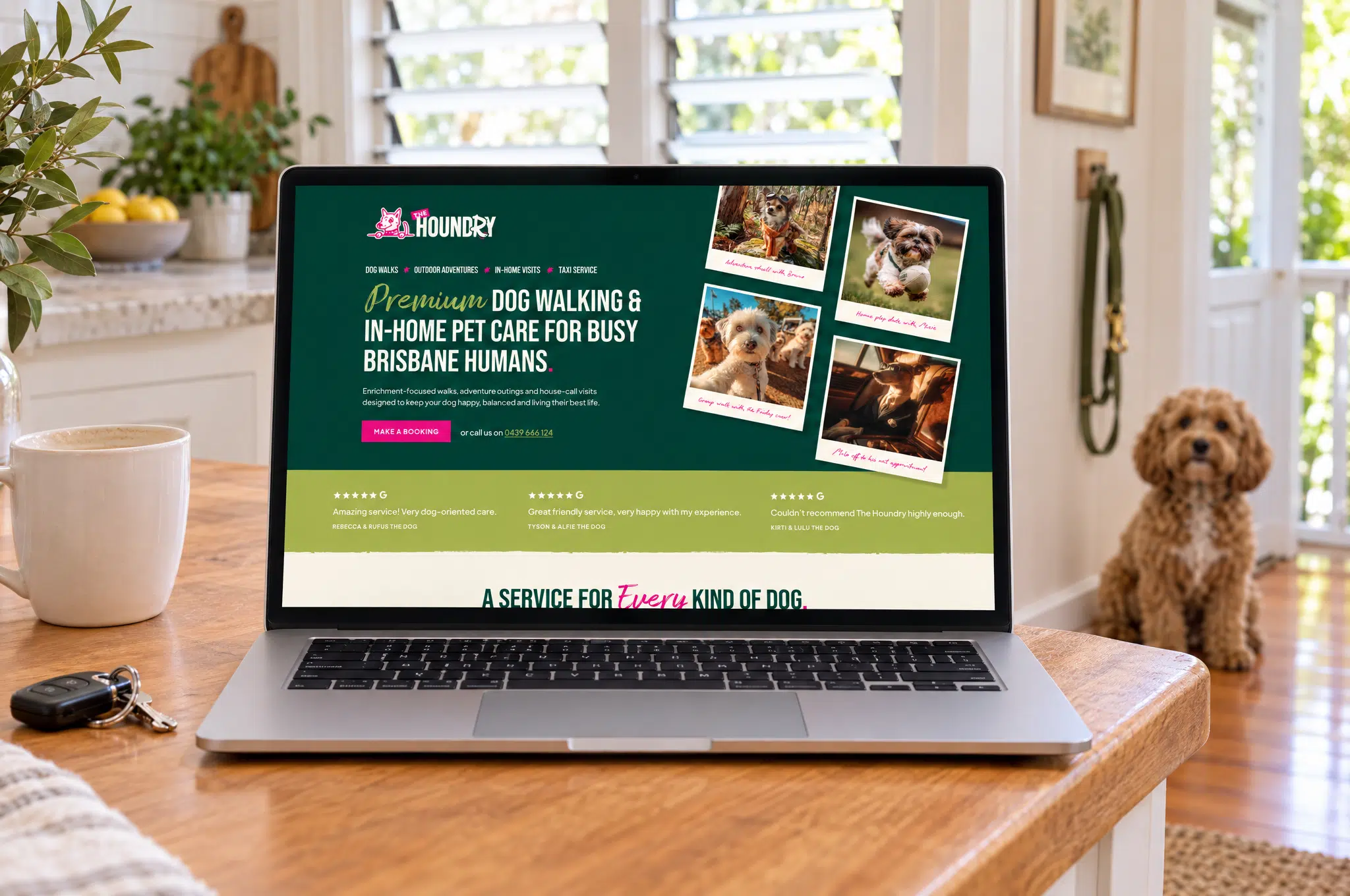
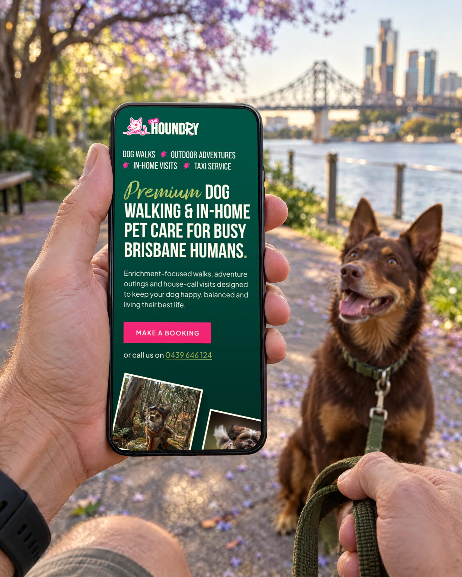
The Houndry needed to be findable months before the facility was finished, so we split the job. First came a landing page marketing the dog walking, adventure outings and house call services Erin was already running, enough to start building a local customer base while the fit-out carried on.
We mapped the pages out as a wireframe with Erin, worked through her comments, then designed and built it to go live before the holidays. We also introduced her to our hosting partner and handled the domain move, so she had one less set of accounts to wrangle while opening a business.
The full site followed on the same brand system, carrying the daycare, grooming, training and membership services as they came online, with the booking flow designed to sit alongside them.
From concept to creation
Market research
Strategy & wireframing
Professional copywriting
Bespoke design
Ecommerce
Post-launch analysis
A brand that doesn’t sit still
The little guy who wags the R
With the identity signed off, we handed the mark to our animator to build a logo reveal. The dog head drops in and barks, and once the wordmark lands, the tail curling out of the R gives a wag. It’s a small piece of motion that does more for the brand’s personality than another page of guidelines ever could, and it gave The Houndry a character rather than just a logo. Erin’s first note back was that she’d need to think of a name for him.
“I had an amazing experience working with Red Kite on my brand guidelines for my new company. From the very beginning, they understood my brief instantly and really “got” what I was trying to communicate — which made the whole process feel effortless. They didn’t just design a logo; they built a complete brand identity and it turned out better than anything I could have ever imagined. A special thank you to Chris, who was fantastic throughout. His communication was clear, responsive and thoughtful, and he truly brought my vision to life. I couldn’t recommend them more highly if you’re looking for a team that listens, understands, and delivers beyond expectations.”
 The Houndry