“Wow! You have exceeded my expectations from logo to branding. I am very happy.”
Steve Morgan
Managing Director, General Building Co.
Project overview
A Gold Coast builder, built to be trusted from day one
General Building Co. is a building and maintenance company in Arundel on the Gold Coast, started by carpenter Steve Morgan after years helping to grow his family’s building business in Adelaide. Steve wanted a brand that said something straight away. This is a builder who turns up when he says he will, looks after your home while the work is on and keeps you in the loop. It became a Brand Master project, from discovery and messaging through to the logo, the vans, the signage and the website, and three years on we’re still working with the team as the business grows.
Finding the voice of a builder who does things properly
Steve came to us with a frustration most people will recognise. Everyone knows someone with a story about a builder who vanished halfway through a job. So before we went anywhere near a logo, we pinned down what General Building Co. would stand for. Our discovery session worked through his values, his customers and the promise he wanted to make, right down to clean boots at the door and quotes that don’t change.
This was a Brand Master project, so discovery ran straight into messaging. We wrote the mission, the vision and six values, then gave the brand a personality to match. Knowledgeable without being arrogant. Approachable. Quietly inspiring. We set out how it should sound, with real examples of what to say and what to leave out, and wrote the key messages, the positioning statements and the line that now sits under the logo, “Build with confidence.”
What came out of it is a brand that talks to homeowners, landlords and property managers the way a builder you’d happily recommend would, and gives the whole team a clear answer to why they’re worth calling first.
What we covered
Brand discovery session
Mission & vision
Six brand values
Brand archetype
Tone of voice
Word bank
Key messages
Positioning statements
Tagline
& more
The logo: built piece by piece
A mark that looks like it was put together on site
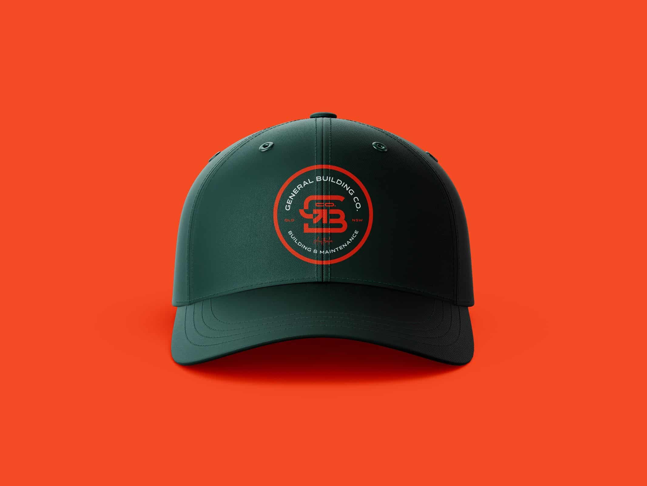
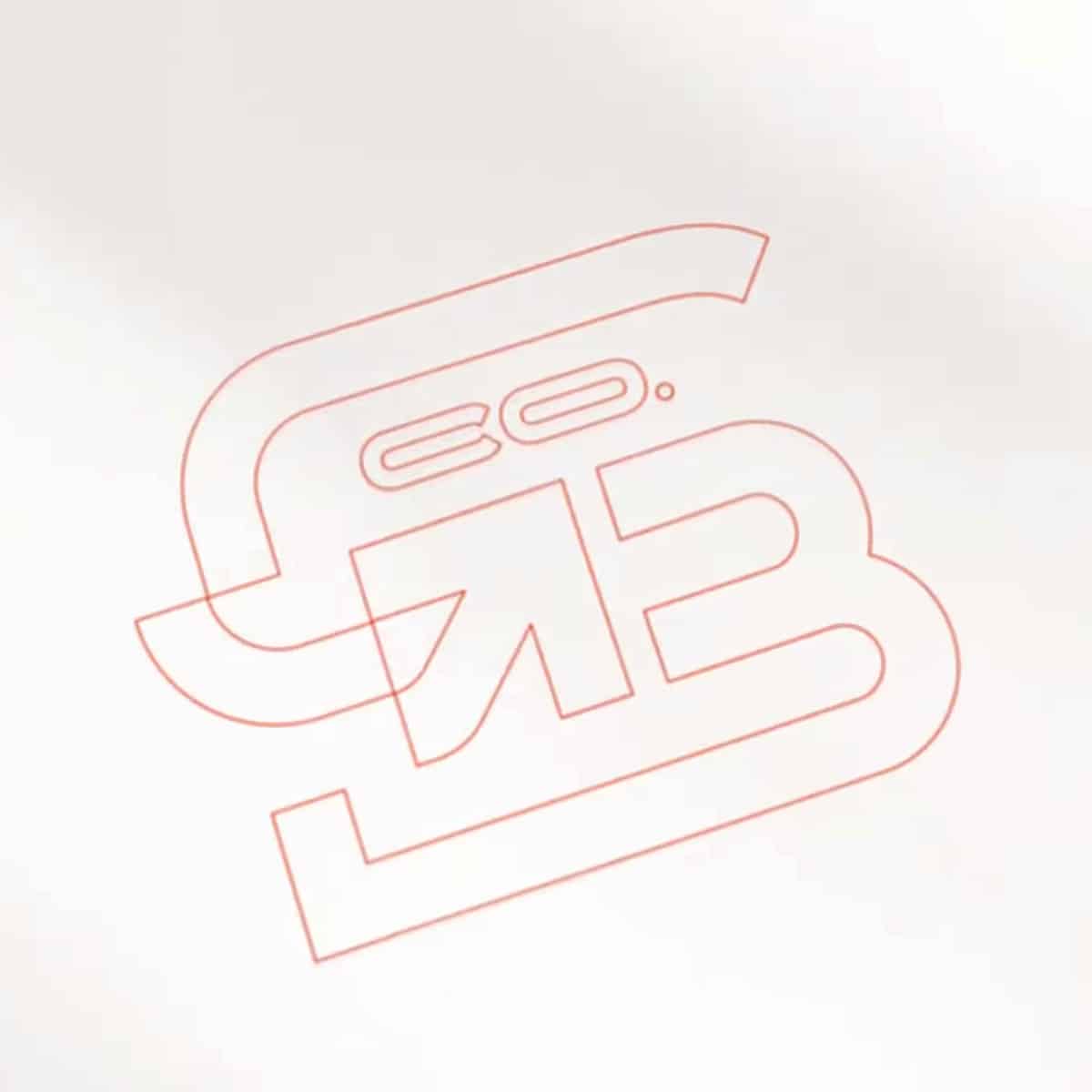
We wanted a logo that felt constructed rather than drawn. The G and B are broken into separate pieces, as if they’d been assembled from parts, and the linework borrows from a building blueprint. Tucked inside the G is a small arrow, a nod to the journey from first site visit to finished job, and the circle around “Co.” gives the name a welcoming, team-first feel. On its own the mark works like a quality stamp on a van door or a site board. Next to the wordmark it becomes a confident lockup for signage and the website.
A brand that holds together
Colour, type and a Blueprint to keep everyone on the same page
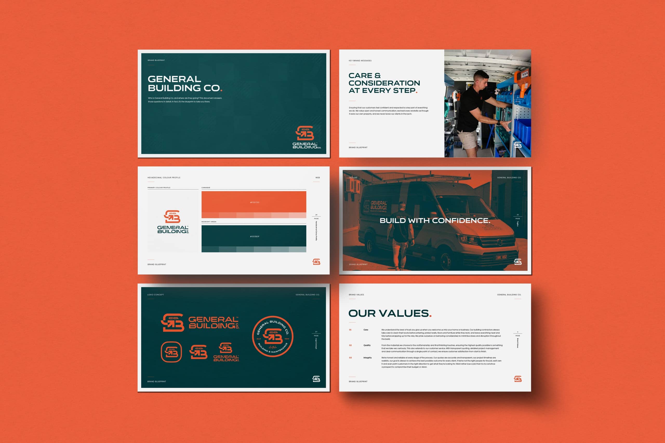
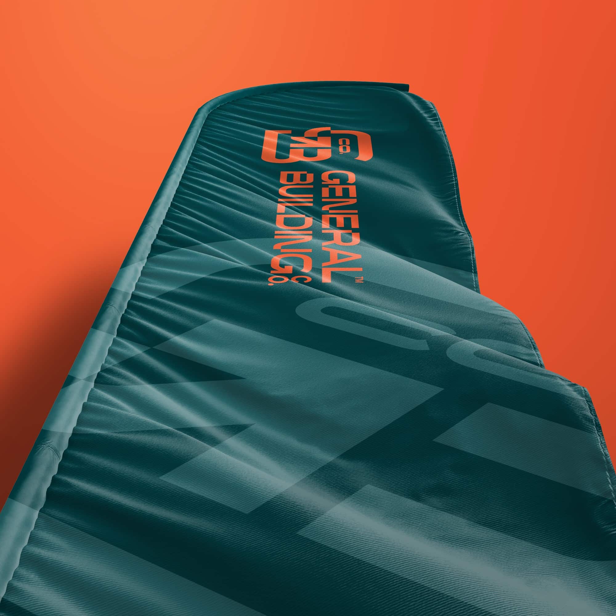
We paired a bright cinnabar orange with a deep midnight green. One gets noticed from across a busy street, the other keeps everything feeling solid and dependable. Organetto, a wide, sturdy typeface, carries the logo and headings, while Lexend keeps documents and the website clean and easy to read. A bold geometric pattern, with the arrow from the mark running through it, gives print and social posts a texture of their own.
All of it lives in the General Building Co. Brand Blueprint, a guide to the story, the values, the voice, logo use, colour and typography. We updated it in October 2026 so it reflects where the business is now. Anyone working on the brand, from a sign writer to a new office manager, can get it right without having to ask.
Brand assets created
Logotype & lockups
Logo mark & badge
Tagline versions
Colour palette
Typography system
Brand pattern
Logo reveal animation
Brand Blueprint guidelines
Ready for the first quote
Everything the office needed to look the part
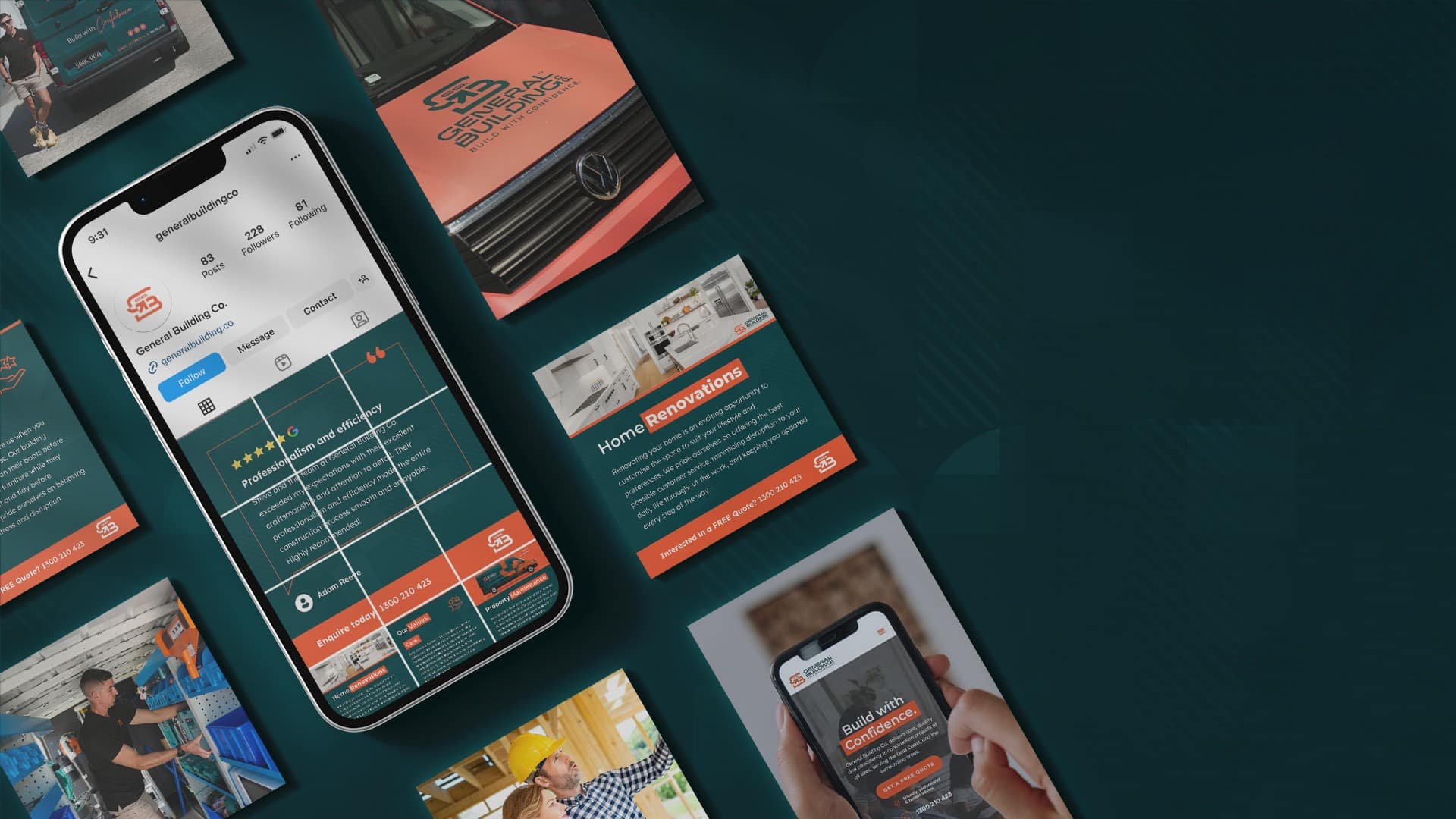
A new business needs the basics before it can win its first job, so we worked through them in the order Steve needed them. Business cards and letterhead first, then a quote template and email signatures, so every document leaving the office looked like it came from the same company.
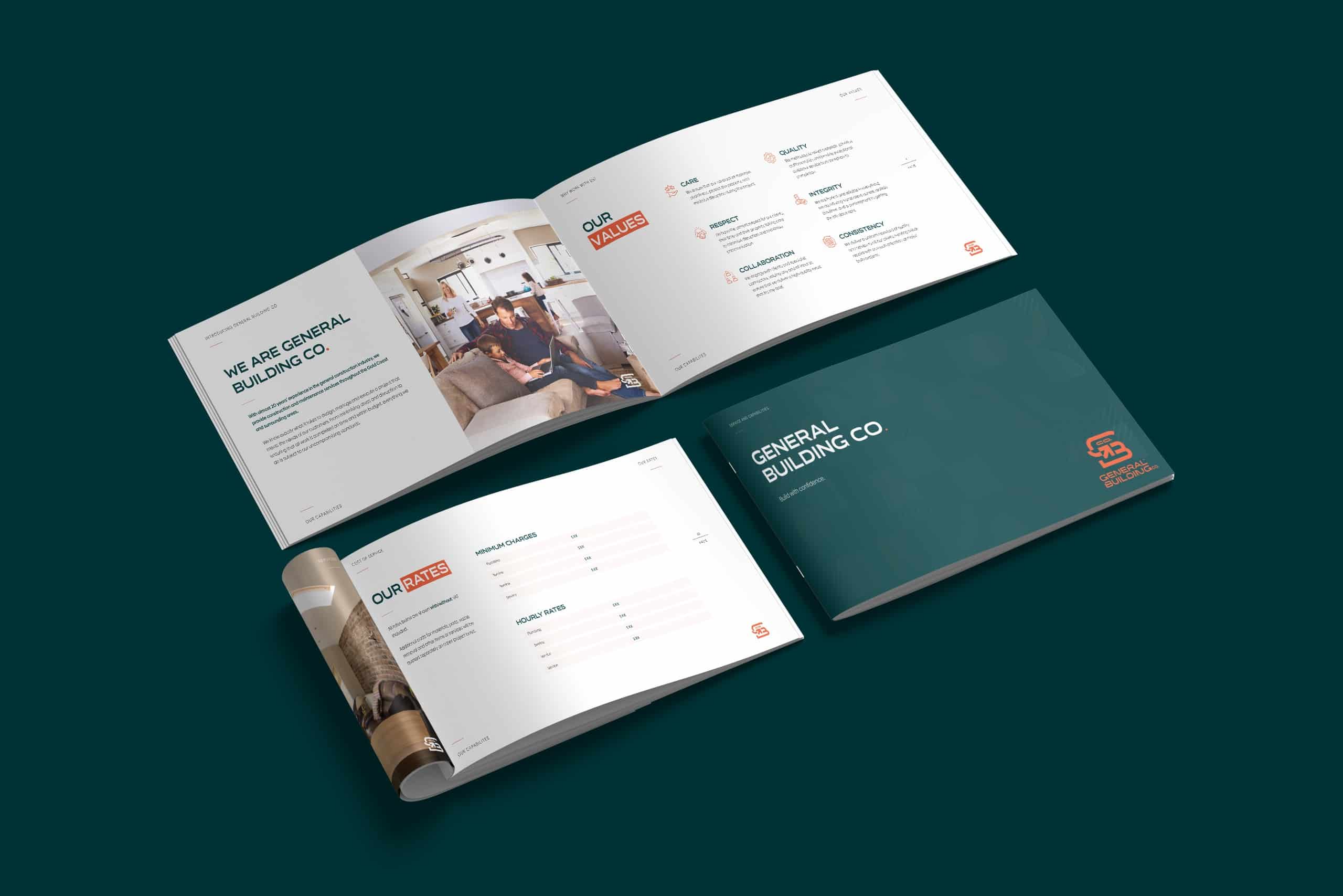
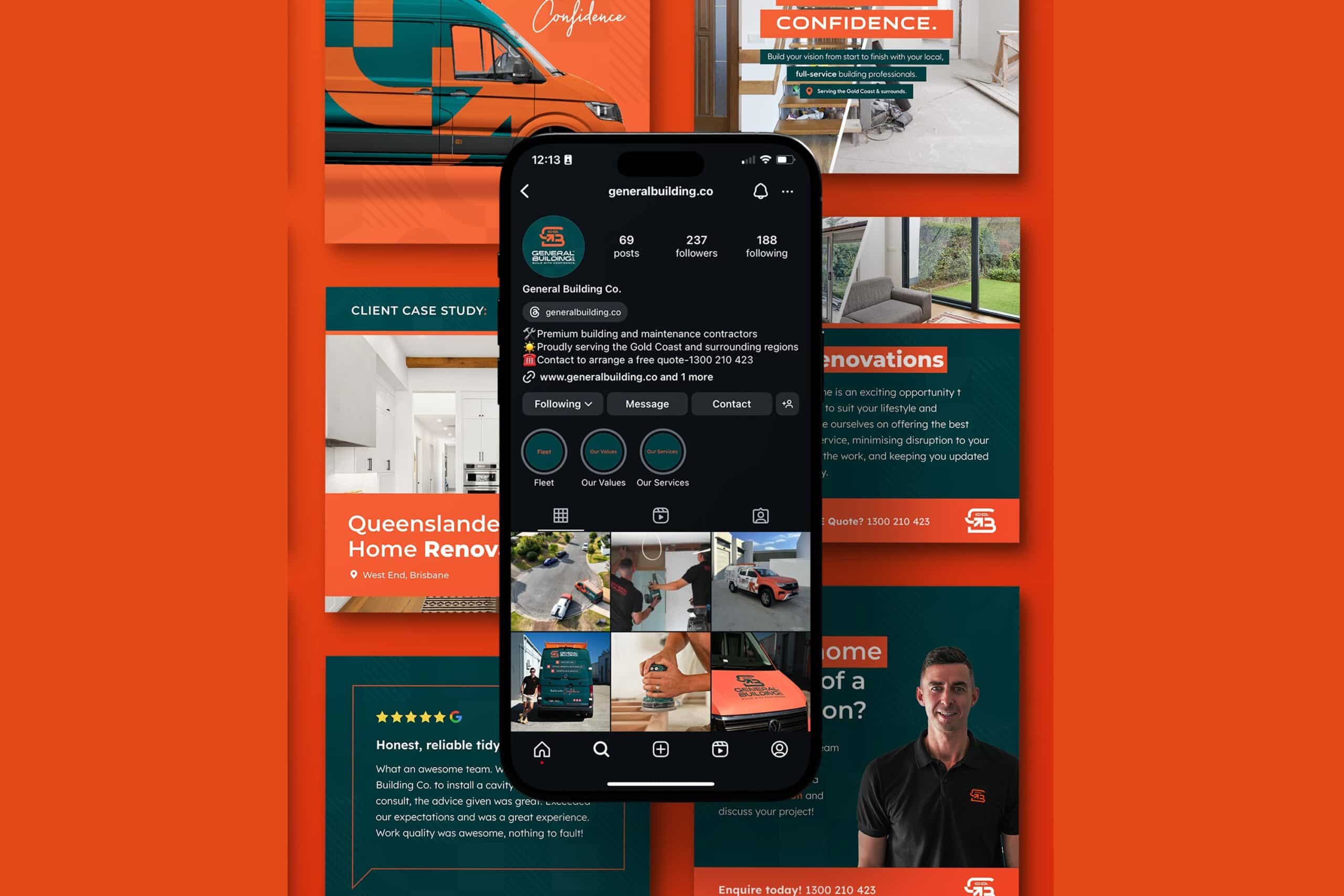
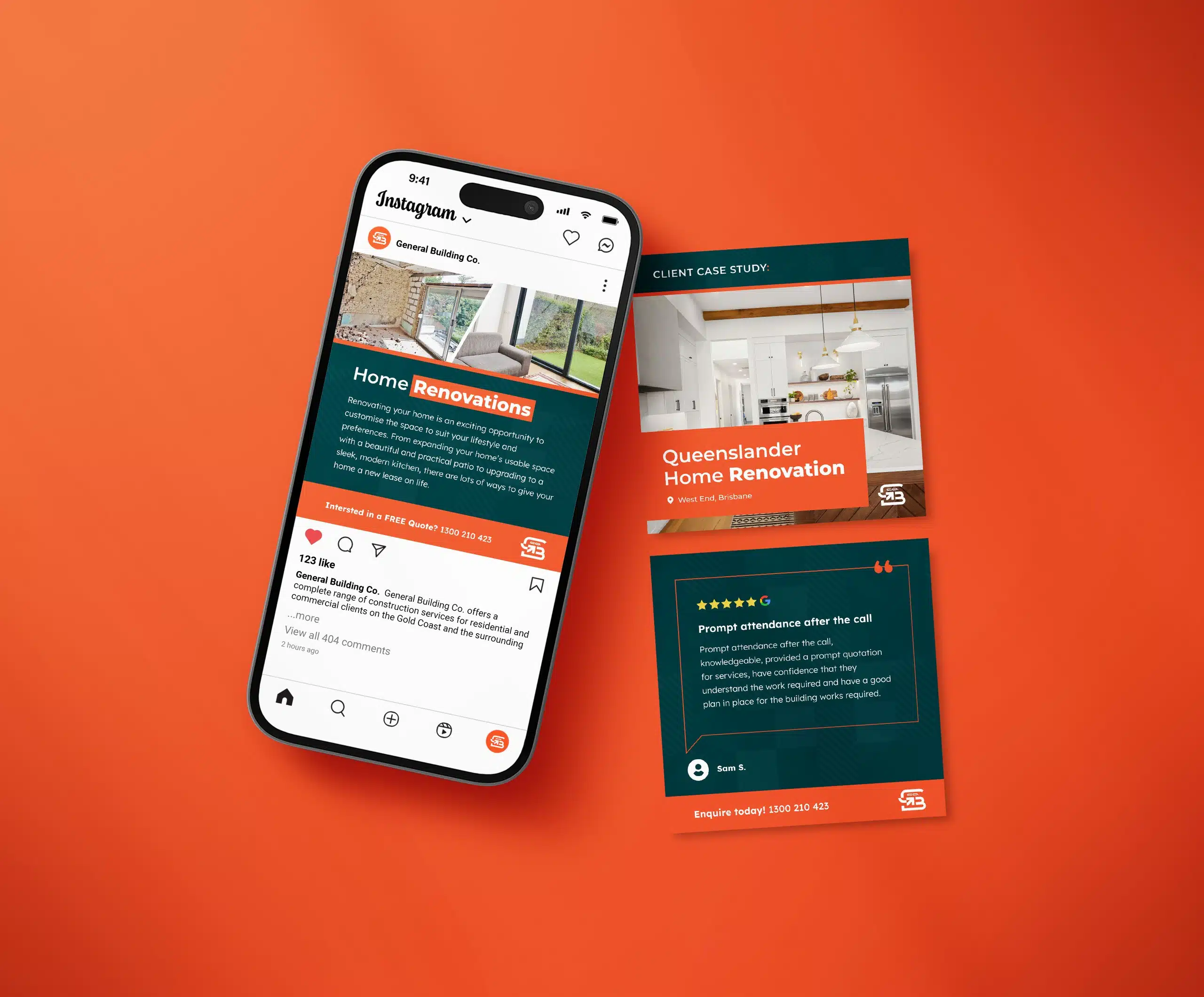
As the team grew, so did the kit. A capabilities document for commercial clients and property managers, an employee handbook written up from Steve’s own policies, and a social media kit with templates so the brand shows up the same way online as it does on paper. It’s the less glamorous side of branding, but it’s what makes a small company feel established from the very first quote.
Brand collateral crafted
Business cards
Letterhead
Quote template
Email signatures
Capabilities document
Employee handbook
Social media kit
Social media templates
Out on the road
Vans, site banners and signage you can read from across the street
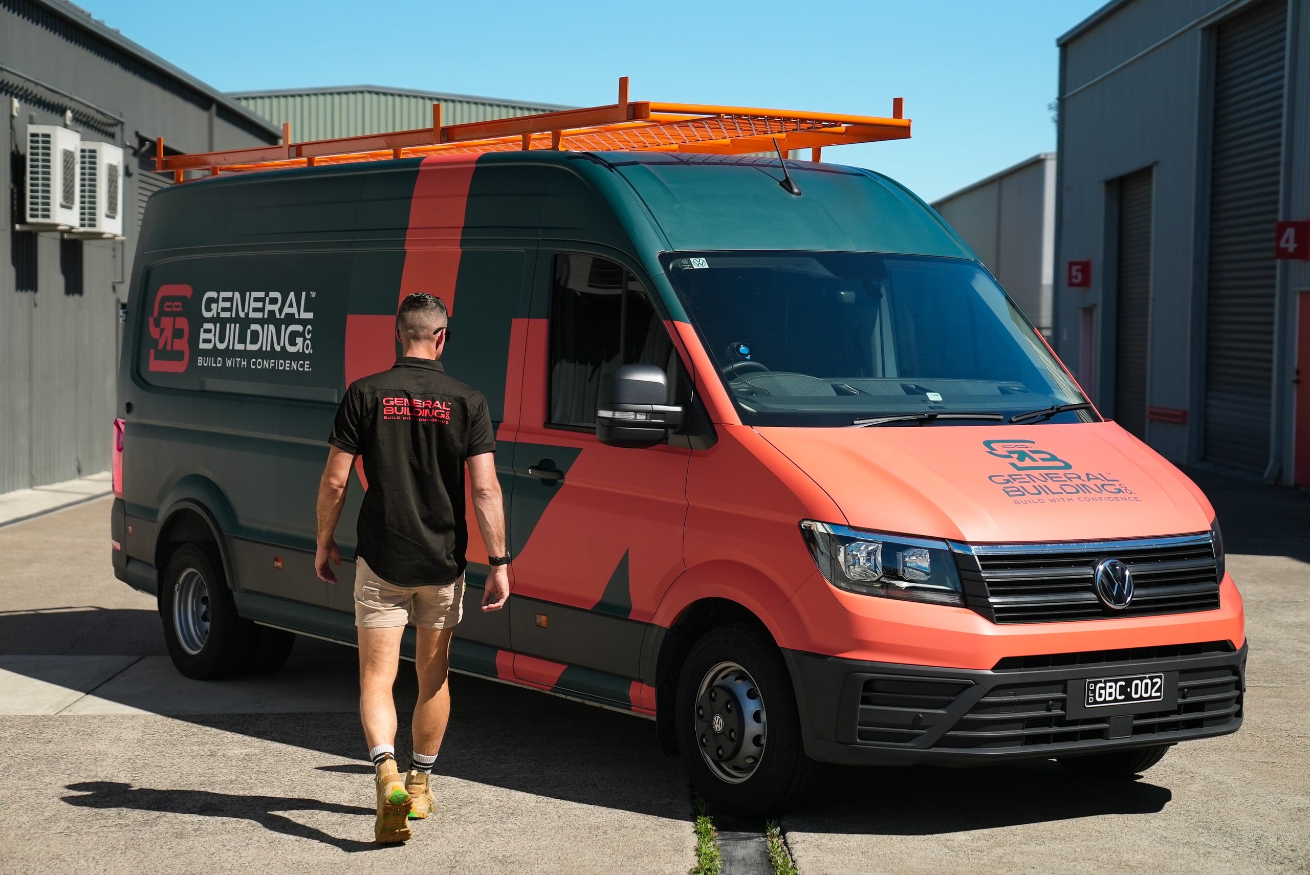
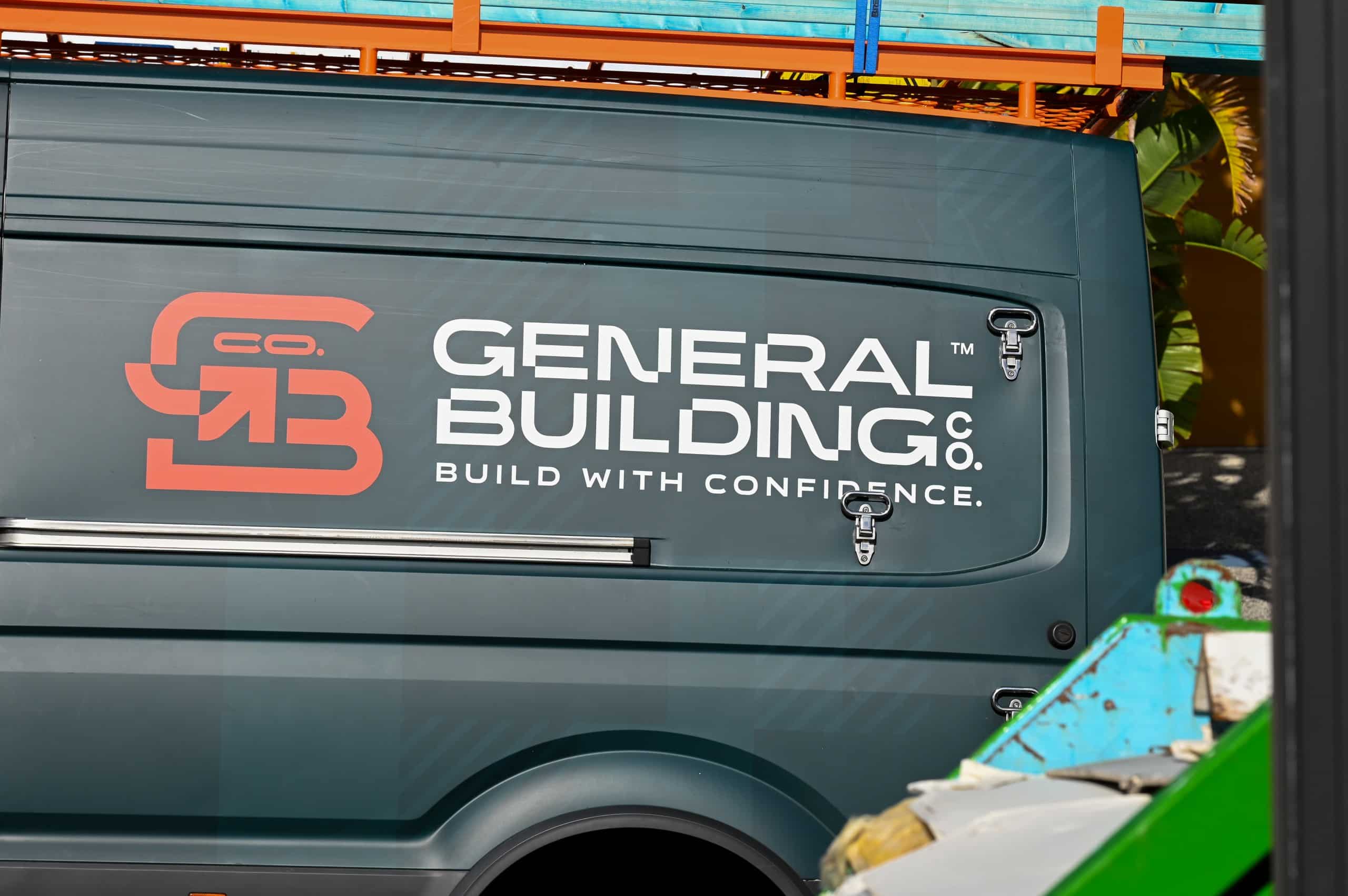
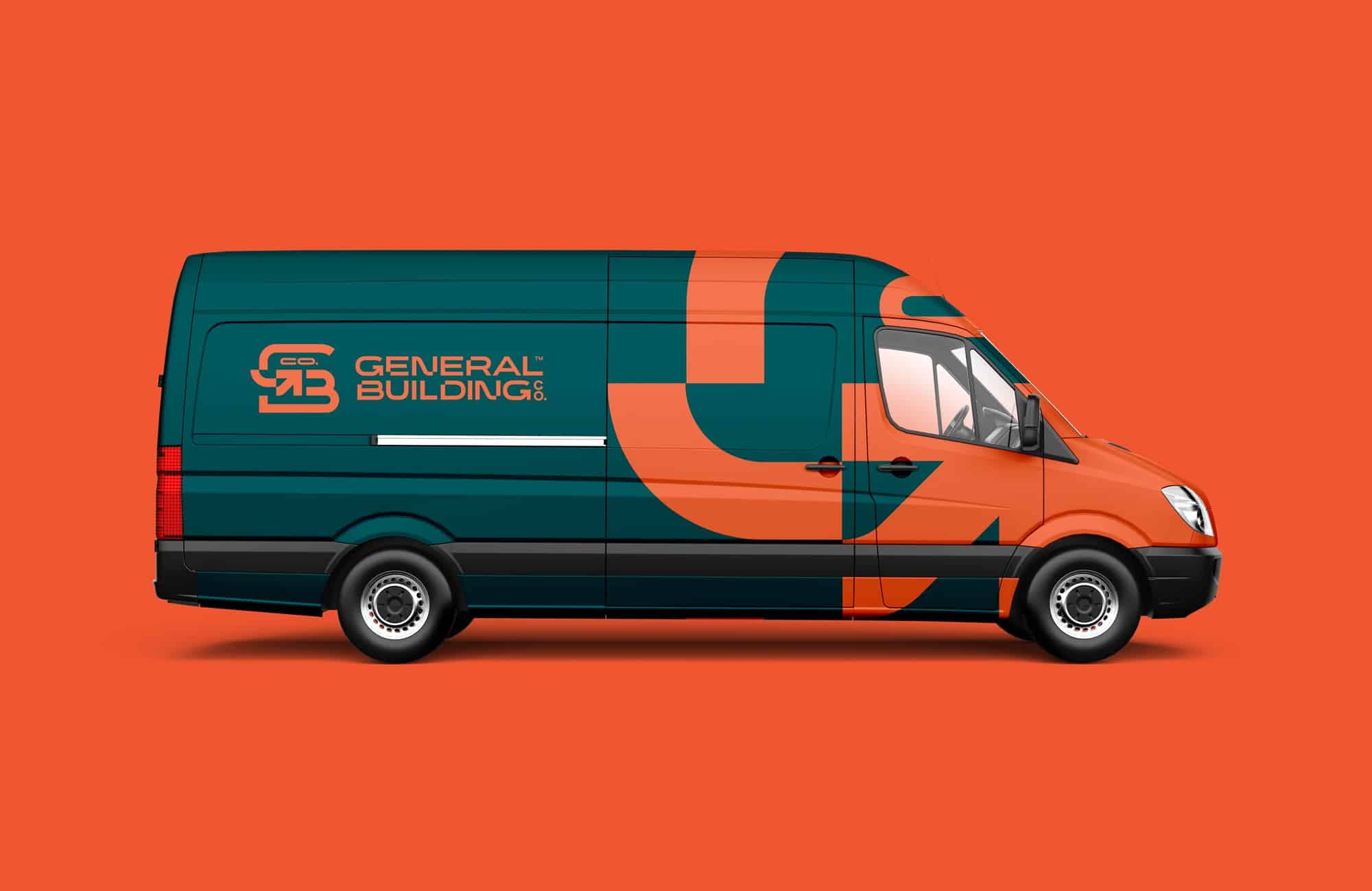
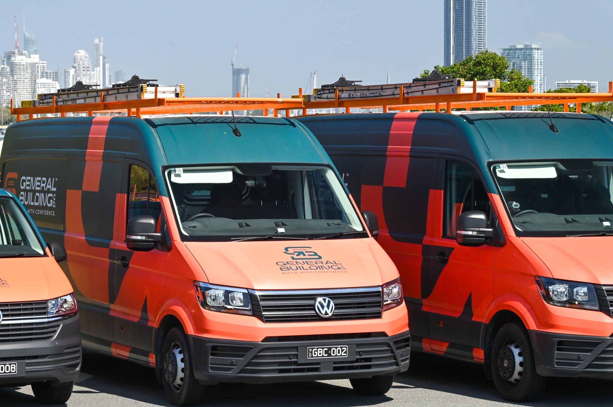
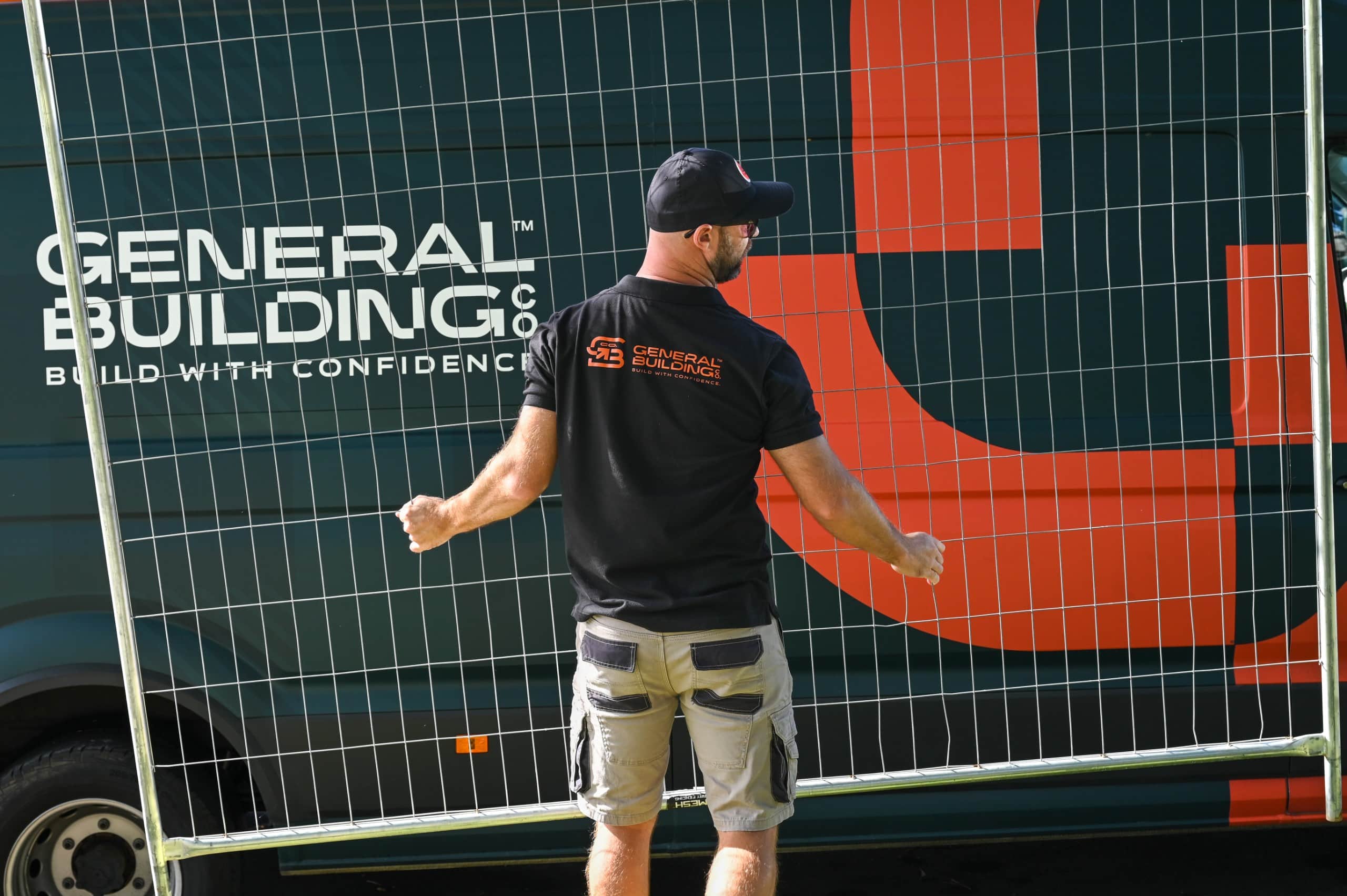
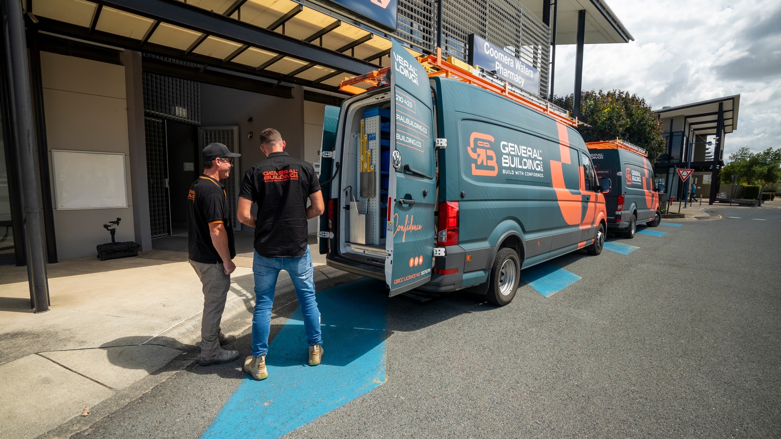
Steve wanted the van on the road as soon as the logo was signed off, so it went straight to the top of the list. He was after something with a bit of depth behind the name. We tried a city skyline, then a sketched version, before landing on a subtle house plans pattern that speaks to what the business actually does. In his words, “It’s unique.” A matching ute wrap followed a few months later.
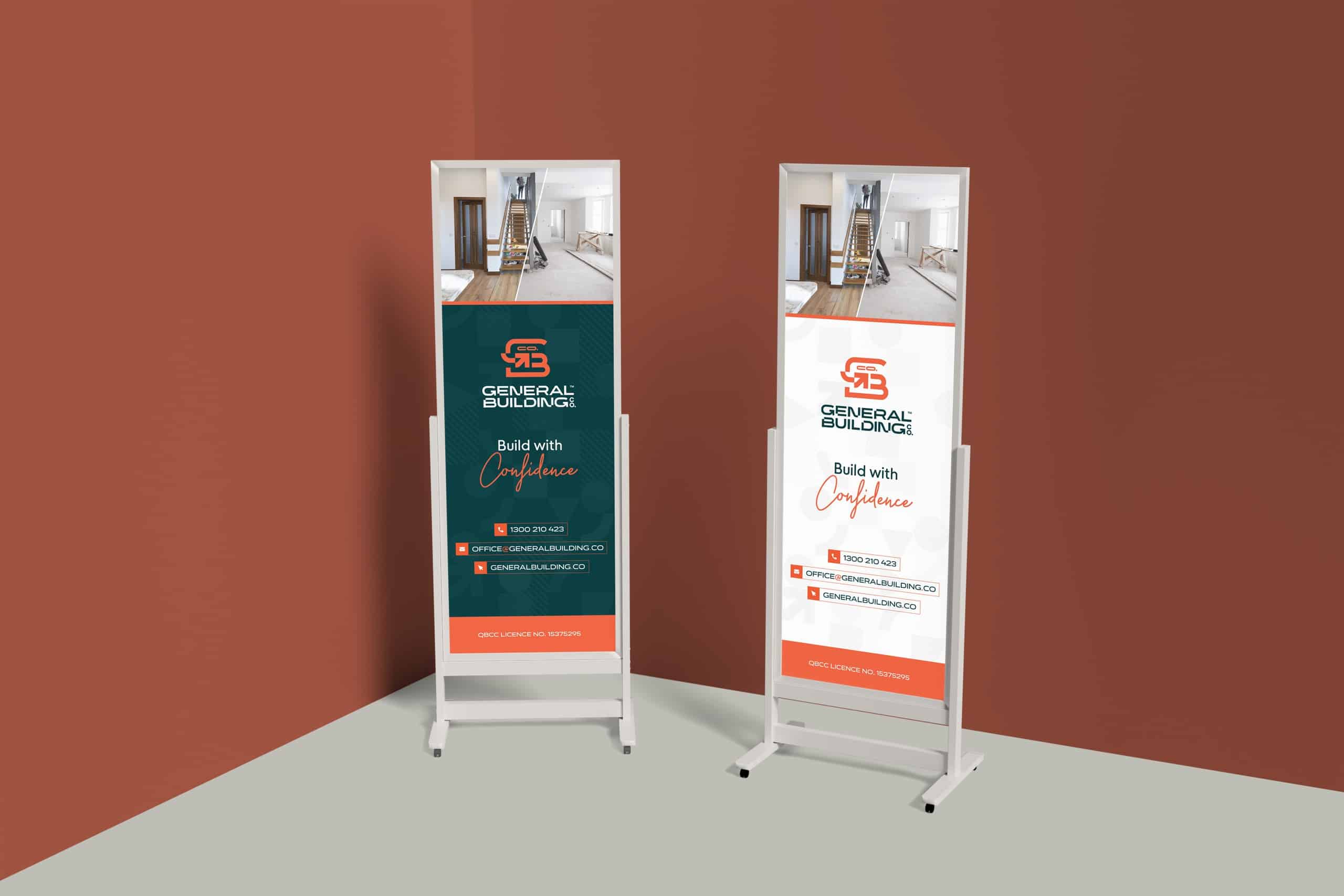
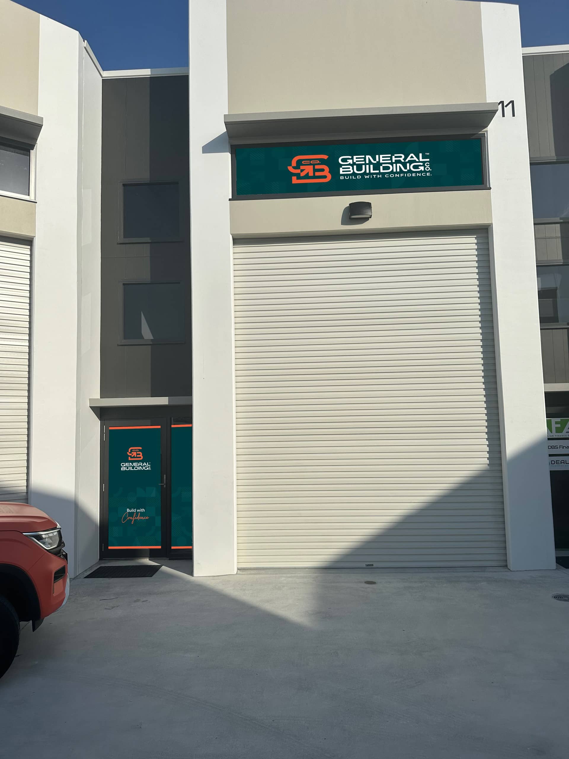
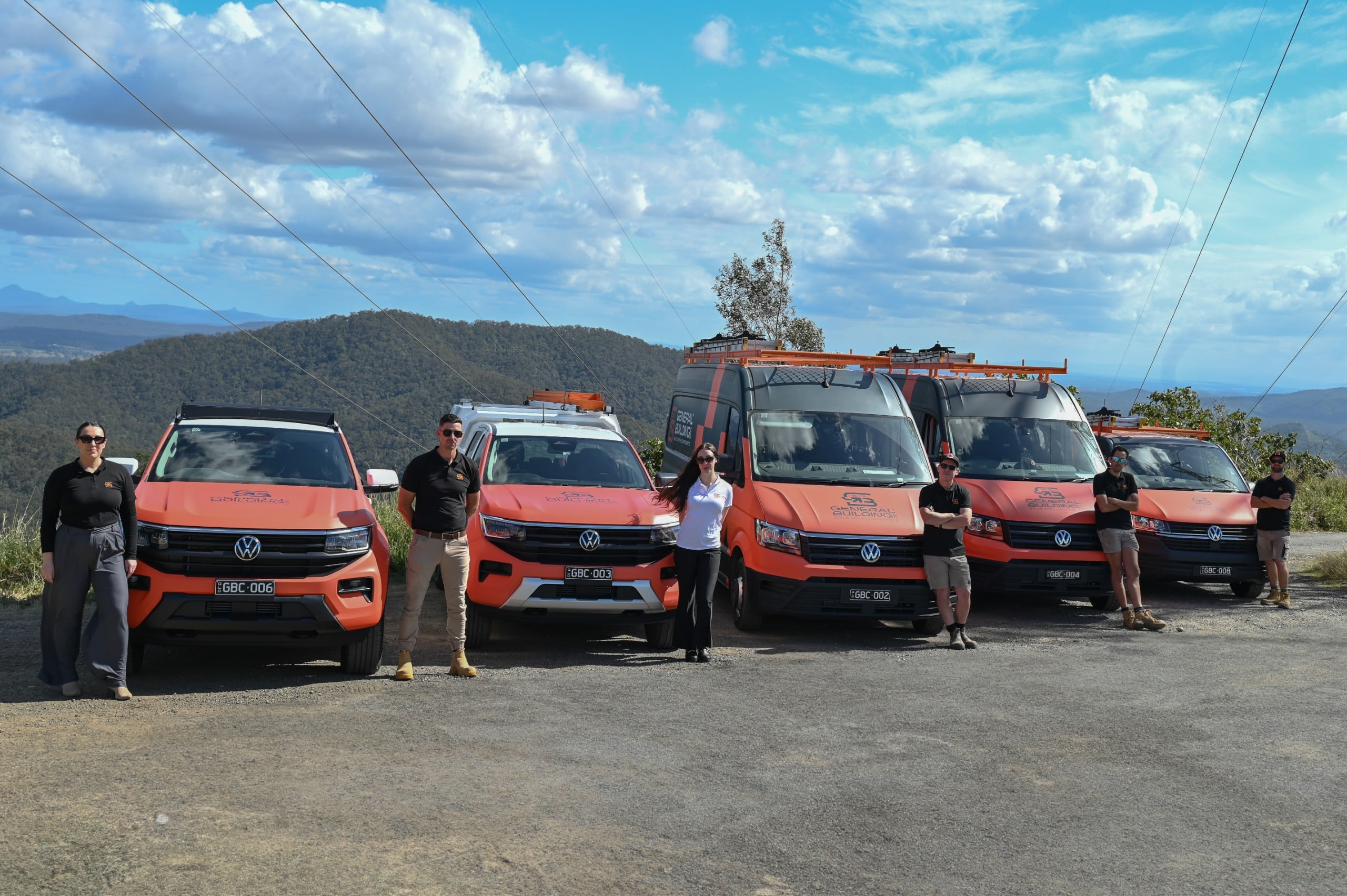
Since then the brand has moved onto the buildings themselves. Signage for the head office and its roller door, graphics on the office doors, pull-up banners and mesh banners for the fences around jobs in progress. The fleet has grown too, and the wrap has grown with it, so a row of vans and utes parked up on a job does a fair bit of the advertising on its own.
Applied across
Van wrap
Ute wrap
House plans pattern
Head office signage
Roller door graphics
Office door graphics
Mesh site banners
Pull-up banners
A website built to win trust
From concept to a site that keeps growing
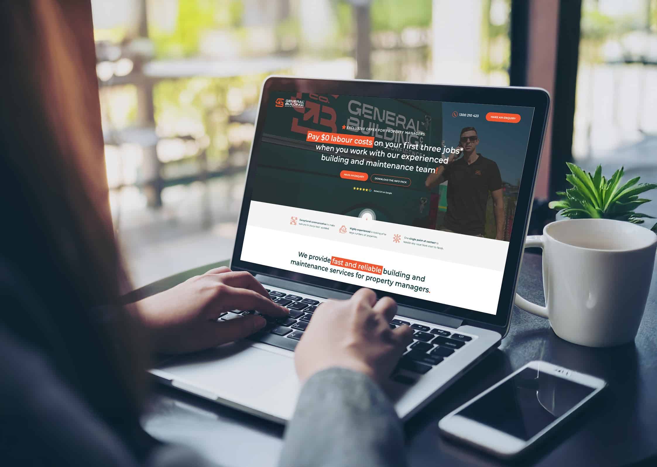
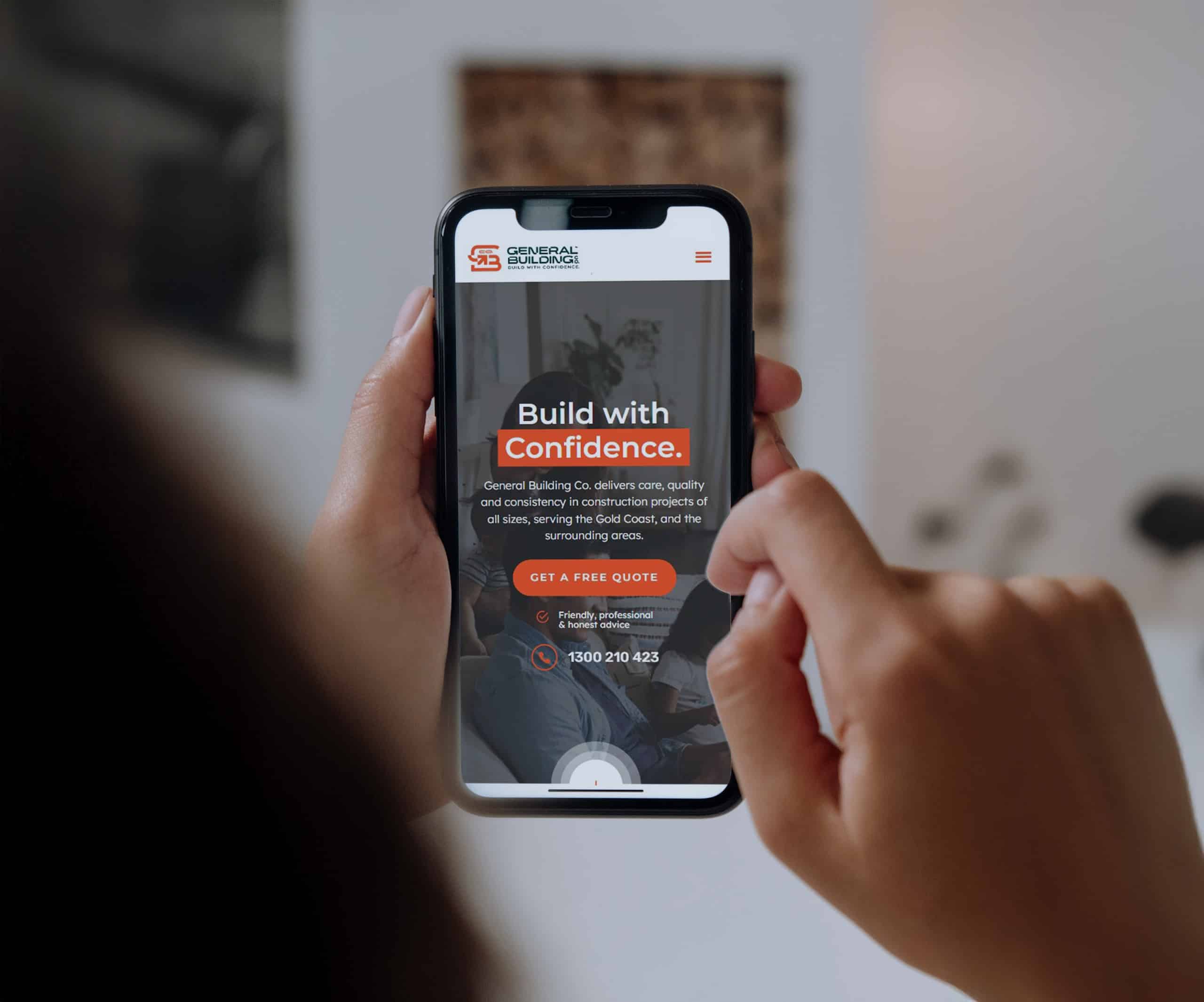
The website had the same job as the brand, to reassure people before they pick up the phone. We designed and built it around the services and the values, with a page for each area of expertise, an honest FAQ about licences and who does the work, and real reviews from customers. We had the copy professionally written so it sounds like the team, plain spoken and confident without overselling.
The site went live in August 2023 and we’ve kept working on it ever since, adding a team page and a careers page, bringing in photography from the team’s own shoots and repositioning the services in 2026. It’s the kind of project we like most, a brand that keeps being used and looked after long after launch day.
From concept to creation
Website design
WordPress build
Service pages
Professionally written copy
Customer reviews
Team & careers pages
Ongoing updates & support
A brand that moves
Drawing the mark out like a set of plans
With the identity in place, we built a logo reveal to give the brand a bit more character on screen. It starts the way every job does, on paper. Fine orange lines sketch the mark over a blueprint grid, the pieces lock into place and the wordmark settles in underneath with the tagline. It’s a small piece of motion, but it says something true about the business. Everything gets planned properly before anyone picks up a tool.
“Wow! You have exceeded my expectations from logo to branding. I am very happy. The colours are awesome and complement each other. The design of all logo concepts I love. They present well on all the application examples.”
 General Building Co.