Have you ever Googled a company’s website and wondered if you arrived at the right place? The landing page has wrong colours, a weird-looking font, and the logo is back-to-front.
Sounds like you’ve arrived at a website that’s not followed a style guide.
If your company doesn’t have a style guide, you may be part of the problem.
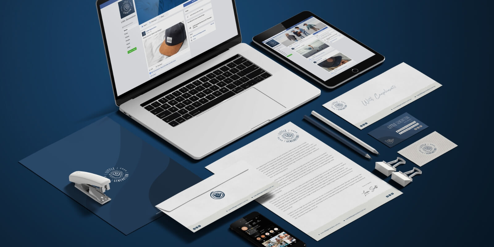
A style guide serves as a company compass. It enables businesses to maintain consistency both internally and externally.
Creating a memorable brand identity doesn’t happen overnight.
However, Red Kite’s got you covered when it comes to style. We’re about to explain what a style guide is and why you need one.
But that’s only the tip of the iceberg. We also offer services from logo creation to full identity design and brand strategy.
What Is a Style Guide and Why Is It Important?
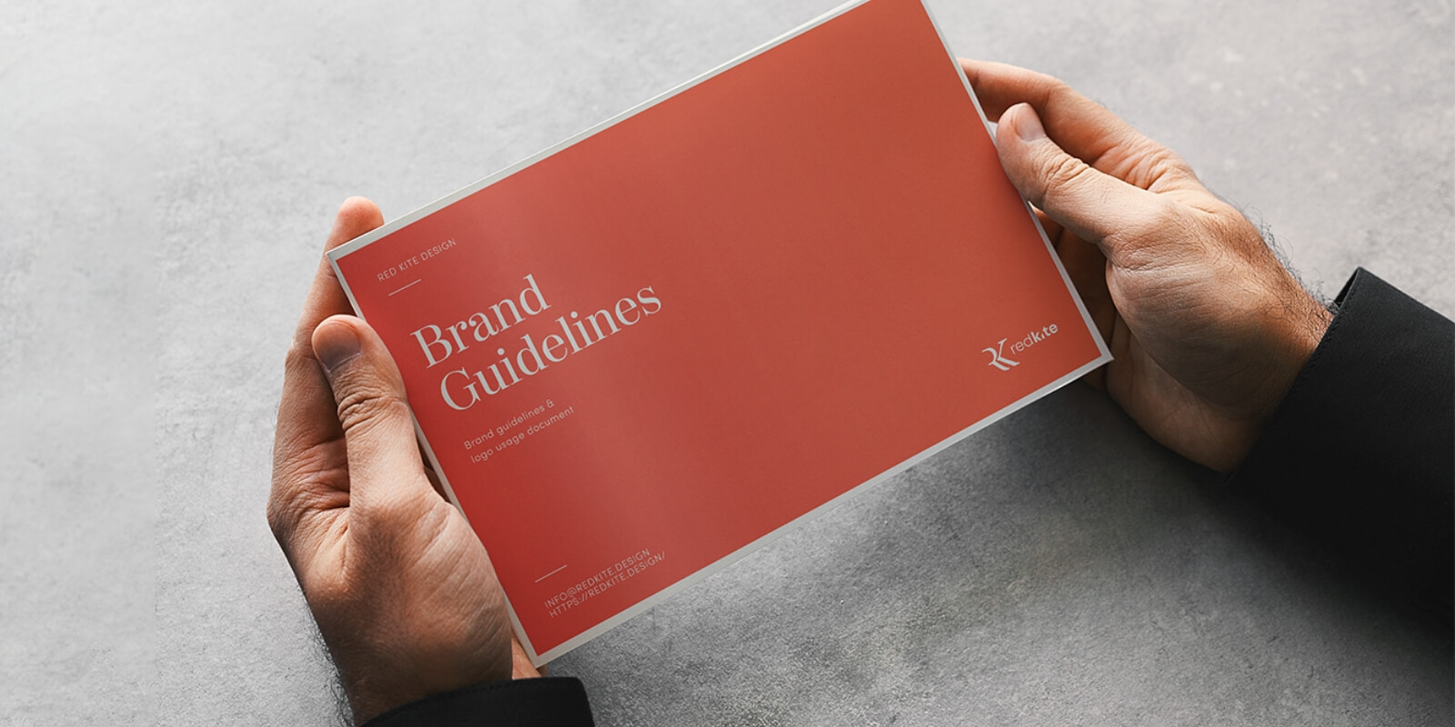
A style guide — aka brand guide — is a document that clearly states the distinctive features of a brand.
Every company has a unique style to accompany its values and mission.
If you are just starting your company, consistency is easy to achieve. The likelihood is, you only have a couple of employees who deal with marketing.
Think ahead.
Your company is growing by leaps and bounds, and your brand is in the foreground. You have to stay recognizable to your audience. This requires consistency across all of your products and services.
But, with 500 hundred employees, how do you achieve consistency?
If only there was a place where all the brand elements could coexist happily.
Enter a style guide.
How to Create a Style Guide

Before we get into detail on all the style guide components, there are two important things you need to adhere to when creating your guide.
- Less is more doesn’t apply to style guides. You should be as detailed as possible. Minimise the chances of an employee making a mistake or a baseless use of your logo. More details included now means fewer questions later.
- Make your style guide accessible. Every employee should know it exists and where they can find it.
Remember: A style guide is often passed on to people outside of the business, so the style guide needs to be easy to use, too. Especially for people who know nothing about the business they’re working with.
Now, here is what to keep in mind when you design your style guide.
The Format
Format refers to the way your brand’s style guide is delivered and how it’s laid out. Let’s explore.
Delivery
Everyone should have easy access to the style guide.
If your entire team is working in one place, it’s a good idea to have a printed version in the office.
If your team comprises people who work in an office and remotely — freelancers, remote employees or partners — it’s best to have an online style guide format. This makes it accessible and easy to share.
Layout
There are infinite layout options for style guides.
Here are some desktop publishing software options you can choose from. These have grids and guides to help you out.
Pay attention to the page layout. You want to achieve consistency and have a clear hierarchy. To establish this, use your existing style.
For example, you can use the header your company places on their letterheads. Also, put the company name on every page.
Editorial Style
Take charge of your narrative, whether your content is published on social media, web, print, or mobile.
To achieve editorial success:
- Choose a style manual — Choose between Chicago manual, the AP, APA or MLA, and others. Decide what works best for your company’s brand.
- Identify exceptions — Research the language your target audience uses and apply it to your brand. Define areas where you want to deviate from the standard manual to engage your consumers.
- Provide examples for style and voice — Describe the style and voice you want to be used. Give examples so your writers can understand the feel and tone you are going for.
The 7 Essentials
Style guides don’t have to be cut and dry. Let your brand’s personality shine through.
Story
You want all of your employees to be familiar with the brand’s story, so put it at the start of your style guide.
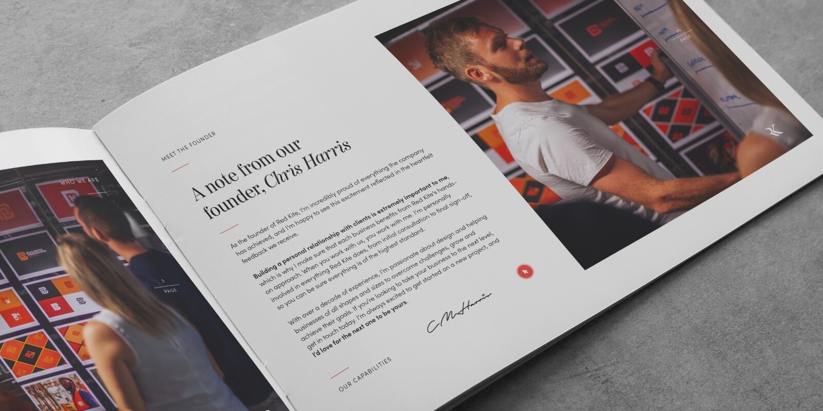
Together with the brand’s story, you can include the company’s:
- Set of standards
- Mission statement
- Vision
- Values
Include enough information so people reading the style guide have a basic sense of the culture and the style of the brand.
Logo
We’re sure you know the feeling of going into Starbucks and ordering your favourite brew. You turn the cup around and see that your name is completely butchered.
This is also how people feel if their logo is messed with.
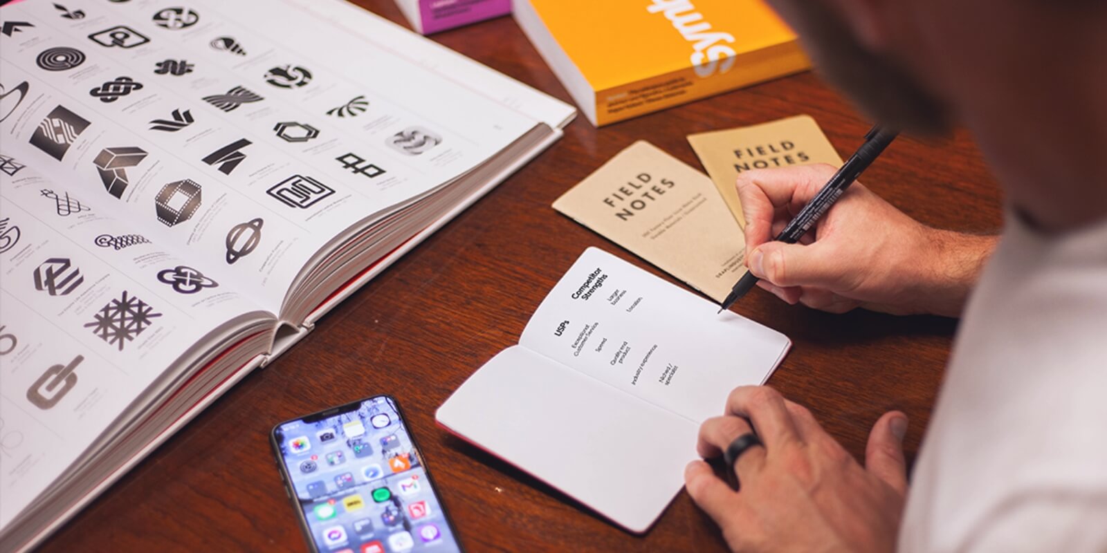
If there are too many logo variations, it will lead to brand disorganization and a weaker identity. Include your primary logo and all variations of the logo that are acceptable — as pictured below.
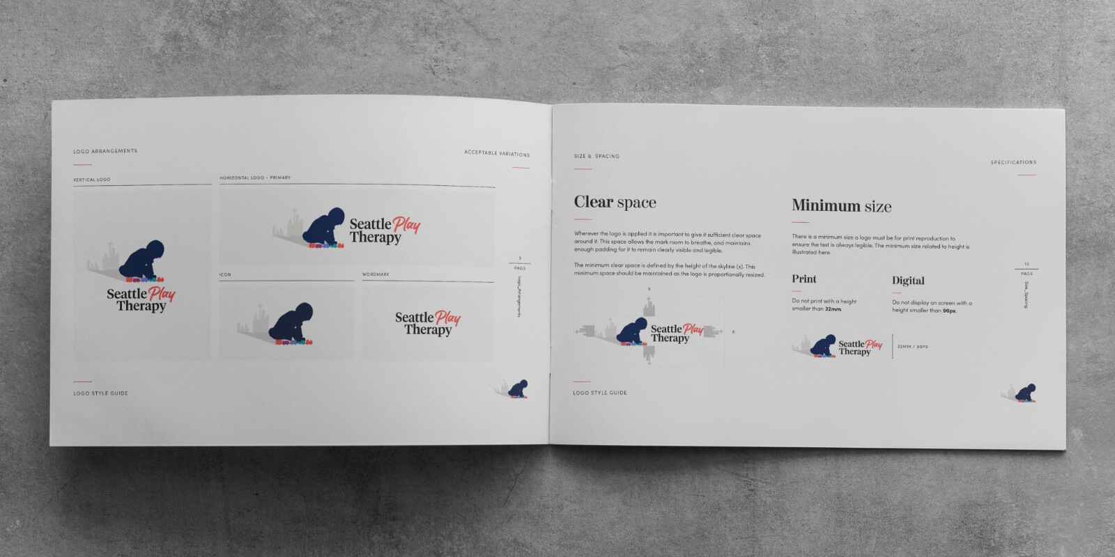
It’s also a good idea to include all logo changes that are not acceptable. The more information you include, the fewer opportunities you leave for mistakes.
Colour Palette
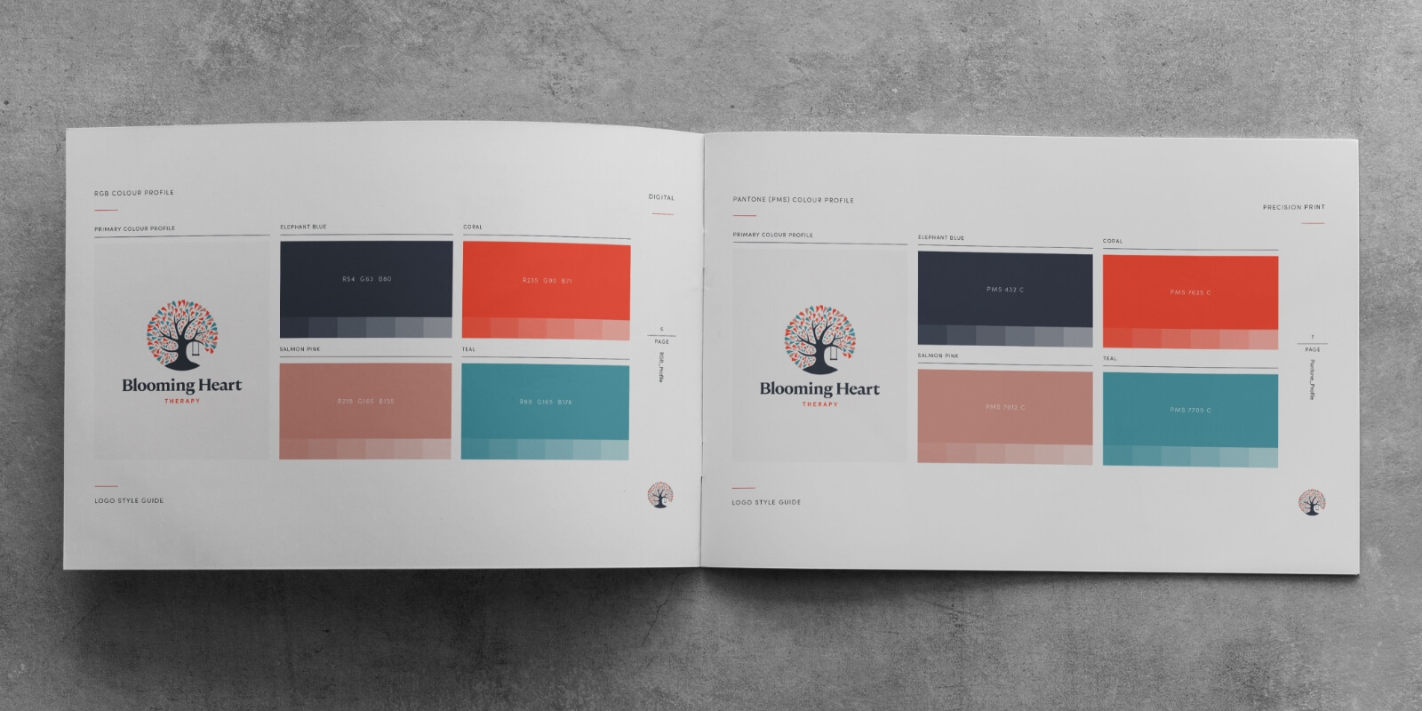
The next section should deal with colours. The same rule applies here — be as detailed as possible.
Saying your brand’s colour is purple is not enough.
In case you don’t have core colours, it’s time to come up with them. It’s a good idea to learn about colour psychology. Brands usually choose up to four colours.
You should display the colour in this section and include:
- Pantone name and number
- Digital colour (RGB and HEX code)
- Print colour (CMYK)
Typography
Typography is as important for brand identification as colour palette, so include it in your brand manual of style.
Check if there is a reason the typeface your company uses was chosen. If the answer is yes, include this information in the company’s backstory.
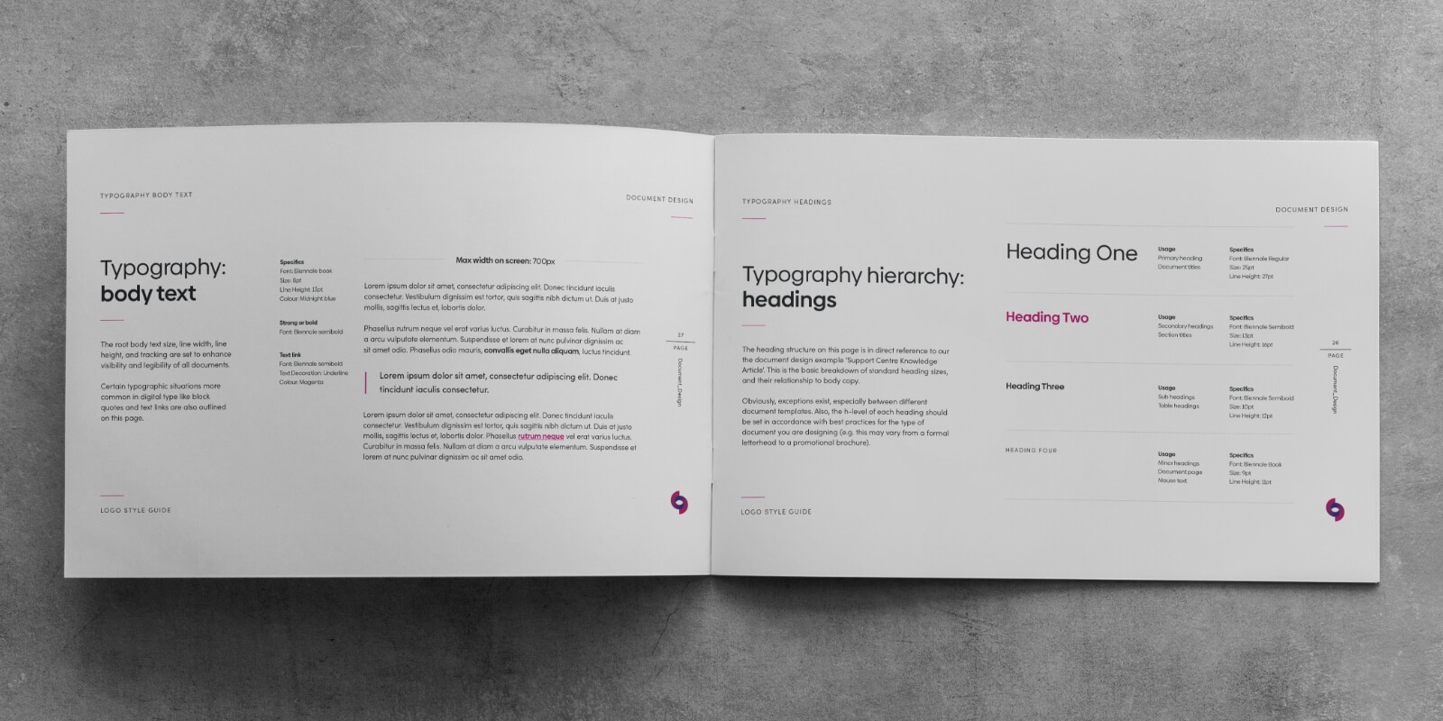
Specify which fonts should be used for:
- Headers
- Captions
- Body text
Your brand may use a particular typeface or font pairing.
In the font section, specify the text alignment rules. For example, should headers be aligned to the centre, should body text be left or justified, etc.
Photography
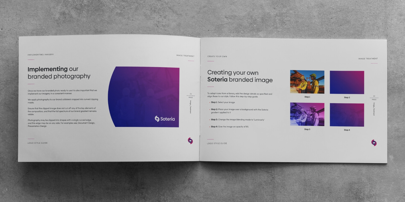
In the photography section, provide everything your employees need to know about choosing photos that suit your brand’s mood.
You can make a page that resembles a mood board. Include all the important elements that should be consistent in every photo. These can include lighting and colours.
If you already have brand photographs, include a few as examples. This will make it clear to employees what kind of photograph styles to go for.
You can even require the use of specific camera equipment or settings, to make sure all photos are cohesive.
Here you can also show how the photos should be laid out.
Illustrations and Graphics
As a photo substitute, you can use hand-drawn illustrations. These will make your company stand out. Customers will have a more personalized experience than if you use stock photographs.
Not to mention, illustrations will make you stand out and be noticed on social media.
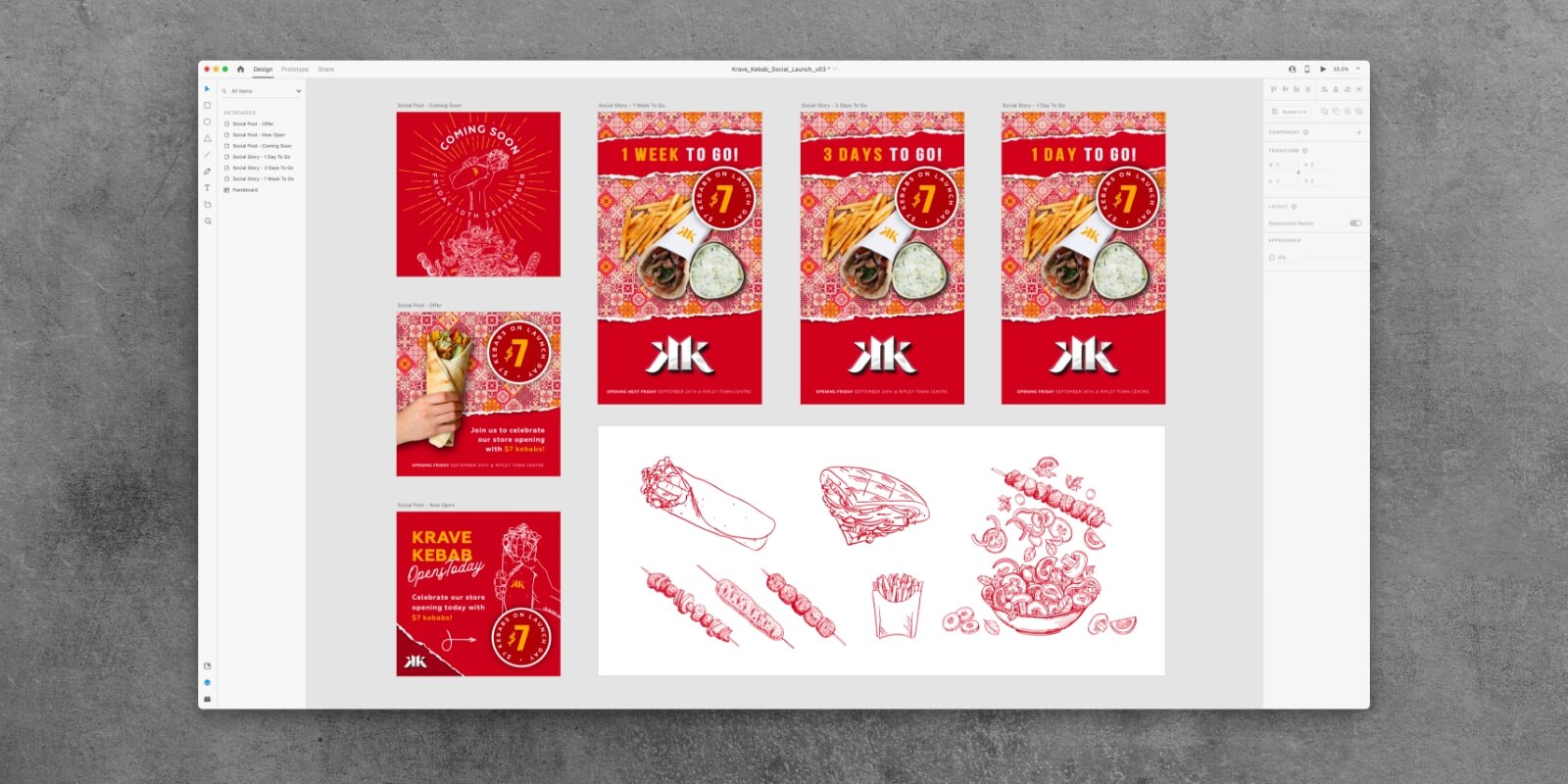
Don’t forget to include any illustrations and background elements your company uses for marketing in the style guide.
Give examples and explain how illustrations and graphics have to be used.
If you have an online location where all illustrations are stored, include it here so employees can find it easily.
Voice
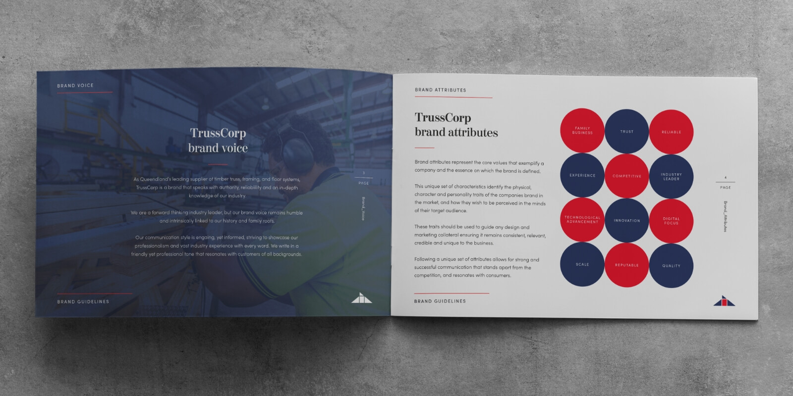
The unique voice is what makes a brand really stand out.
For example, what is your customer communication like? Do you use a formal or casual approach?
Here, you can include adjectives or phrases for employees to use when communicating with customers. If there are phrases that your company prefers over others, list them. You can create a do’s and don’ts sections with examples.
2 Style Guides That Stand Out
To inspire you, we’ve included 2 excellent examples of style guides.
Nasa
Nasa is famous for its design due to a few iconic points, such as the vertical title text. This evokes the image of shuttles before being launched.
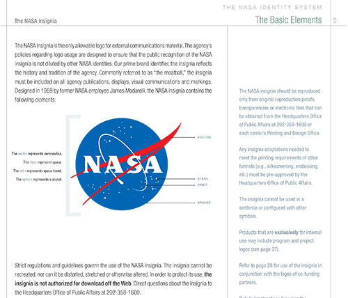
Their style guide is 220 pages long and includes:
- Colour uses
- Countless logo placements
- Supporting designs
MailChimp

MailChimp is a great example of a style guide where every single aspect is explained. These include:
- Goals
- Audience types
- Voice
- Tone
- Copyright
- Wordlist
It’s easy to navigate because they included a bookmark section.
For more inspiration, check out these 14 style guides.
Do It With Style
Think of your style guides as a lighthouse that leads everyone in the company to smooth sailing.
The clearer the rules, the less room for error.
If you don’t want to deal with all of this on your own, come to Red Kite. We’re here to listen and help you sort out any difficulties you have with your style guide.
Not only that, but we can create everything you need for your brand to shine — from logos to identity design.
Check out our blog for useful advice on defining your brand identity and growing your business with a tailored brand strategy.
