The key to having a memorable brand is consistency.
You pop to your local grocery store for your favourite coffee or chocolate. You’ve learned to recognize your favourite products on the shelves from a mile away, even when they are surrounded by hundreds of other items.
Why?
Because the best brands are continuously easy for us to identify due to the coherent, clever and consistent design of their brand identities.
Repeated use of colours, fonts, patterns, logos, images, icons and shapes make up their visual identities. As well as consistent messaging, tone of voice and communication style in their brand personality.
We’ve rounded up the 13 best brand style guides to inspire you on your design journey.
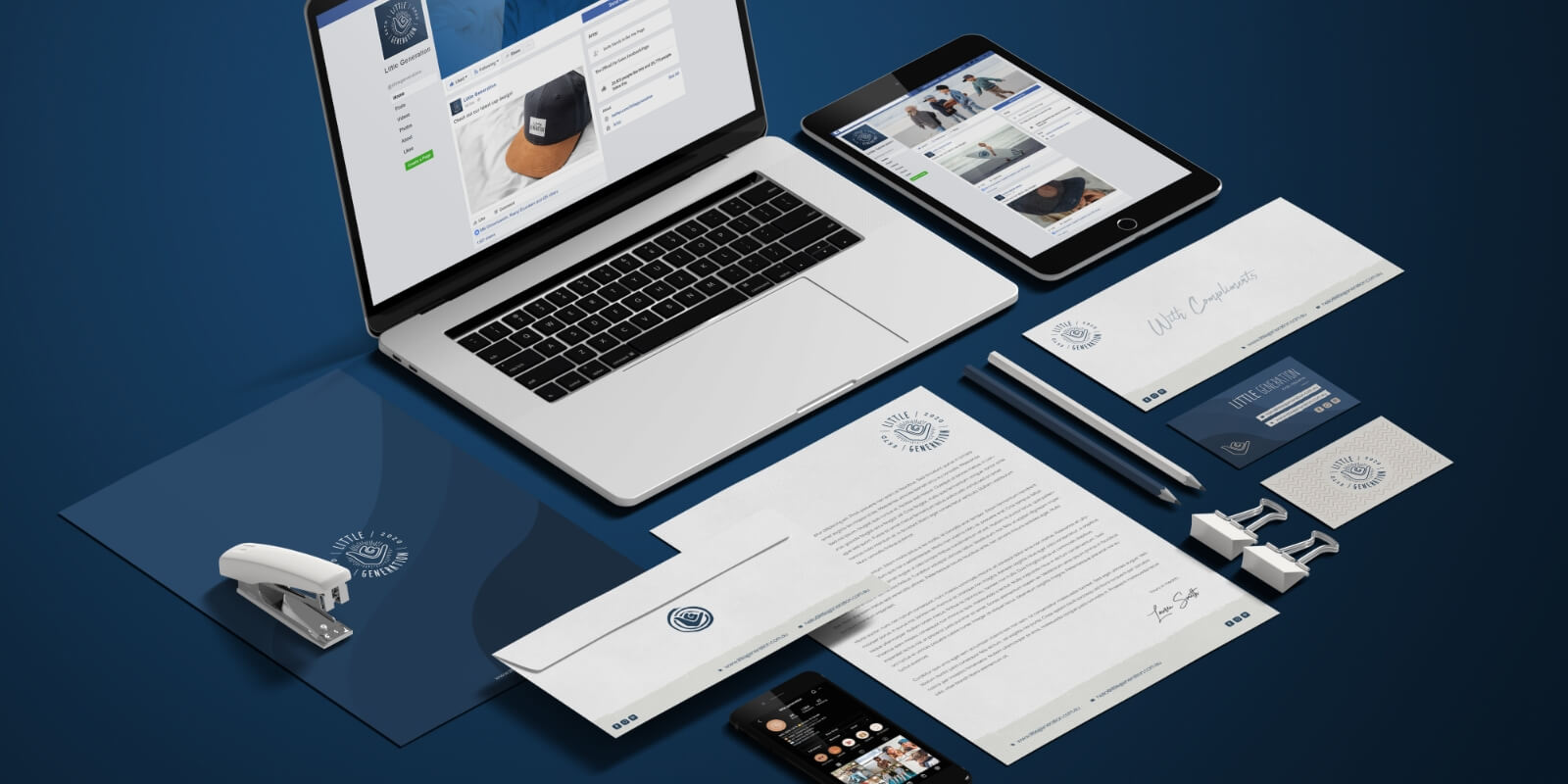
And if you’re after a helping hand in the creation of your brand, don’t hesitate to talk with us.
Not only will we create a memorable logo for your business, but we can design a complete brand strategy and identity. We have everything you need to put your business on the map.
1. Instagram
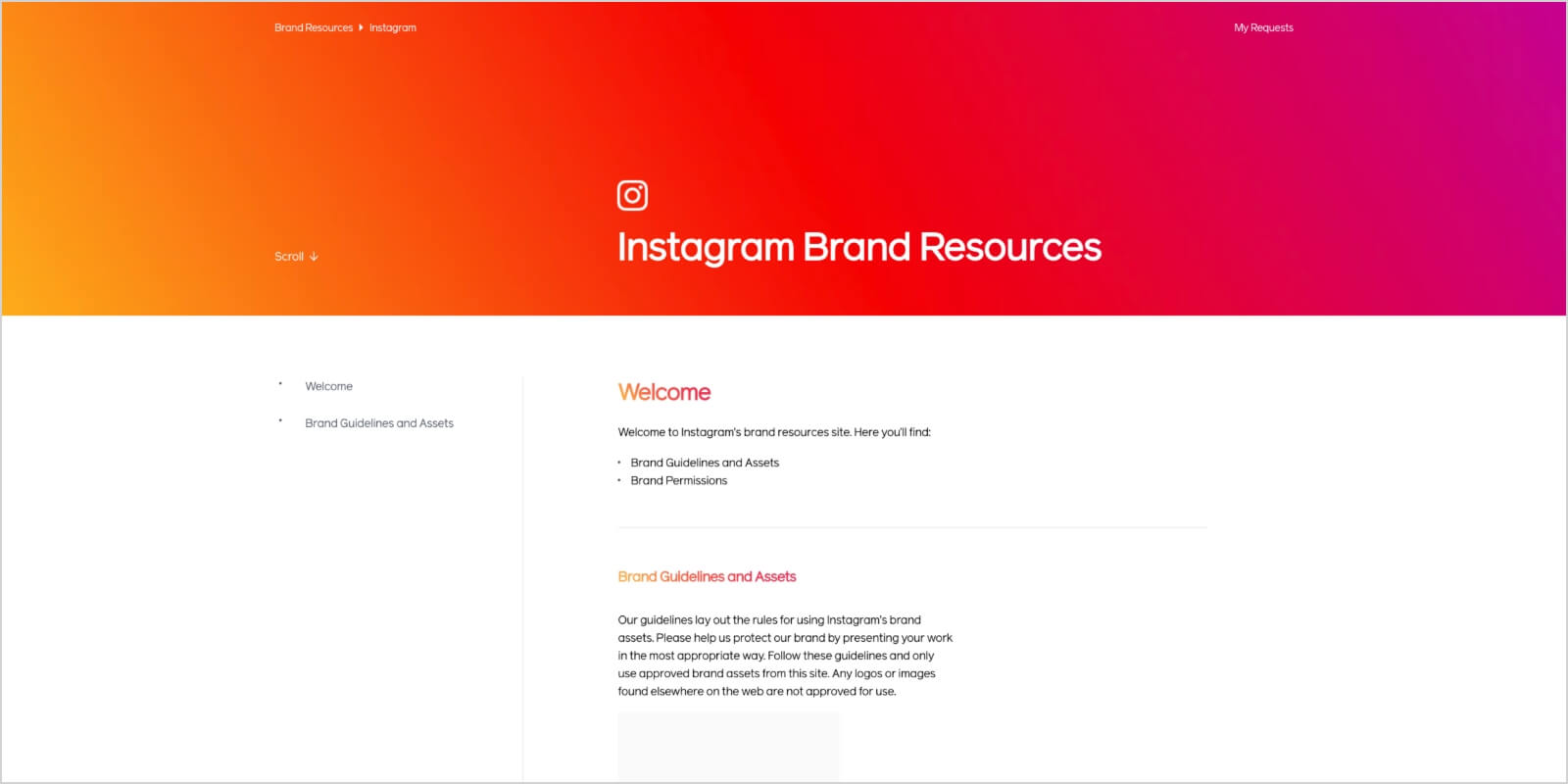
Instagram does a superb job of enabling anyone to insert this social media giant into their own business.
They do this by providing templates for:
- Live broadcasts
- Screenshots
- Websites
They make sure the formatting is the same, no matter which device their styles are used on. They even give detailed instructions on when and how to position the glyph icon and talk about the importance of white space.
2. X (formerly Twitter)
Like Instagram, X exists in the digital world — so a digital guide makes perfect sense.
Why does X make its own brand style guide so accessible?
Because brands use X icons to market their businesses. By making its rules accessible, X:
- Gives other brands a high chance of being followed.
- Gains a great deal of free exposure
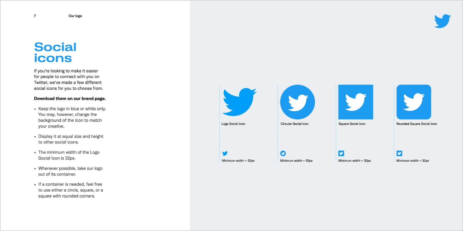
When you go to their branding resources page, you can find:
- Brand guidelines
- Logo — downloadable in different formats. “It’s not a bird, it’s a symbol of X.”
- Social icons
- Logo pairing lockups
- Tweet treatments — font and typeface styles
- Username and hashtags — Helvetica, with negative tracking
- Colour palette — blue and shades of grey
All of these resources make the guide simple and clear.
3. Skype
Skype has one of the most gratifying guides out there.
Often, these guides are dry and heavy. Not the case with Skype. Their guide is clear, concise, and at the same time, engaging and friendly. It resembles the way the platform is used — as a conversation.
Their brand style guide is 33 pages long. Some might think this could be condensed.
However, the spacing is what delivers such an impact. They make sure that every area of brand identity is covered. Although colourful, the guide is not overpowering. They found the perfect balance between white space and the number of graphics used.
It’s easy to skim and keep up with their rules — which even include instructions on how to draw the famous cloud.
You can find their brand book here. It mostly focuses on product phrasing and logo placement.
4. NASA
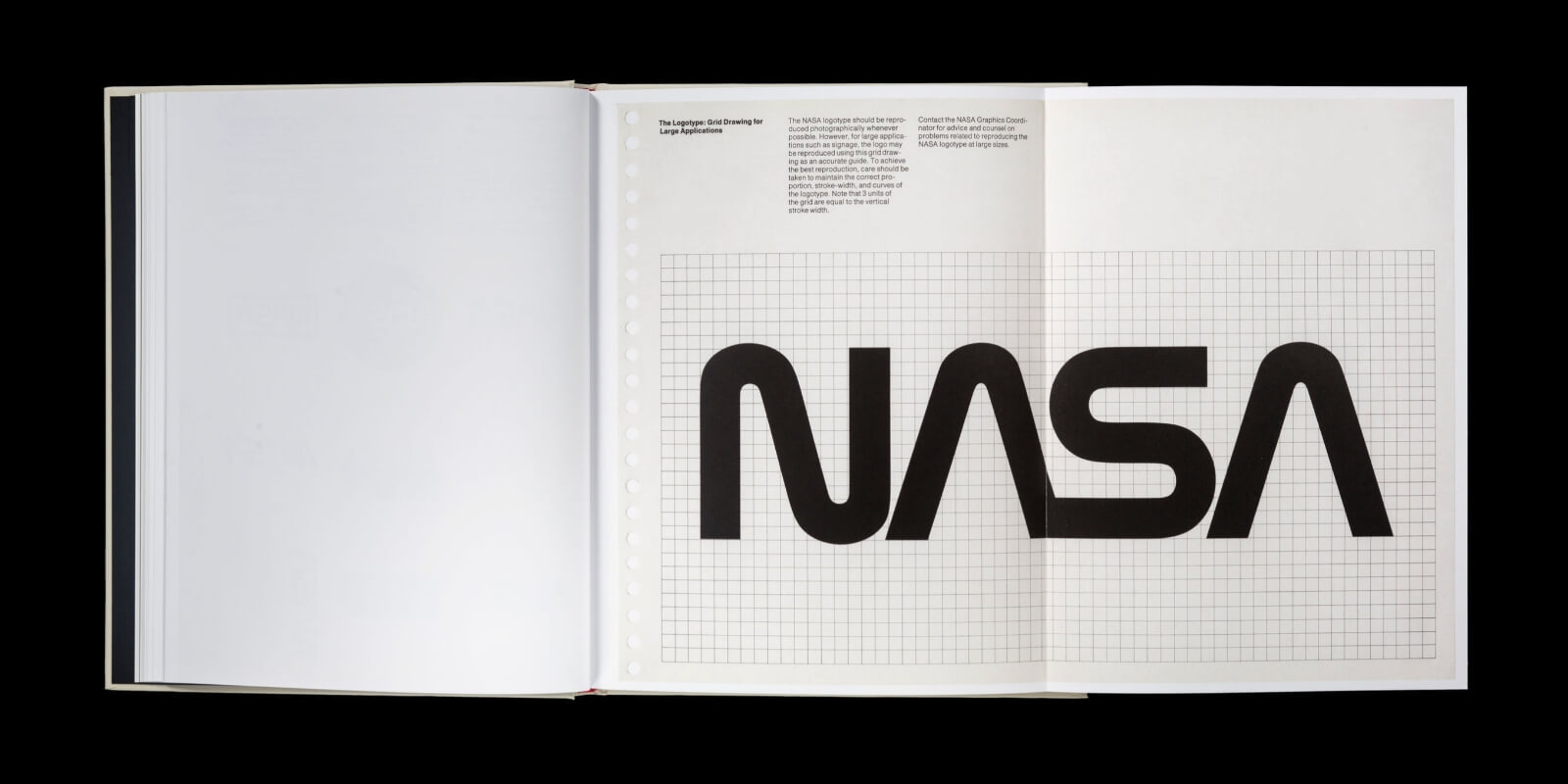
The award for one of the most complex style guides out there goes to NASA.
Their 220-page guide covers everything:
- Use of colour
- Logo placement
- Supporting designs
And, let’s not forget NASA space shuttles. They have their own branding rules.
Nasa wants to ensure their brand stays recognizable. This is why the style guide has exact rules for “the meatball” — the official nickname of the red, white and blue circular logo.
The guide even includes rules on where the logo can be placed on government vehicles, including planes — always toward the back, with NASA written on the door.
The style guide itself says: “It is our prime brand identifier, reflecting the history and tradition of the agency.”
5. Boy Scouts of America
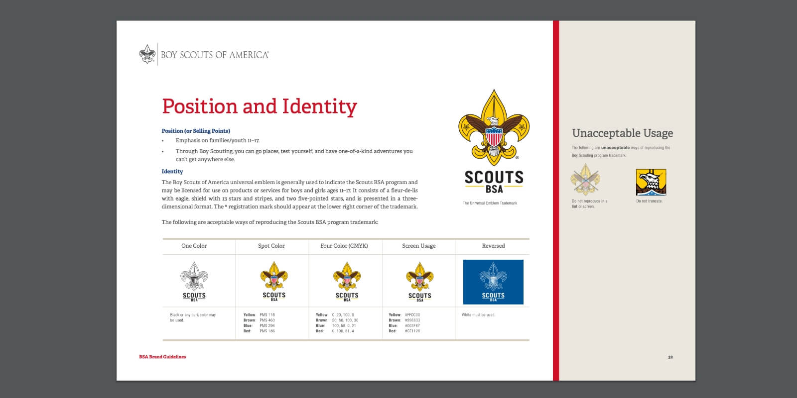
Boy Scouts of America (BSA) are based in small communities, which means that funds are limited.
In order to help parents and Boy Scout’s leaders maintain consistency, they’ve developed an excellent style guide to demonstrate appropriate logo usage. BSA go a step further and explain the proper use of patches, as well as the correct way to wear uniforms.
This guide is jam-packed with valuable information, such as:
- The brand’s purpose
- Core values
- The brand story — shown through the visuals
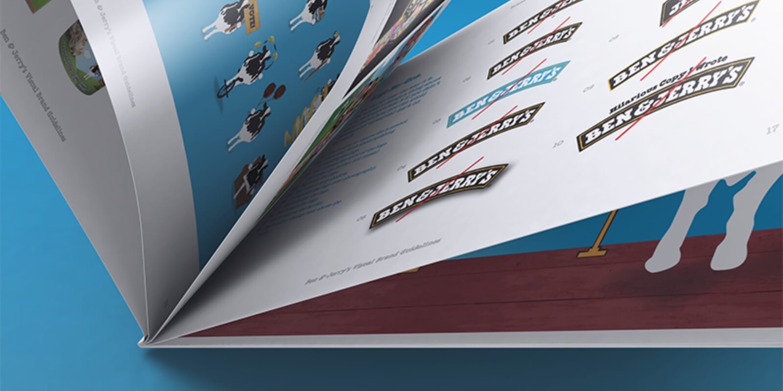
6. Ben & Jerry’s
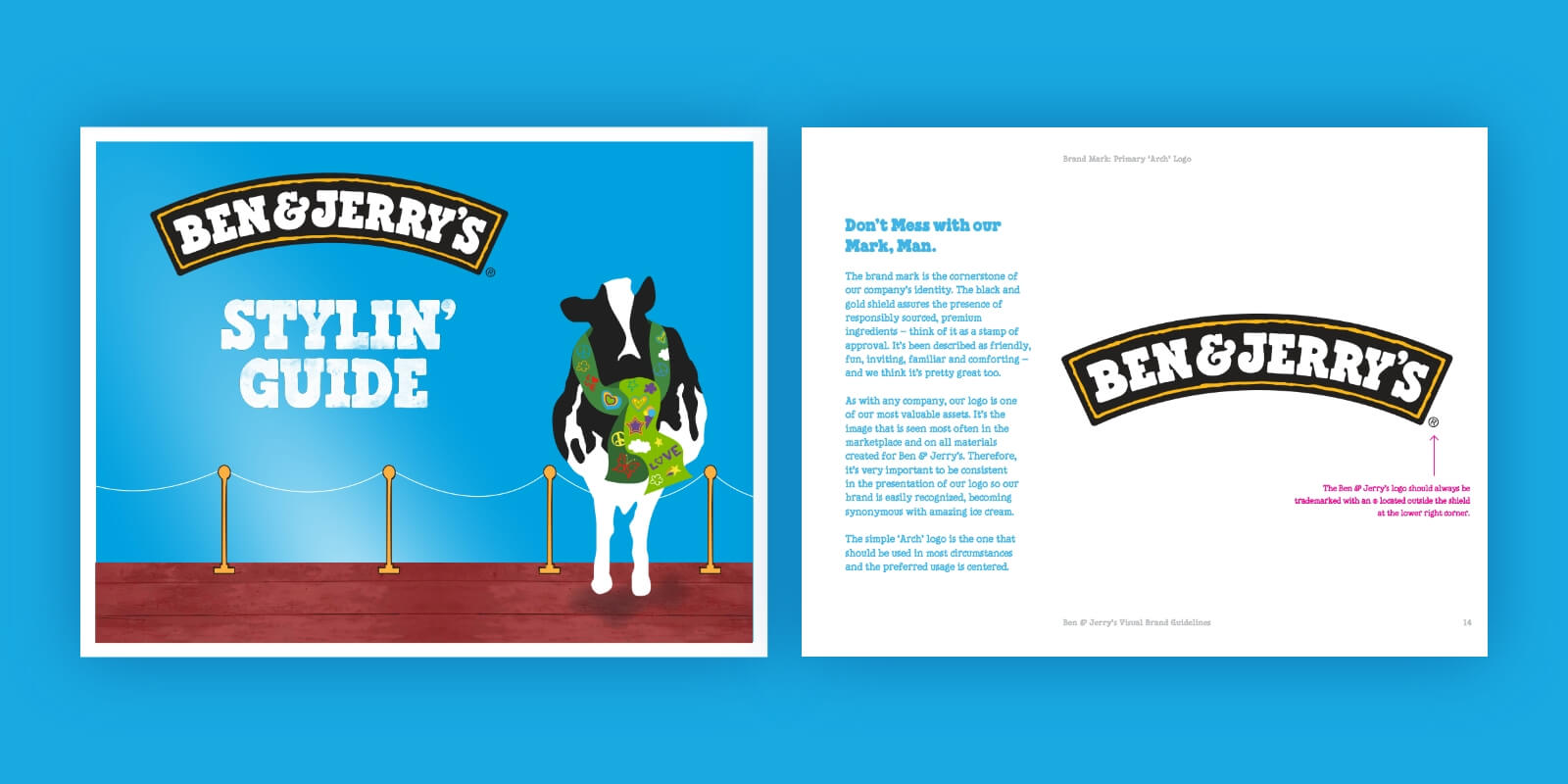
Ben & Jerry’s is a great example of brand consistency. No matter the flavour, the logo colour palette stays the same. This makes it instantly recognizable.
This is a company that mirrors its brand assets into a brand style guide.
They leave no stone left unturned. Everything is explained in detail, including:
- Interactive countdowns
- Quirky icons
- Design components
- Page layouts
- Content creation
They provide examples and full markups so that embedding on web pages is easy.
Their guide is engaging, fun and easy to follow. It works great on touchscreen devices where the icons are revealed when clicked on.
For an interview with the guide creators, go here.
7. Spotify
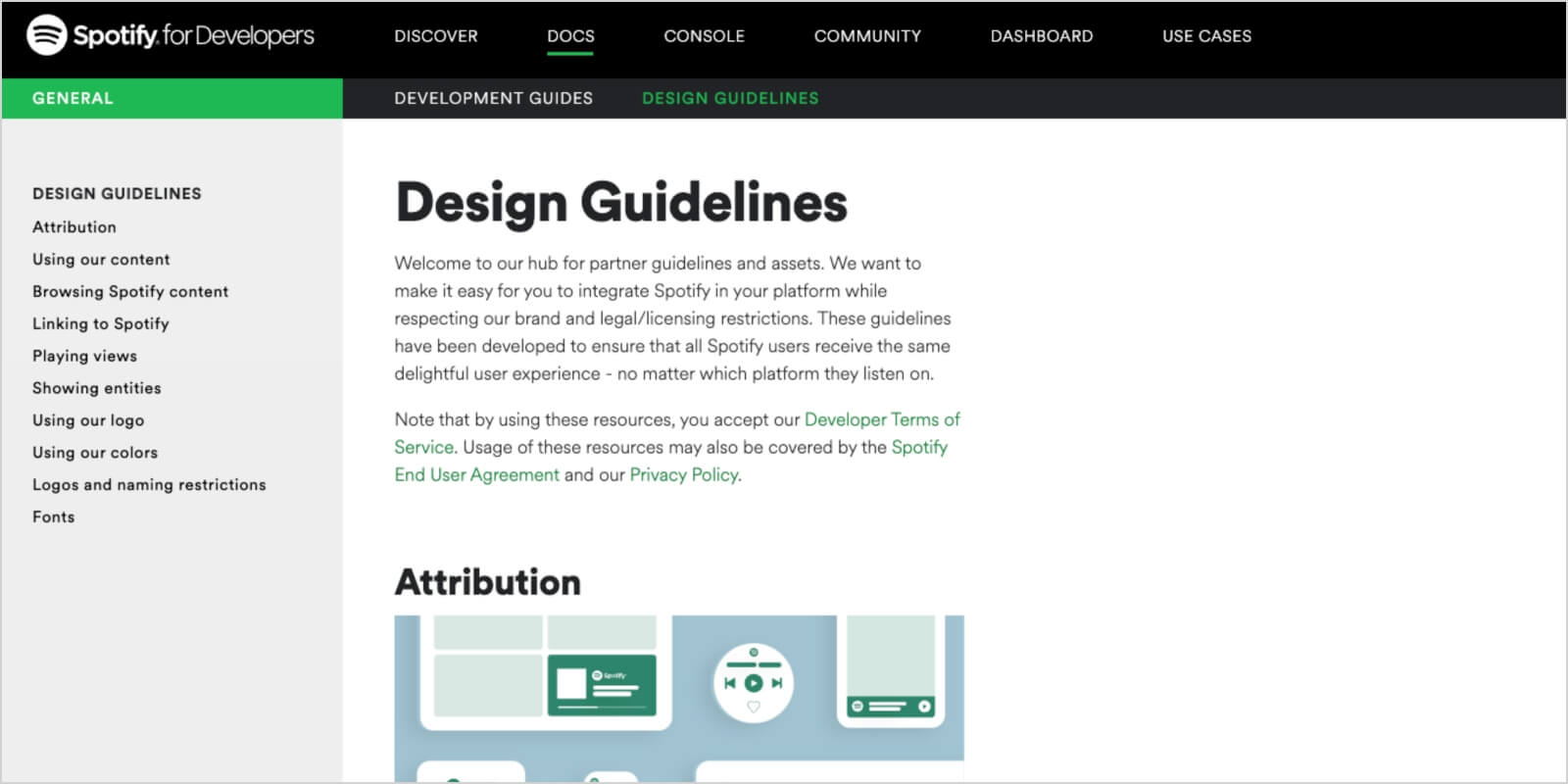
Spotify’s brand style guide is more in-depth than others on this list. It covers all the visual elements, such as colour palette and logo guidelines.
The brand colour rules are clearly stated. For example, there are instructions about which colours can be used on which backgrounds.
What makes this guide so comprehensive is all the brand guidelines on the use of their content. They include ample examples of logo misuse.
This brand guide outlines exact rules for using album art and artist content. Although the rules are strict, it’s easy to use their music by downloading widgets.
They go a step further by having a widget builder, where users can get the code and embed widgets to their own pages.
8. New York City
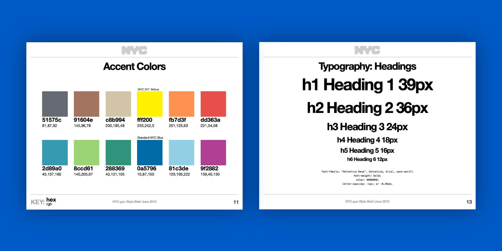
Thought you had to be a business to create a brand style guide?
Surprise!
Even New York City has created its own branding.
New York City has a very comprehensive guide. It includes rules for pretty much any type of material containing an NYC logo. There is no confusion about how the brand’s assets can be used.
They make sure to cover all of their bases, such as:
- Editorial voice and tone
- Design and content strategy
- Grid and layout
- Responsive breakpoints — for phone, tablet and desktop
- Colour palette for site and accent
9. Airbnb
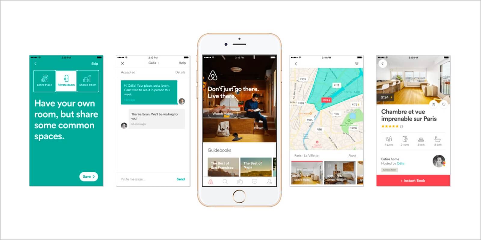
Airbnb makes its brand voice loud and clear in their brand style guide.
This brand’s guide stands out thanks to all the visual elements. They are used to assign importance to the meaning of the brand elements, and not the placement or instructions.
Each visual component tells a story of who they are as a company, while at the same time bringing the brand to life.
The powerful visual language allows Airbnb to be recognized globally, on a multitude of devices and platforms.
10. Medium
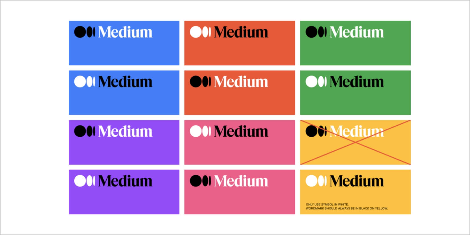
Medium’s style guide is a fantastic example of colour and typography.
It’s published just like a typical Medium post — they make sure to integrate brand guidelines with their platform style.
They also talk about the company’s purpose and Product Principles.
Their set of guidelines include instructions for:
- The Logo anatomy
- Logo clear space and margins
- Logo incorrect usage examples
- Wordmark rules
11. Bacardi
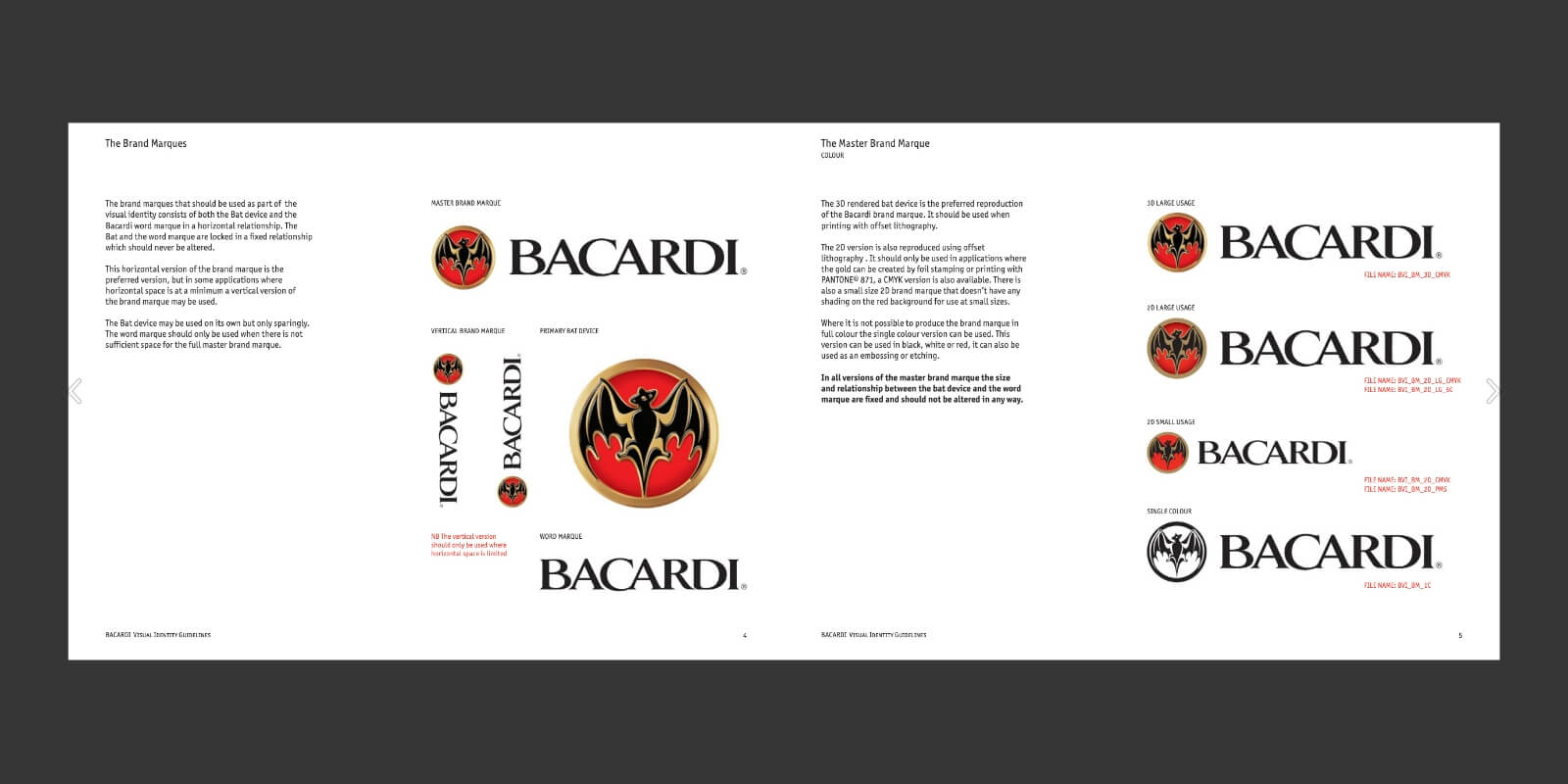
Bacardi’s style guide is all about its history.
The style guide talks about:
- Logo
- Typography
- Colour
The main focus is on the logo. The guide sets clear rules on:
- Logo evolution through history
- How the logo is inverted against a black background
- How much free space there should be around the logo
- Ways in which the logo can’t be used
What makes this guide stand out is the way they show how the brand evolved over time, while keeping the original visual identity.
12. Jamie Oliver
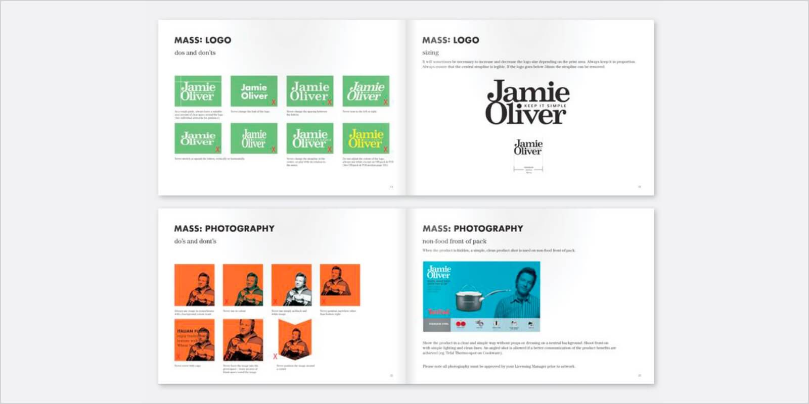
If you have a brand that deals with a lot of photographic elements, this is the guide for you.
Following this example, you can set your own rules on how you want your photography to be treated.
Take a look at Jamie Oliver’s branding manual for:
- Basics of branding
- Do’s and don’ts of logos
- Use of imagery
- The correct way to use colour and images in communication
13. Cisco
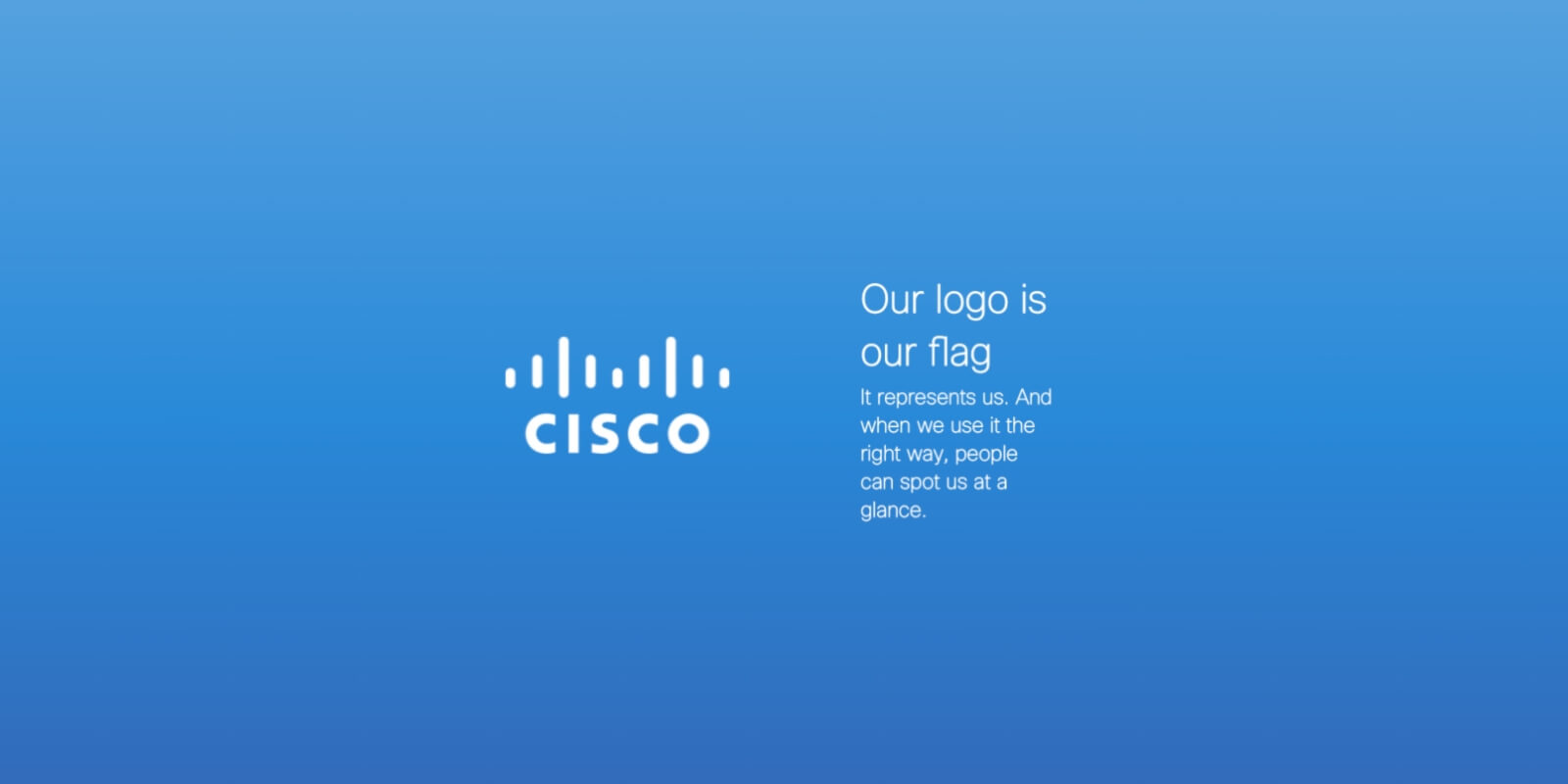
Cisco’s guide is not just a guide — it’s a whole interactive brand book, which covers:
- Brand vision
- Mission
- Strategy
- Company promise
- Library of approved photos
- Audio and video to be used without fees
If you’re only looking for Cisco’s colour palette, there’s a whole separate webpage addressing just that.
Get Creative
We hope these examples provided you with ideas for your branding and got your creative juices flowing.
It doesn’t matter if you are just establishing your brand, or you have an existing business, looking to lift your brand to new heights.
Red Kite is at your disposal for any branding help you may need. Don’t hesitate to contact us. Let’s make your business soar to new heights together.