Contemplating how to best design the perfect logo for your brand?
An eye-catching, professional logo that’s as communicative as it is subtle? Well, welcome to the first and most important step of your branding.
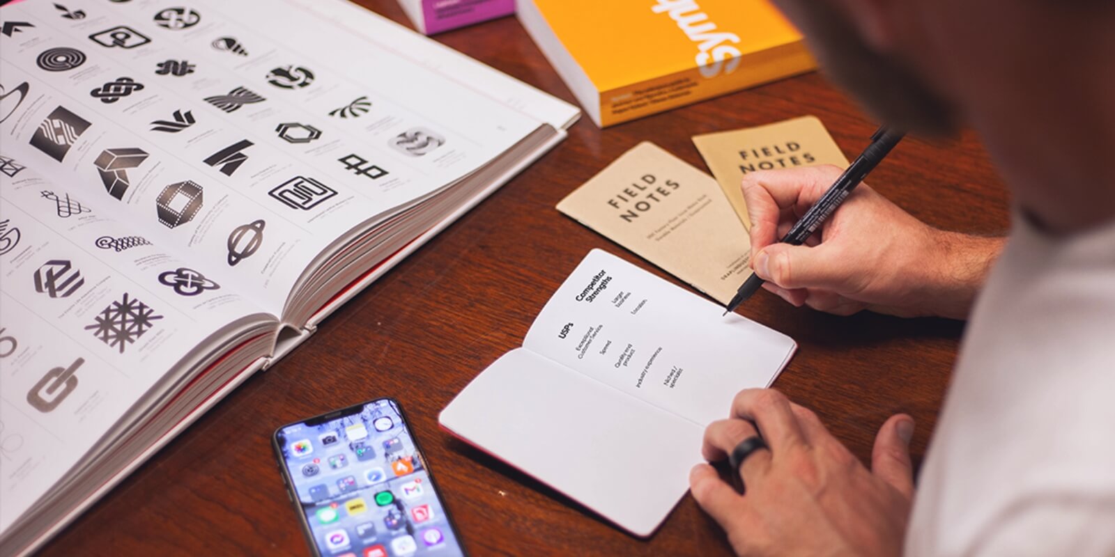
Coming up with professional logo designs might sound simple – but it really isn’t. It’s part art, part science (mixed in with a bit of psychology).
All companies, both small and established, start-ups and conglomerates, owe their traction in the market to the efficacy of their brands. More specifically, your company’s visual signature says a lot to both prospective leads and existing customers you want to maintain.
When talking about design, there’s a whole lot you need to learn before you begin to create a good professional logo. Red Kite Design has specialised in business branding for years.
Today, we’ll take you through five of the catchiest, most impressionable of professional logos, from companies in Australia and beyond.
Highlighting at each point some takeaways we think you should incorporate in your own logo. From colour scheme to shape-theme balance.
Starting us off is a company whose product you’ve probably interacted with in the not so distant past.
#1: Apple
Apple is known for its strict adherence to consistency when it comes to their products.
They’re one of the largest brands in the world, and for good reasons.
Reasons that go beyond their contribution to the world of consumer electronics. Certainly, they have what is probably the most universally recognisable form factor.
But the reasons most people—indeed, most Australians—opt to spend way more money on Apple gadgets goes beyond their famed ecosystem.
Nor is it solely attributable to the new vibrant features the products they put out, given how awash the market with more spec-heavy gadgetry today.
All it is is this: Apple’s brand makes a promise and it keeps it. That’s it.
From huge yearly shindigs wherein they announce their new flagships to the single straight line that’s subliminally drawable from their company’s logo branding to all their product’s visual design—this fact is proven and then some.
When asked about the source of his inspiration to create a logo, designer Robert Janoff said,
“I designed it with a bite for scale, so people get that it was an apple, not a cherry,”
Janoff has also said, “The only logo design direction we got from Steve Jobs was ‘don’t make it cute’.”
The Apple custom logo has to make the top 3 spots in our company logos for a variety of reasons.
Logo Design Pointers
- Minimalistic with recognisably subtle signature — the large bite on the apple diffuses any plainness that might come of simply having an everyday food (in monochromatic) as the company marker. This way, the Apple brand asserts itself.
- Innovative and not literal — the use of an apple as a symbol for all it’s tech products is really thinking out of the box; it sets Apple apart from other businesses with conventional logos dealing in the same field.
- Have a core concept — and stick to it; simplifying it makes it more versatile and renders it all the more memorable
#2: Woolmark
The Woolmark logo design, arguably the most recognisable of all Australia’s clothing brands, was the result of a push to win a business logo competition.
The company itself was just starting out and in 1964, as soon as they claimed the top prize, they rolled out the company logo in Belgium, Netherlands, Britain, Japan, the US, and Germany.
The Woolmark company logo is used on garments made of 100% modern wool.
But there are two other iterations of the same logo which have slight modifications: The Woolmark Blend logo and the Woolblend logo.
Of course, most people don’t realise that both of these versions each serve a different purpose.
The Woolblend logo indicates that a garment contains 30-50% modern wool. The Woolmark Blend version, on the other hand, is used to indicate garments that make use of a minimum of 50% modern wool.
Logo Design Takeaways
- Innovative but still adequately simplistic — Woolmark adopts some artistry in how they try to convey their business theme to a rather memorable effect, and they do this without making it overly complicated.
- Relevant — again, the effect here is clear. The 3 batches of concentric strokes underscore the textile theme.
#3: Google
The original Google logo adopted back in 1998, used a basic font. For nearly a decade, it remained unchanged.
Until 2009. This time, a few changes were introduced regarding the colours.
Following this, in 2015, the logo was relaunched with a modified professional font and saturation to the colours.
And this is the logo you know today.
While the preceding two company logos have been quite minimalistic in their use of colour, the signature aspect of the logo is the varying colour scheme. Which is an interesting choice.
Unlike most other tech conglomerates, the platform eschewed symbols and stuck with simply their name as the logo.
One theory as to why is because of their need to make the design accessible to all, which is an important operative mantra for the company.
The use of text as opposed to a symbol is also quite appropriate when you think about the fact they are, indeed, a word search engine.
Logo Design Inspiration
- Wordmark with a custom typeface* and font colour design.
- Uses colour in a creative and recognisable manner.
- Relevant—the everyday font speaks to the product offered: a word search engine.
*FUN FACT: The font used in Google logo is actually a custom one. It’s patented and owned and exclusively for their branding. Talk about setting yourself apart and dedication to your brand’s uniqueness! This is an excellent way to go for companies that are thinking of going with a Wordmark logo.
#4: ABC (Australian Broadcasting Commission)
Now here’s an example of a timeless design that uses both text and symbol in a simple and effective way.
The right word to describe this logo is utilitarian. Being a media company, there’s a natural need to strike a balance between artistry and conciseness.
The logo is intricate enough to catch and hold a gaze — an oscilloscope’s waveform that rides into itself.
And it’s still simple enough to get the job done. Not to mention the relevance of the waveform imagery to the broadcasting company.
Logo Design Pointers
- Simple monochromatic colour scheme.
- Uses creative custom imagery that’s relevant to the media industry.
- Double whammy—uses both text and media symbolism. Therefore scalable across different formats: business templates, business cards, professional art-work, etc.
FUN FACT: Graphic designer Bill Kennard was paid a total of £25 for his work on the ABC logo.
#5: Shell
The shell logo, distinctively colourful as it is now, bears some real cultural relevance to the world.
The use of an actual shell was meant by the designer to evoke a feeling of oneness with the heritage of California at the time of inception.
The original idea was to use the Spanish flag (most Californians were Spanish natives).
Investigating the ideas and symbolism a little deeper, you will see that the shell used is one from a mollusc, which affirms the industry core business: an exploration of oil and the earth.
Logo Design Pointers
- Thoroughly appropriate for business — uses a relevant symbol: an actual shell.
- Remarkably bright red colour scheme — which ties in well with the company’s history and vision.
- Culturally relevant, even to the modern market.
Your Perfect Logo Design Checklist
The Logo Design Should Be Relevant
The rule here is pretty simple. Your company logo should serve the primary objective of being an identifying symbol for your business.
But there’s a balance that begs to be struck here, see. Your logo should NOT be used to communicate what your company does.
It should be meaningful to whoever seeks to purchase your product, sure, but it should represent an idea, not a vocation.
(A la, a pair of earphones for a radio station/audio broadcasting company will always be banaler than it is communicative.)
The words used, the colour scheme, the type (and mood) of the font should all be carefully tailored to meet the right end.
Translation:
A colour scheme that is bright and animated is certainly relevant for an ice-cream manufacturer and distributor; not so much for a law firm. Or a private coroner service.
The Logo Design Should Be Vibrant & Innovative
Rule #8 in the company logo designer handbook: steer clear of clichés. For example, if yours is a finance startup, try to avoid coins on your company logo designs.
Or if you’re looking to create a logo design for an online radio station, using a pair of silhouetted headphones won’t do.
People’s minds have a way of mentally annotating clichés and disregarding them as plain.
Your Next Step
Your mission should be to find a custom logo design that accurately expresses your company’s vision in a modern, gripping style.
The Logo Design Should Be Simple AND Communicative
Great logo designs should strike the right balance between its moving parts and how much they communicate.
There’s an optimal limit here (probably measurable) that should never be exceeded; otherwise, your logo might end up being too abstract and complex to be effective.
More Specifically…
Fonts and symbols that are too intricately constructed (think: a mandala) should not be used in logo creation. A great logo is conceptual and achieves its intent as simply as possible.
The Logo Design — Should It Be a Wordmark or a Symbol?
Not much of a warning here, only a reminder that you will have to choose from the outset which of these two options you’re going to use.
The general tenet is: go wordmark if you’re in the finance, legal or business sector. Otherwise, you’re free to go either.
There’s not a rule here that’s set in stone. It’s up to you to choose which option most expresses your vision to prospective clients.
Other important boxes to check:
- Versatility — your logo should be adaptable to different formats: business cards, company logo art.
- Catchy — your logo should be memorable from the first glance.
Yes, Ultimately Branding Does Matter
So, there you have it, folks. Some final advice from our Red Kite designer:
“Don’t memorise. Internalise.”
The best way to create a logo is to choose a core idea. Whether that’s a stroke, a shape, a colour, a mood. Ideas you feel are an appropriate starting point for your company logos.
After scouting for ideas and fiddling on social media or with an online logo maker, you need someone who’s going to help bring your developed idea to life.
In other words, someone with great visual skills and, most importantly, an artistic eye to read (and translate) your mind.
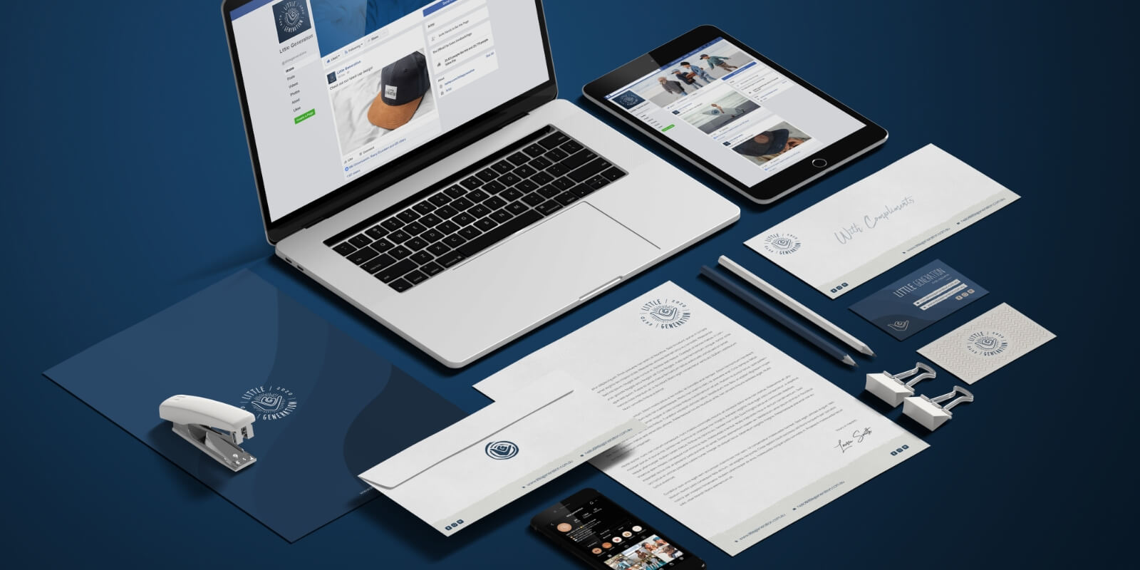
Brand identity is a huge part of marketing and business growth, both online and off.
What We Do
We develop a memorable brand across all touchpoints so your business looks its best no matter where your customers want to find it.
There are multiple levels of defining and developing successful brands, extending far beyond the company logo itself.
Other than company logo design, we also offer full company identity design and brand strategy services. We’ll help your business with logo creation and maintaining a memorable identity, tailored to your vision and need.
Contact us today for a free quote.