We’re honoured to have not one but seven of our logo designs included in the upcoming LogoLounge Book 13.
This was our first time submitting for the book and we’re extremely proud to be featured alongside some of the biggest and best logo designers around the world.
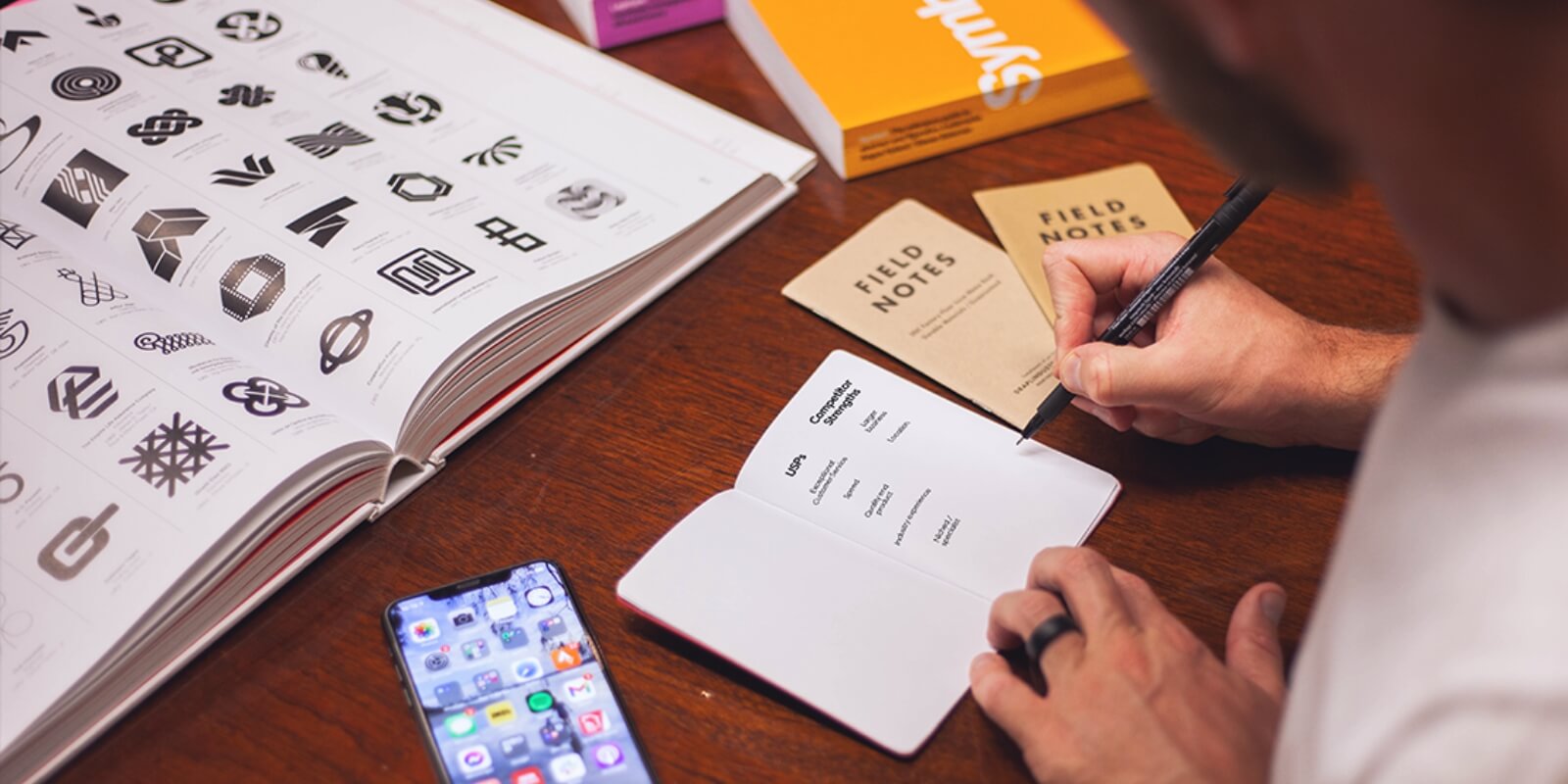
What is the LogoLounge Book?
First published in 2006, this best-selling book series gathers together industry-defining logo designs from all over the world.
Anyone can submit a logo for consideration, and there’s no limit to the number of submissions you can make, which means there’s lots of tough competition for a limited number of spaces.
For each book, LogoLounge recruits some of the top names in the design industry to judge the submissions. Every logo is scored by three experts, and the total score determines whether a logo makes it into the final collection.
LogoLounge Book 13
Judges for the upcoming edition included Irina Kolosovskay, Kim Berlin, Kakha Kakhadzen, Ivan Garcia, Adam Anderson, James Greenfield, Nadia Castro, Allan Peters, Brooke Robinson and Steff Geissbuhler.
39,000 logos were submitted from designers in 60 countries. 3,000 winning logos from 698 designers were selected, putting Red Kite in some amazing company – and one of 24 winners based in Australia.Check out the full list of Book 13 winners to see who else made the cut and check out some of their designs.
How LogoLounge shapes the industry
As well as their annual books, LogoLounge’s trend reports are another great resource for designers, highlighting what’s hot in logo design and looking back at previous trends to inform the next big thing.
With insights by LogoLounge founder and logo guru Bill Gardner, the reports are a go-to reference for designers worldwide. Rather than being ‘trendy’, which suggests a short-lived fad or gimmick, these logos embody certain themes or elements that define successful design during a certain place in time.
Garder says of the reports: “If you take the reports we created, you can start to see how the 15 trends we identified each year have merged their way forward by people standing on the shoulders of designers in previous years and pushing an idea into its next iteration.”
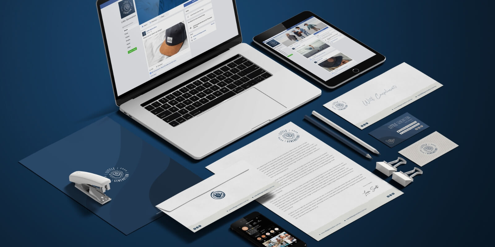
Why this is great news for us
Although they’re less well known outside of our industry, the LogoLounge books are a huge deal to designers. Having even a single logo included is a huge accolade, and to have 7 accepted into the book from our first time submitting is actually quite overwhelming.
We design branding elements to delight our clients and their customers, but it’s always great to hear that our work is respected within the graphic design community. Each logo is assessed by a panel of industry experts, meaning that some pretty impressive people have seen our work and been impressed by it.
LogoLounge describes their books as featuring “the leading edge of identity design created by highly accomplished and noteworthy up-and-coming designers from around the world.” Having our work included is a huge feather in our cap and will help to spread the Red Kite name far and wide.
Why this is great news for our clients
According to Gardner, “successful branding companies and designers understand how to bridge the objective and subjective” and that’s exactly what we aim to do with every design we create.
For our clients, seeing that our work has been so highly commended gives them the peace of mind that we’re a branding agency with the skills, creativity and keen eye required to realise a concept and ensure that the end result is something they can be proud of. In particular, for our clients whose logos made it into the LogoLounge book, this is a huge boost in awareness. Not only will their brand be immortalised in LogoLounge’s archives, they get some pretty cool bragging rights about the quality of their logo design.
Our winning logos
So, here are the seven Red Kite logo designs that were selected.
We have a little bit of everything in the mix: two client-approved logos, four unused logo concepts, and even a side project from our own rebranding.
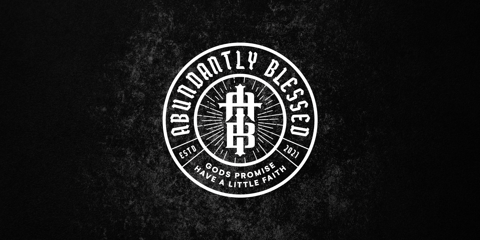
Abundantly Blessed
Abundantly Blessed is a start-up clothing brand by professional basketball player Junior Etou. The line of modern urban apparel aims to spread the word of God, and the message that no matter what your background, everybody is blessed in some way.
The goal with this logo was to create a brand identity that is modern and youthful, but that also speaks to people of all ages, races, genders and backgrounds. Global appeal was also an important factor, as the brand is being marketed in both Europe and the USA.
By weaving the company initials into a subtle crucifix, we strengthened the religious aspect of the brand while also presenting a versatile symbol that looks great when applied to any kind of garment.
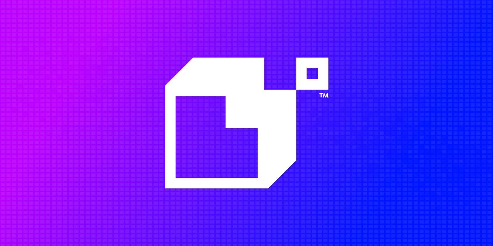
Look What We Built Web Development
We created this logo as part of a larger rebranding project for Look What We Built, providing a new direction following a change of name and some ambitious new goals.
The aim of the project was to create a modern, minimal brand identity that included a strong symbol and felt in keeping with the technological focus of the business. Geometric shapes and minimalist design were key elements that the client wanted us to explore.
This logo uses a 3-dimensional L-shaped building block, providing the initial for Look What We Built. The square in the top corner represents a missing puzzle piece, symbolising the problem-solving nature of the business.
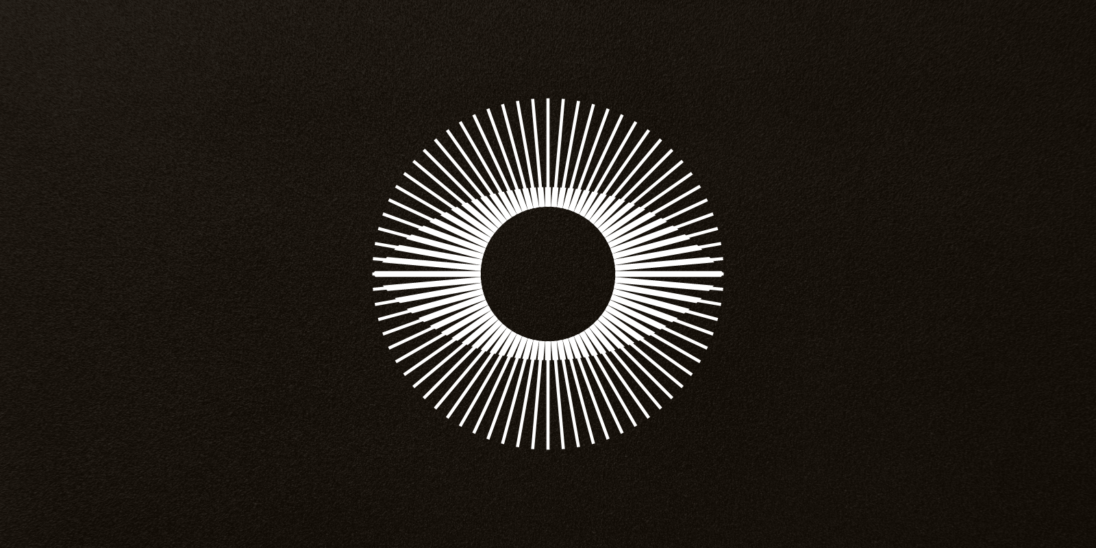
The Beauty Bae Australia
The Beauty Bae offers industry-leading training to brow and lash artists, as well as supplying the industry with high-quality cosmetics products.
Our aim with this logo design was to create a brand identity that portrays The Beauty Bae as pioneers, game changers and an inspiration for the industry as a whole, all while appealing to their core demographic of females aged 25-40.
The final logo is unique, luxurious and sexy, with a memorable abstract eye motif that symbolises knowledge and industry foresight while also hinting at their primary services. We opted for a sophisticated black-and-white palette to provide a high fashion feel.
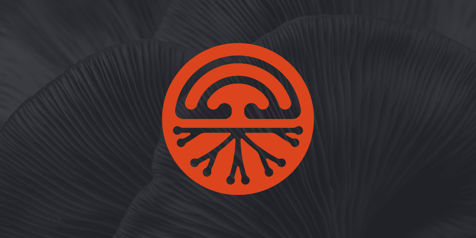
Spore Collective
Spore Collective is a Brisbane-based start-up growing sustainable gourmet mushrooms, which immediately gave us a strong starting point for the logo design.
We wanted to ensure that the brand was modern and youthful, appealing to the ever-expanding pool of consumers who place a great deal of importance on making healthy, environmentally friendly choices.
This logo uses the cross section of a mushroom, showing elements both above and below the ground. We chose a circular shape to represent the petri dishes where the mushrooms are originally grown.
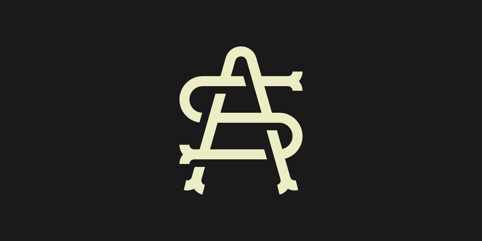
Addicted Society
As a business raising awareness and providing support for those struggling with addiction, it was important that we developed a brand identity that Addicted Society felt comfortable with.
The initial brief for this design was to create a bold, assertive symbol. After a few iterations, we pivoted to a more subtle approach that still felt robust and trustworthy. As well as fulfilling this, the monogram logo is extremely versatile for online and offline use, including branded apparel.
The full logo design uses a youthful badge style to appeal to Addicted Society’s target market of millennials looking for support with addiction of all kinds, including drugs, alcohol, diet and screen time.
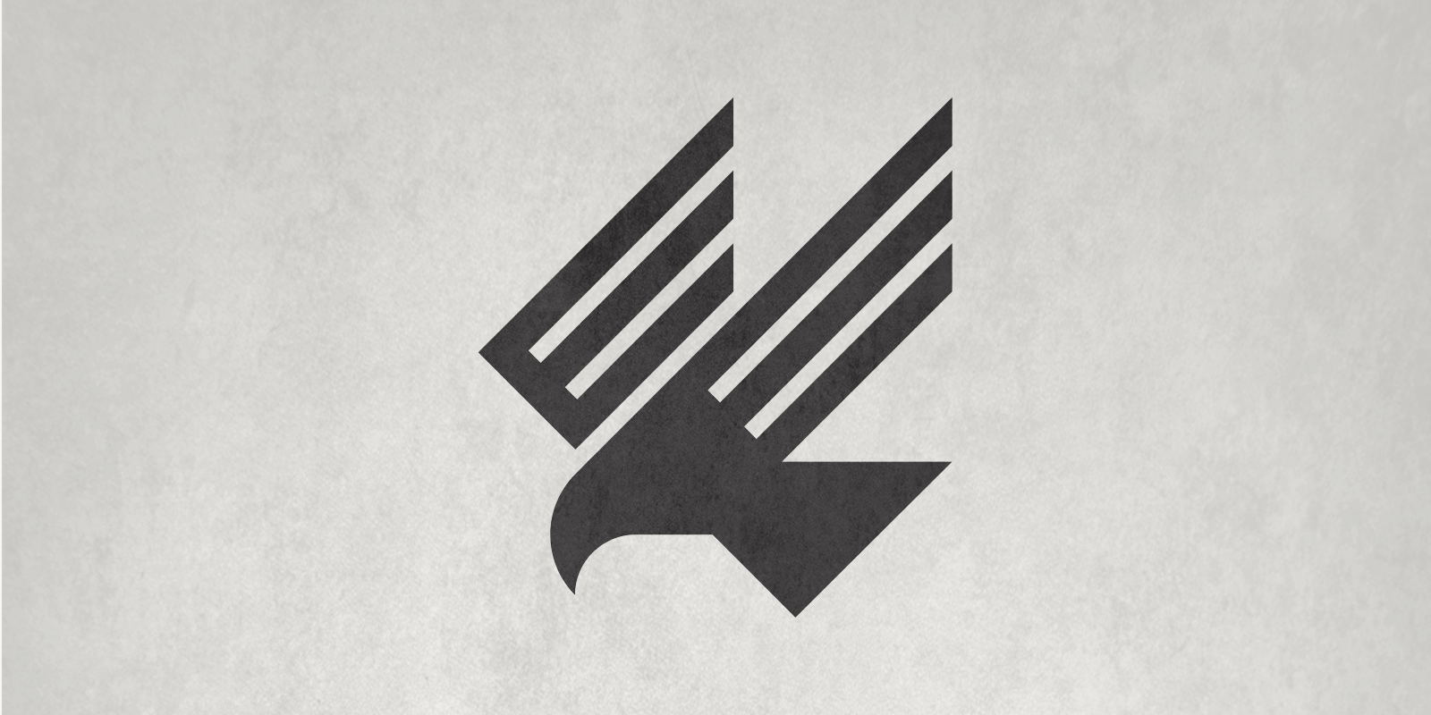
Red Kite
It’s no surprise that we spent a long time playing around with our own logo design. If you head to our Instagram, you’ll find lots of examples of red kites!
This abstract bird design is one of the concepts we created for our own brand, using bold, simple shapes to create a recognisable silhouette.
As well as giving definition and readability to the wings, the diagonal lines provide a sense of movement. Red kites are birds of prey, and this simple representation immediately gives the impression that the bird is swooping down to catch its prey.
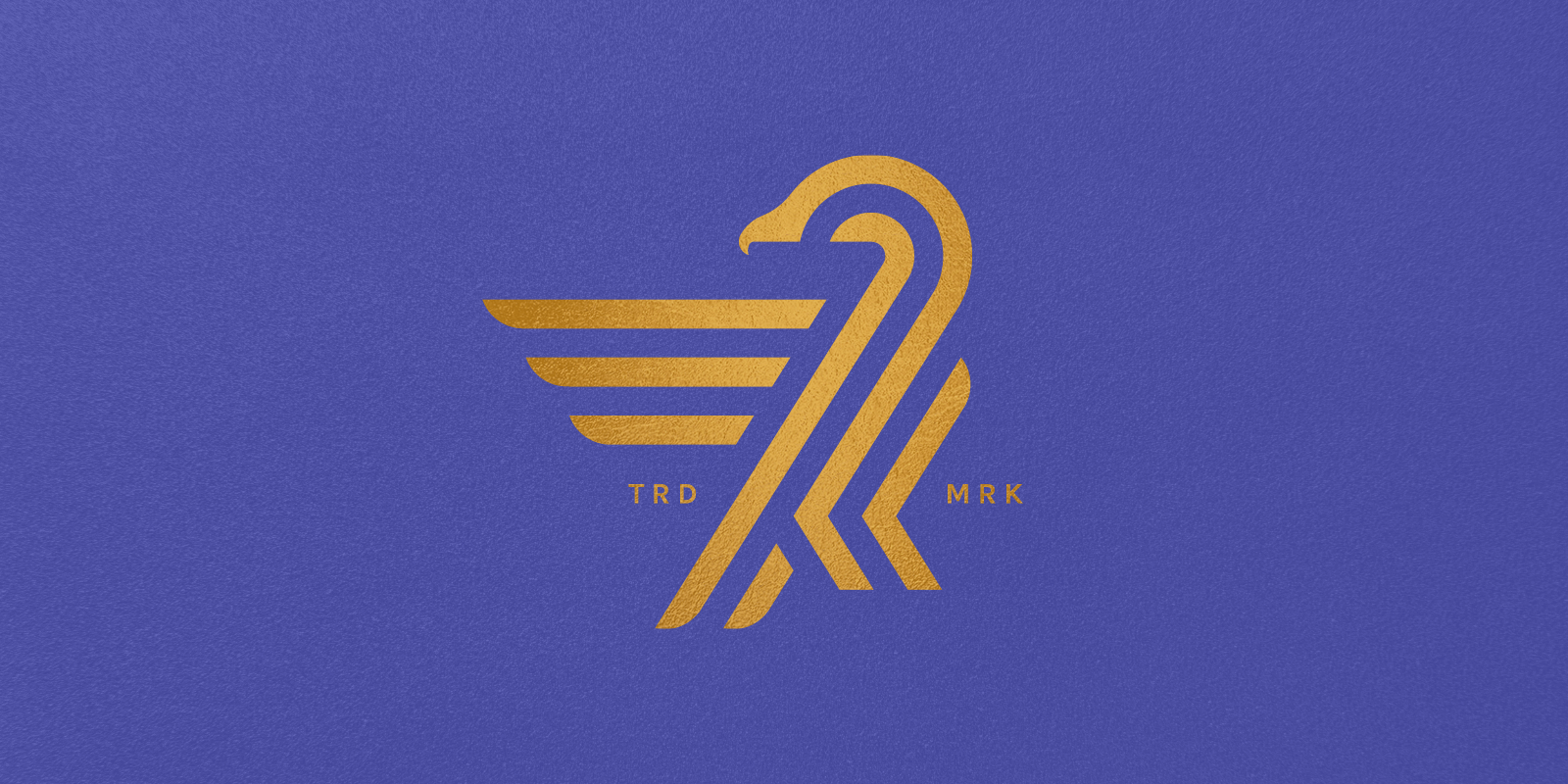
Aquila Air Services
The final logo that made it into LogoLounge Book 13 is a spec piece for an Australian aviation company.
We’re partial to bird designs here at Red Kite, and the flight connection made sense for an aviation concept. The golden logo is paired with a luxurious purple to create a premium, high-end feel.
To increase versatility across large and small formats both online and off, we opted for a minimal, geometric design that would read well on everything from plane tickets and social media posts to full plane wraps.
Want to work with an internationally recognised brand agency?
If you’d like to put your brand in the capable hands of an award winning logo designer, just get in touch and we’ll be happy to discuss your project.
And who knows, maybe you’ll see your brand in a future edition of the LogoLounge book?