
So you’ve learnt what needs to go into a style guide. You know that more is more, and that it’s not just about logos and colours. And it needs to go beyond what your brand looks like online.
If you don’t have a good idea what needs to go into a style guide, read this before moving on.
If you think you’re ready to get your own company’s style guide in the kind of shape that can transform the way you do business, here are five examples that do a great job of putting their brand in the hands of the people who need to market it. Safely.
You shouldn’t necessarily copy the things they do, but you can learn from what they include, the design and voice elements, and the stories they tell about how they want their companies represented at every single touchpoint.
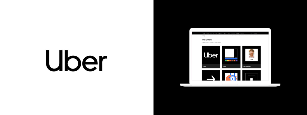
The ride-share giant’s style guide ticks a lot of boxes, especially considering it is a technology company. Tech companies have the tendency to only really talk about what they look like online, but Uber expertly and efficiently displays how it wants its brand to be represented everywhere – online, print, in cars, outdoors. You name it, they cover it.
But the real beauty of Uber’s approach is the number one lesson in creating a style guide: ease of accessibility.
For one thing, anyone can see it. It is housed in a totally public website that anyone can use. That is the kind of transparency marketers dream of. Secondly, that website is super easy to use and navigate, and categorised perfectly and simply to ensure there is absolutely no excuse for marketers or anyone else applying the brand to get it wrong.
The other thing Uber does really well is to present its style guide as a system, rather than just a group of assets that need to be applied. They explain exactly how to use the guide and how the system works, and divide the system into nine, simple-to-follow core elements.
Why is this good? It means Uber controls the narrative and vision of its brand no matter who is applying it and where. An approach that truly drives the enormous intangible brand equity the company has.
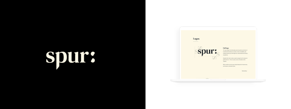
Similarly to Uber, Spur’s style guide is online and highly accessible. But the thing that stands out most with Spur’s approach is the company’s depth and detail that has gone into its style guide.
It goes beyond brand colours and logos, and demonstrates layout principles, illustration styles, photography styles, iconography and, probably most importantly, aligns its values to all of this thinking. That paints its mission, values and voice explicitly for the people using it. It would be harder to apply the brand incorrectly, such is the detail with which Spur has presented its style guide.
One of the most interesting sections talks not about how Spur’s brand should be represented physically, but how those physical elements should be sourced and made. Ethical, sustainable, reusable materials are vital, keeping with Spur’s values. And they demand materials be locally sourced.
The missing parts? Look, the company could include more in situ examples of its brand in action. But when developing a style guide, those things can come later.
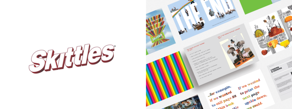
If the job of a style guide is to get the people into your brand’s mindset, then Skittles – in all its manic, insane and saccharine glory – is a diabolical benchmark to which every brand can aspire.
The style guide lives and breathes the brand’s almost bipolar approach to its marketing. Presented as a PDF document, it takes the brand’s mantra of “Taste the rainbow” and puts it into a kind of Jekyll and Hyde, upside-down physical world that lands somewhere between circus nightmare and brain-twisting candy store.
But it does put their brand, its assets, its product line and visual tone into a sharp focus for anyone attempting to decipher it. Skittles makes it clear it only wants truly creative thinkers playing with its brand and campaigns. This is the innate strength of this type of style guide – it sets designers and marketers free within it but still applies constraints to how the brand can be used.
It takes a mature, confident and differentiated brand to create such a masterpiece, but smaller and younger brands can learn a lot from it. You want your marketing to live and breathe your brand’s truly unique pieces? This is how you do it.
See the full, crazy document here.
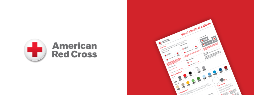
From the sublime, to the exceptionally simple. In a complete 180-degree turn from Skittles, Red Cross’s style guide is everything the Red Cross is itself – pared back, simple, almost spartan. It is, in every sense, a charity’s style guide.
A single PDF page, it focuses on the simple visuals of its brand. Logos, fonts, an array of secondary colours (this is questionable considering their actual name is Red Cross, but we can let that go) and a guide to how it’s all applied.
In the bottom right corner is a succinct but deeply focused tone of voice guide. It does a great job in only a few paragraphs of spelling out exactly how marketers should let the brand speak.
The good things - you can’t mess up the brand’s logo, font and colour applications. It’s so simple.
The bad things? American Red Cross leaves a lot to the imagination, which isn’t always a good thing when it comes to style guides. However, it does a good job of quickly showing what the brand should look like. It just needs some soul and emotion added for good measure.
For those brands about to rock, we salute you.
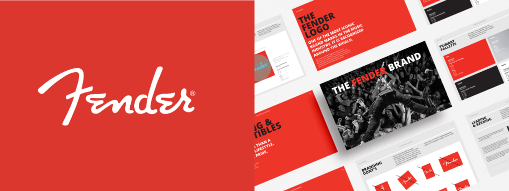
Fender is a legendary music brand known for its world-famous guitars and the incredible musicians who use them. Its style guide acts like a star itself.
Bold, simple but with a swagger only a rockstar can show with a wiggle of their hips, Fender’s style guide is every inch the famous brand, and proves the mantra that “more is more” is, indeed, much more.
In its examples of typography use and design, Fender refers to itself as “iconic”, “the world’s best guitar”, and “the sound that creates legends”. But where this style guide truly knows its audience is in its product application.
Sure, it delves into what its logo and brand should look like on products, but it dives deep into the music industry’s favourite thing – merchandise. A guide shows how it should appear on T-shirts, packaging, hats, water bottles, even the price tags that hang off it all. It’s a great example of the depth a great style guide goes to to ensure marketers get every aspect of its voice, its design and, for Fender, its rock star attitude.
See the guide here.
Read next: What Should Your Perfect Brand Style Guide Look Like?

Article by:
Chris brings over a decade of industry experience to Red Kite working at design agencies in both the UK and Australia. Over the years he has accumulated a wealth of graphic design, strategic identity design and marketing experience. Chris is a hugely passionate identity designer endeavouring to offer the highest quality branding and logo design Brisbane and Australia wide. Chat to Chris about your branding.

We would love to hear more about your design project and how we could help bring your vision to life. Simply hit the button below to get started with a free quotation.
GET A FREE QUOTE