Choosing the perfect logo for your business is never a simple task.
There is no ‘one size fits all’ solution
Selecting the correct type of logo is an important first step when creating or refreshing your company’s identity.
To help distinguish between these different types of logos and understand which may be most appropriate for you, we have broken these into 7 key categories.
Continue reading for a closer look at the 7 types of logo, when each is most suitable to use, and examples of well known companies that utilise each style and why.
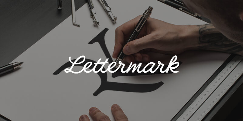
Lettermark
AKA: Monogram
Type: Typographic
Description:
A lettermark logo is an abbreviation of a company’s name using the first letter of each word, otherwise known as an initialism. The letters are pronounced separately, for example the BBC (British Broadcasting Corporation).
Monograms can be a clear and simple solution to communicate your identity, especially common with organisations whose names are lengthy. Condensing it into a bite-sized symbol can make a company’s brand more memorable and easier to talk about.
Lettermarks are generally clean, clear and simple in nature, lending themselves well to use on many applications of all shapes and sizes. Our own ‘RK’ monogram was chosen for this very reason!
When using a lettermark, it is important to be scrupulous with the design. Be sure to use a typeface that is in keeping with your brand. A good logo is unique and unforgettable, so to simply type out the letters in a popular font could leave it open to replication. Customising the characters in some way will make a monogram much more distinctive, helping it stand out from the crowd and appeal to a wider audience.
Best Used:
- To condense businesses with long names of multiple words into a memorable and recognisable initialism.
- When starting out, a typographic logo is great for getting your name known. NOTE: Using the company’s full name in small text underneath a lettermark could be a good idea until the lettermark becomes well known on its own.
- When a logo needs to be replicated across many different applications, especially at smaller sizes.
Examples:
London Symphony Orchestra (LSO) is a good example of an organisation using a lettermark to shorten a long-winded name. The unique custom font is very distinctive, and gives the impression of a conductors flowing hand movements.
H&M is in fact short form for ‘Hennes & Maurtiz’. As the full name is so rarely used, most people wouldn’t know it, however, the H&M mark is so iconic on its own that the brand is even stronger because of it.
NY is seen on caps and merchandise all over the globe, despite the Yankees being a sports team from New York. This beautifully designed monogram is so successful, it has become a hugely popular fashion icon worldwide.
Yves Saint Laurent uses an elegant font well suited to the fashion industry. The interesting arrangement of letters makes it memorable, and using an initialism helps the french language name become more easily digestible in a global marketplace.
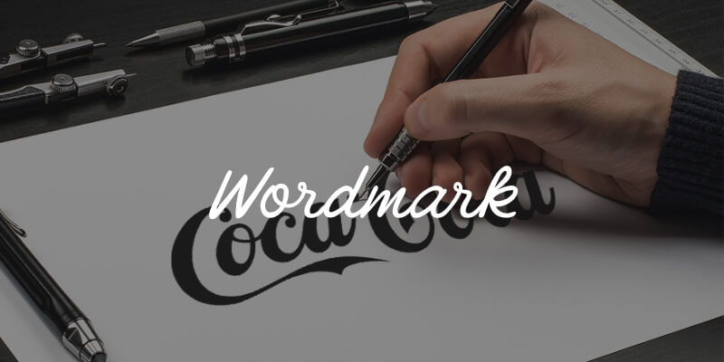
Wordmark
AKA: Logotype
Type: Typographic
Description:
Wordmarks are font based logo designs consisting of an organisation’s name alone, and no accompanying symbol.
Much like monograms, logotype logos work well when they are modern and minimal. Their clean and uncomplicated nature makes them highly versatile, allowing a wordmark to be replicated effortlessly across many mediums and busy backgrounds.
For new businesses, such as start-ups, a wordmark can be better than a lettermark alone as it helps to get the full name out into the world. They are therefore better suited to companies whose names are short (often one word), distinctive and memorable in their own right.
Because there is no symbol to hide behind, it is essential to make sure your wordmark logo uses a well chosen typeface that resonates with your target audience. Be distinctive, but stay on brand; don’t just be different for the sake of it. Also, make sure you are aware of competitors in your space, being careful not to use a mark too similar to another. Having a professional customise a typeface will ensure it is one of a kind, and help a wordmark stand out from the crowd.
When done well, having the company name in a well chosen and beautifully customised font can be one of the most favourable logos for ensuring your brand is remembered. Your audience will recall the name itself rather than recognising a symbol and trying to connect the dots to which company it is associated with.
Best Used:
- When a company’s name is short, distinctive and memorable.
- When a business is new to the market and wants to get their name out there.
- When a logo is required to be used across many mediums and on busy backgrounds.
Examples:
Google have a logo seen by billions of people across the planet on a daily basis. They went as far as creating their own custom typeface, ‘Product Sans’, ensuring their wordmark is unique, modern and in keeping with the technology sector.
The Disney logo is a great example of a custom font tailored to their sector. It’s fun, quirky and cartoon-like features speak volumes about what they do and who their audience is, whilst remaining versatile and easy to read.
Etsy’s mark is another example of a clean, clear and modern logo. Their choice of a customised serif typeface gives it an air of elegance, vintage and traditionalism; a subtle nod to the company’s ethos and arts and crafts origins.
FedEx is a syllabic abbreviation of the company’s original air division, Federal Express. Now its own brand, this logotype looks clean and simple at first glance, but the hidden arrow between the ‘E’ and ‘X’ make it an iconic mark worldwide.
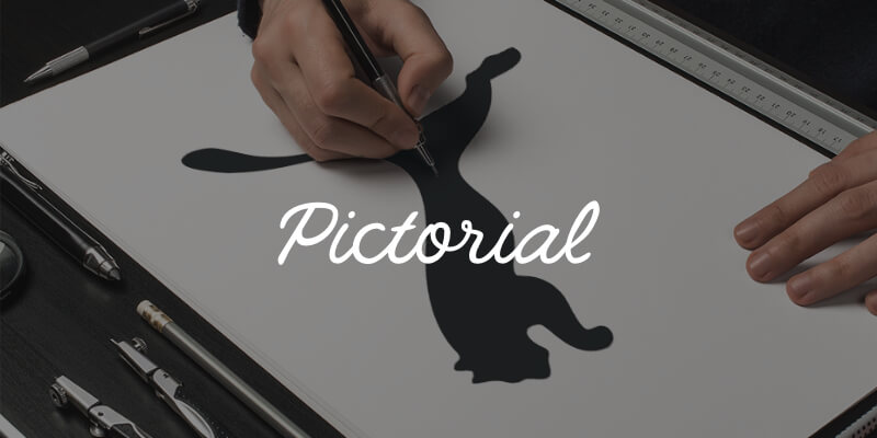
Pictorial
AKA: Brand Mark, Logo Symbol
Type: Picture / Symbol
Description:
A pictorial logo is the opposite of the aforementioned typographic marks and consist of an icon or graphic of a recognisable item or object alone, with no accompanying text.
Logo symbols use an emblem that represents a company. This does not necessarily mean it is a literal depiction of what a business does, or the services they provide. Brand marks can draw inspiration from many places, and so long as the chosen symbol is appropriate for your sector, resonates with your target audience, and is unique and not over-complicated, they will work well.
Some organisations chose to use a graphic that literally depicts their name, such as Target or Apple. Others may use a symbol which literally illustrates what they do, such Major League Baseball’s batter silhouette. Communicating what you do using a recognisable symbol can be a great way to combat a long or complicated name, and can also transcend boundaries such as language or cultural differences.
Contrary to these more literal representations, it is becoming increasingly common to diversify by devising a brand mark with a deeper meaning. A business’s history, location or unique characteristics are excellent sources of inspiration, and can be used to create a distinctive and memorable symbol that tells your audience a little more about your organisation and its values.
The challenge of creating a good pictorial logo design is to take recognisable everyday objects and turn them into a stylised symbol unique to your business. It can sometimes be difficult for new companies to establish their identity in the market using a brand mark, as it is purely an image. Before you truly have brand recognition, people may struggle to remember who you are.
Best Used:
- When a brand is well recognised within its sector.
- When simplifying and modernising a brand’s identity for greater versatility.
- To convey what a business does graphically if it has a long or complicated name.
- When operating internationally and your business name doesn’t lend well to translation.
Examples:
NBC’s colourful peacock is an iconic symbol the world over. Whilst it does not immediately communicate that they are a national broadcasting network, it is modern and memorable. The colours in fact represent their revolutionary switch to colour programming, and the different divisions of the organisation.
Apple’s logo began as a complicated emblem, evolved to the multi-coloured apple and has gone through several colour and style variations in its history. The bigger the company became, the simpler the logo, the plain black apple silhouette now one of the most distinguishable symbols on the planet.
Major League Baseball’s brand mark is an example of a long name being condensed into a clear, simple and attractive graphic. It is highly distinguishable as a symbol and clearly depicts what the organisation are about, spreading recognition for MLB on merchandise across the globe.
WWF’s (World Wildlife Foundations) negative space panda icon is a stand alone symbol for the organisation. Inspired by Chi-Chi the Panda in residence at London Zoo in 1961 when they were formed, this highly distinctive symbol was the perfect mark to communicate what they stand for and overcome language barriers.
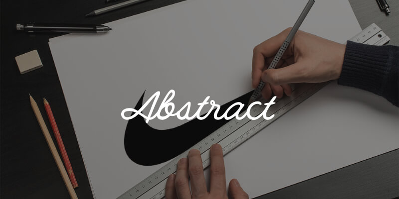
Abstract
AKA: –
Type: Picture / Symbol
Description:
An abstract logo is much like a pictorial logo, using a stand-alone icon or graphic as a symbol for an organisation. Unlike a brand mark however, an abstract logo does not comprise of a recognisable object, but is instead an impressionistic symbol exclusive to that company’s identity.
Where Apple’s icon is a clear pictorial representation of the fruit, Pepsi’s coloured bands do not embody anything as literal. The swirling red, white and blue sphere is purely a custom abstract icon with no direct connotations, yet has become one of the world’s most recognisable brand identities.
Using an abstract logo mark allows a business to condense their brand into a single identifiable and truly unique mark, with far less chance of similarity to, or confusion with, a competitor.
Choosing an impressionistic symbol rather than literal representation may also allow for greater flexibility in the long run, especially if there is a chance a businesses direction or services may change. If a company was to start out exclusively in charter yachts, but later expanded and specialised in aviation, having a boat in their logo may no longer be suitable.
Your mark can still convey what your company does symbolically, through the use of colour and form, and without cultural implications that can often be tied to well known items and objects. The universal appeal of an abstract logo can make it a great choice for businesses wanting to stand out from the crowd and transcend international boundaries.
Understanding how to communicate certain ideas purely through the use of colour, shape and structure can be a challenge, and requires a solid knowledge of the core design principles. To make sure an abstract mark is the right fit for your company and its goals, using a design professional is a wise choice.
Best Used:
- In a crowded sector or market where a truly unique symbol is important to stand out.
- In global commerce where a symbol is needed that is immune to cultural diversities.
- If a business anticipates that the direction of their products or services may change in the future.
Examples:
Nike’s swoosh is an abstract mark loosely resembling a check/tick icon. Its dynamic form is well suited to the sporting sector, implying movement, freedom and positivity, tying in perfectly with their ‘Just Do It’ slogan.
Mastercard only recently decided to completely strip back their logo, leaving just the two simple interlocking red and yellow circles. This symbol of security, trust and confidence is powerful and recognisable, despite its simplicity.
Chase Bank’s iconic octagon is an abstract mark, yet still has an interesting backstory tied to their history. Originally named ‘The Bank of the Manhattan Company’, their mission was to deliver fresh water to New Yorkers. The shapes symbolise the original wooden water pipes laid in the late 1800s, and the company’s lesser known origins.
The Adidas ‘trefoil’ is a mark that is worn on apparel around the globe. Loosely resembling a leaf, the three points are said to represent the company’s three core values; diversity, power and growth. Above all, it is a unique and beautiful mark that transcends boundaries and appeals to a diverse target audience.
Mascot
AKA: –
Type: Picture / Symbol
Description:
A mascot logo uses a character or spokesperson who represents the face of the brand. Depending on the business and its target audience, the style and inspiration for this mascot can vary from a completely fictitious character, to a real person who is an icon of the company, for example the founder.
Mascots are most commonly seen in sectors such as food and beverage, sports and the entertainment industry. Companies who wish to appeal to families and young children will often use this style of branding as it resonates well with their clientele and offers great opportunities to connect with their audience on a more personal level.
Having an ambassador for your business who you can communicate your brand values through is a great tool for use in advertising, social media campaigns and even at events. Almost every sports team has a mascot which is a fantastic way for clubs to engage with young families as well as their adult fanbase.
As an illustrated character, the style can differ from colourful, cartoonish and fun when appealing to families, to a more sophisticated interpretation aimed at an older market. Whichever direction is chosen, a mascot logo design is only ever one part of a successful brand. The detailed nature of a mascot logo does not always lend well to every application, especially those of smaller resolutions.
Best Used:
- When targeting families and wanting to create a wholesome feel to your brand.
- When wanting to encourage customers to interact with your organisation.
Examples:
Family restaurant KFC’s illustration of Colonel Sanders, their iconic founder, is a great example of an extremely successful Mascot logo. His highly distinguishable features make him the perfect man for the job, whilst highlighting the company’s rich history and authenticity.
Captain Morgan Rum is an example of a company using a mascot logo within the food and beverage sector, however, aimed at a very adult market. Named after a welsh privateer of the Caribbean, ‘Sir Henry Morgan’, their mascot draws on the history of the industry and authenticity of their exotic ingredients.
Monopoly’s ‘Rich Uncle Pennybags’ has been around since 1940. Through changes to the name of the game itself, the mascot remained the same, bar some minor moderations to the illustration style. Uncle Pennybags has truly withstood the test of time and Monopoly is still a family favourite and boardgame staple nearly 80 years on.
Mr Muscle is an example of using a mascot in a different market sector. Their super hero character is used in their ad campaigns to clearly communicate their brand values of power and reliability. This macho man persona is synonymous with the strength of their cleaning product.
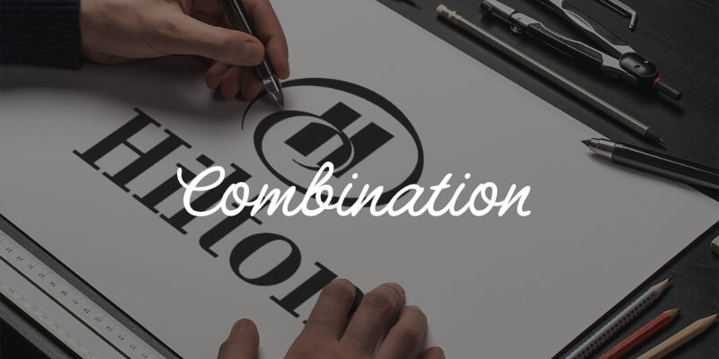
Combination
AKA: –
Type: Typographic + Pictorial
Description:
Perhaps the most commonly used logo is the combination logo. This is comprised of a typographic mark (lettermark or wordmark) alongside a pictorial element (symbol, abstract or mascot). These components can be side by side, stacked on top of one another or even mixed together.
In this instance, the text and symbol work together to reinforce a brand, and can be a great choice for any business whether a fledgling startup or a longstanding corporate. Unlike when these elements are used in isolation, people will begin to associate the company name with a pictorial mark straight away. This can often help to grow and maintain brand recognition more than a pictorial mark alone.
Starting with a combination mark maintains the option to strip back an identity or use elements independently at a later stage, once your audience becomes more familiar with your brand. For this reason it can be a highly versatile choice for any business.
Combining a symbol with a wordmark also offers more opportunity to differentiate from competitors. A combination logo of letters and graphic elements together will often result in a more unique mark, which can also make it easier to trademark.
Best Used:
- When wanting to create a truly unique mark that will be easy to trademark.
- When versatility is important across many applications.
- When wanting to create instant brand recognition.
Examples:
The Burger King logo is an example of a combination mark where the typographic element and symbol have been cleverly mixed to create one strong and highly unique brand identity; the typography making up the patties in the bun.
Microsoft use a side by side combination mark. The four panes of the window represent the different components of the business; Windows, Office, Xbox and Surface, and is often used in isolation of the text.
Amazon’s logo may at first glance appear to be a wordmark, however it is also a combination logo. Their subtle arrow from ‘A’ to ‘Z’ symbolises their huge range of products and reliable delivery service.
Lacoste is one of the most recognisable clothing brands in the world. The distinctive crocodile paired with a clean and modern logotype is a classic example of a combination mark that just works.
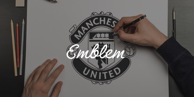
Emblem
AKA: –
Type: Typographic + Pictorial
Description:
An emblem is a specific type of combination mark where a font is displayed inside a symbol or an icon. Inspired by crests, seals and badges, these are often more traditional in appearance and are very common with schools, organisations and government agencies.
Although emblem logos have quite classic associations, this does not mean they must have a traditional appearance. Drawing inspiration from their time-honoured origins, we now see many examples of emblems being modernised to appeal to 21st century audiences.
Whilst emblems are still most common in public agencies like schools and government, they are increasingly popular in other sectors such as food and beverage. The rise of the hipster scene has inspired modern twists on emblem logos on beer labels and coffee cups around the globe.
Whilst an emblem can be a unique and highly stylised logo, the level of detail that is often involved (text and symbol intertwined) can mean that they are not always the most versatile of marks. An emblem is often a common choice for companies wishing to embroider their logo, however, this as well as any applications at small sizes, requires a fairly clean and simple approach to work well. A great emblem can form a strong identity but will often need well-designed supporting brand elements to translate effectively across all mediums.
Best Used:
- When a more traditional and professional appearance is desirable.
- When wanting a unique and highly stylised identity to stand out in a crowded marketplace (e.g. food & beverage sector).
Examples:
Starbucks is arguably the most famous emblem on the planet. Their logo combines a clear modern typeface with the iconic twin-tailed mermaid into a modern and distinctive badge that looks great on everything from coffee cups to storefronts.
Another industry where emblem logos are commonplace is the automotive sector. Harley Davidson’s clean and simple crest has changed several times over the years, but eventually reverted back to a modern take of their original 1910 emblem. The choice to maintain this mark is a clear nod to the company’s rich and successful history.
Almost every school around the world uses an emblem style logo, often highly detailed and intricate. These marks are synonymous with words like distinction, quality, history and achievement. Hogwarts school of witchcraft and wizardry is no exception.
General Electric’s emblem is an example of a modernised and stripped back interpretation. Formed in 1891, an emblem is a great choice for any long established organisation clearly communicating authority, prestige and tradition to their audience.
Even after breaking down the different types of logo designs and when they are best used, it can still be difficult to determine which logo would best fit your business. Some companies may be suited to more than one type of mark, and determining which will work best for you may require a deeper dive.
Who is your target audience and what would best communicate your message to that market? What is unique about your business and how can you tell your story? How can you create brand recognition whilst maintaining a unique identity?
If you would like help answering these questions, and choosing which type of logo is perfect for your business, We’re here to help! Drop us a line at [email protected], or request a quote.