The key objectives of any logo design are to catch the eye of your target audience, stand out from your competition & be versatile enough to apply gracefully across any and all applications your business may require.
For a deeper dive into what makes the perfect logo, check out our 'What Makes a Great Logo' article.
The process of creating a logo that ticks all these boxes can be difficult and stressful, especially if you’re not familiar with the core principles of graphic design. You may have a logo that you just aren’t happy with but can’t quite put your finger on what it is that needs to change.
To help you answer that question, here is a list of my top 6 tips for how to get your brand back on track, and give you a great logo that will stay looking fresh and serving your business long into the future.
Don’t add more to your logo, strip it back!
When creating a logo it can be tempting to try to communicate as much information as possible as to what your business does and what your customers need to know about you. In actual fact, it is much more beneficial to remove as much information and as many elements as you can, leaving only a unique mark that resonates with your target audience.
You can see below this is exactly what Shell have evolved towards over their 100+ year history.
![]()
The less going on, the easier it is for people to recognise your logo at a glance and commit your brand to memory. A great test of this is the ‘Sketch Test’. Show your logo to people who have never seen it before for 10 seconds. Cover the logo and ask them to draw it from memory. If they can do this easily then you know you’re on the right track!
Every logo is different. Some elements may be integral to your brand and hard to remove. Common components that can often be simplified are:
Now that we have stripped away unnecessary elements in our logo design, we can give what is left a little room to breathe.
Giving purposeful space between the different components in your logo helps it become more digestible and easier on the eye. This is especially noticeable when we reduce a logo to smaller sizes, such as in a website header. Run your eyes over the Windows logos below and see which one is the easiest to read.
![]()
You never know what applications your mark may require in the future and keeping it clean and clear will ensure it is ready for anything!
Also worth taking into account here is that it is becoming more common to see logos used on top of busy and bold backgrounds. To do this, it is best to have a mark that works well as a silhouette (all one colour). Giving the elements of your logo room to breathe, rather than having pieces that overlap or intersect, can ensure that your brand will look instantly recognisable and attractive, even in silhouette form.
Think outside the box!
Perhaps your logo needs a little more of a shake up, rather than stripping back or simplifying what you already have. Instead, we can use the ideas above and apply them to a new symbol to represent your business.
One of the key objectives we mentioned was to make sure your logo stands out from the competition. In many sectors, there are symbols and elements that we see over and over again.
A good example is Starbucks. Many coffee chains and cafes use variations of coffee beans or cups in their logo. Starbucks well and truly bucked the trend with their iconic twin tailed mermaid.
![]()
Try to think of something that sets you apart from the rest of the pack. If everybody else is using a similar symbol, use something else instead. If everyone else is using dark colours, go bold and bright.
Of course, we still want our new logo to appeal to our target audience. Whilst we want to break from the mould, we don’t want to alienate our audience, so make sure the symbol, colours and message we communicate still meets those three key objectives!
When choosing a symbol to represent your brand it doesn’t always need to be a literal depiction of exactly what you do.
If we took some of the worlds biggest brands and showed them to a person who had no knowledge of them, they would struggle to describe what those companies did from the logo designs alone. This isn’t a bad thing. So long as your logo appeals to the desired target market and is memorable, then you are on to a winner!
Nike uses a swoosh, not a pair of running shoes.
Starbucks doesn’t incorporate a coffee cup or beans.
McDonald’s golden arches don't have a burger in sight.
![]()
Moving away from the literal can be a bit daunting. “If I’m not going to use what I do, then what do I use instead?!” is a common question I've heard many times. Step 5 may help get the creative juices flowing.
Rather than showing exactly what you do, your logo design can instead say something about your business and its values.
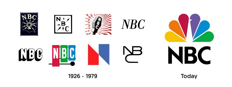
A great example of this evolution process in action is NBC. Their early logos feature broadcasting equipment, but later switch to a peacock, highlighting the network's then revolutionary colour programming.
Every company is unique in one way or another. Below that surface level of the service or product you provide, there is something that sets you apart from your competitors. Use that point of difference as inspiration for the symbol that represents your organisation. Some avenues to explore might be:
Communicate your brand values through a symbol that says something about your business and only your business. Use complementary colour palettes and well matched typography to help show your audience the kind of company you are, and what you represent.
When you finally have a logo design you love, you want your audience to see it looking its very best at all times.
Objective one and two are now well and truly ticked off. Your logo is clean, clear, eye catching and stands out from the crowd. Now make sure that you are always showing it in its best light.
There are many ways a mark can be used and each application can require your logo in a different file format so as not to become distorted or discoloured.
To ensure your logo is as versatile as possible, it needs to be created as a vector file using software such as Adobe Illustrator. This will allow the logo design to scale infinitely from a postage stamp to a billboard without any loss in quality or pixilation.
Keeping your brand colours consistent is also important. Make sure when providing your logo for print materials you use a version with the CMYK colour profile. For use on screens, RBG is required.
Having your mark ready to go as a vector graphic, PNG and JPEG, and in both CMYK and RGB colour profiles, should mean your logo is ready for any application!
I hope these tips have helped inspire you to see potential in your brand’s identity. Your logo is not lost, it just needs some love!
If you're still not sure exactly how to breathe life back into your logo, or would like to start afresh, we are here to help! Drop us a line at info@redkite.design, or request a quote.

Article by:
Chris brings over a decade of industry experience to Red Kite working at design agencies in both the UK and Australia. Over the years he has accumulated a wealth of graphic design, strategic identity design and marketing experience. Chris is a hugely passionate identity designer endeavouring to offer the highest quality branding and logo design Brisbane and Australia wide. Chat to Chris about your branding.

We would love to hear more about your design project and how we could help bring your vision to life. Simply hit the button below to get started with a free quotation.
GET A FREE QUOTE