What makes some logo designs better than others?
At first glance this can sometimes be confusing, and this is because there are often natural misconceptions about exactly what a logo should be.
Common assumptions are: a logo should communicate exactly what a business does; it should, above all else, be pretty - after all it is a piece of visual design and a symbol for your business; and it must appeal to everyone, most importantly the business owners themselves.
None of these statements are necessarily accurate, nor are they what truly make a great logo.
At the heart of it, a great logo is comprised of 3 key ingredients:
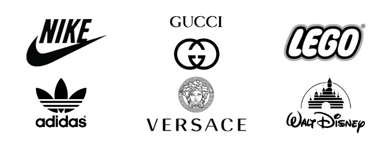
For a logo design to be considered great it must firstly be relevant, in terms of feeling and personality, to the unique requirements of the sector which it serves. There is a reason that brand identities within the same industry ‘feel’ similar.
That particular style resonates with their consumers. To sway too far from this would be to risk losing touch with their target audience.
Sporting brands like Nike and Adidas use fonts and symbols that are bold, chunky and dynamic. On the other hand, brands in the fashion industry are naturally more elegant and subtle in their approach.
A good logo must therefore communicate a feeling in line with what your brand represents. It may communicate your values and what you stand for, but does not need to say exactly what you do. So long as it resonates with your target audience, it is achieving one of its key objectives.
A great mark is one you remember.
Although a good logo needs to be appropriate to its sector, it does not mean that it must look the same as all of the others around it. If it simply blends into the crowd it will not be a brand consumers remember above its competitors.
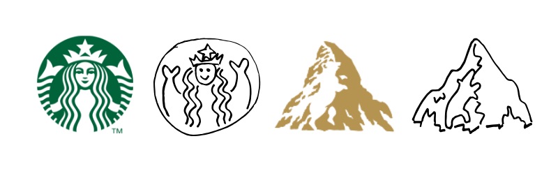
A good logo is one that is memorable, and this distinction can be achieved in different ways. Starbucks’ unusual symbol of a twin tailed siren is one you wouldn’t forget in a hurry, but still feels very much in keeping with the pictorial emblem style common within the food and beverage sector.
Look a little closer at the Toblerone logo and you might spot a bear hidden within its iconic mountain. Thinking outside the box like this is a great way to set yourself apart from the competition.
If it is distinctive enough it is more likely to stay in someone's mind after only seeing it a couple of times.
An excellent test of this is the ‘sketch test’.
Show your logo to people who have never seen it before for 10 seconds. Cover it and ask them to draw it from memory. If they can do this successfully then the logo is on the right track.
There is, however, one more factor that may influence the effectiveness of a logo and the outcome of a successful sketch test.
Perhaps the most important ingredient of all is ensuring a logo is uncomplicated. A symbol can remain simple whilst still achieving distinction. Striking a balance between these two traits is the real mark of a successful logo.
As suggested above, simplicity has a big impact on how memorable a logo is. We often only glance at a mark for a few seconds and if there is too much to take in it simply won’t be absorbed.
If we take a look at the biggest brands in the world today, you will see a definite trend towards simplicity in their identities.
The bigger the brand the simpler the logo. This is no coincidence.
There are many good reasons that this decision was made and why others should follow in their footsteps.
![]()
An important factor also influenced by a marks simplicity is its versatility.
Today more than ever, logos are required to look good over a myriad of different applications. Whether it is shrunken to the size of a mobile app icon or blown up on the side of a building, you want your logo to look it’s best, whilst preserving legibility.
A mark that is over cluttered and complicated will inevitably lose lucidity and detail, especially in instances where it is used in small sizes.
Although it may not be required in all applications now, keeping a logo simple will ensure it is future-proof and ready for anything!
![]()
As well as retaining longevity in terms of their application, simple logos have a far better chance of withstanding the test of time.
Sticking to clean and uncomplicated elements that do not follow the trends of that time will allow a mark to age gracefully. Whilst it may feel ‘plain’ or ‘boring’, simple logos can become truly iconic over time.
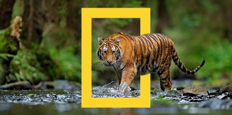
A great example of this is the National Geographic rebrand. Initially stakeholders argued that losing the globe in favour of a simple yellow rectangle was moving away from anything that represented what the organisation was about.
After some gentle persuasion, they agreed to move ahead with the new identity. It is now arguably one of the most well-recognised and iconic symbols on the planet.
In establishing these 3 ingredients for what makes a great logo, we have of course learned a great deal from those that missed the mark along the way.
Finding the sweet spot between these ingredients is a balancing act, and a difficult one. Tipping the scales a little too much in one direction can result in a logo that isn’t well received, and a wrong fit for any business.
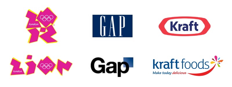
One example of this is the London 2012 Olympics logo. Whilst certainly distinctive and memorable, it was met with widespread criticism.
The public argued it was garish and illegible, whilst it even came under scrutiny at a political level for its resemblance to a swastika and the word ‘Zion’ (offending the Iranian government as an apparent pro-Israeli conspiracy). It’s safe to say this symbol was not appropriate or fit for purpose.
Another example of logo design gone wrong is the Gap rebrand. The word Gap in a serif font surrounded by blue is a symbol recognised the world over.
In 2010, the company rolled out a rebrand pairing their symbol back to a sans serif, 'Helvetica-esque' typeface and small blue box behind the ‘P’. Whilst this is the definition of simplicity, they lost what made them distinctive and upset thousands of loyal consumers in the process.
This move towards uniformity over distinction and appropriateness was a big miss, and was reverted six days later.
Contrary to Gap's rebrand, Kraft Foods went too far in the other direction. In 2009, Kraft decided to roll out a new identity, ditching their bold and well-loved blue and red symbol for a uninventive and over-complicated starburst.
Making their name longer, adding a tagline, including more colours and changing the simple border for a strange and generic firework was all unnecessary clutter and didn’t sit well with the critics. In an attempt to make themselves more distinctive, Kraft lost the simplicity that appealed to their consumers.
After a curious rework of the rebrand, and four logo designs in as many years, Kraft eventually reverted back to a variation on their original mark.
From observing these businesses at both ends of the spectrum, it is clear that not all logos are created equal.
Putting the time and resources into creating a mark that meets the unique requirements of your business is extremely important.
Striking the perfect balance of the three key ingredients; appropriateness, distinction and simplicity, will allow for the makings of a symbol you can confidently carry into the future.
If a logo design resonates with the target audience in your sector, is memorable enough to stand out from the crowd, and is intrinsically simple to allow for versatility and longevity, then you will truly have a great logo!
I hope this article has helped you distinguish between what makes a logo good, bad and great. Sometimes there is a fine line.
If you would like some help cooking up a recipe for a great logo you can call your own, Red Kite are here to help! Drop us a line at [email protected], or request a quote.

Article by:
Chris brings over a decade of industry experience to Red Kite working at design agencies in both the UK and Australia. Over the years he has accumulated a wealth of graphic design, strategic identity design and marketing experience. Chris is a hugely passionate identity designer endeavouring to offer the highest quality branding and logo design Brisbane and Australia wide. Chat to Chris about your branding.

We would love to hear more about your design project and how we could help bring your vision to life. Simply hit the button below to get started with a free quotation.
GET A FREE QUOTE