“Chris is an articulate, knowledgeable and very reliable designer.”
Sam Campbell
Managing Director
Project overview
Branding that means business. Say hello to HelloQuota.
HelloQuota isn’t your typical recruiter. They’re laser-focused on the sales industry—connecting high-performing candidates with top-tier businesses across Australia and New Zealand. Alongside their recruitment services, they also deliver online training programs to sharpen sales skills and set new benchmarks. They needed a fresh, distinctive brand that could hold its own in a crowded market while appealing to a younger, ambitious audience. We developed a modern brand identity from the ground up—including a custom logo, visual and verbal identity, digital presence, and a full suite of marketing materials—built to attract attention and drive results.
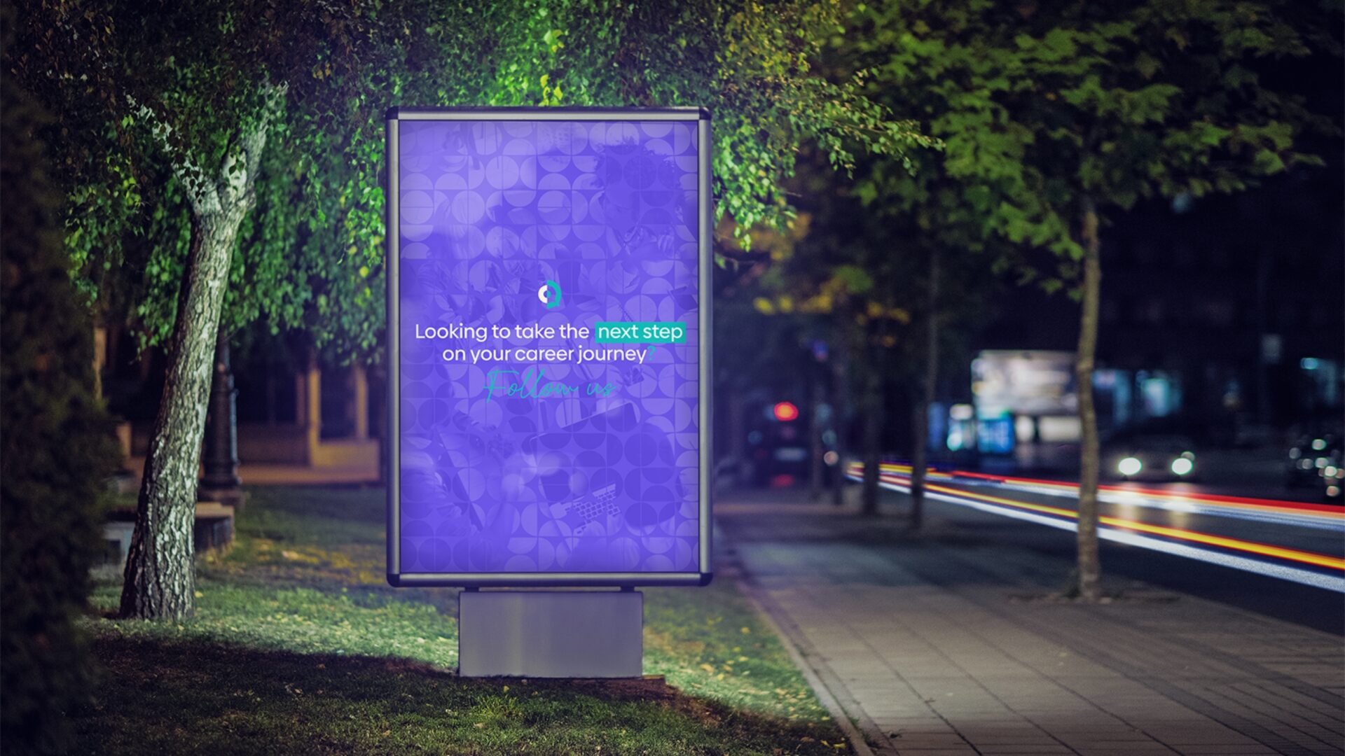
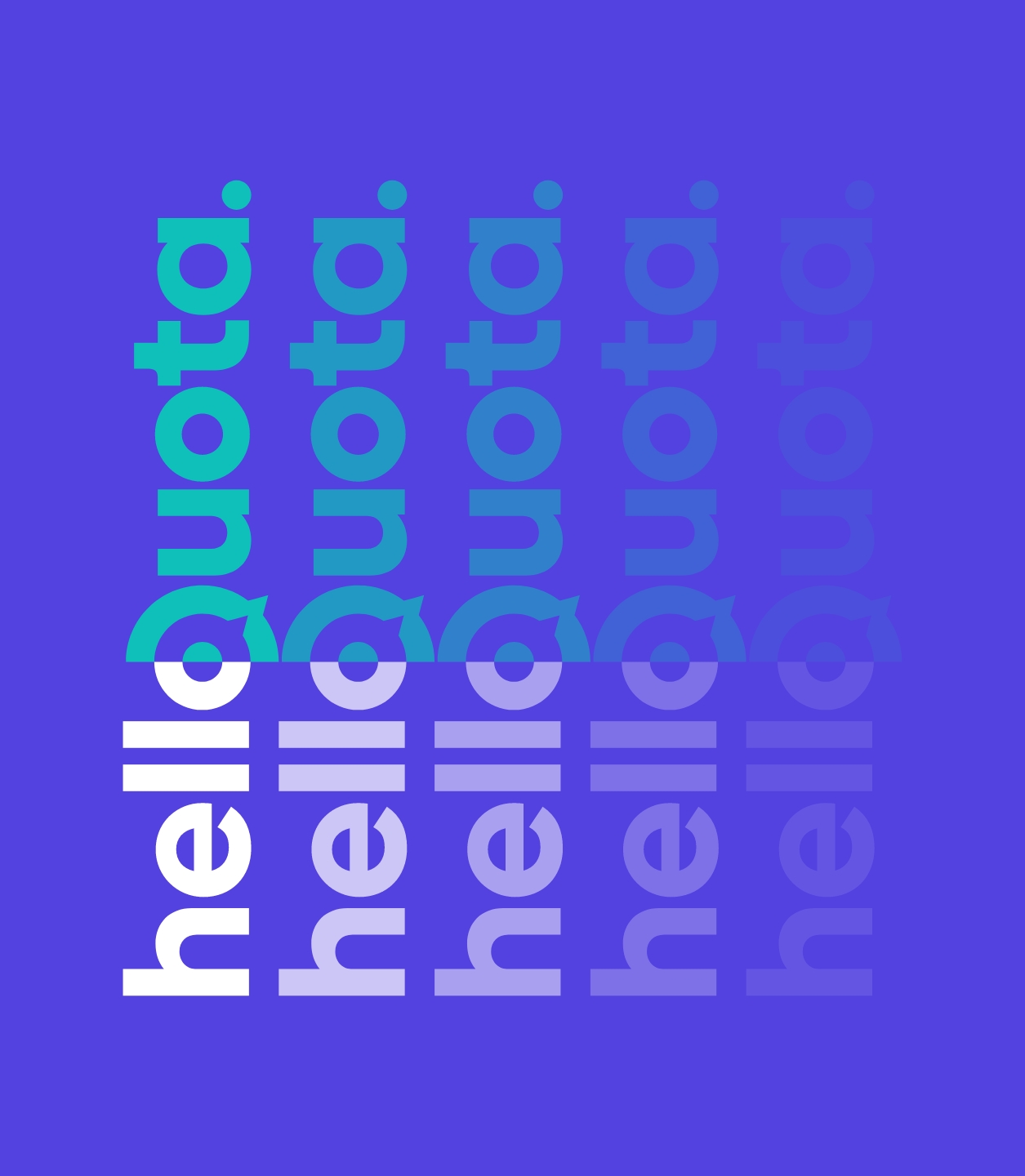
The Q in the logo doubles as a speech bubble—symbolising coaching, communication, and connection. It’s modern, flexible, and designed to stand out in both recruitment and training spaces.
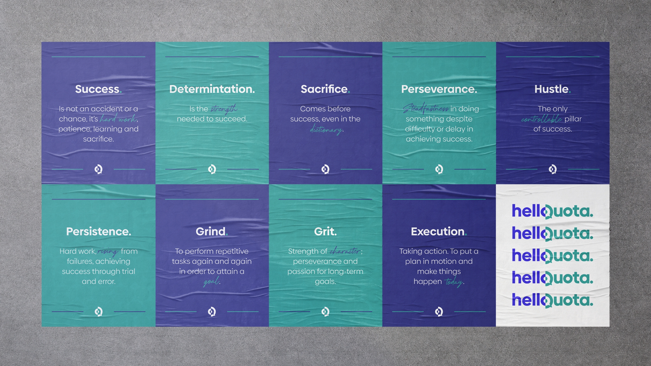
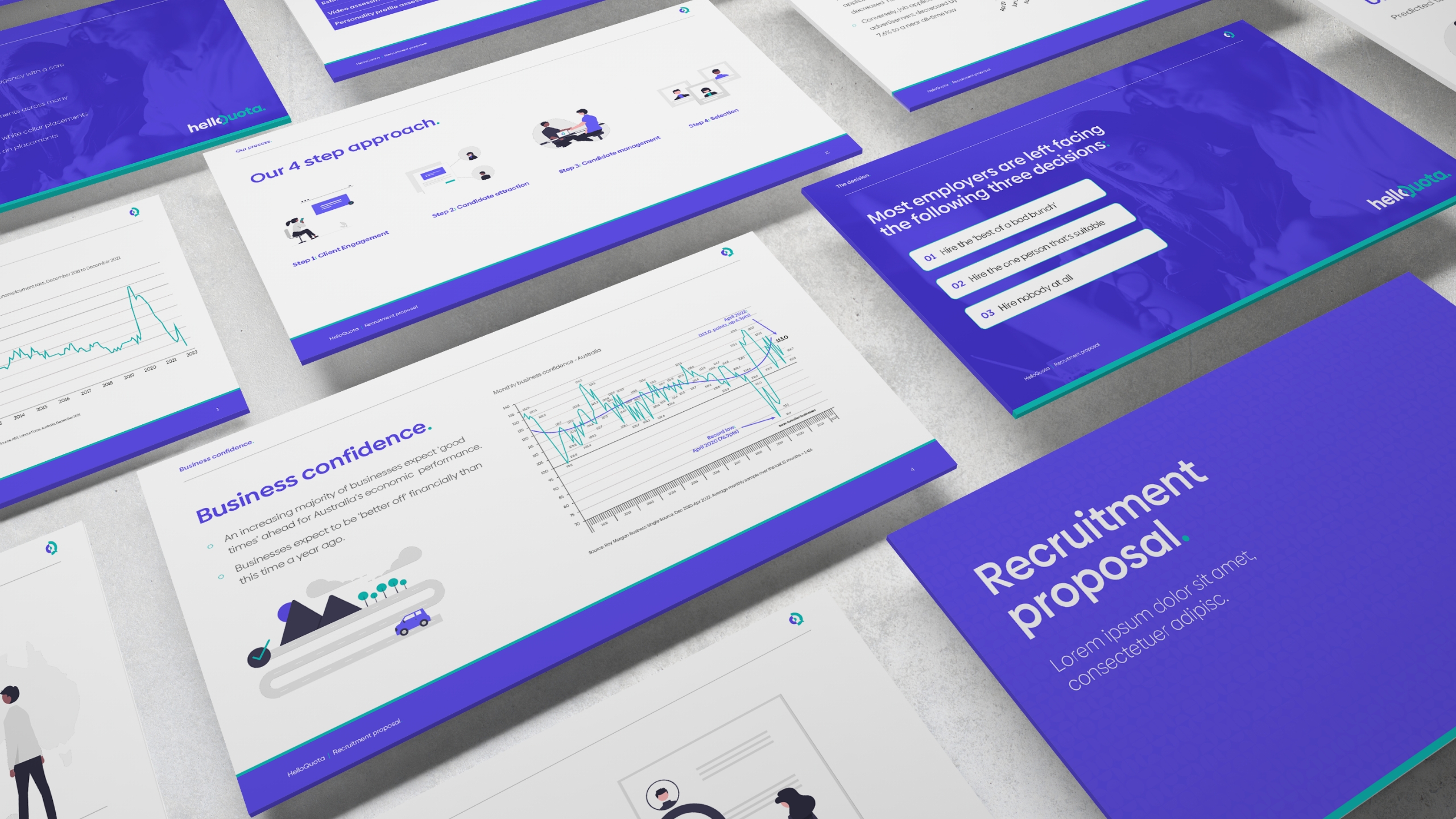
We brought the brand to life visually & verbally
We built a bold identity around vibrant purple and teal, clean type, and modular graphics. Messaging is confident, clear, and sales-focused—designed to cut through and connect.
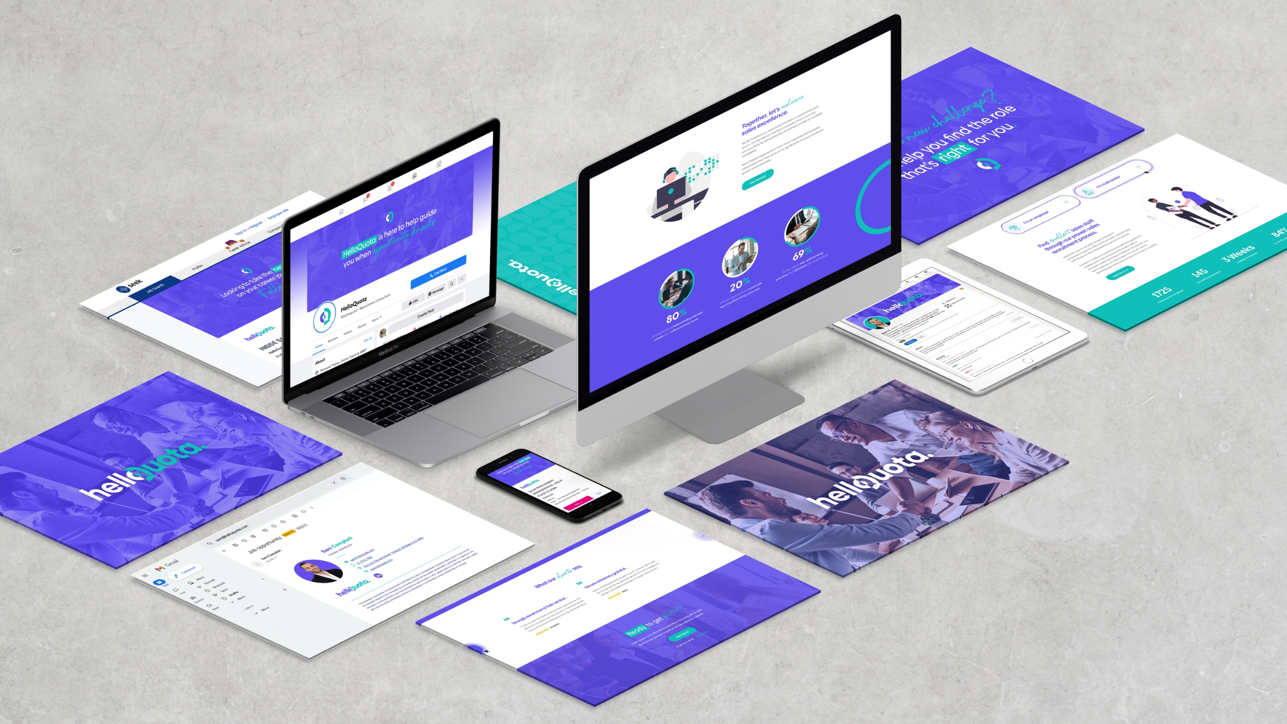
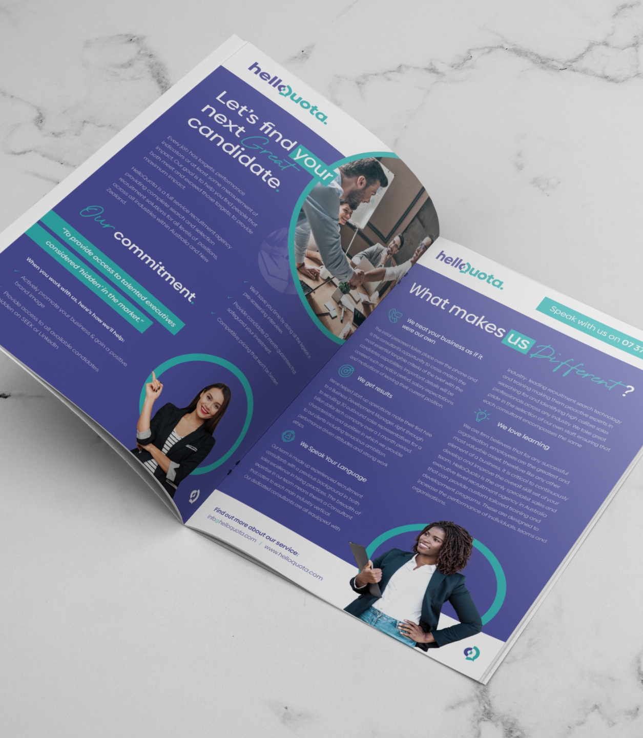
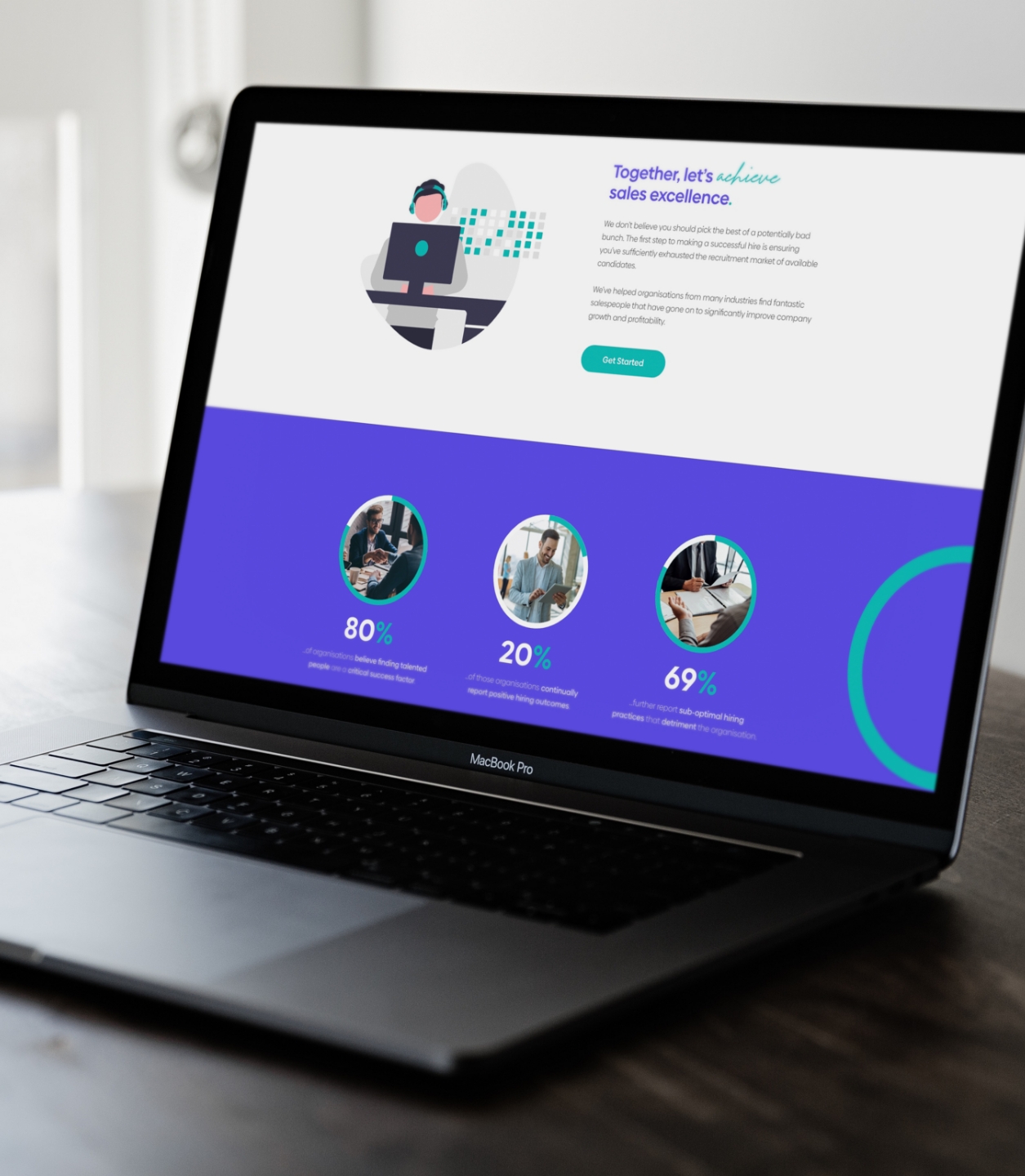
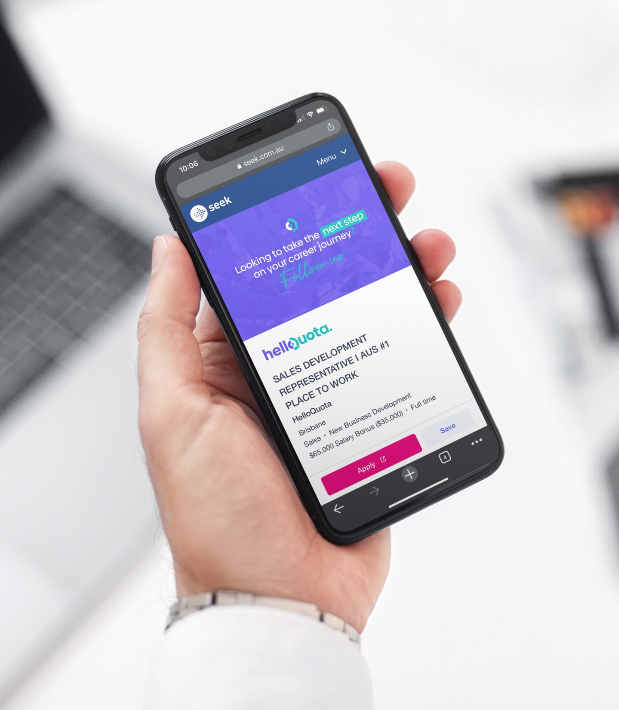
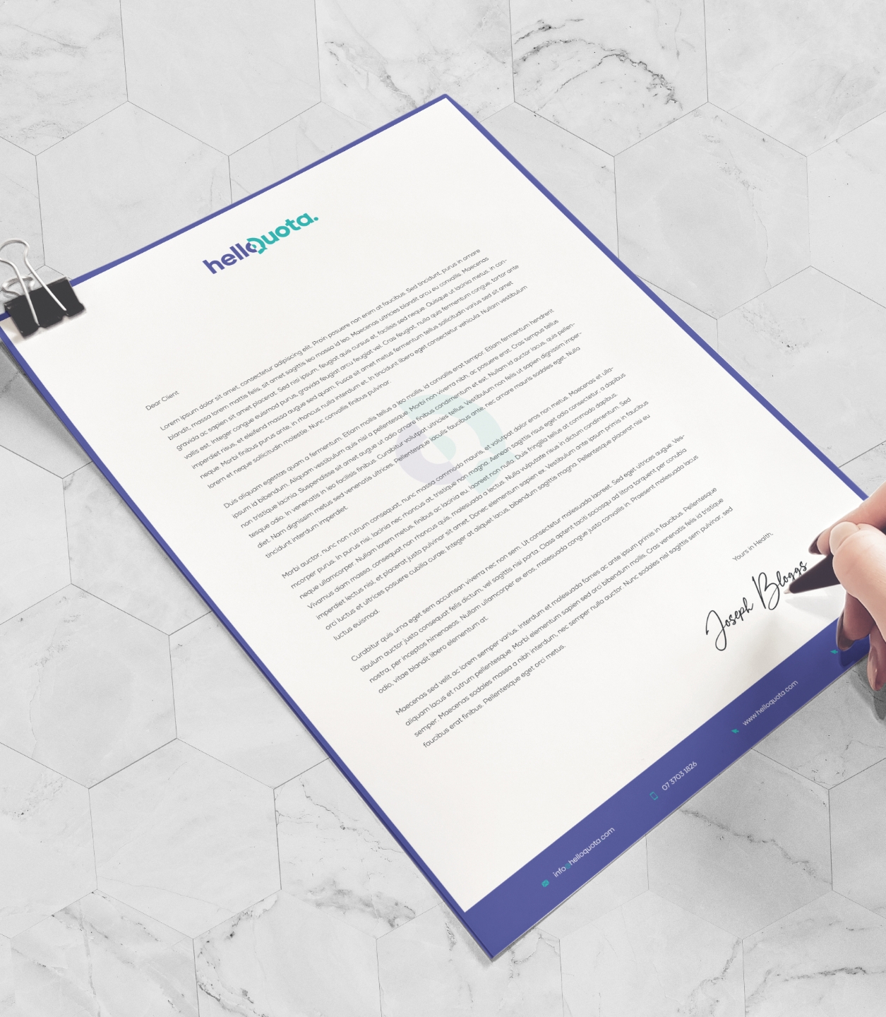
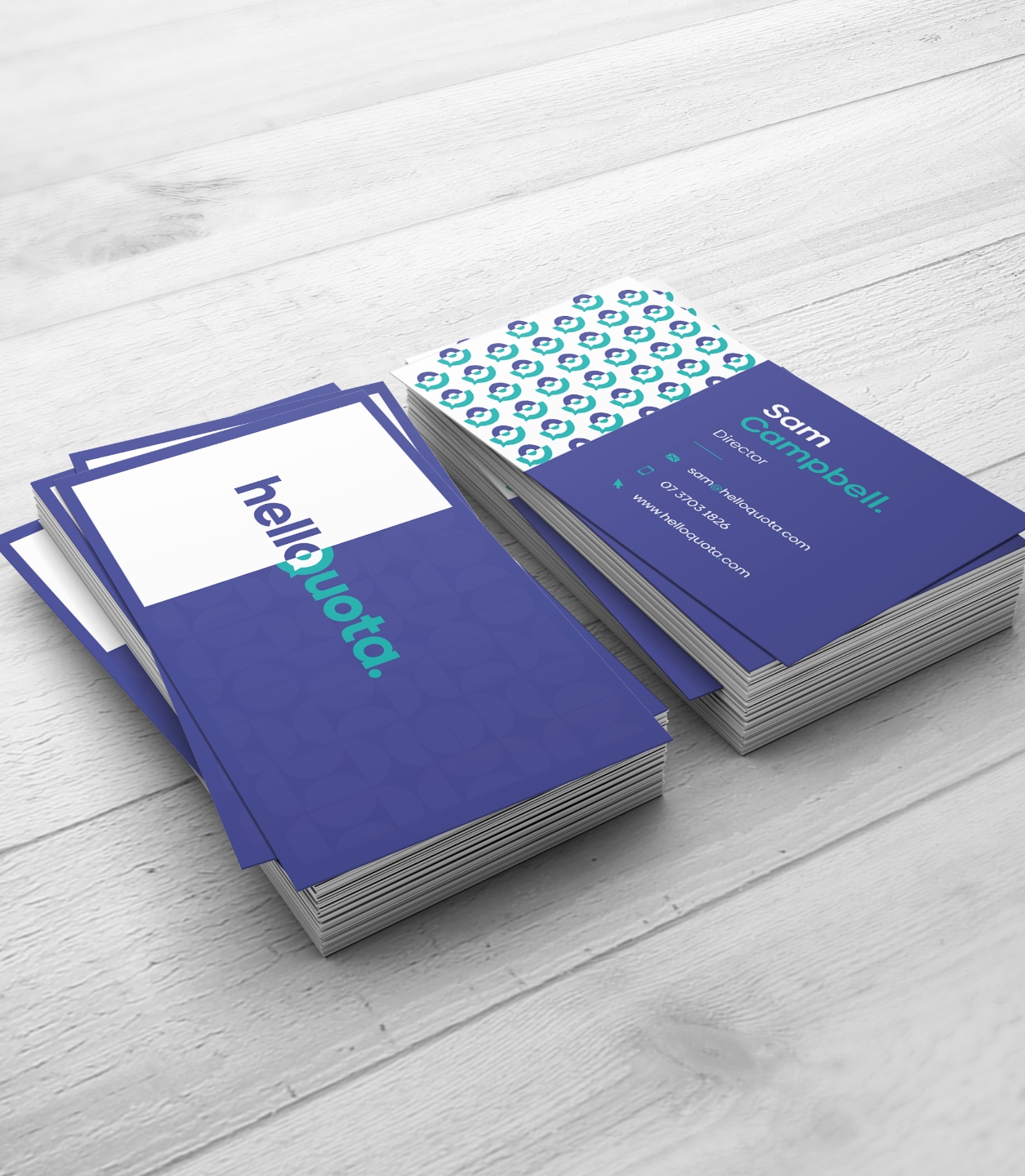
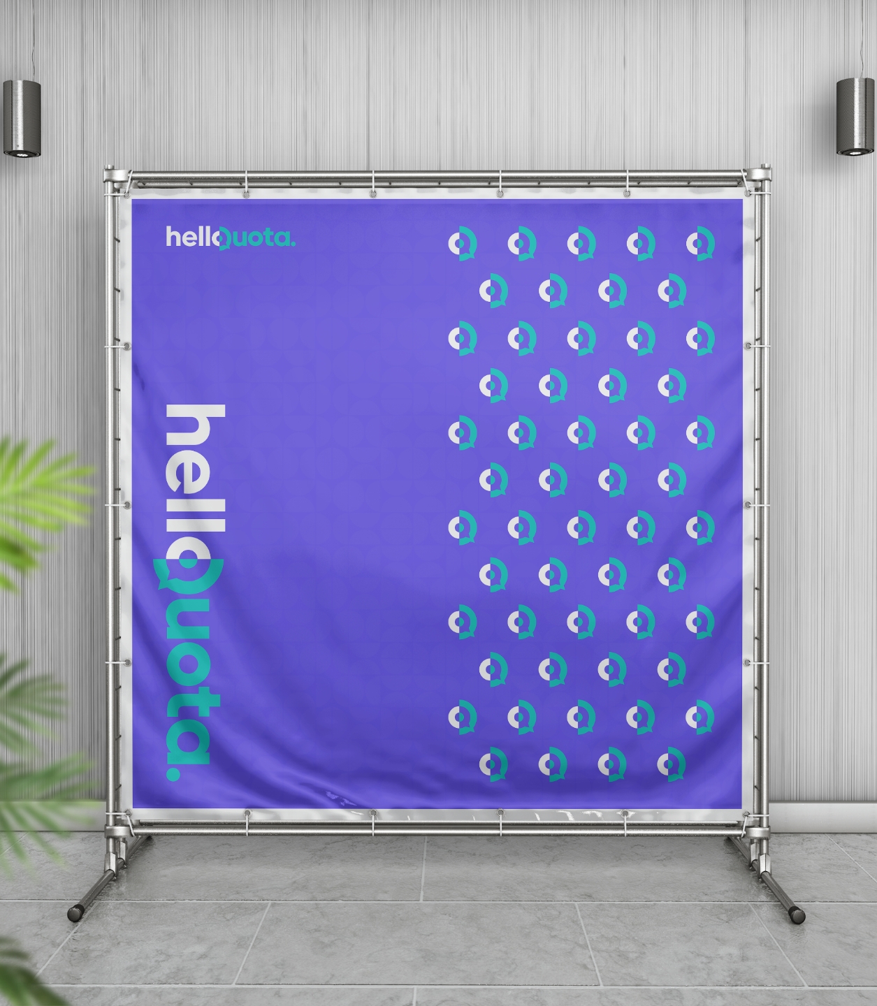
We rolled it out across every touchpoint
From stationery and brochures to social templates, pitch decks, pull-up banners, and a custom website—everything was designed to be cohesive, professional, and ready to perform.
A launchpad to hit the ground running
The brand gave HelloQuota a clear, confident identity from day one—ready to make an impact in a competitive space. It laid the foundation for a strong launch, and we’ve since teamed up with founder Sam on more design projects. Always a pleasure!
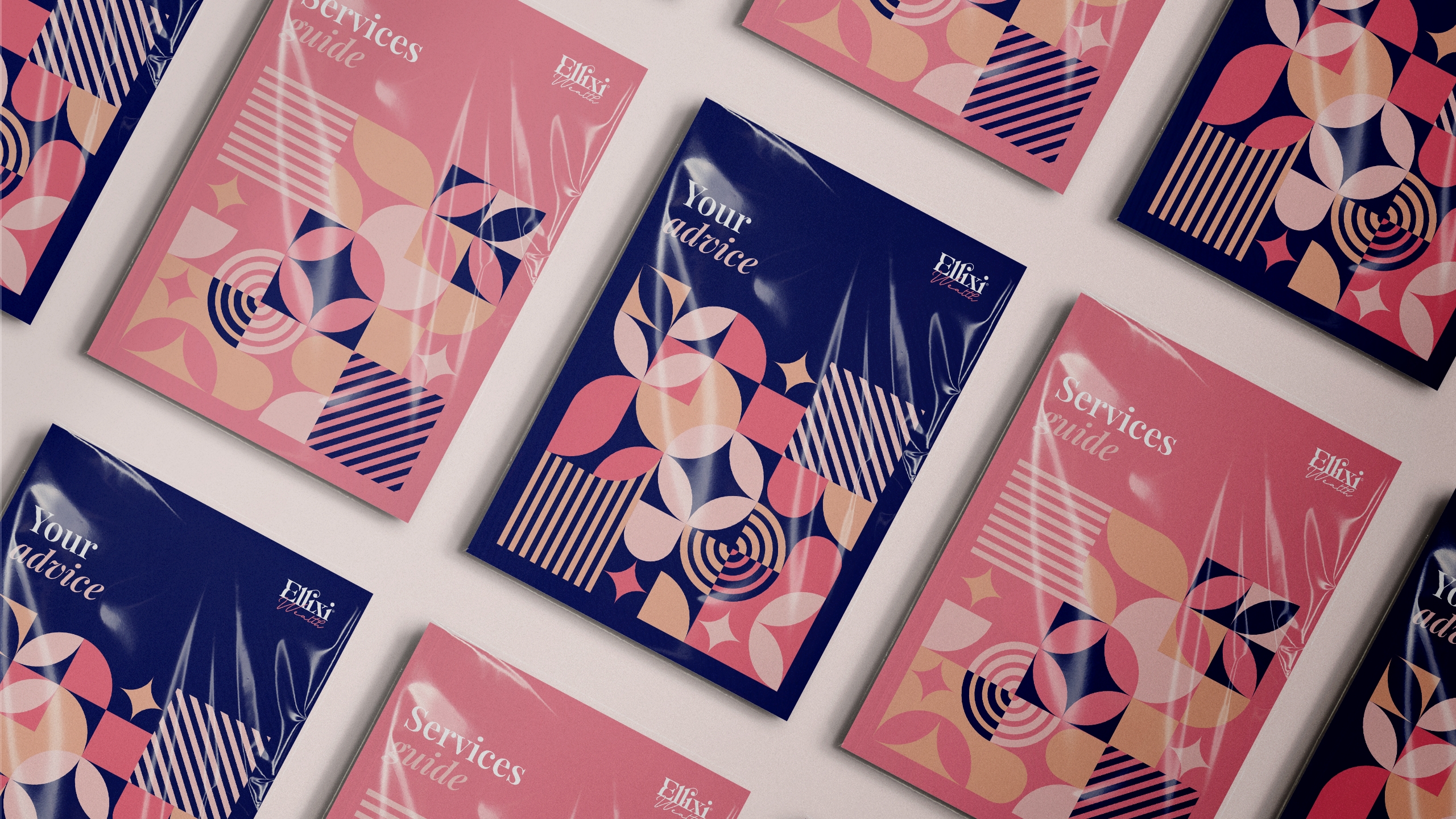
Full suite of digital assets
Promotional poster set
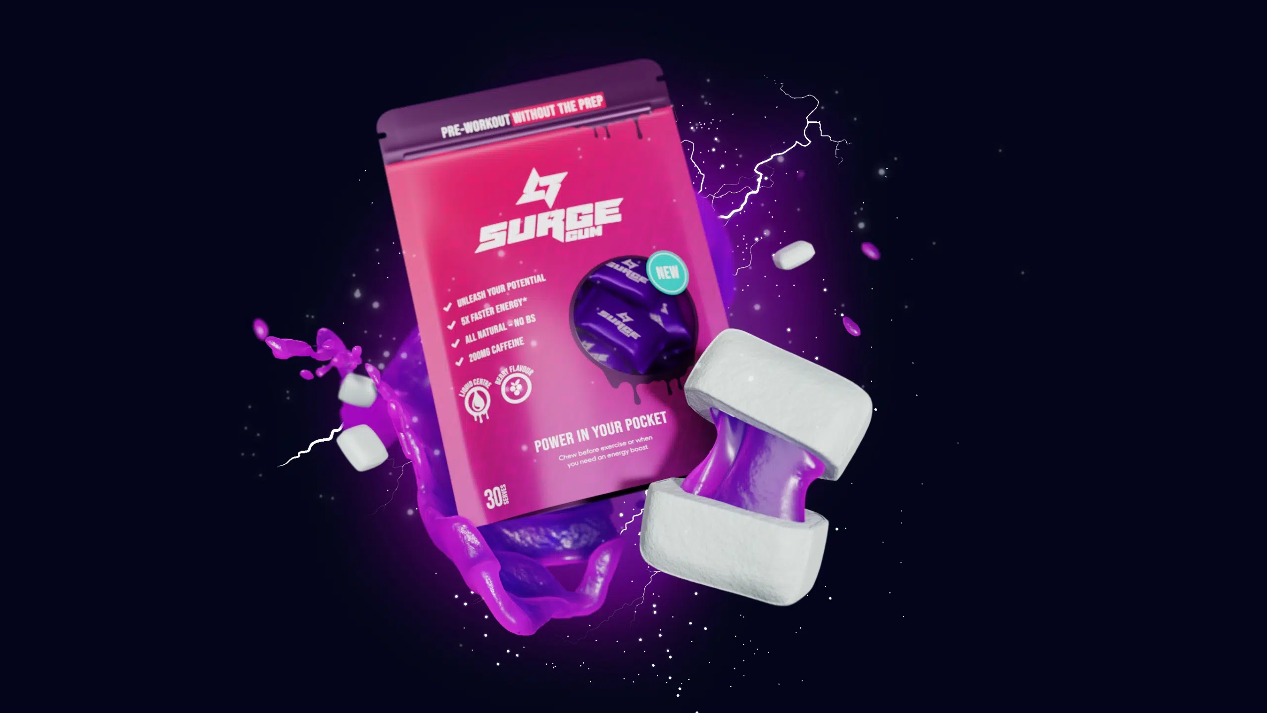
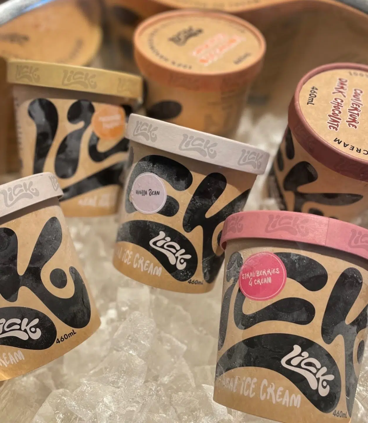
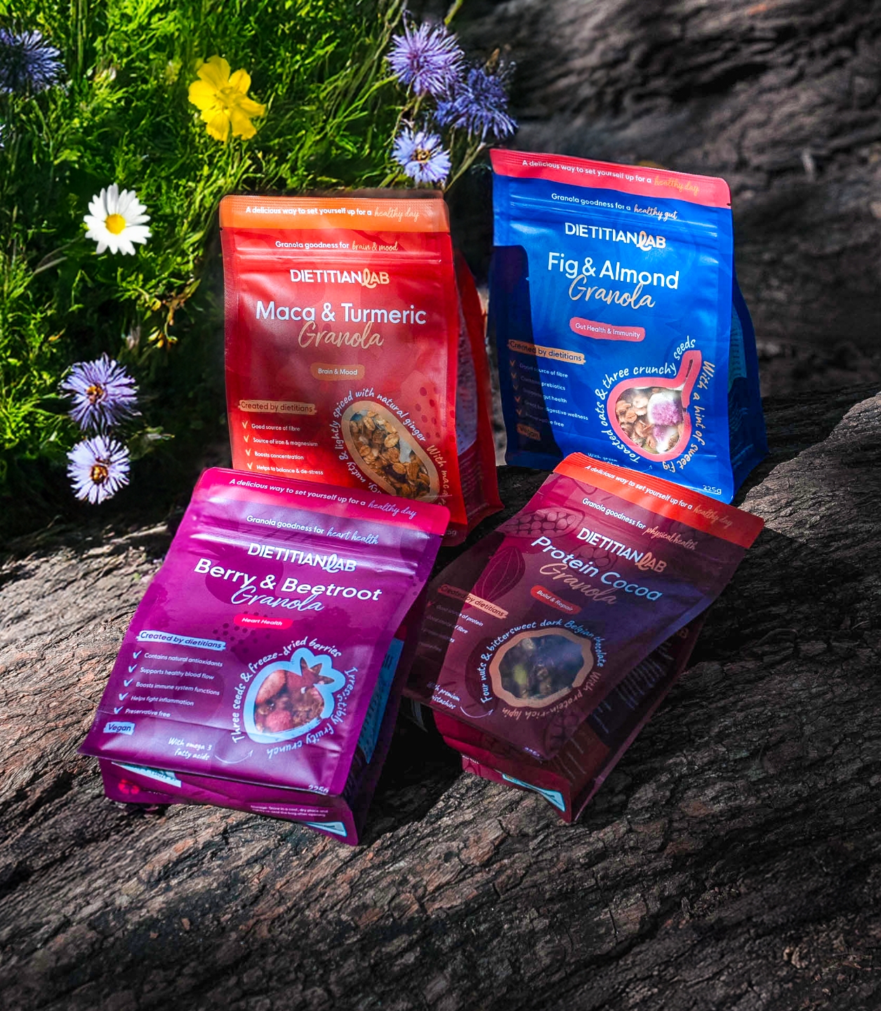
Flagship flavours – now in Woolworths!
Pitch deck template designs
Flagship flavours – now in Woolworths!
“Chris is an articulate, knowledgeable and very reliable designer. My experience with him has been positive from the outset and will most certainly be doing business with him again.”

 Hello Quota