In this article:
We’ll reveal four famous examples of when branding goes wrong!
Key takeaways
- There are hidden costs that must be considered when developing a new logo. To mitigate your risk of a branding nightmare, make sure you invest adequately based on your existing business size, potential growth, brand awareness, and the number of places you logo appears.
- Even the biggest companies in the world can mess up their branding by not considering some fundamental principles and being in touch with who their customers are and what they want and need.
- Customer backlash can cause reputational damage and cost $10,000’s to resolve the issues unless your brand designer understands and mitigates the branding risks during the design process.
Four examples of branding gone wrong
Nailing your brand can be difficult, and even the biggest companies with multi-million dollar budgets have been known to get it wrong.
They say that any press is good press, but brand disasters can have a huge negative impact that smaller, less established businesses may not be able to bounce back from.
So, what does it look like when brand designers don’t get it right?
Here are a few examples of the disasters that could be waiting for you if you don’t do your homework.
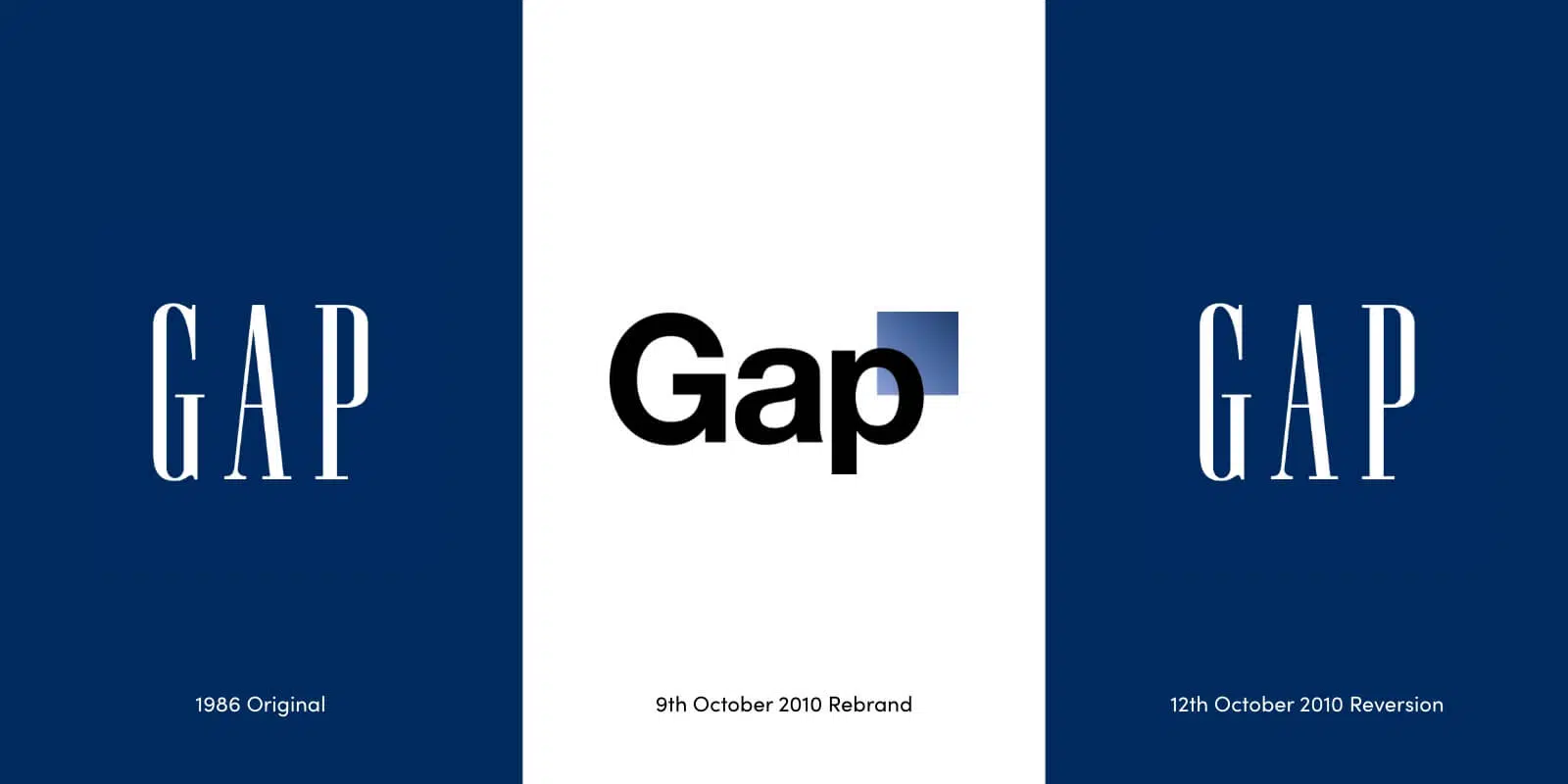
1. Gap’s short-lived rebrand
Clothing brand Gap decided to redesign its iconic logo to something more modern in an attempt to boost sales after the 2008 recession. The project was given to Laird and Partners, a New York-based creative agency with a strong reputation, and cost around $100 million.
The new design was launched on October 6th 2010, replacing the classic ’90s vibe with something that would look more at home on an accountant’s website. Following a huge wave of backlash from consumers and brand experts alike, the old logo was reinstated just six days later. This example goes to show that even the best in the business can get it wrong if there’s no strategy behind the branding.
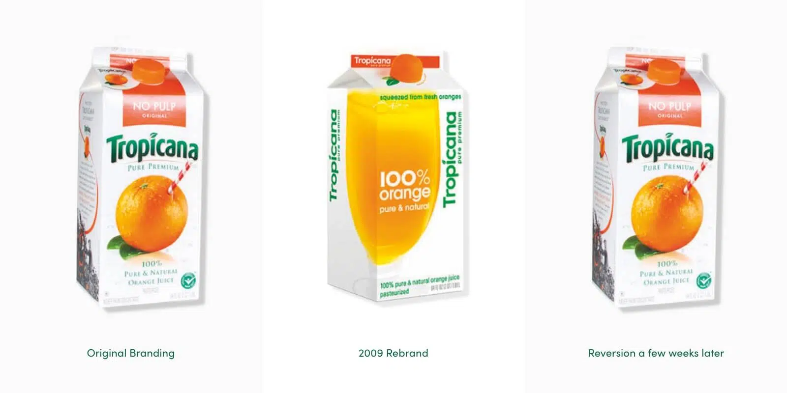
2. Tropicana’s (also) short-lived rebrand
In 2009, global juice brand Tropicana made a similar expensive mistake when updating the packaging for their North American market. Another attempt to modernise the look and feel of the brand, this rebrand streamlined the logo and moved away from the image of an orange with a straw in it, instead showing a glass of the juice itself.
After investing $35 million in the campaign, the new branding fell completely flat. Despite its attempts to focus on the natural qualities of the juice, many felt that the previous concept of an orange with a straw in it better represented this. Such a drastic change in design also made it hard for consumers to locate Tropicana on the shelves and had a negative impact on their emotional bond with the brand. Sales dropped by 20%, representing a loss of $30 million, and the old design was reinstated after just a few weeks.
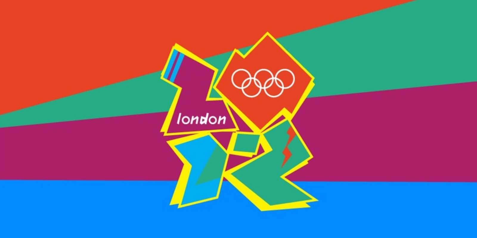
3. The infamous London 2012 Olympics logo
The logo for the London 2012 Olympics was met with huge criticism when it was unveiled, for a number of reasons. Two of the key issues that people had with it was that it was overly jazzy, and that it had no obvious connection to either London or the Olympics.
However, another big concern was that the abstract jagged shapes forming the numbers ‘2012’ seemed to look like a variety of other unintentional things, none of which exactly embodied the Olympic spirit.
With comparisons including a swastika, the word “zion” and Lisa Simpson performing a sex act, this logo was certainly memorable – but not for the right reasons.
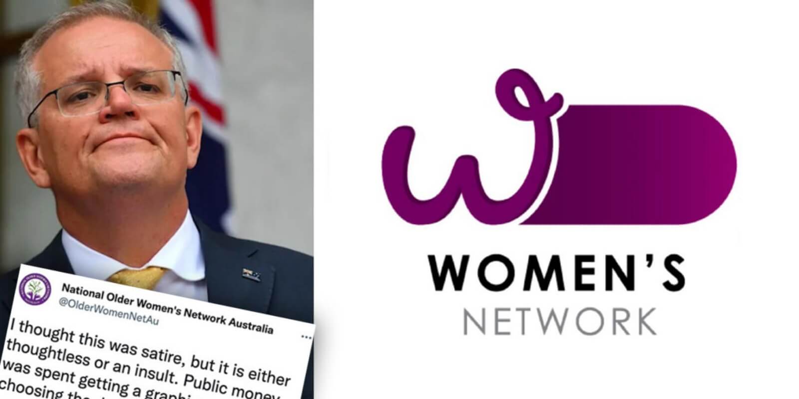
4. Phallic logo for the Women’s Network
Australia’s Department of Prime Minister and Cabinet unveiled a new logo for the Women’s Network in 2022 but had to withdraw the design after it was (quite rightly) mocked for its phallic appearance.
Created as part of a rebranding effort to establish a consistent look and feel across staff diversity networks, the design at least got one thing right in retaining the lowercase ‘w’ icon that staff had been using for a number of years, helping to retain consistency. However, the unintended resemblance to male genitalia was particularly unfortunate within the context.
Worried about getting your own branding wrong?
While there are no guarantees, if you put in extra time and effort upfront when researching the best branding agencies to work with and check that they have a comprehensive design process that mitigates these risks (just like we have at Red Kite), you’ll massively reduce the branding risks.
The only way to find out which brand agency is the right fit for you is to get in touch with them and discuss your design project in-depth.
Speaking with someone in person, or at least over the phone, will help you to see what level of passion, enthusiasm and attention to detail you’ll get when working with them.
This also gives you the opportunity to check what considerations they put in their design process to reduce your risk of a rebrand.
To find out whether Red Kite is the right choice to help you succeed, contact us online or give us a call on 1300 383 146 and we’ll be more than happy to discuss your project with you.