If you feel like motion graphics and animated logos are all over the internet at the moment, you’re not alone. More and more brands are taking advantage of the exciting possibilities that animation has to offer, and reaping the benefits.
In this article, we’re going to take a look at animated logos, why they’ve grown in popularity, and how to decide whether your brand needs one.
What is logo animation?
With print-only marketing a thing of the past, businesses are embracing more engaging and interactive ways to develop their brands online.
To this end, designers have been including animation in more and more elements of online marketing, helping to make the most of the precious seconds they have to grab the attention of users in the digital space.
Logo animation allows brands to incorporate motion, colour and even sound in their identities. From simple movements to short video scenes, there are almost endless ways to add a little flair to your logo online.
Why do brands animate their logos?
So why should you animate your logo when your static design is performing just fine? Here are some of the benefits that logo animation can bring to your brand.
Tell your brand story
If a picture is worth a thousand words, imagine how much information you can share through animation. Even the most carefully crafted logo designs can only say so much in a single image. By incorporating movement into their logos, brands can tell a story and embody it as part of their visual identity.
Boost brand recognition
Videos tend to be easier to comprehend than static images, as the movement gives our brains more information about what we’re looking at. Dynamic movement helps people to better understand and remember your brand, so it will be fresh in their mind the next time they need your product or service.
Trigger an emotional response
When used well, logo animation can evoke an emotional response in your audience that can strengthen their connection with your brand. Whether you’re looking to excite and delight your audience or add a little intrigue to your marketing efforts, animation can create an instant reaction that gets you noticed.
Breathe new life into an old logo
Movement can help to reinvigorate your identity, even if you don’t have the budget for a full brand refresh. You don’t necessarily have to get a new logo designed in order to benefit from animation. Existing logos can often be adapted for animation, though you will likely get better results if the design is crafted with animation in mind from the beginning.
Ensure a unique logo design
No matter how hard you try, sometimes brands’ logos end up looking a little similar, especially if they include certain symbols or features that signify what the business does. Animation can help you to make sure your logo identity is completely unique, setting you apart from the competition – especially if their logo is static!
Studies show it works!
In addition to the obvious visual appeal, logo animation can also improve brand recall. Studies, such as “Psychological Impact and Influence of Animation on Viewer’s Visual Attention and Cognition”, have found that watching animation can actually improve our ability to pay attention and remember things. This is because animation tends to be more engaging and interesting than other types of media, like text or photos.
They also found that not all animation is created equal. Some types of animation are more effective at capturing our attention and helping us learn than others. For example, animation that uses bright colors and simple shapes tends to be more effective than animation that is more complex and detailed.
Overall, the researchers concluded that one thing is clear: animation can be a powerful tool for engaging our attention and improving our cognitive abilities.
Is logo animation right for my brand?
It’s worth noting that logo animation might not be suitable for every business. As a huge part of your branding, you need to make sure that an animated logo fits in with the overall tone of your business, and that it’s suitable for your sector and target audience.
Younger audiences who are active on social media may be particularly receptive to logo animation, and many lifestyle-orientated brands can easily incorporate motion in a way that feels fun and fresh. On the other hand, animation may seem inappropriate in sectors that require a high level of trust and seriousness.
Generally speaking, there’s a place for logo animation for most brands, as long as it’s carefully considered within your overall marketing strategy. If all you’re doing is adding a little movement just for the sake of it, chances are you won’t gain much from the effort.
Is logo animation a passing trend?
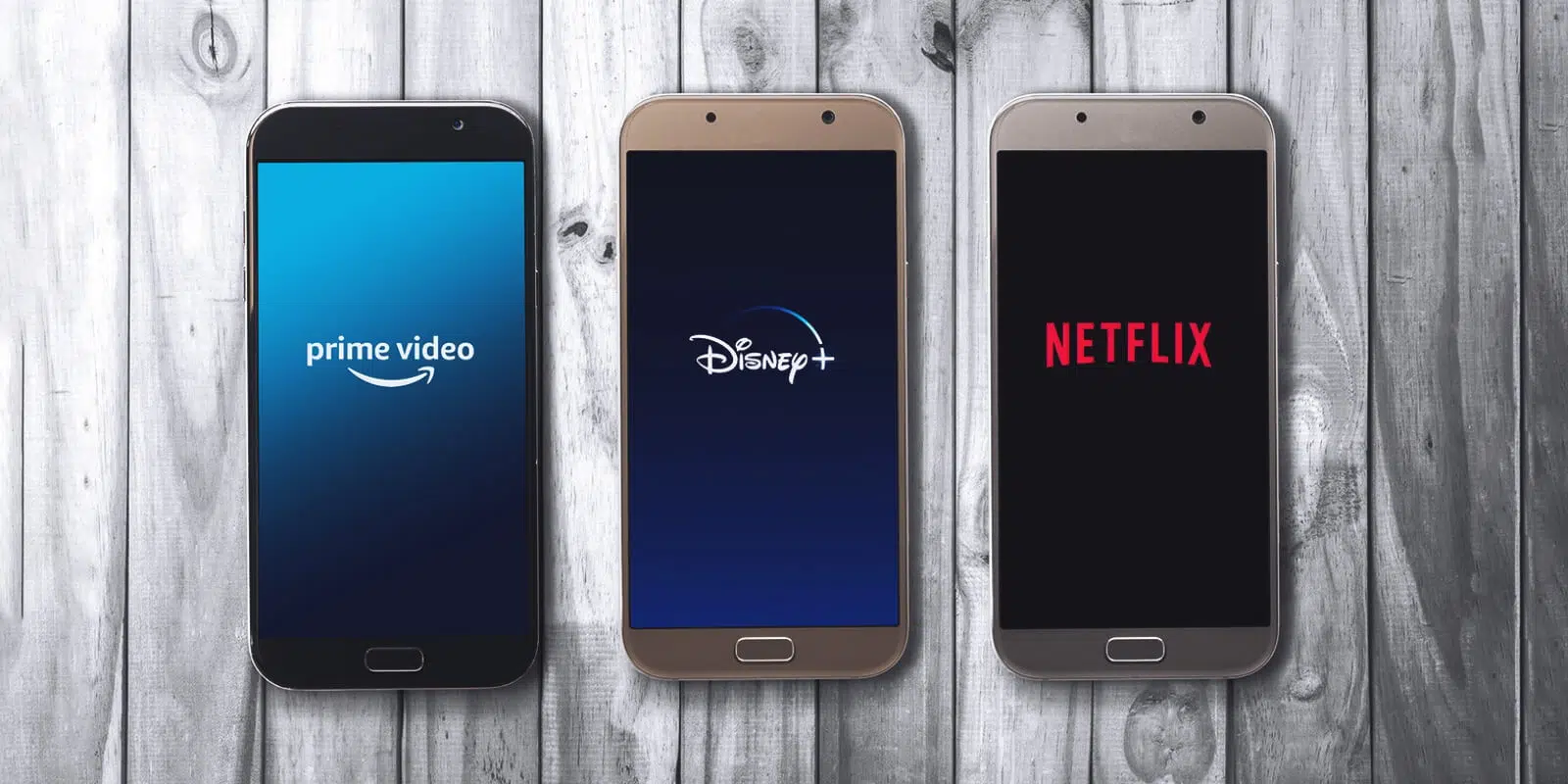
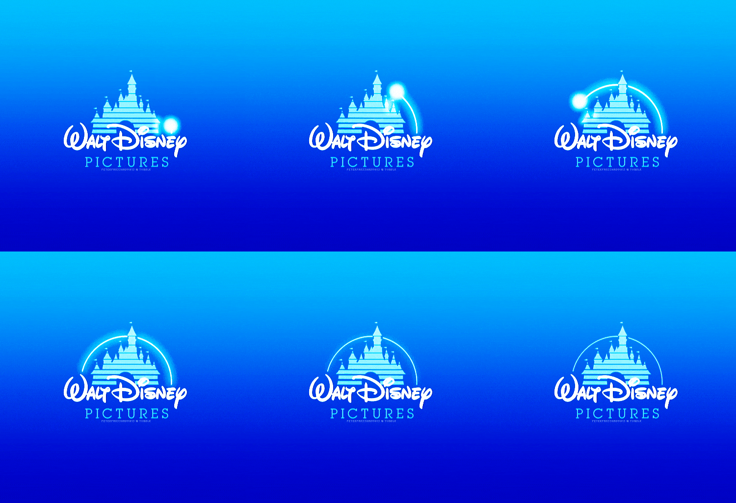
It might feel like adding motion to your company logo is just the hot new trend, but brands have been animating their logos for decades. Think about the iconic castle and shooting star at the start of Disney movies, or Netflix’s signature animated ‘N’ ribbon.
The two reasons why it might feel like everyone is suddenly jumping on the bandwagon is because animated logos have now become much more accessible to smaller brands, and more of our business now takes place online, where motion graphics can thrive.
With the continued growth of the ecommerce industry, we can expect to see more and more animation in branding. That means there’s even more reason to do this now, or risk getting left alone with a boring static logo in a sea of engaging competitors.
Where to use an animated logo
The short answer of where to use your animated logo is: anywhere you can.
Video content continues to dominate the internet, so adding a little motion to your social media presence can help to capture your audience’s attention and stop the scroll. Animated logos can be converted into gifs, making them quicker and less resource-heavy to load than video files. This makes them perfect additions to your website, helping to tell your brand story without slowing your visitors down.
Don’t forget to include your animated logo on non-marketing materials as well. From presentation templates to staff-only intranet portals, carrying your dynamic design through to your internal documentation can help your team members to better understand and embody your brand in everything they do.
Examples of great animated logos
To give you an idea of how movement can transform a brand identity into something special, we’ve put together a few different examples of brands that have really nailed logo animation.
Disney
We briefly mentioned Disney above, but we wanted to highlight it again here as a reminder that great animated logos aren’t a new phenomenon.
Many of us will have memories of a shooting star arcing over Disney’s iconic castle from our childhood, with that little twinkling motion signifying that something magical was about to commence. There’s nothing flashy and over-the-top about this animation; it’s short, simple and effective.
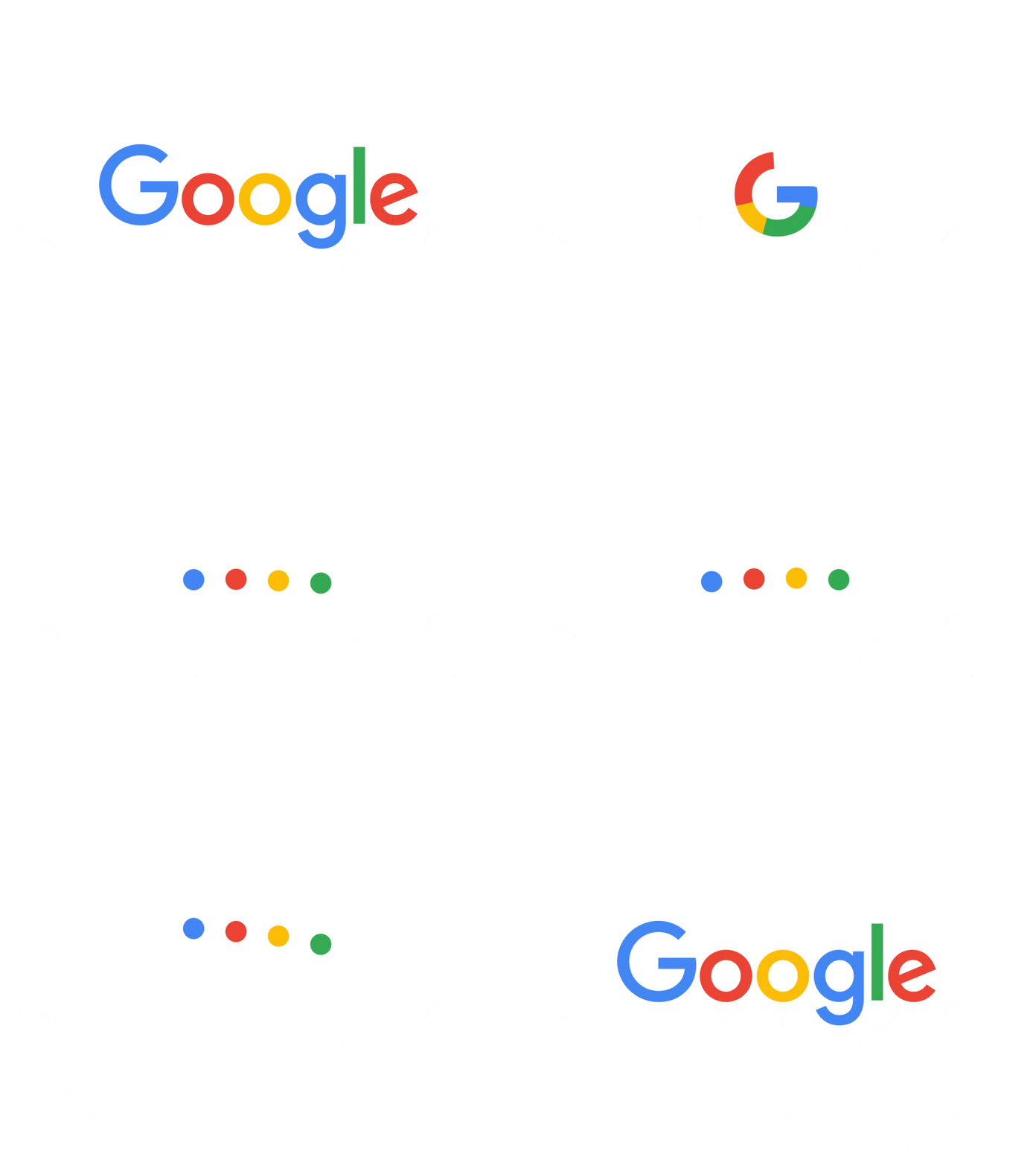
Google is a master of brand messaging, managing to turn red, yellow, blue and green into an instantly recognisable identity.
The animated version of their logo showcases the wide range of services that Google offers, morphing smoothly between a microphone, sound waves, processing animation and the simple ‘G’ logo. As well as giving an idea of what they provide, this animation backs up the seamless integration of Google’s tools and leaves room for scalability.
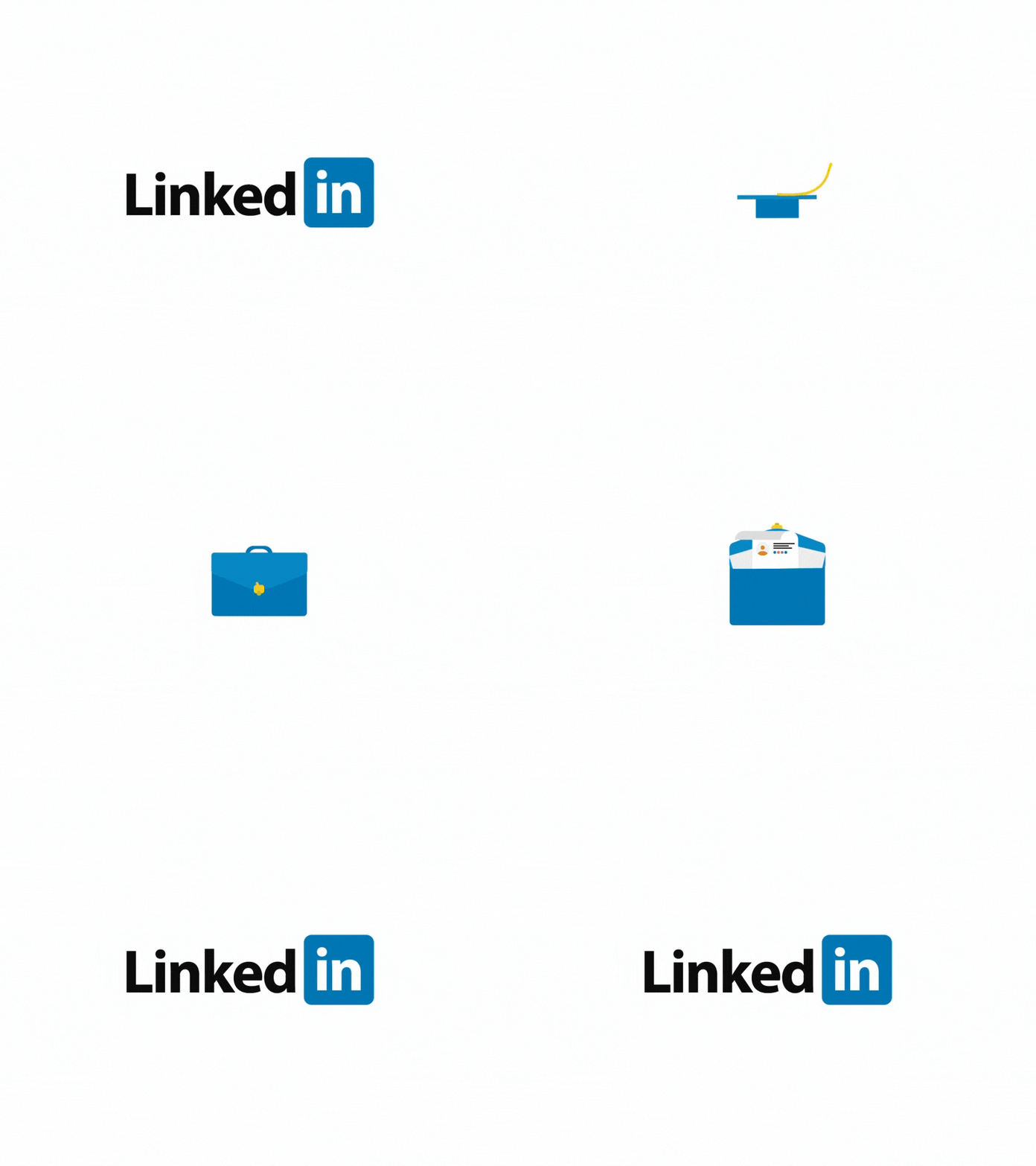
LinkedIn’s animated logo tells a compelling story in just a few seconds, giving audiences a clear impression of what they can expect from the platform.
Embracing the colour and shape of the signature blue square that accompanies their logo, the animation moves from a mortarboard to a briefcase containing a resume, demonstrating the journey from education to career that is supported by making professional connections on LinkedIn.
Red Kite
It’s a little cheeky to include ourselves in this list, but we wanted to show you that great logo animation isn’t just for global multi-million dollar companies.
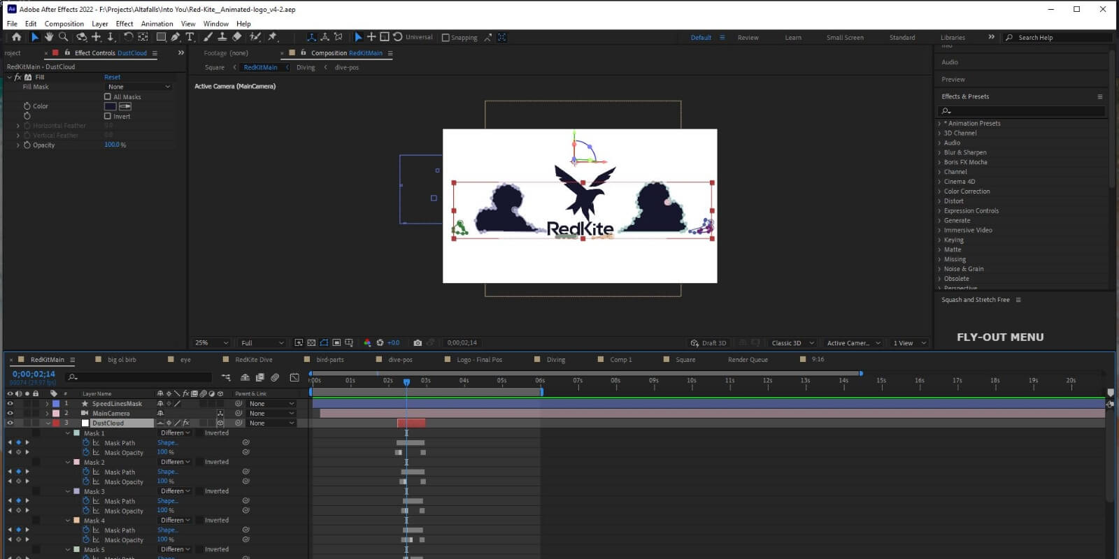
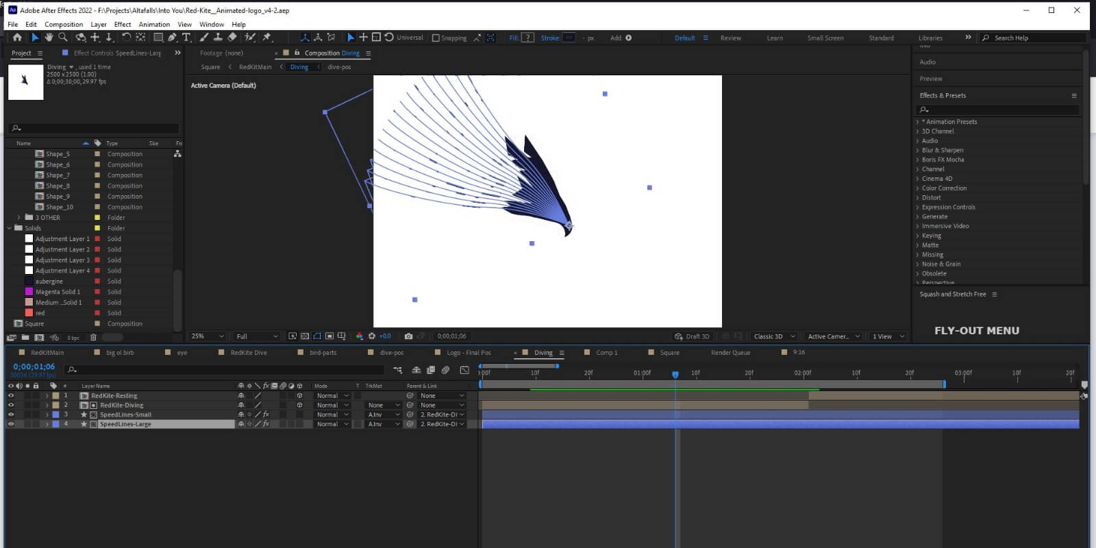
From lines to indicate speed to the clouds that part as the bird descends, the animated version of our logo includes lots of elements that would clutter the design if they were included in the static version. It also shows the kite in different positions, helping to clarify each shape within the stylised design and ensure that it is understood correctly once still.

Get animated with Red Kite
If we’ve convinced you that animation is not only the present but the future of logo design, we’d love to hear from you. You can also check out our logo animation services page for more information.
While animation isn’t included as standard in all of our logo design packages, just let us know if you’d like to add this service when you talk to us. Logo animation isn’t right for every brand, which is why you won’t find it in the standard packages listed on our website. We want to make sure that our clients never pay for a service they don’t need or want.
We can design a logo with animation in mind, ensuring that the final result is well suited to motion, creating an eye-catching and engaging addition to your digital branding.
