An international consultancy business helping companies and organisations improve their processes around staff selection and development.




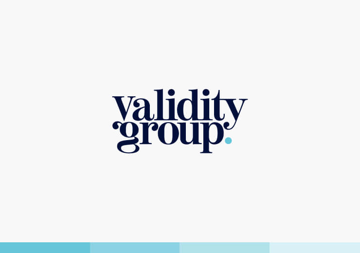
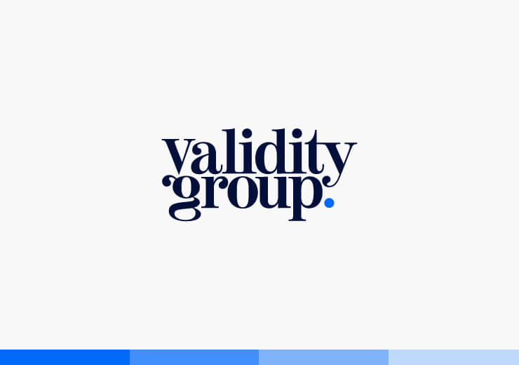
Alternative versions of the logo design were created so that the mark may still look its best at smaller sizes and different dimensions.

NAVY BLUE:
PRIMARY COLOUR

ELECTRIC BLUE:
BRAND SUB-COLOUR

TEAL:
SECONDARY COLOUR
As well as their primary identity, Validity Group has four core service areas; assessments, digital learning, microlearning and coaching, and mentoring. To help their customers distinguish between these we developed a complimentary colour palette, with each colour representing a different service. We also included one spare, allowing for growth of their product range in the future.
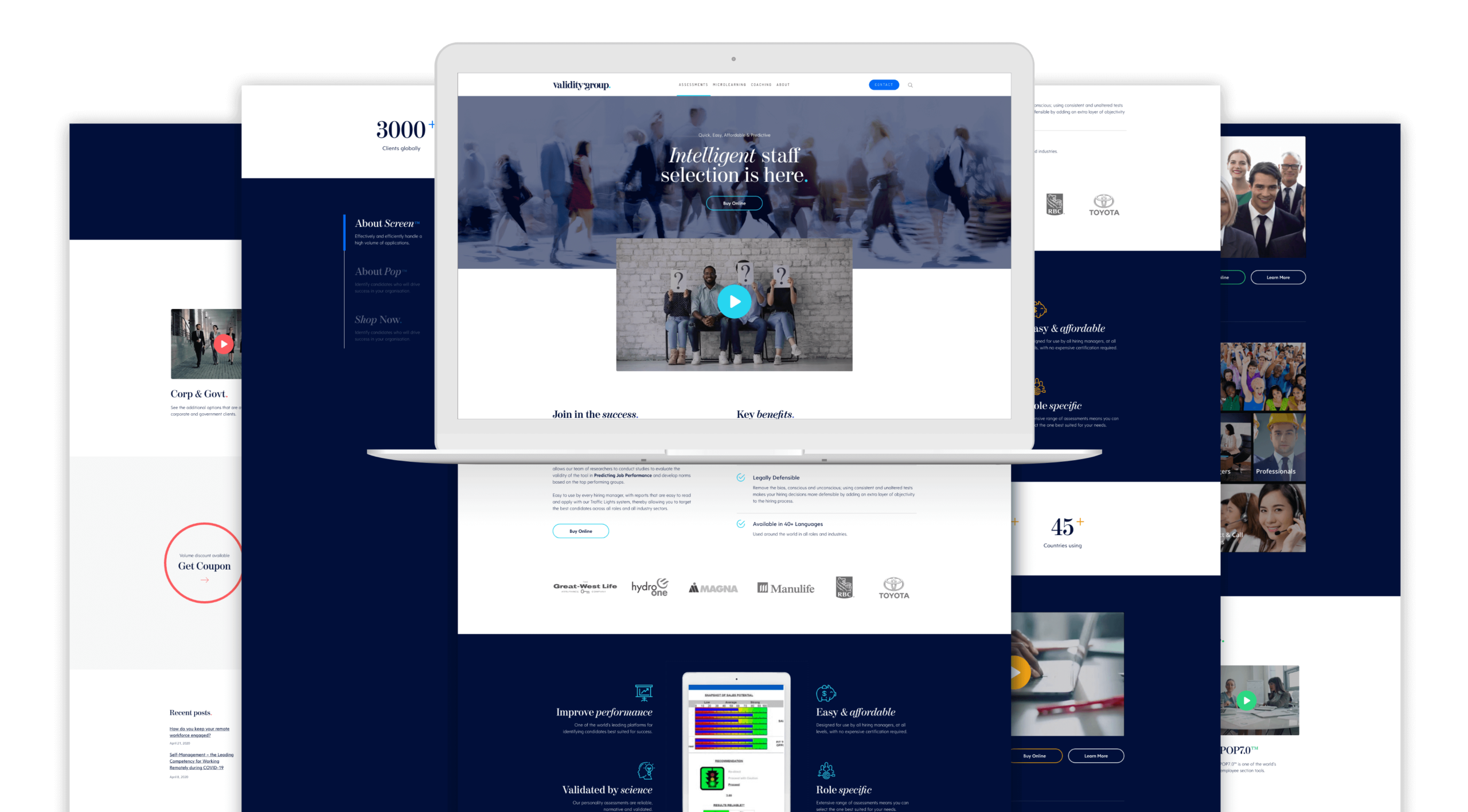
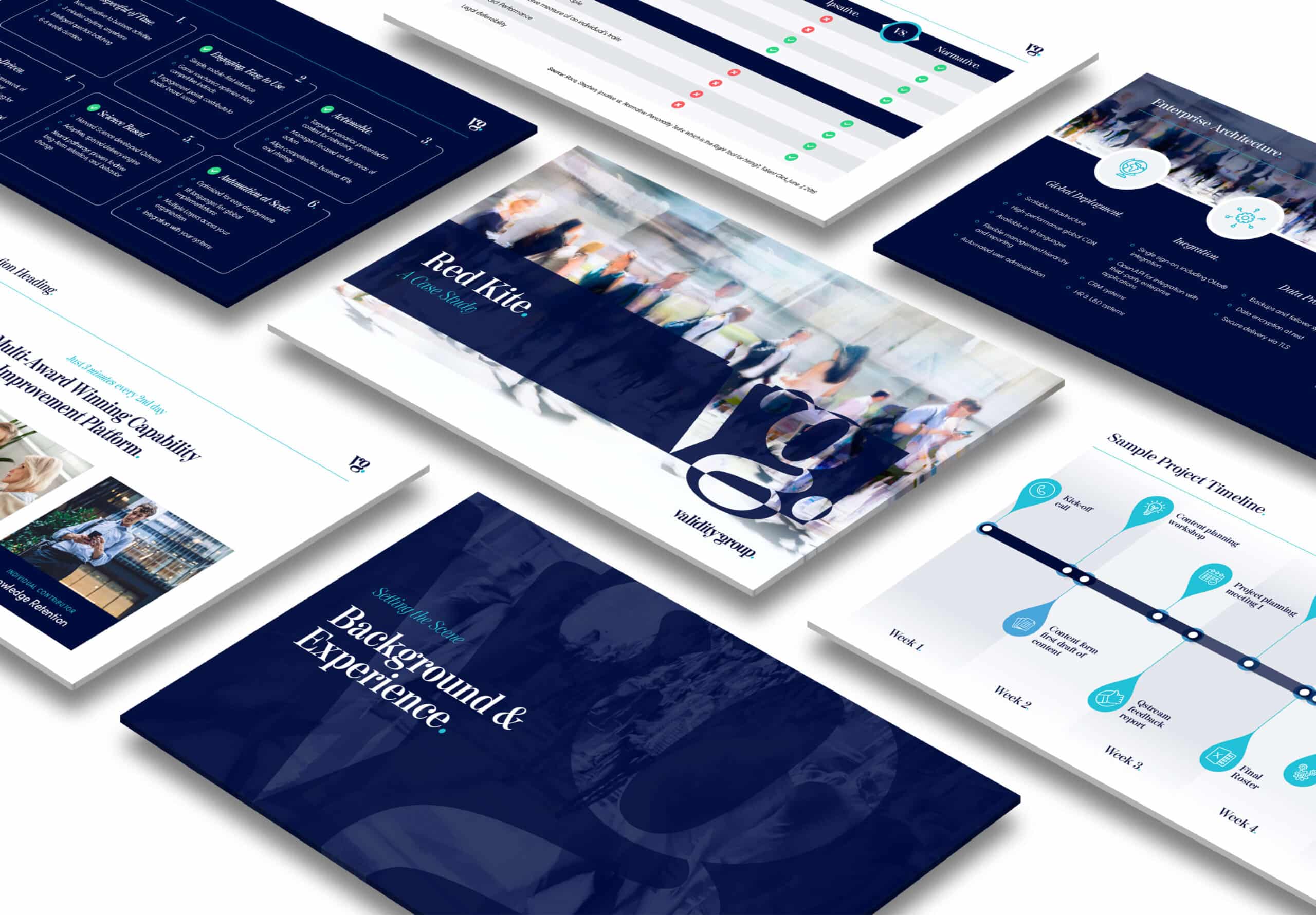
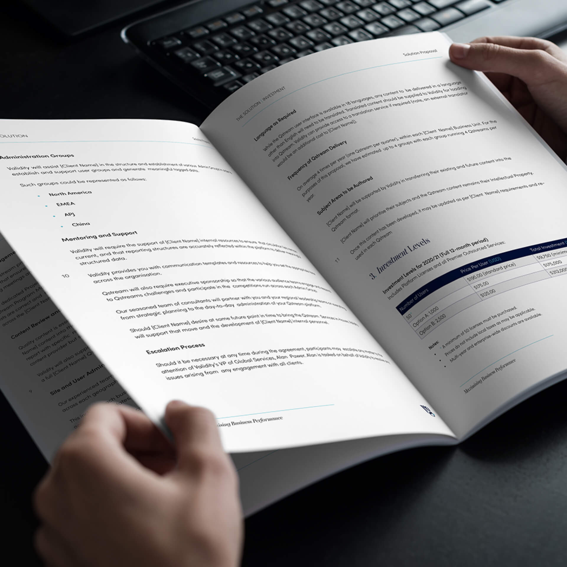
For any business, it is important to make a great first impression, so having a professional looking proposal document that is perfectly in tune with your brand is a real asset. This is exactly what we developed for Validity Group!
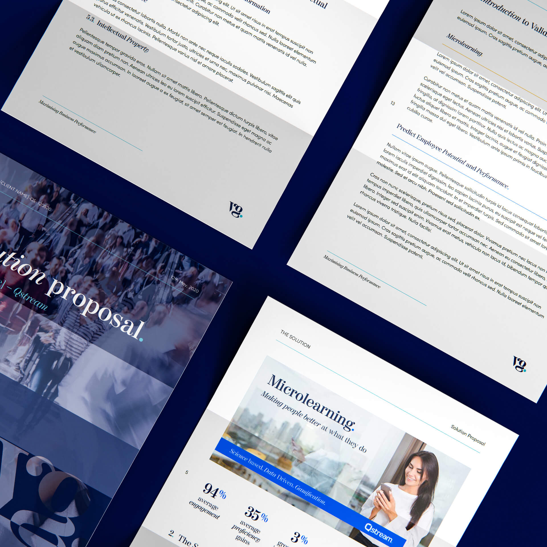
When pitching their products and services to prospective clients, Validity Group uses a wide variety of presentation slide decks. It was important that we developed a style for these that was cohesive with their new identity, marrying up perfectly with their new look website.
