“The brand has played a pivotal role in helping us stand out, scale confidently and earn real trust from our customers.”
David Grant
Vice President of Global Sourcing
Project overview
Bringing personal grooming home—with style & confidence
When Shaver Shop came to us, they had a vision for their new in-house brand: personal grooming products designed to empower customers to define their own style. With a strong retail presence across Australia and New Zealand, they were ready to create their own mark with a brand that felt premium, innovative, and uniquely theirs. Our mission? Crafting an identity from scratch that captures the essence of confidence, innovation, and transformation—making grooming products that customers would proudly display in their homes and enjoy every day.
Tailoring a brand identity through collaborative market insights
For Transform-U, we took a slightly different path than our usual intensive deep dive. After an initial briefing chat with our project contact, David, we immersed ourselves in Shaver Shop’s vision, products, and positioning, then hit the ground running with our own research and concept development.
We created an engaging presentation showcasing multiple brand names and distinct visual directions, ready for the Shaver Shop team to test in a market research phase. Armed with fresh audience insights from this research, we collaborated closely with David, refining our direction to create an identity finely tuned to resonate deeply with the intended customers. This strategic, collaborative process set the stage for a brand that speaks directly to what the audience was truly looking for.
What we covered
Brand ambitions
Target audience
Competitive landscape
Product portfolio
USPs
Marketing strategy
Research prerequisites
Design requirements
& more
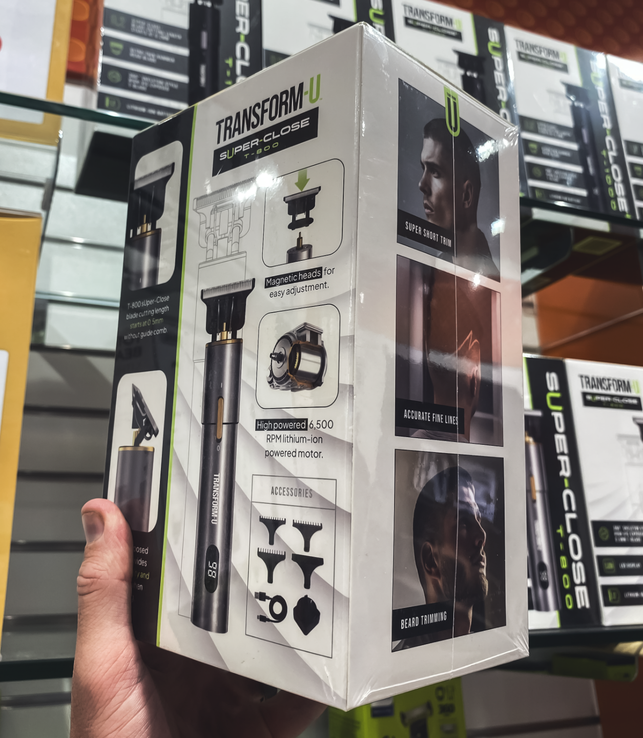
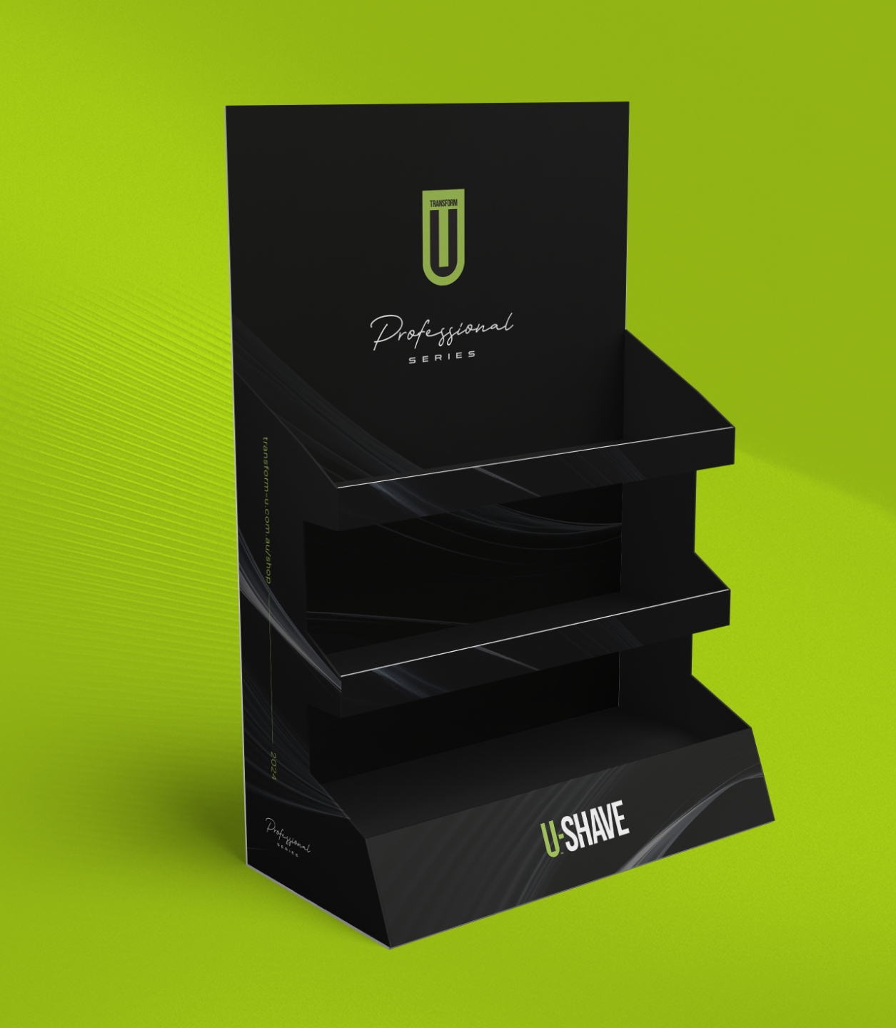
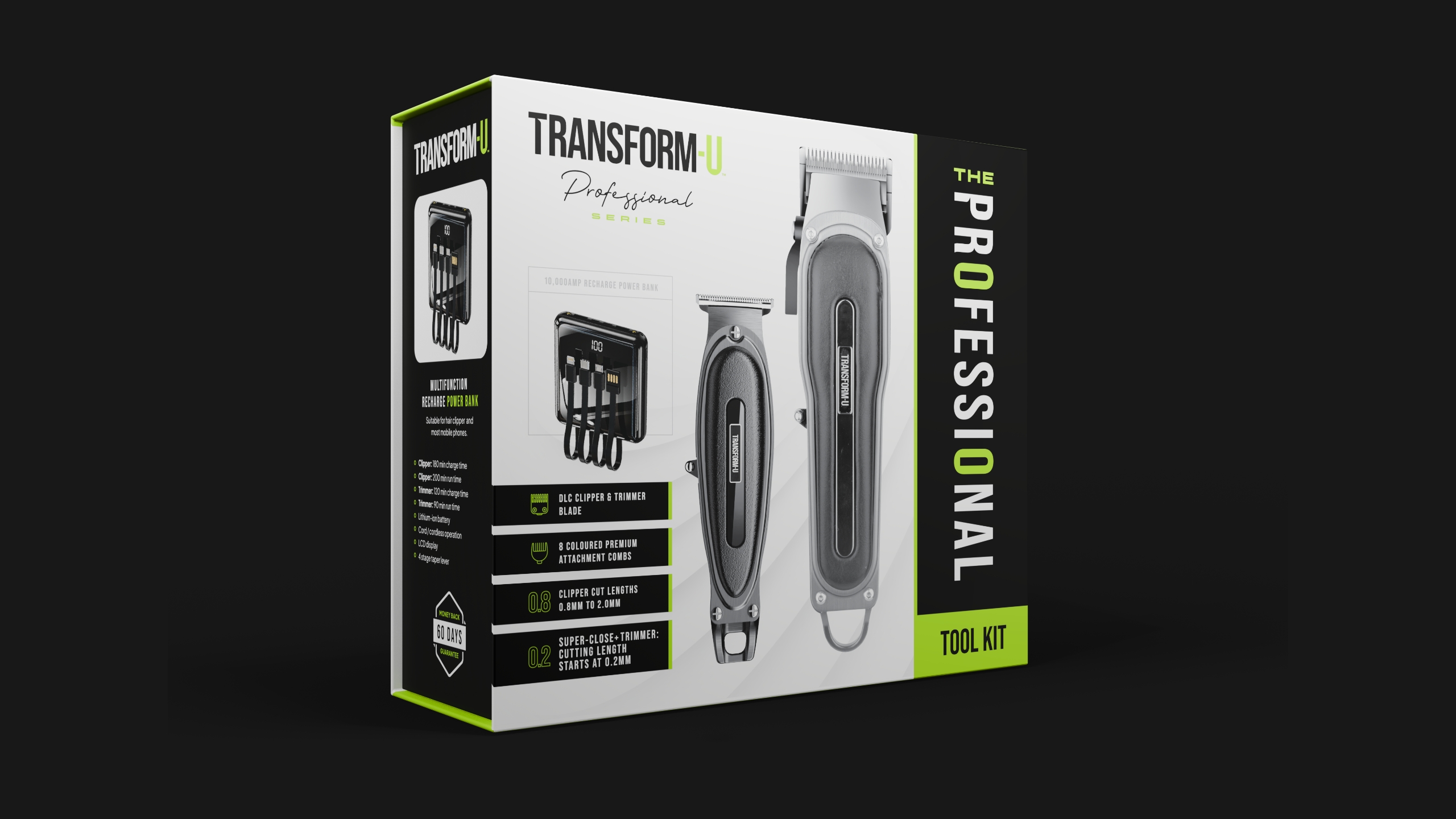
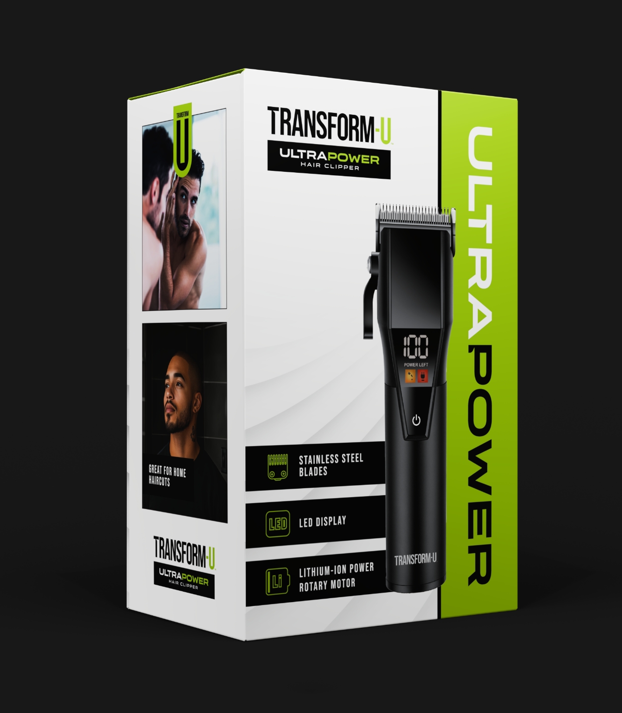
Packaging design
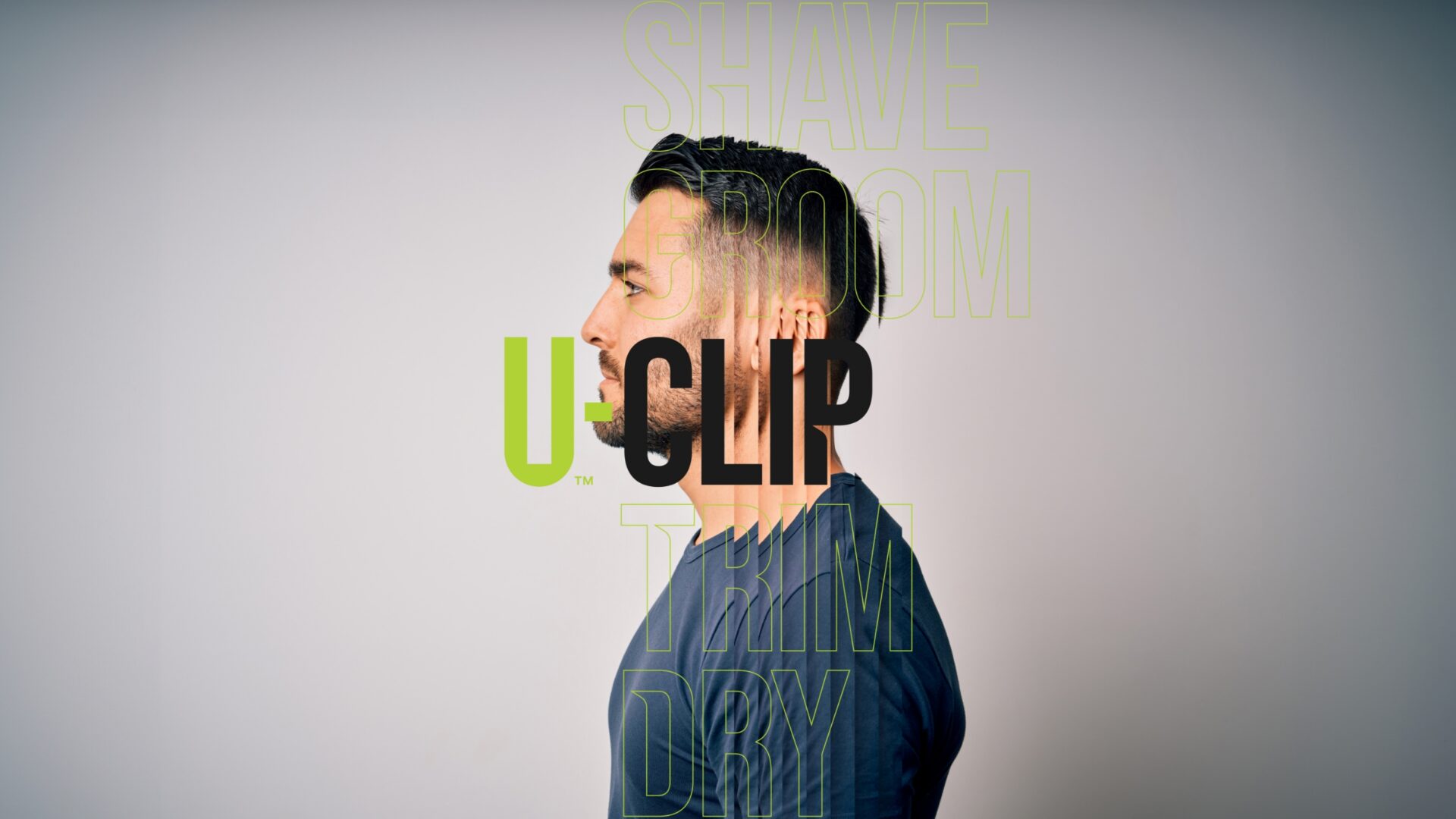
The logo: the first piece of the puzzle
A minimalist mark with maximum potential
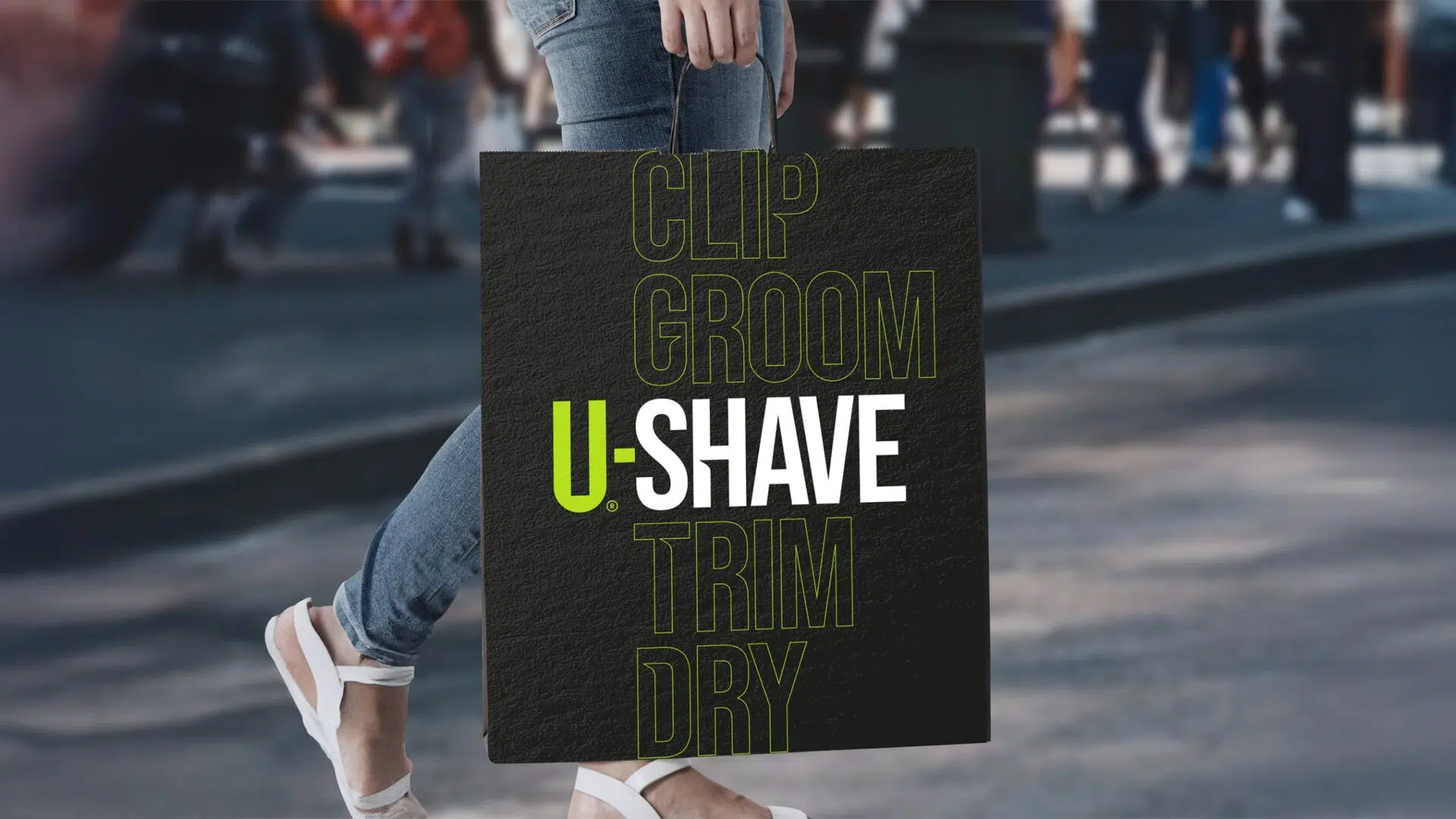
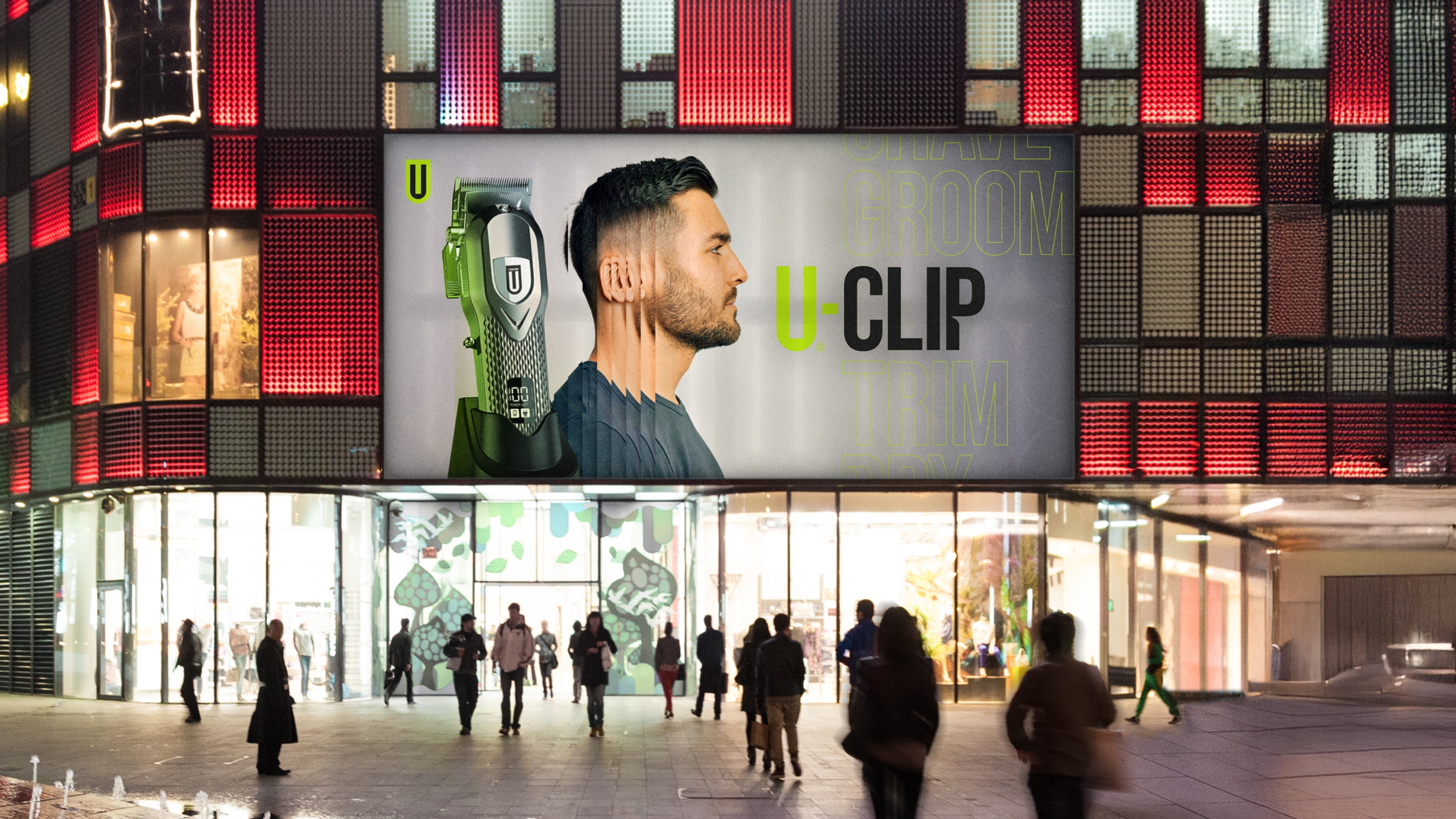
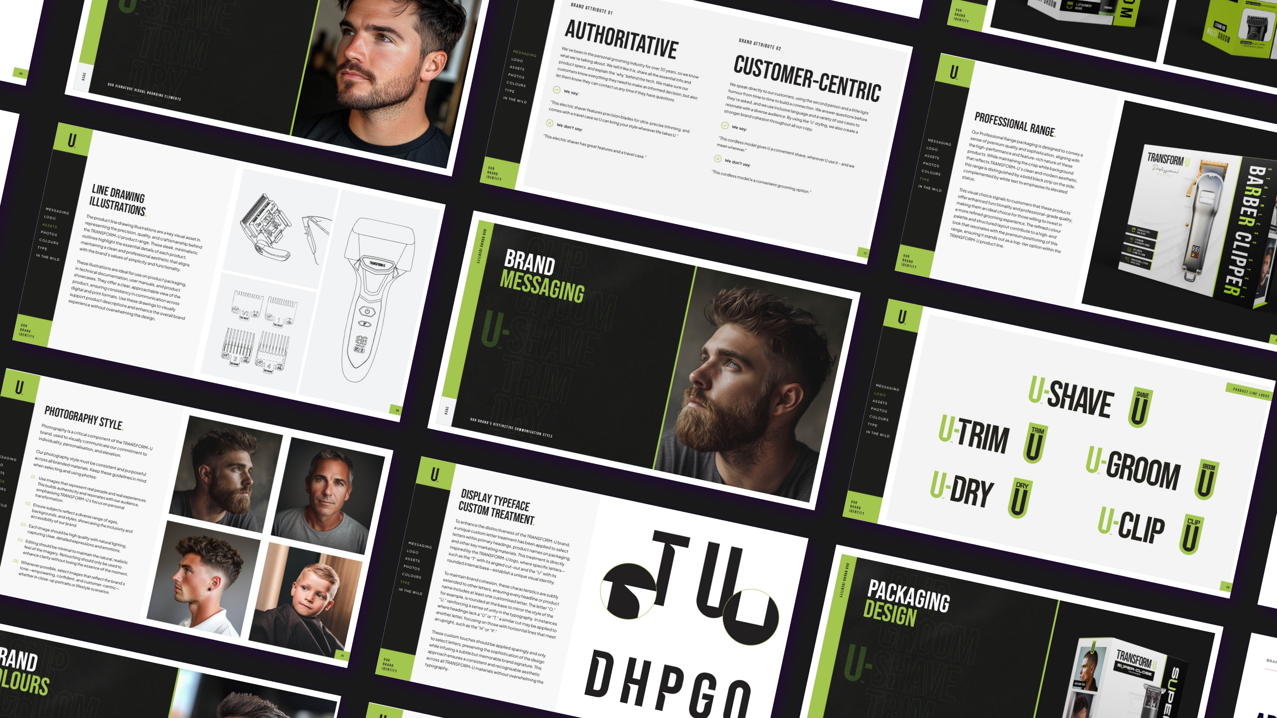
The heart of Transform-U’s identity starts with a strong, versatile badge-style logo. At first glance, it’s bold, clean, and straightforward—but a closer look reveals subtlety and strategic design. By integrating a cleverly hidden ‘T’ within the negative space of the ‘U’, we created a distinctive mark that stands proudly as a symbol for personal transformation.
The tailored typography features deliberate cuts in the lettering, representing precision grooming and linking visually back to the overarching brand. It’s distinctive yet flexible, easily adaptable across the diverse product ranges (like U-Clip, U-Trim, U-Shave), making each uniquely recognisable and unmistakably Transform-U.
Packaging design
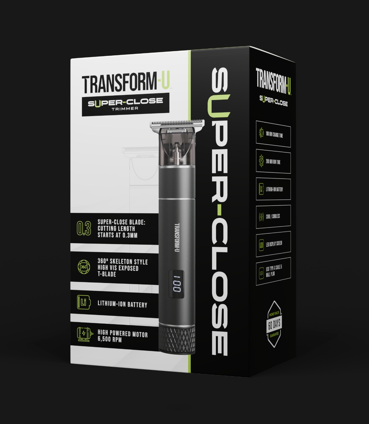
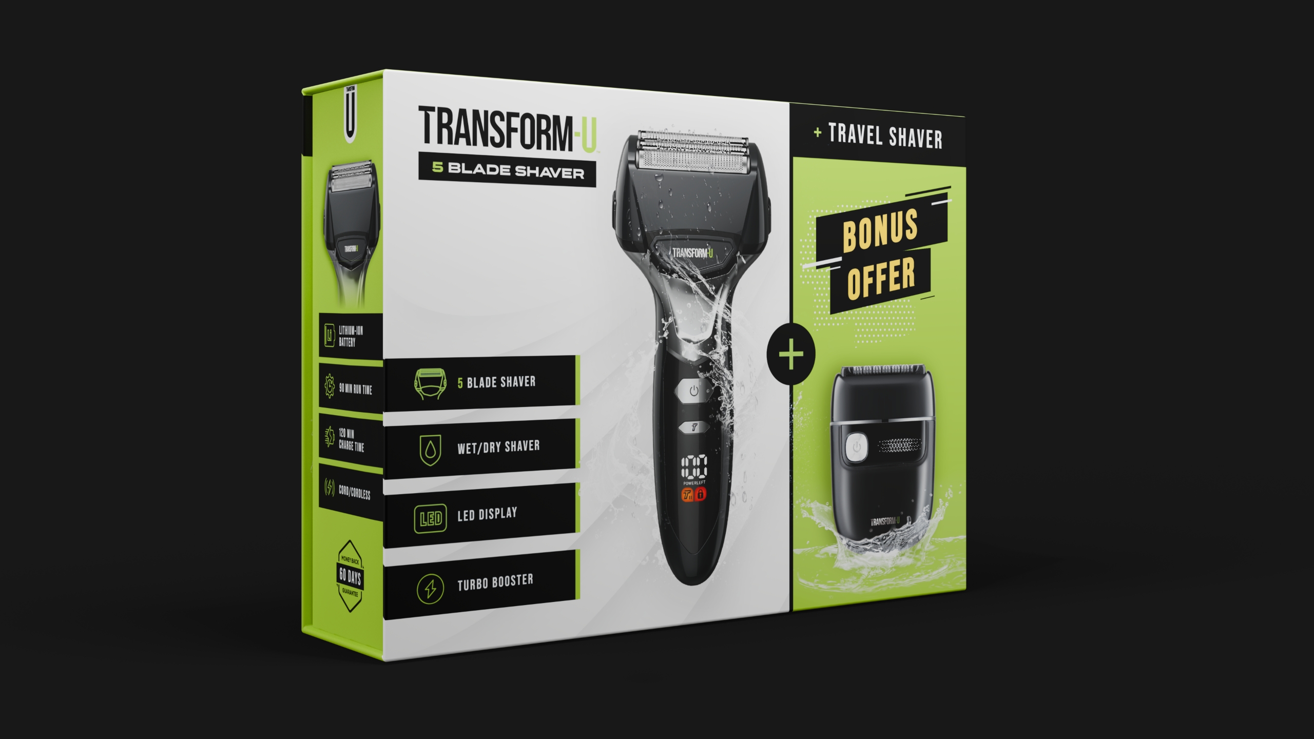
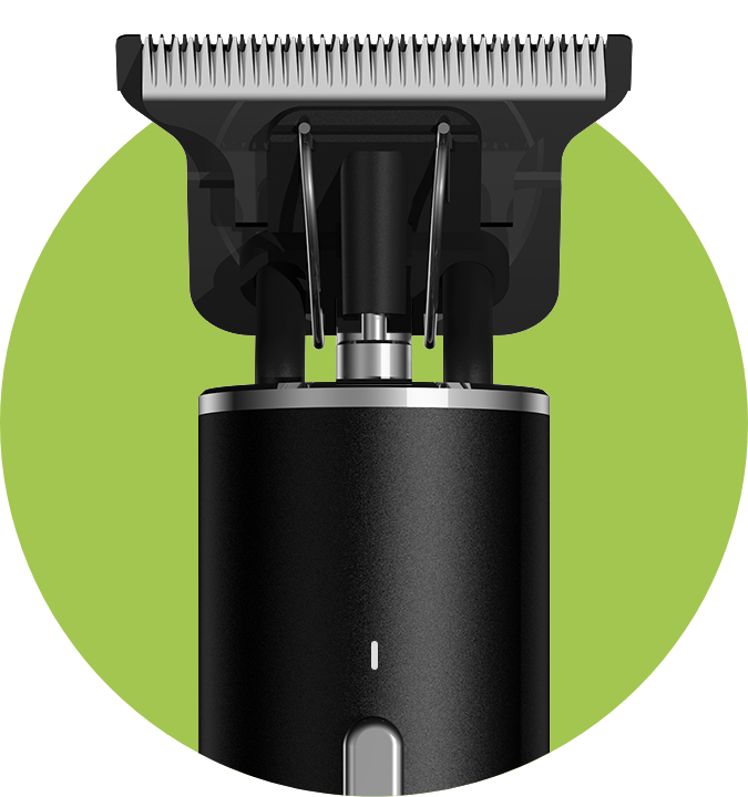
3D product render
Building the brand beyond the logo
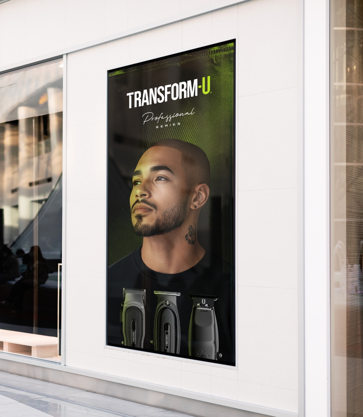
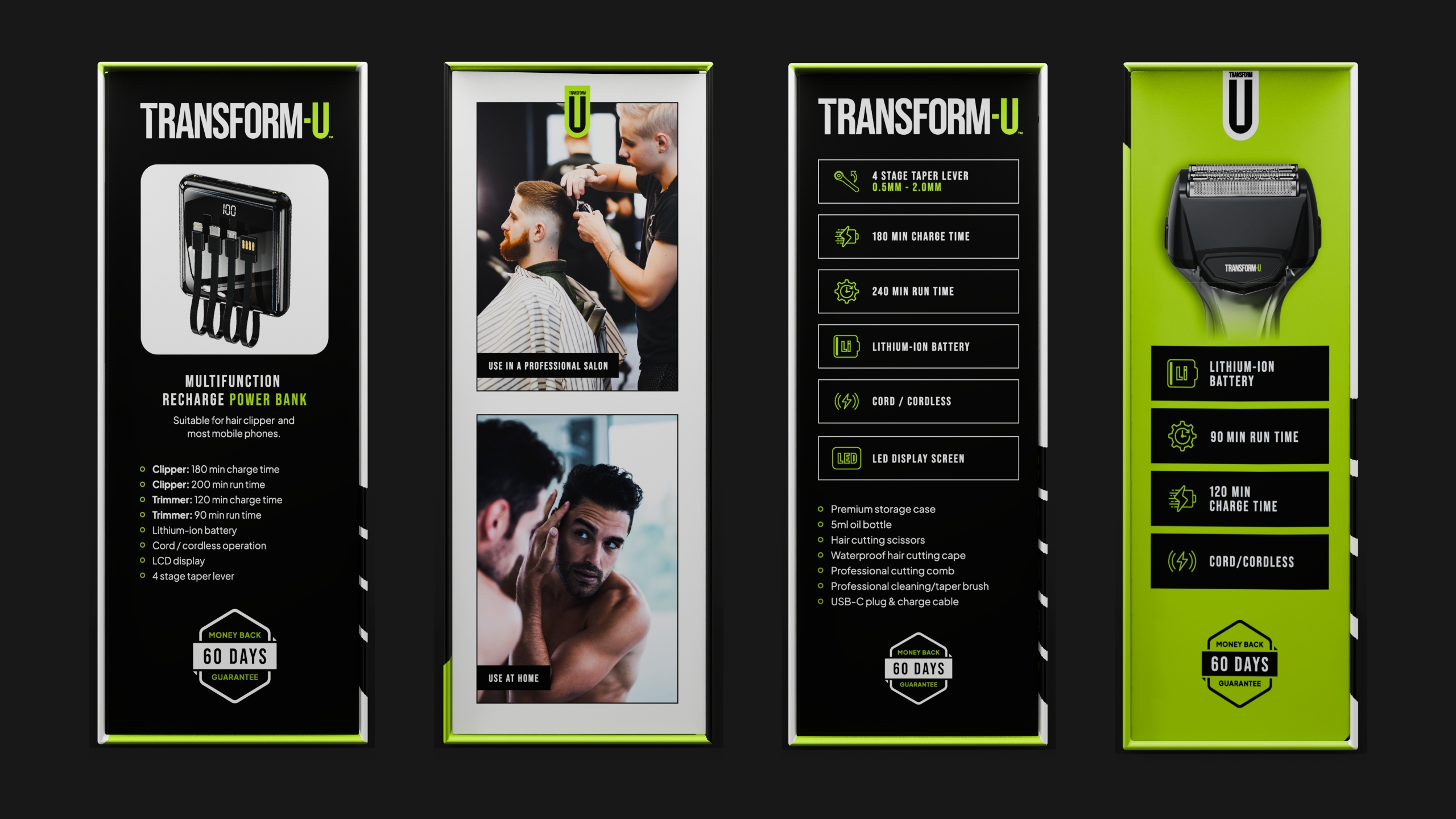
Brand assets built for shelf appeal
A powerful identity is about having a toolbox full of dynamic visual elements, each strategically designed to amplify brand recognition. For Transform-U, we developed custom brand patterns inspired by movement and transformation, sleek minimal line illustrations highlighting precision, and versatile icons that reinforce product features and benefits.
Together, these assets make Transform-U distinct, versatile, and memorable, effectively communicating the premium yet accessible feel across all touchpoints—from packaging and promotions to digital media. It’s proof that a logo alone doesn’t need to do the heavy lifting when crafting a truly transformative brand identity.
Brand assets created
Brand colour palettes
Patterns & textures
Customised typography
Iconography
Decorative product drawings
Custom image treatments
3D product render
POS design
Messaging that’s unmistakably Raise
Words that resonate, empower & elevate
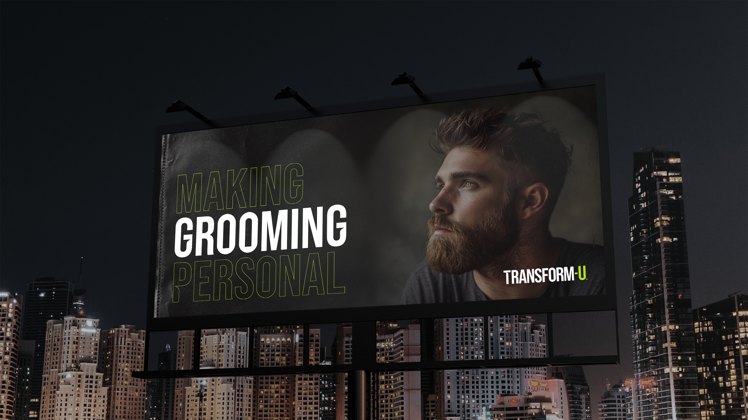
Transform-U’s personality deserved a voice equally engaging and confident. We developed an authoritative yet conversational messaging style—informative but infused with personality and a touch of cheekiness. By using a playful “U” throughout the messaging, the brand achieves a strong sense of cohesion and personal connection.
From catchy slogans and impactful taglines to detailed yet engaging product descriptions, we built a verbal identity tailored specifically to Transform-U’s audience. It’s not just grooming—it’s personalised grooming that’s all about U, every time you interact with the brand.
What was included
Brand story
Purpose, vision & mission
Values
Archetype & personality
Voice
Attributes
Vocab
Key messages
Difference
Positioning
Taglines & slogans
& more
Comprehensive brand guidelines
Brand taglineAdaptable brand name
Rolling it out to the real world
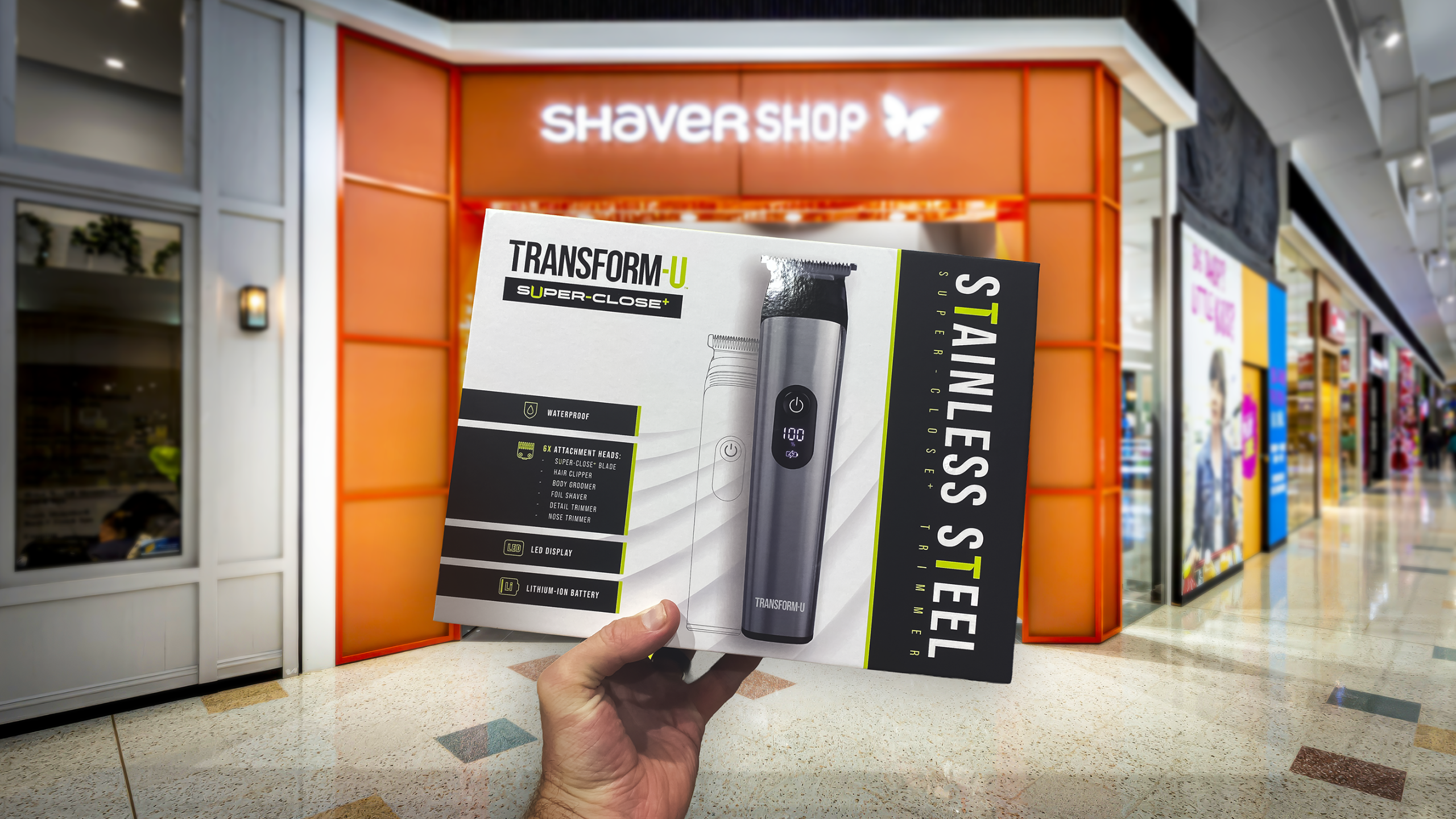
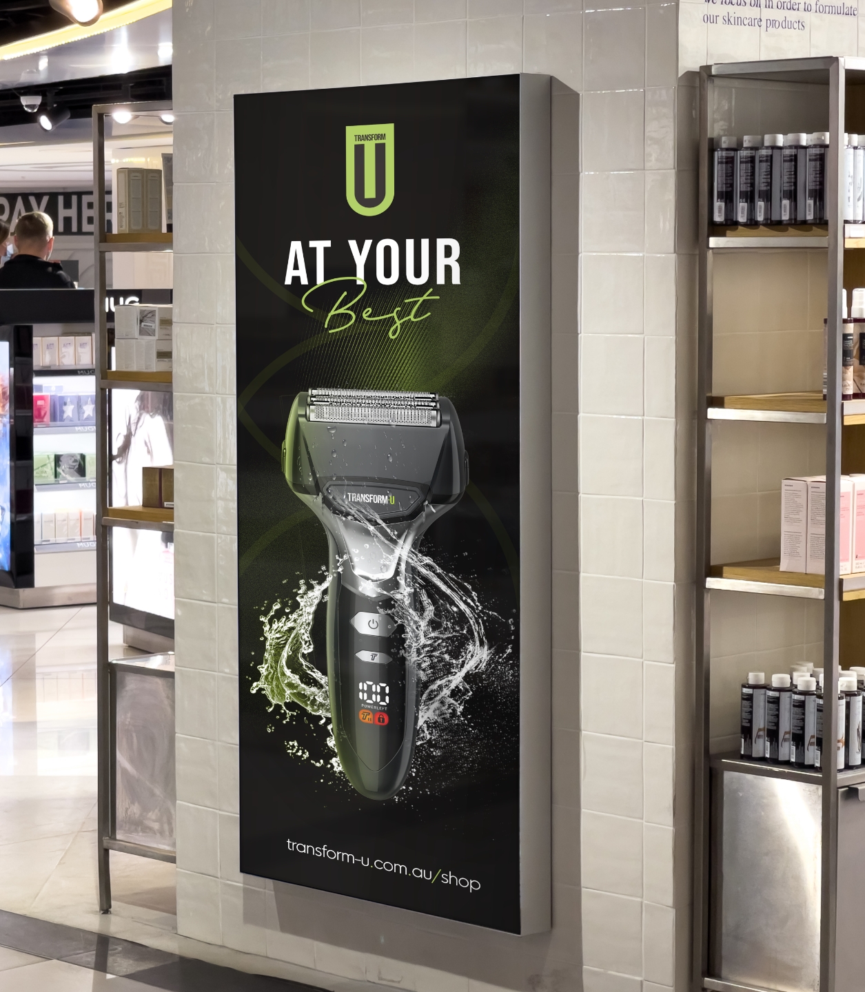
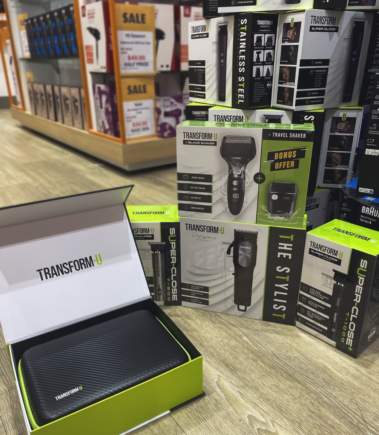
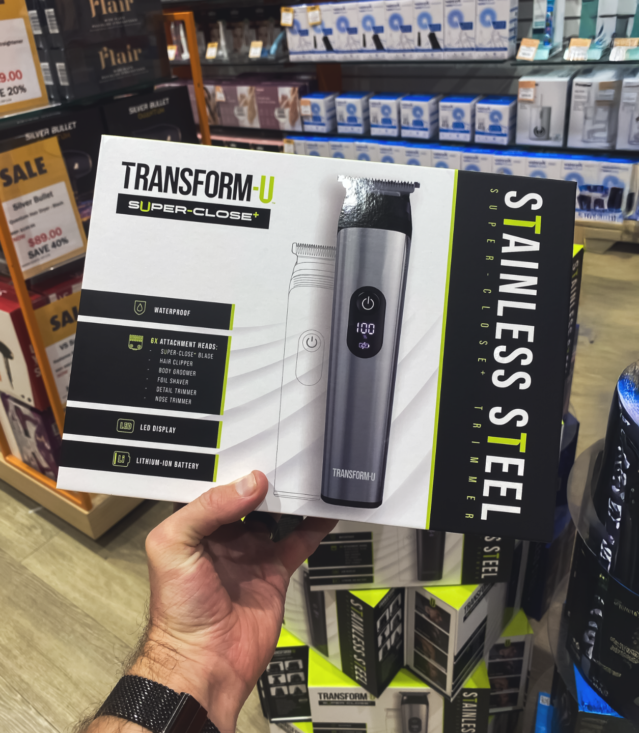
Packaging a brand for immediate impact
With our logo, visual identity, and messaging locked down, we set about creating packaging and 3D product renders for an extensive line of men’s grooming products, ensuring the brand made a confident statement on shelves from day one.
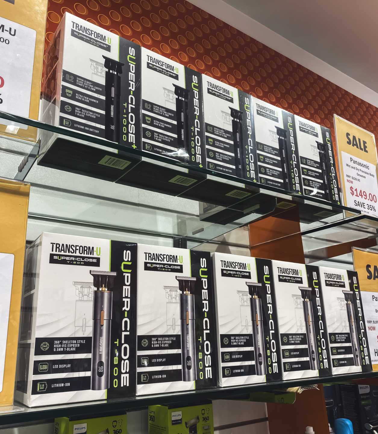
The impact was immediate. Within just a few months of launch, Transform-U skyrocketed, quickly becoming the third most popular brand in-store, trailing only behind two well-established industry giants. Thanks to this runaway success, the product line continues to rapidly expand, showing absolutely no signs of slowing down. From packaging to promotions, every collateral piece we’ve created has helped Transform-U make its mark clearly, consistently, and unforgettably.
Brand collateral crafted
Full suite of product packaging
Standard range
Premium range
Accessories range
3D product renders
Promotional materials
3D product renders
Full range packaging designs
3D packaging renders
Bringing products to life—without the expensive photoshoot
Instead of a traditional photoshoot, we created detailed, realistic 3D renders for the entire Transform-U men’s grooming range. These versatile visuals gave Shaver Shop a flexible and cost-effective solution that looked just as sharp online as photography (or even sharper!). Not only was this approach quicker and more budget-friendly than a physical shoot, it also set the stage for exciting future possibilities—opening the door to seamless animation and motion graphics to further elevate the brand’s digital presence.
“We’ve been working in partnership with Red Kite since 2023, and they’ve helped build this brand from the ground up. Even though we’re still new to the market, the growth has exceeded every expectation. In just six months we’ve become one of the best-selling players in our sector and the momentum hasn’t slowed. The brand has played a pivotal role in helping us stand out, scale confidently and earn real trust from our customers.”

 Shaver Shop (Transform-U)