If you feel like motion graphics and animated logos are all over the internet at the moment, you’re not alone. More and more brands are taking advantage of the exciting possibilities that animation has to offer, and reaping the benefits.
In this article, we’re going to take a look at animated logos, why they’ve grown in popularity, and how to decide whether your brand needs one.
With print-only marketing a thing of the past, businesses are embracing more engaging and interactive ways to develop their brands online.
To this end, designers have been including animation in more and more elements of online marketing, helping to make the most of the precious seconds they have to grab the attention of users in the digital space.
Logo animation allows brands to incorporate motion, colour and even sound in their identities. From simple movements to short video scenes, there are almost endless ways to add a little flair to your logo online.
So why should you animate your logo when your static design is performing just fine? Here are some of the benefits that logo animation can bring to your brand.
If a picture is worth a thousand words, imagine how much information you can share through animation. Even the most carefully crafted logo designs can only say so much in a single image. By incorporating movement into their logos, brands can tell a story and embody it as part of their visual identity.
Videos tend to be easier to comprehend than static images, as the movement gives our brains more information about what we’re looking at. Dynamic movement helps people to better understand and remember your brand, so it will be fresh in their mind the next time they need your product or service.
When used well, logo animation can evoke an emotional response in your audience that can strengthen their connection with your brand. Whether you’re looking to excite and delight your audience or add a little intrigue to your marketing efforts, animation can create an instant reaction that gets you noticed.
Movement can help to reinvigorate your identity, even if you don’t have the budget for a full brand refresh. You don’t necessarily have to get a new logo designed in order to benefit from animation. Existing logos can often be adapted for animation, though you will likely get better results if the design is crafted with animation in mind from the beginning.
No matter how hard you try, sometimes brands’ logos end up looking a little similar, especially if they include certain symbols or features that signify what the business does. Animation can help you to make sure your logo identity is completely unique, setting you apart from the competition – especially if their logo is static!
In addition to the obvious visual appeal, logo animation can also improve brand recall. Studies, such as "Psychological Impact and Influence of Animation on Viewer's Visual Attention and Cognition", have found that watching animation can actually improve our ability to pay attention and remember things. This is because animation tends to be more engaging and interesting than other types of media, like text or photos.
They also found that not all animation is created equal. Some types of animation are more effective at capturing our attention and helping us learn than others. For example, animation that uses bright colors and simple shapes tends to be more effective than animation that is more complex and detailed.
Overall, the researchers concluded that one thing is clear: animation can be a powerful tool for engaging our attention and improving our cognitive abilities.
It’s worth noting that logo animation might not be suitable for every business. As a huge part of your branding, you need to make sure that an animated logo fits in with the overall tone of your business, and that it’s suitable for your sector and target audience.
Younger audiences who are active on social media may be particularly receptive to logo animation, and many lifestyle-orientated brands can easily incorporate motion in a way that feels fun and fresh. On the other hand, animation may seem inappropriate in sectors that require a high level of trust and seriousness.
Generally speaking, there’s a place for logo animation for most brands, as long as it’s carefully considered within your overall marketing strategy. If all you’re doing is adding a little movement just for the sake of it, chances are you won’t gain much from the effort.
It might feel like adding motion to your company logo is just the hot new trend, but brands have been animating their logos for decades. Think about the iconic castle and shooting star at the start of Disney movies, or Netflix’s signature animated ‘N’ ribbon.
The two reasons why it might feel like everyone is suddenly jumping on the bandwagon is because animated logos have now become much more accessible to smaller brands, and more of our business now takes place online, where motion graphics can thrive.
With the continued growth of the ecommerce industry, we can expect to see more and more animation in branding. That means there’s even more reason to do this now, or risk getting left alone with a boring static logo in a sea of engaging competitors.
The short answer of where to use your animated logo is: anywhere you can.
Video content continues to dominate the internet, so adding a little motion to your social media presence can help to capture your audience’s attention and stop the scroll. Animated logos can be converted into gifs, making them quicker and less resource-heavy to load than video files. This makes them perfect additions to your website, helping to tell your brand story without slowing your visitors down.
Don’t forget to include your animated logo on non-marketing materials as well. From presentation templates to staff-only intranet portals, carrying your dynamic design through to your internal documentation can help your team members to better understand and embody your brand in everything they do.
To give you an idea of how movement can transform a brand identity into something special, we’ve put together a few different examples of brands that have really nailed logo animation.
We briefly mentioned Disney above, but we wanted to highlight it again here as a reminder that great animated logos aren’t a new phenomenon.
Many of us will have memories of a shooting star arcing over Disney’s iconic castle from our childhood, with that little twinkling motion signifying that something magical was about to commence. There’s nothing flashy and over-the-top about this animation; it’s short, simple and effective.
Google is a master of brand messaging, managing to turn red, yellow, blue and green into an instantly recognisable identity.
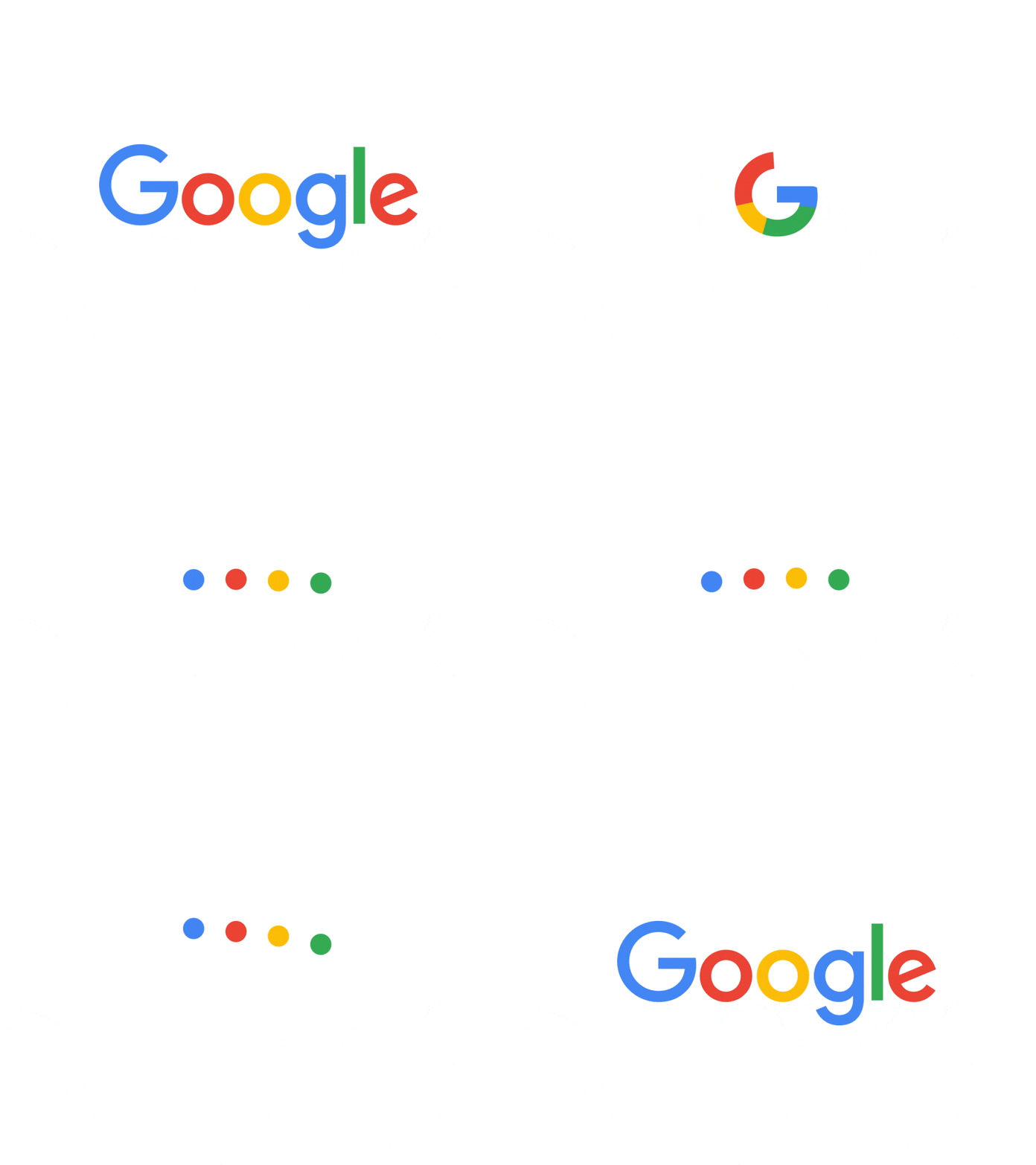
The animated version of their logo showcases the wide range of services that Google offers, morphing smoothly between a microphone, sound waves, processing animation and the simple ‘G’ logo. As well as giving an idea of what they provide, this animation backs up the seamless integration of Google’s tools and leaves room for scalability.
LinkedIn’s animated logo tells a compelling story in just a few seconds, giving audiences a clear impression of what they can expect from the platform.
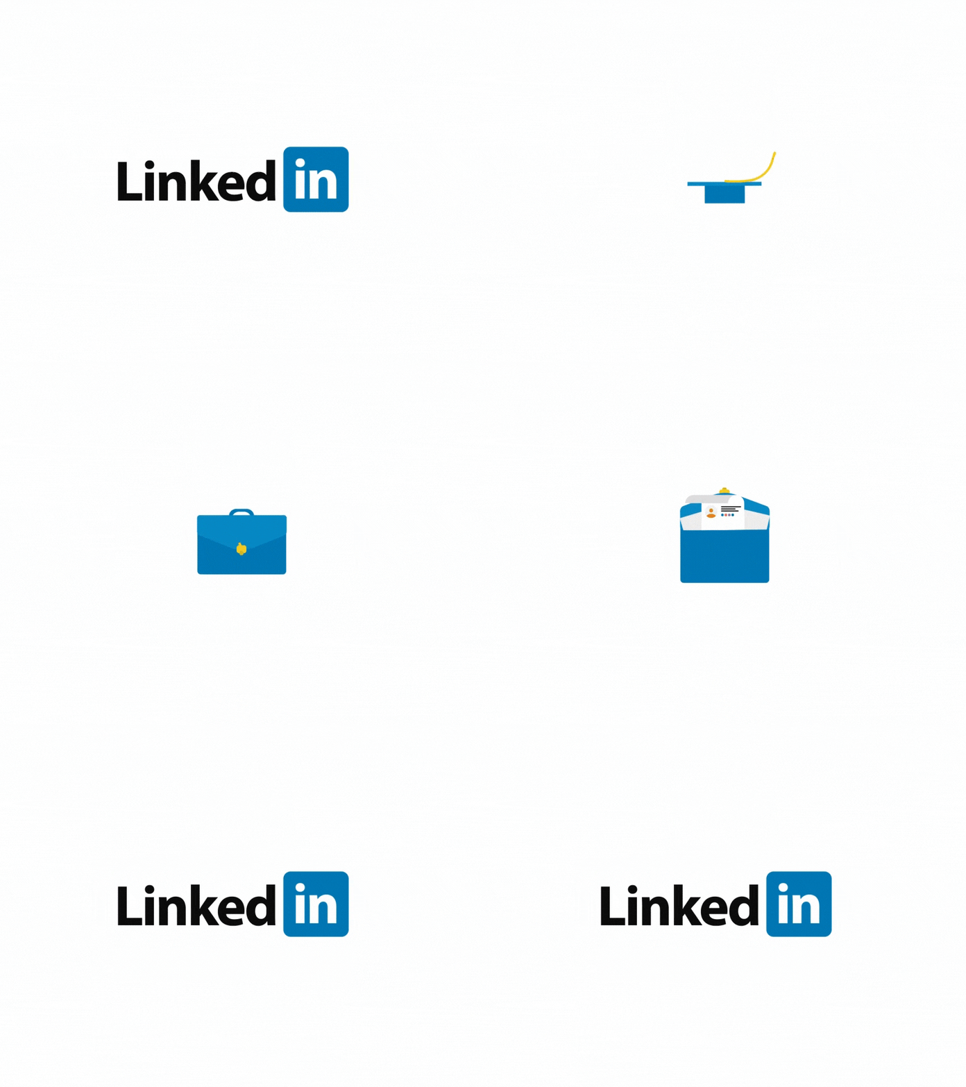
Embracing the colour and shape of the signature blue square that accompanies their logo, the animation moves from a mortarboard to a briefcase containing a resume, demonstrating the journey from education to career that is supported by making professional connections on LinkedIn.
It’s a little cheeky to include ourselves in this list, but we wanted to show you that great logo animation isn’t just for global multi-million dollar companies.
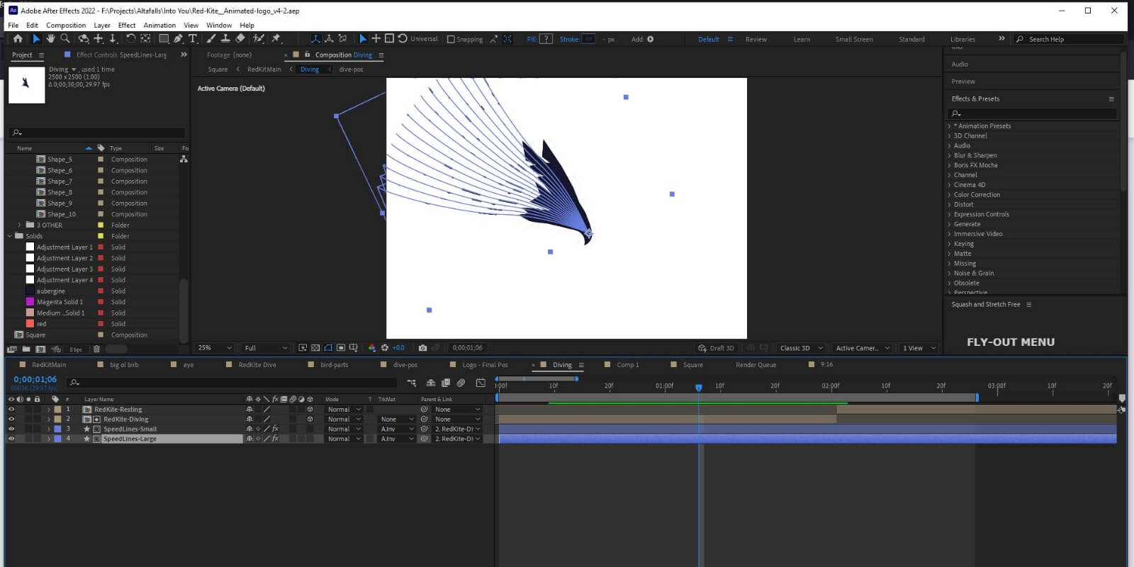
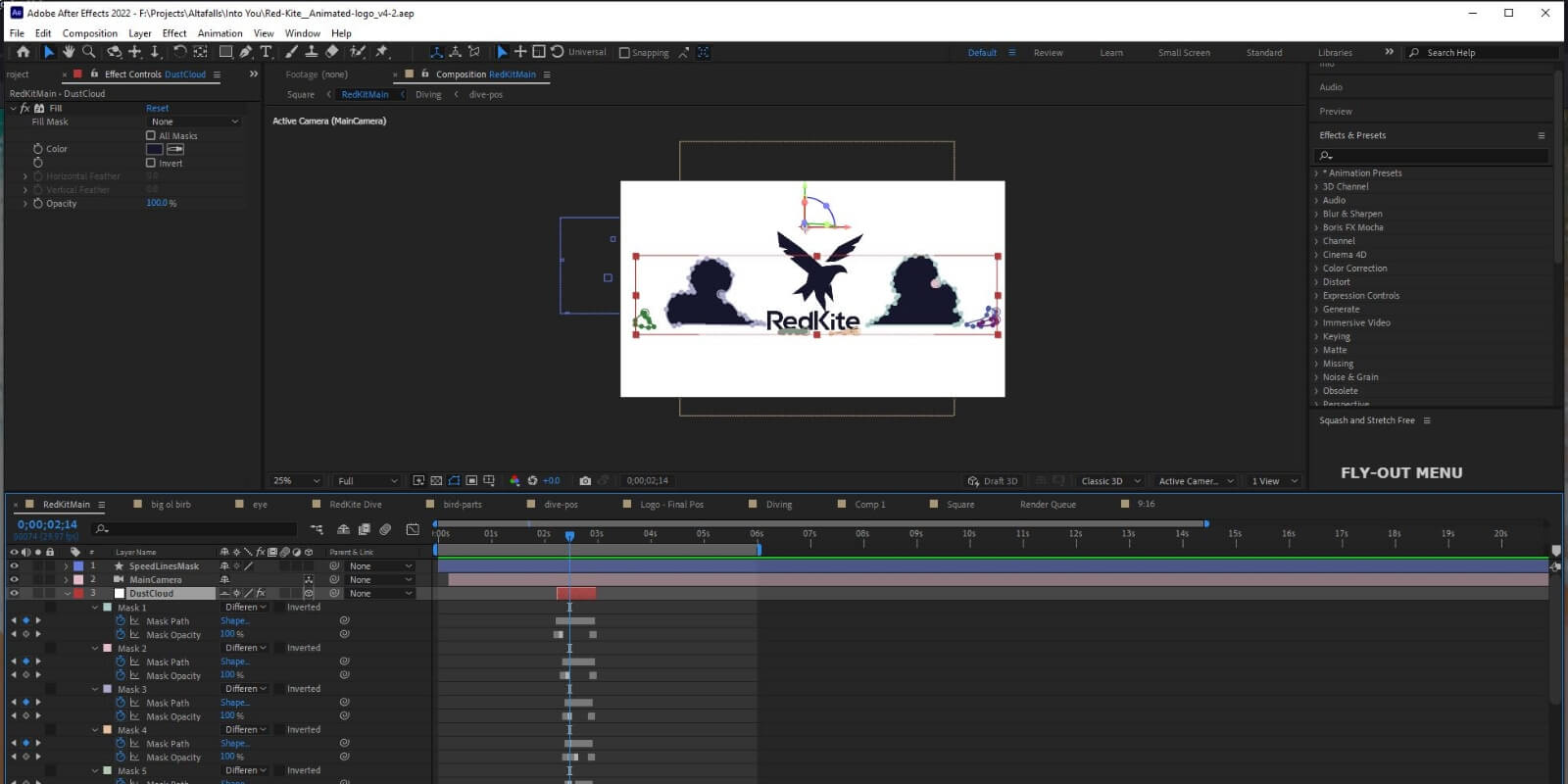
From lines to indicate speed to the clouds that part as the bird descends, the animated version of our logo includes lots of elements that would clutter the design if they were included in the static version. It also shows the kite in different positions, helping to clarify each shape within the stylised design and ensure that it is understood correctly once still.

If we’ve convinced you that animation is not only the present but the future of logo design, we’d love to hear from you. You can also check out our logo animation services page for more information.
While animation isn’t included as standard in all of our logo design packages, just let us know if you’d like to add this service when you talk to us. Logo animation isn’t right for every brand, which is why you won’t find it in the standard packages listed on our website. We want to make sure that our clients never pay for a service they don’t need or want.
We can design a logo with animation in mind, ensuring that the final result is well suited to motion, creating an eye-catching and engaging addition to your digital branding.
Read next: What Makes a Great Logo
When it comes to budgeting for your new logo, the answer often comes in the form of another question: "How long is a piece of string?" You can, of course, spend endless amounts on marketing and brand development, but there is a sweet spot for getting a quality logo for your new business or refreshed brand. So, how much should it cost to design a new company logo?
The reason why there’s no simple answer to this question is because logo design is a service-based delivery, in which time investment can vary, as can the rate at which the time is charged. Logo and brand design service offerings range from budget services (through either freelancers or design agencies), mid-tier, or high-end – and everything in between.
It’s not hard to find budget logo options – just head over to Fiverr and the like and find freelancers offering up 10 logo concepts for $500. While that may seem like good value for money, it’s unlikely that much time and thought have gone into the concepts to be able to come up with that quantity at that budget. Furthermore, it’s likely that they’ll be cutting corners with cheap fonts and stock elements which can risk looking underdone, or like straight-up copies of other logo designs.
Rather, you’re better off spending $2000 for a single concept and working with the person or agency to get it right.
A custom logo is important for your business and its identity. A lot of people just see a logo as a box to be ticked, but it’s worth investing in getting it right because of what you stand to gain. How much you should invest on your logo development depends on the size of your business and business goals.
For a national property investment business that earns millions of dollars per project, a strong and strategically designed identity that has the potential to land them many more million dollar projects is worth investing $10,000+ in a logo. On the other hand, a small business whose average client spends a few hundred dollars per project isn’t likely to see the same returns. It’s still worth investing, but the amount to invest is relative to the impact that logo can have for them.
$0-$500 – Crowdsourcing
At the lower end of the range, sites like Fiverr and 99 designs offer a marketplace of freelancers that can provide standard logo designs in line with their style and experience. This process involves a basic brief but no research or competitor analysis on their part. Designers submit concepts without knowing much about your business. You’ll often find young designers with minimal experience on these platforms. Quality varies.
$500+ – Freelancer
For a budget of around $500, you can work with a more experienced freelance designer. As a one-man band, you’re still limited to a single person’s design ideas and style, and not likely to get a whole lot of strategic input or process from this engagement. Depending on how you find them, it can be a gamble as to their experience and what you get at the end. And if they claim to be cheap – there’s usually a reason why.
$1000+ – General Agencies
At this budget level, you may start to find some budget agencies that will be willing to take on your project. The cost here may vary depending on if their logo design service is a specialism or a side offering. Be wary, because if the charge is on the cheaper end of this scale, it’s possible that the work has been outsourced to a marketplace anyway in order to be able to engage you on a follow-on service like ongoing marketing.
$2500+ – Specialist Branding Agency (like us!)
Agencies that specialise in brand development take a strategic approach to logo design, and will take the time and research to ensure your logo design is going to be beneficial to your brand, stand the test of time, and work in the ways that you need it to. Specialist brand agencies will list their experience, the brands they’ve worked with, show a large portfolio of quality work, and take the time to get to know your business before engaging in your project. You’ll get a smaller number of strategically-developed concepts to choose from and you can hone down the chosen concept until it’s right for your business.
$100,000+ – Highly reputable branding agencies
Well, we did ask how long a piece of string is. For enterprise brands with highly competitive markets and complicated brand architectures, logo budgets can and should exceed tens of thousands of dollars. This is because there’s strategy and consultation to be done ahead of design, a long concept development phase, and a long roll-out phase across overarching and sub brands.
Ultimately, how much you should invest in a logo depends on your unique circumstances – but be wary of cheap and shoddy services, because rebrands down the track can end up costing you more.
One reason the above dollar figures can seem like a lot is because people often look at a logo and think it’s a single business asset – i.e. a flat jpeg image whipped up in a matter of hours.
In reality, your logo design project should deliver a whole range of visual assets for your business, which can be rolled out across various formats and placements including your social media profile images, your business shop front, your email signature and your car decals, to name a few.
As a minimum, your logo design project should deliver you a logo suite. That includes:
If you engage an agency or designer to deliver a branded logo style guide, you will also get a document that details a range of fonts, colours and usage guidelines. At Red Kite, we also deliver a logo usage document which will detail which logo file to use for what application. Both of these are highly valuable documents, as they will help maintain your brand identity and integrity when using your logo in various applications.
Beware of budget options that only deliver your logo in a limited range of formats, as you’ll quickly be back to square one when trying to work with your logo on various applications and placements.
Most importantly, your logo needs to meet the requirements of your business, be appropriate for your industry and resonate with your target audience.
Checklist: The right process to follow when designing your new company logo
If you’ve decided on a budget for your logo, you might be wondering if you need to put some more cash away for a logo refresh in the coming years. The rate at which you should look to update, change or refresh your logo depends (sorry!) on the industry you’re in, how competitive it is, and how your business has changed.
Fast-paced and highly competitive industries involve more consistent and strategic brand and logo review, while less competitive industries will find this less important.
Most brands don’t change their logos per se, but refresh them with small tweaks every 5-10 years to stay relevant, with a refreshed look and feel to engage their customers.
Once you’ve got your logo sorted, you’re ready for your brand style guide development.
Read next: What should your perfect brand style guide look like?
First impressions count.
It’s your opportunity to show, not just tell, people what you’re all about without having to say or do too much in those first few minutes.
It’s no different for new businesses seeking to expose their wares to potential customers. In fact, it’s probably even more crucial, as a strong, authoritative, trustworthy and correctly positioned brand can be the difference between a call back or radio silence.
The most interesting thing for new businesses is this – whether or not you choose to invest in branding, you still have a brand (like it or not). Customers will still form a perception of you, talk about you with their colleagues and friends, and pass judgment on your products or services.
Investing in a fully-formed and well-positioned brand gives you the opportunity to actually control all of those things, and turn them into opportunities. As a new business, that’s as valuable as gold.
For new businesses seeking to create a brand, the power of a suite of assets – a logo, a tone of voice, a group of colours and fonts, a unique position, a certain feel and perception around what you do; not to mention the signage and branded assets your business has – will help communicate what you’re all about in an instant.
It also lets your business find the space between your competitors and build a position that is unique in the market. Trying to do that without a strong brand is nightmare material, leaving you in a sea of sameness in your category.
And with customers who receive a barrage of content on social media, TV, email, the internet and from friends and family, being recognisable and memorable has never been more valuable.
Take this logo from TrussCorp, for example. It tells you and shows you exactly what the business does straight away. It paints a picture in your mind of their products and services through visuals, and becomes an instantly recognisable mark that triggers feelings and thoughts about their company.
But more than that, it makes them look a certain way – an established, trustworthy and reliable company that can deliver what you need them to.
And it does it all in an instant.
When you invest in a new brand, and use that brand repeatedly to deliver useful, high-quality products and services, you create tangible value (‘I got exactly what I wanted from that company’) and intangible value (‘that brand makes me feel something, and because of that I’m confident they could deliver good things again’).
Not to just pull out the big guns, but if you stripped the Apple logo off Apple’s range of products, things would take a downward turn very quickly. They’re the same products we all know and love, but there’s something about that brand – the intangible value – that just makes us go back again and again.
And that value is important for businesses of any size, not just multinational technology behemoths named after the most common fruit.
It’s from that equity in the brand that your business can start to tell its stories. Having a new brand allows you to frame things emotionally for your potential customers. There’s a saying in marketing that brands have to appeal to the head and the heart. But research shows companies that appeal to the heart the majority of the time have far more success when they do push for more sales.
Take Nike, for example. Their brand aligns itself with athletes and weekend warriors, and tells those stories about sweating it out, no matter your skill level or athletic ability. Just Do It, so to say. They use that emotional storytelling so well that it’s rare to even see them advertise a price for their products. Consumers just pick them up off the shelves, check the price, and vote with their wallets.
The same happens with small businesses that establish their brand early – they become far easier purchase decisions for potential customers to make.
When you have a new business, you probably have a small team (or even a few contractors) who need to buy into what you’re trying to achieve.
Creating a brand, positioning it and giving your team a northstar to follow can be an absolute game changer, especially in the early days. It can become the centre of your culture, help guide your staff on making good decisions without you (the dream), and it can attract new, well-aligned talent to the company as you grow.
When your team and business move in the same direction, it delivers business results. And when your customers buy into that vision and values for your brand, you have a united front on all sides of the ledger.
Companies such as Afterpay and Lululemon – which have almost cult-like followings – understand how a great position and brand can bring everyone along for the ride.
If you’re building a new company, we’ll assume you’re keen to be in it for the long haul. It’s often said that brands can be immortal, while categories can die tomorrow. Having a strong brand early on can allow you to build a strong emotional connection with consumers, even if your products, services and audiences need to change as time moves on.
Nokia started as a paper mill in the late-1800s. Allied Manufacturing and Trade Industries Limited (you may know them as beverage giant Coca-Cola Amatil) started as a tobacco company in 1904. Nintendo started out making playing cards in 1889.
But a strong brand builds you a foundation for the years ahead. It lets you leverage the equity you already have to launch new products and services, or entire new businesses. It enables growth in a really structured and effective way, letting you focus on what needs to be delivered for customers.
We get it. It can feel like an expensive operation. If you don’t have the budget to lock in a brand strategy and all of the things that go along with it, the one thing you shouldn’t do is just get a logo designed ad hoc. Taking this approach can make things far more complex and difficult as things move on.
It’s important to know your business, market, audience and point of difference in order to set you up for the best chance of success. Investing in a brand strategy is worth the short term expense to avoid costly mistakes.
If your budget is limited, at least find someone who can take a strategic approach to how your business is branded as they develop your brand assets.
Your business, your staff and your customers will thank you for it.
Read next: The Right Process To Follow When Designing Your New Company Logo
Just like there’s a process you should take to come up with your brand name, there’s also a process to follow when designing your new company logo.
As with any design project, there’s a lot of variables to choose from. Things that may come into consideration include industry standards and best practices (ie. common colours and fonts), as well as personal style and designer preferences – but this may not get you to where you need to be.
You may want to like your business’s logo, but more importantly, your logo needs to meet the requirements of your business, be appropriate for your industry and resonate with your target audience. Here’s the right process to follow when designing your new company logo.
Your logo is the first impression people have of your business, and therefore an important visual brand asset. And while it’s not just a tick box activity, it does need to tick a few boxes. For starters, it needs to set you apart from your competitors and resonate with your audience. When done well, designing your company logo should be seen as an opportunity, as it can help your business achieve its goals and be more profitable.
After an initial workshop about business and strategy, the company logo is the first item on our list when we take on new clients. It’s the development of the logo that guides the rest of your visual identity – the first piece of the puzzle that forms your unique business identity.
If you’re starting from scratch, you’ll be looking to develop a new logo. But if you already have something developed (maybe it was made by a family member, or has been in place for a while but is now dated), you might be wondering if a new logo is the right approach.
Unpacking the reason why you want a new logo is important, to ensure that you get the desired result for your logo and branding project.
For example, you may think you need a new logo because your business or marketing is not performing as expected – but it could be that your logo is not the problem. In reality, it may be that your brand messaging is inconsistent or disjointed. You might be fishing in the wrong pond, by marketing to the wrong audience. Maybe your website is dated and not converting. Maybe the logo is good, but the rest of the brand identity hasn’t been given the same amount of attention.
If you are unsure, it’s worth going back to your strategy to diagnose what the problem is and figure out how to address it. In many cases, your visual identity is something that needs to be addressed, and this starts with your logo. But not always.
Chatting with us about strategy can help you diagnose what the problem is and where your time, energy and budget could best be utilised. Sometimes a logo just needs some small adjustments, or to be brought up to date. If you have a brand and logo that is well recognised, it makes sense to maintain that hard-earned brand recognition. But sometimes, you might need to start again to help realign with your audience or reposition your company in the market.
You might think that your logo is all about you and your company, but actually the most important consideration is not your personal preference or design style – it’s what will appeal to your customer. Knowing your target audience is incredibly important, so you can make sure your logo design and brand name resonate with them.
It’s essential to check out what your competitors are doing to make sure you avoid repetition or being too similar. For example, a landscaper might choose the colour green and a tree as their logo – but that would put them in the same box as every other landscaper in their suburb. Think outside the box and stand out.
If you work in a serious industry, in most cases it would make sense for your logo to follow suit. You don’t want Comic Sans as your font if your business is a doctor’s surgery, because you wouldn’t gain customer trust and wouldn’t be taken seriously. (Side note: no one should be using Comic Sans – just so we’re clear.) Be different, but make sure it’s still industry-appropriate. Find the balance.
The requirements of your logo will vary depending on the type of business you’re operating and the industry you’re in. For example, if your business is e-commerce, most of the requirements of your brand would be digital.
But for Jim’s Mowing, business cards, invoices and car (or trailer) decals are the primary places the logo will be shown. It doesn’t sound like much, but this will influence how versatile you need your company logo to be, and whether or not a wordmark or custom graphic is applicable or relevant. Keeping it simple will ensure that your logo ages gracefully.
Quick case study: Take the Jim’s Mowing logo, for example. It’s a simple wordmark with a silhouette of a man (presumably Jim). The company has stuck with industry-relevant colours – green and yellow. And while it’s pretty uncommon to have a face in your logo, it makes sense in this application as the brand name is so human-centric. Jim’s Mowing has a local neighbourhood vibe and that’s reflected in the logo design.
Logo designs vary widely from simple text (Facebook) to custom illustration (Mastercard) to both (ING).
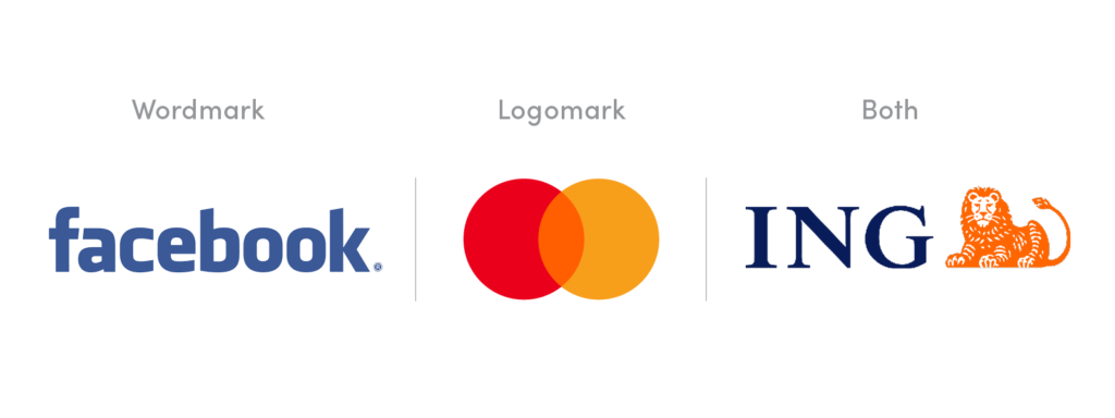
An accountant or lawyer may use a wordmark, as it is appropriate for that industry, whereas a daycare centre may want a more playful symbol that people associate with them.
So it depends on your industry, but can also depend on how long you’ve been in business. For example, Mastercard didn’t launch with just a symbol as its brand. But over time, the awareness grew of its logo mark and consistent use of brand colours, to the point where the brand realised it could drop its name altogether and still be recognised. Apple’s in the same basket.
Whichever you choose, the success will be in the execution. A logo is a part of a wider brand and suite of assets which become touch points with your customer on a day-to-day basis. Getting this right from the get-go will serve your business for years to come.
Read next: How Do I Trademark a Logo in Australia, And Should I Do It?
So you’ve worked with a designer to create the perfect logo for your business – and now it’s time to protect it. Here’s what you need to do to trademark a logo in Australia, and why you need to make it a priority.
A trademark is, essentially, a form of brand protection that sets your business apart from your competitors. The easiest way to understand what a trademark is might be to understand what a trademark is not.
It’s not a copyright, which is created automatically as soon as a particular work – like a movie, a book, or even this article – is created. For that matter, your logo is automatically copyrighted when it’s created, and that copyright most likely belongs to the graphic designer who worked on it, so you’ll want to make sure they transfer that copyright over to you.
It’s not a business name, which has to be registered with the Australian Securities and Investments Commission (ASIC).
Legally, it’s not even considered a design. Designs are subject to their own intellectual property (IP) laws, which refer specifically to the shape, configuration, pattern or ornamentation of a particular product. Designs have to be new to be registered, whereas trademarks don’t.
A trademark is your brand identity. Virtually anything can be a trademark – your logo can be a trademark, sure, but so can a word, phrase, letter or number that you want people to associate with your business. A jingle can be a trademark. A trademark can even be a sound, a scent, a particular way that your product is packaged, or a combination of any of these things.
IP Australia, who are responsible for registering trademarks in Australia, give the example of the flying red kangaroo on the tail of Qantas planes – that’s a trademark. On the other hand, the shape of a new ergonomic chair aboard that plane would be a design.
Once a trademark is registered, you have the exclusive rights to use, license and sell it. So if you register your logo as a trade mark, for instance, other businesses won’t be able to use that logo in an attempt to ‘pass off’ their product or service as yours.
Strictly speaking, you’re not legally obliged to register your logo as a trade mark. If you’re happy to take the risks that come with failing to protect your logo, you can choose to do that – and indeed, some start-ups choose to do exactly that, until they see their brand as having a value that’s worth protecting.
You can even add a ™ symbol to your product labels without actually registering it. That’s not illegal, even if the trademark itself will have no actual protection under IP law. It’s basically just a way of bluffing anyone who might be thinking of stealing it. (The ® symbol, on the other hand, can only be legally placed next to trademarks that are actually registered.)
But the risks are significant. The more successful your business becomes, the more valuable your logo is, and the more damaging the consequences of failing to protect it will be.
Your logo is what identifies you to the market. That’s its primary purpose – not to communicate what you do, but to help people recognise you. If someone else has a logo so similar to yours that it can be mistaken for you, and you haven’t registered it as a trademark, then it could be confusing for your customers, and the other business will get to enjoy the benefits of all the time, effort and money you’ve spent building your brand. And that’s probably the best-case scenario.
The worst-case scenario is that the business using a logo similar to yours does shoddy work and damages your reputation by association, or that they register the logo as a trademark and prevent you from using it. (Remember, logos don’t have to be new to be trademarked.) If you’ve worked long and hard to achieve brand equity, that’s not something you’ll want to let someone take from you.
It’s not particularly expensive to register a trademark, anyway. It’s all relative, of course, but the IP Australia trademark application and registration fee is $250 per ‘class’. Goods and services are divided into 45 classes, or product categories, and when you register for your trademark, you’ll be asked to choose your class – most trademark applications are only for one or two classes, and the registration fees only have to be paid once every 10 years.
Now, it is possible to protect a logo without registering it as a trademark – they have some value under common law, and under state-based fair trading legislation. But it’s likely to be much more difficult and expensive to win that battle than it would be with the benefit of trademark registration.
First, you have to make sure that you’re eligible to apply for a trademark. To be eligible, you have to intend to use the trademark in relation to the class of goods and services you’re registering it under, and you have to apply as an individual business owner, not as your business.
You also have to ensure that your trademark doesn’t conflict with any marks that are already registered, because that’s a surefire way for your application to be rejected. You can upload images to the Australian Trademark Online Search System here to see if a similar logo has already been registered.
A trademark can also be rejected if it’s likely to mislead the public about the nature of your offering – but if your logo does that, it’s probably not a very effective logo anyway, right?
Once you’re confident your logo meets these requirements, you can apply online through IP Australia.
Once you file your application, it will be made publicly available shortly afterwards, and from there, only very minor changes can be made – so make sure the logo you submit for approval is in its final form.
It usually takes IP Australia three to four months to assess the application. Other people and businesses will then be given the chance to oppose the application – a ‘speak now or forever hold your peace’ kind of situation. As long as nobody successfully opposes your logo, its registration will be finalised a couple of months after that – so, all told, it’ll take around six months from the time your logo is submitted to the time the trademark is formally approved.
If you want to register your logo globally in the future, IP Australia recommends using the Madrid Goods & Services Manager to check if the class of goods and services you’ve chosen for your mark will be accepted by the World Intellectual Property Organisation. You can use the Madrid Protocol to apply for trademark protection in a number of countries in one fell swoop, but you’ll have to register your trademark in countries that haven’t signed up to the Madrid Protocol on a country-by-country basis.
Once your trademark is registered, it’s your responsibility to enforce it. If you see someone using a logo that looks suspiciously similar to yours, IP Australia recommends sending a letter of demand to assert your ownership, before attempting alternative dispute resolution tactics, including mediation, arbitration and expert determination, and finally going to court as a last resort.
Aside from being on the lookout for imitators, you also have to ensure that you actually use your trademark in order to protect it. If you don’t, it can be removed on the grounds of non-use – this law exists to stop traders from simply Hoovering up as many trademarks as they can and then sitting on them forever without using them.
The earliest a non-use application can be made is five years after you filed for the trademark, and if you can demonstrate that you’ve used it in the past three years, you’ll be in the clear.
Your trademark registration will be honoured in all Australian states and territories for 10 years after its filing date. You can then renew it every 10 years, for whatever the going rate of a trademark registration is at that time. You can renew your trademark up to 12 months before the renewal is due, and as late as six months after it’s due, but you’ll need to pay a late fee in that case.
Read next: How To Write The Perfect Brand Strategy
Contemplating how to best design the perfect logo for your brand?
An eye-catching, professional logo that’s as communicative as it is subtle? Well, welcome to the first and most important step of your branding.
Coming up with professional logo designs might sound simple – but it really isn’t. It’s part art, part science (mixed in with a bit of psychology).
All companies, both small and established, start-ups and conglomerates, owe their traction in the market to the efficacy of their brands. More specifically, your company’s visual signature says a lot to both prospective leads and existing customers you want to maintain.
When talking about design, there’s a whole lot you need to learn before you begin to create a good professional logo. Red Kite Design has specialised in business branding for years.
Today, we’ll take you through five of the catchiest, most impressionable of professional logos, from companies in Australia and beyond.
Highlighting at each point some takeaways we think you should incorporate in your own logo. From colour scheme to shape-theme balance.
Starting us off is a company whose product you’ve probably interacted with in the not so distant past.
Apple is known for its strict adherence to consistency when it comes to their products.
They're one of the largest brands in the world, and for good reasons.
Reasons that go beyond their contribution to the world of consumer electronics. Certainly, they have what is probably the most universally recognisable form factor.
But the reasons most people—indeed, most Australians—opt to spend way more money on Apple gadgets goes beyond their famed ecosystem.
Nor is it solely attributable to the new vibrant features the products they put out, given how awash the market with more spec-heavy gadgetry today.
All it is is this: Apple’s brand makes a promise and it keeps it. That's it.
From huge yearly shindigs wherein they announce their new flagships to the single straight line that's subliminally drawable from their company's logo branding to all their product's visual design—this fact is proven and then some.
When asked about the source of his inspiration to create a logo, designer Robert Janoff said,
“I designed it with a bite for scale, so people get that it was an apple, not a cherry,”
Janoff has also said, “The only logo design direction we got from Steve Jobs was ‘don’t make it cute’.”
The Apple custom logo has to make the top 3 spots in our company logos for a variety of reasons.
The Woolmark logo design, arguably the most recognisable of all Australia’s clothing brands, was the result of a push to win a business logo competition.
The company itself was just starting out and in 1964, as soon as they claimed the top prize, they rolled out the company logo in Belgium, Netherlands, Britain, Japan, the US, and Germany.
The Woolmark company logo is used on garments made of 100% modern wool.
But there are two other iterations of the same logo which have slight modifications: The Woolmark Blend logo and the Woolblend logo.
Of course, most people don’t realise that both of these versions each serve a different purpose.
The Woolblend logo indicates that a garment contains 30-50% modern wool. The Woolmark Blend version, on the other hand, is used to indicate garments that make use of a minimum of 50% modern wool.
The original Google logo adopted back in 1998, used a basic font. For nearly a decade, it remained unchanged.
Until 2009. This time, a few changes were introduced regarding the colours.
Following this, in 2015, the logo was relaunched with a modified professional font and saturation to the colours.
And this is the logo you know today.
While the preceding two company logos have been quite minimalistic in their use of colour, the signature aspect of the logo is the varying colour scheme. Which is an interesting choice.
Unlike most other tech conglomerates, the platform eschewed symbols and stuck with simply their name as the logo.
One theory as to why is because of their need to make the design accessible to all, which is an important operative mantra for the company.
The use of text as opposed to a symbol is also quite appropriate when you think about the fact they are, indeed, a word search engine.
Logo Design Inspiration
*FUN FACT: The font used in Google logo is actually a custom one. It’s patented and owned and exclusively for their branding. Talk about setting yourself apart and dedication to your brand’s uniqueness! This is an excellent way to go for companies that are thinking of going with a Wordmark logo.
Now here’s an example of a timeless design that uses both text and symbol in a simple and effective way.
The right word to describe this logo is utilitarian. Being a media company, there’s a natural need to strike a balance between artistry and conciseness.
The logo is intricate enough to catch and hold a gaze — an oscilloscope’s waveform that rides into itself.
And it’s still simple enough to get the job done. Not to mention the relevance of the waveform imagery to the broadcasting company.
FUN FACT: Graphic designer Bill Kennard was paid a total of £25 for his work on the ABC logo.
The shell logo, distinctively colourful as it is now, bears some real cultural relevance to the world.
The use of an actual shell was meant by the designer to evoke a feeling of oneness with the heritage of California at the time of inception.
The original idea was to use the Spanish flag (most Californians were Spanish natives).
Investigating the ideas and symbolism a little deeper, you will see that the shell used is one from a mollusc, which affirms the industry core business: an exploration of oil and the earth.
The rule here is pretty simple. Your company logo should serve the primary objective of being an identifying symbol for your business.
But there's a balance that begs to be struck here, see. Your logo should NOT be used to communicate what your company does.
It should be meaningful to whoever seeks to purchase your product, sure, but it should represent an idea, not a vocation.
(A la, a pair of earphones for a radio station/audio broadcasting company will always be banaler than it is communicative.)
The words used, the colour scheme, the type (and mood) of the font should all be carefully tailored to meet the right end.
A colour scheme that is bright and animated is certainly relevant for an ice-cream manufacturer and distributor; not so much for a law firm. Or a private coroner service.
Rule #8 in the company logo designer handbook: steer clear of clichés. For example, if yours is a finance startup, try to avoid coins on your company logo designs.
Or if you’re looking to create a logo design for an online radio station, using a pair of silhouetted headphones won’t do.
People’s minds have a way of mentally annotating clichés and disregarding them as plain.
Your mission should be to find a custom logo design that accurately expresses your company’s vision in a modern, gripping style.
Great logo designs should strike the right balance between its moving parts and how much they communicate.
There’s an optimal limit here (probably measurable) that should never be exceeded; otherwise, your logo might end up being too abstract and complex to be effective.
Fonts and symbols that are too intricately constructed (think: a mandala) should not be used in logo creation. A great logo is conceptual and achieves its intent as simply as possible.
Not much of a warning here, only a reminder that you will have to choose from the outset which of these two options you’re going to use.
The general tenet is: go wordmark if you’re in the finance, legal or business sector. Otherwise, you’re free to go either.
There’s not a rule here that’s set in stone. It’s up to you to choose which option most expresses your vision to prospective clients.
So, there you have it, folks. Some final advice from our Red Kite designer:
“Don’t memorise. Internalise.”
The best way to create a logo is to choose a core idea. Whether that’s a stroke, a shape, a colour, a mood. Ideas you feel are an appropriate starting point for your company logos.
After scouting for ideas and fiddling on social media or with an online logo maker, you need someone who’s going to help bring your developed idea to life.
In other words, someone with great visual skills and, most importantly, an artistic eye to read (and translate) your mind.
Brand identity is a huge part of marketing and business growth, both online and off.
We develop a memorable brand across all touchpoints so your business looks its best no matter where your customers want to find it.
There are multiple levels of defining and developing successful brands, extending far beyond the company logo itself.
Other than company logo design, we also offer full company identity design and brand strategy services. We’ll help your business with logo creation and maintaining a memorable identity, tailored to your vision and need.
Contact us today for a free quote.
You are a logo. We, Red Kite Design, are also a logo.
This is because a logo design is more than just a brand atop your letterheads. It is more than a picture atop your social media. And it is more than a signpost outside of your business.
A logo is who you are, and not just a stamp for your business cards — it’s what you believe in, and how your clients will remember you.
A logo is the face of your business, and it will be seen on your:
Jessica Fung once said, “IHOP’s logo gives off a sinister vibe that puts me in no mood to enjoy a stack of pancakes.”
Do you see it? Now, one might call it a subtle mistake, or the opinion of a single brick in a great wall.
However, the bigger that wall is, the more bricks it has and the larger that opinion grows.
One small, insignificant mistake can drag your business to the ground; a logo’s graphic design can make or break you. And that’s why you can’t get it wrong.
When coming up with a logo design, you need to take it one step at a time. So, we at Red Kite Design have collated five of our top tips to help immortalize your brand.
Without further ado, get your pen and paper at the ready, because you don’t want to forget these.
This tip is a given. In fact, the Association of Internet Research Specialists has said research is “critical to product innovation and to improving services.”
You should research how other businesses in your niche have chosen to design their logo. Include businesses that succeeded and businesses that failed.
Then, ask yourself these key questions:
And most importantly:
Let’s work on one together.
MarketingMag calls the Qantas Airlines logo design one of the best Australian logos of all time. Let’s inspect it:
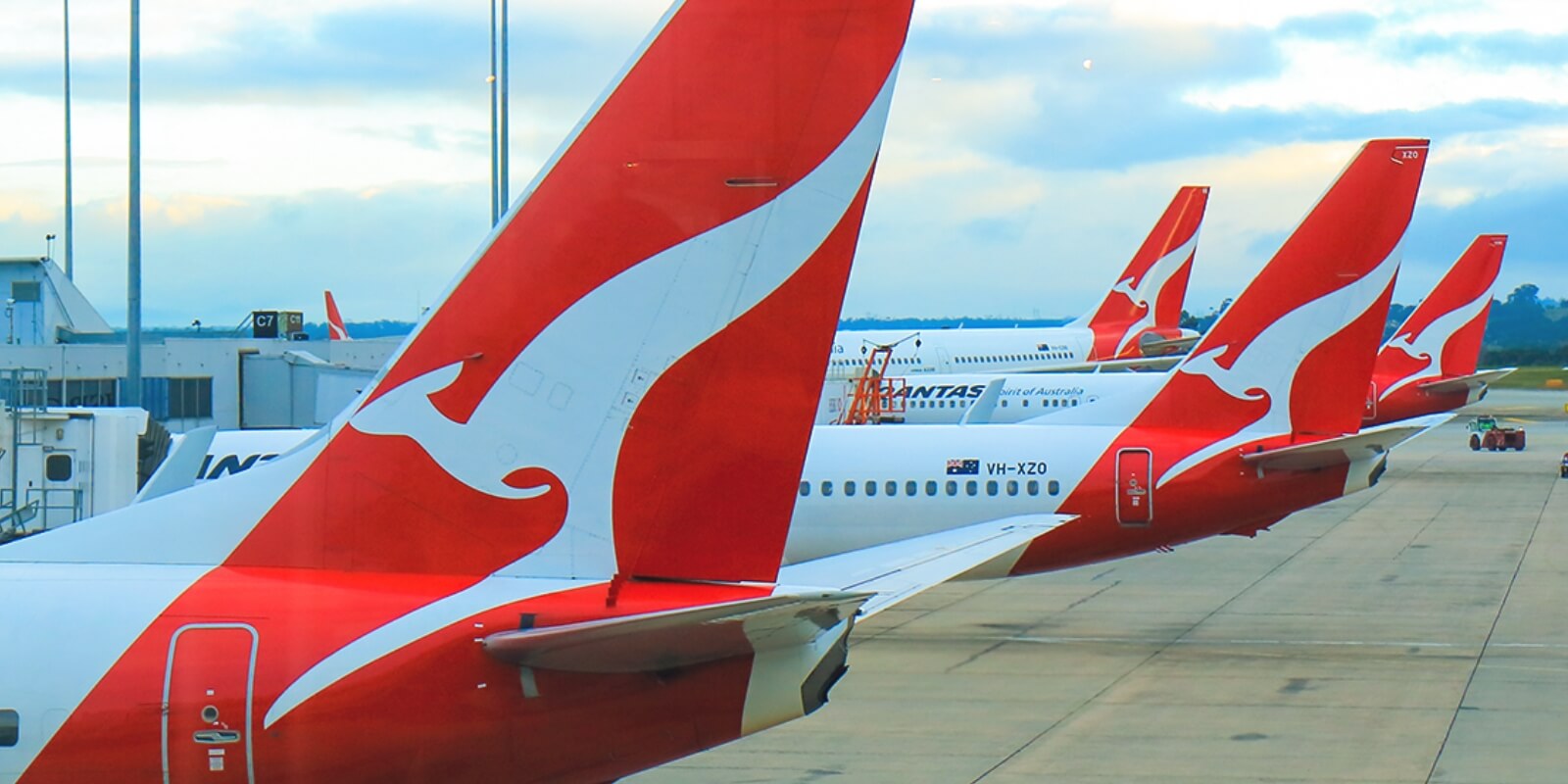
Now, what made this logo design succeed?
It’s simple, colourful, and easy on the eyes.
What design characteristics of this logo worked, and what didn’t?
The kangaroo represents Australia, and the triangle suggests an aeroplane’s tail. Just by looking at this logo design, we know where Qantas Airlines are based and exactly what service they provide.
What didn’t work? We believe its unusual dimensions make it less versatile, and the use of gradients and details may be lost in small sizes
What does this logo design make me think of? Can I see why the company chose it?
The logo design is the back of a plane, clear as open skies, and it’s apparent why Qantas chose it. As mentioned above, it is both representative and memorable.
How can I beat this logo design?
This is a tough one to beat. But, you must challenge yourself in research. Perhaps we would make sure your logo resonates with customers more than the Qantas logo. It would have to be more memorable, more versatile, and in some cases, it could even be a bit different from the industry standard (so long as it is still appropriate - not different just to be different).
If we wanted to appeal to an Aussie audience and play on the aviation theme we could use another Australian icon, incorporate green and gold, have a subtle yet identifiable symbol of travel, ensure our logo works really well digitally so we reach a wider audience.
It’s hard to know for sure whether these ideas would work, but brainstorming is yet another key to success — a bonus tip to this list. That’s why, during the Red Kite design process, we put a lot of thought into our work and present a few options that are well refined and we believe would work well for their business. We provide a variety of logo designs that are strategically developed to differentiate your brand from your competitors.
Qantas’ logo design represents their company, and so should yours. That’s why knowing your brand identity and business matters.
B. L. Teague says:
“When you understand the root of what business you are in, what it is that you are really selling, then it doesn’t matter what the good or service actually is.”
That can’t be more true — you could be selling the most unheard-of product in Australia, but if your logo’s graphic design is memorable, your product will be too.
Next, let’s look at Amazon’s logo design.
Note how the arrow points from A to Z. Amazon knows what their mission is — they know their service is to deliver goods throughout Australia. That’s clear in their logo’s graphic design.
What is your service? What do you hope to deliver to the customer?
If you don’t know these things, you’ll struggle with making an effective logo design.
Now, onto the second B: Business
What is your target audience?
Toys R Us’ logo design is perhaps one of the most memorable out there. Their target audience is children.
Their logo design is big, well-spaced, and colourful.
If someone told you the target audience of Toys R Us were children — looking at the logo’s graphic design, would you raise your eyebrows?
A good custom logo should have many perspectives, but, as said before — don’t clutter it. Don’t make a design that’s convoluted or one that’s hard to remember.
Have you ever seen a successful logo that is more than just a simple image with a slogan?
A complicated logo is hard to look at, and even harder to remember. It hurts the eye and fatigues the mind.
When designing, you want your logo to be versatile, and simplicity is key to that.
There may come a time where you need to make slight adjustments to your logo — perhaps you need to adjust it to fit on a letterhead, or to fulfil social media resolution requirements. Imagine how hard that will be with a more complicated design.
You’re creating more work for yourself, and more work leads to errors.
So remember: Make it unique, but keep it short and sweet.
We’ve already mentioned colours, but a good logo must also excite.
Don’t mistake this for clutter — even simple logos can be memorable.
Let’s take a look at the Tourism Australia logo.
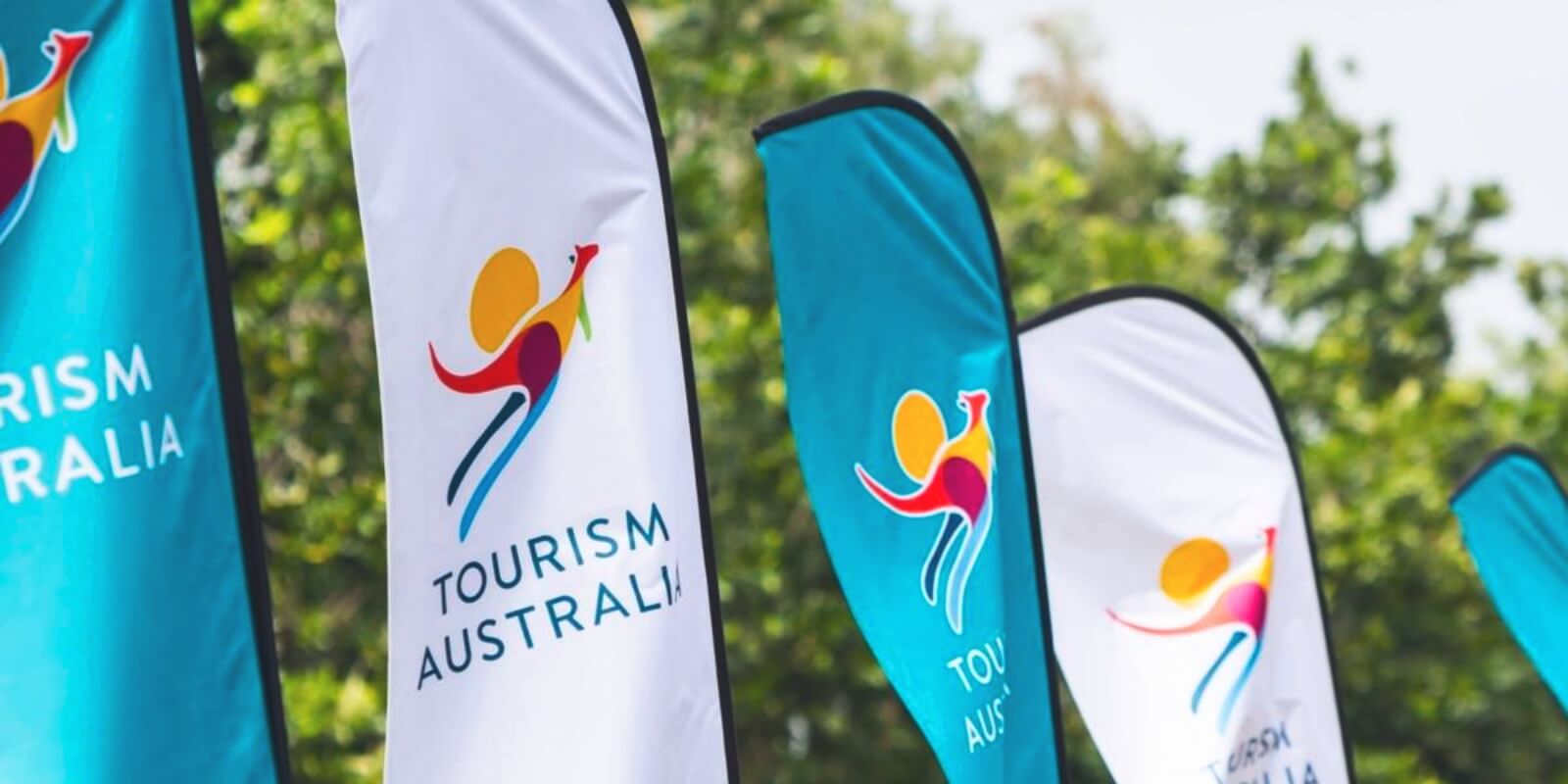
See how it’s colourful, simple, yet still includes plenty to look at? Do you think you’d easily forget this design?
An exciting logo is a clever logo.
Tourism Australia is exactly that — it’s a simple design with plenty of perspectives and one that you can look at multiple times and still see more.
Remember how we broke down every logo above? With a boring logo, you’d struggle to do that. You’d look at it once and pass over it without a second thought. How do you think that would fair for a business card?
To know if your design is unforgettable, show it to peers and ask them, “What do you see in this logo?”
Do they study it, or simply move on?
This last point is our finest. Creating a custom logo yourself is great, but by hiring reputable logo designers here in Australia, you’ll be in safe hands.
Not only will a design professional have the right skills for the job, but they’ll also have experience and a full design agency team at their disposal.
At Red Kite, we offer a strategic brand identity design service that includes logo design. Your brand is more than a custom logo design - it is who you are, what you say, how you say it, and what you stand for. It is how you are perceived in the mind of your customers.
We help brands to define their brand identity and stand out in a crowded marketplace. Oh, and we can also help you stand out by animating your logo!
Our six-step design process is a recipe that will help you design an effective and custom logo with care.
But don’t just take our word for it. Here’s what David from Blood Red Clothing had to say:
“This team did a fantastic job for us. They immediately understood our needs, listened, and delivered in a timely manner great creative solutions. We’re delighted with the work. Thank you.”
Contact us today for a free quote, or check out our dedicated professional logo design blog for more tips on building your perfect brand.
Finding a logo maker that is a perfect fit for you and your business is the most important part of crafting a strong brand identity.
A logo is a small but significant part of any brand. Your logo is generally what your audience will notice first about your business. This is why the logo is often referred to as the face of a brand.
Customers look at a business logo as a mark of authenticity when buying your products or services.
A well-designed business logo makes your brand immediately recognisable. This applies to advertisements, business cards, product packaging, and other marketing material.
Whenever your target audience sees and recognises your logo, they’re reminded of your brand. This boosts brand awareness, which ultimately translates into trust, loyalty, and profits!
With that in mind, the importance of getting your logo right from the beginning can’t be overemphasised. And it all starts with getting the right creative to design a professional logo.
Here are five of the most important factors to consider when hiring someone to make a logo:
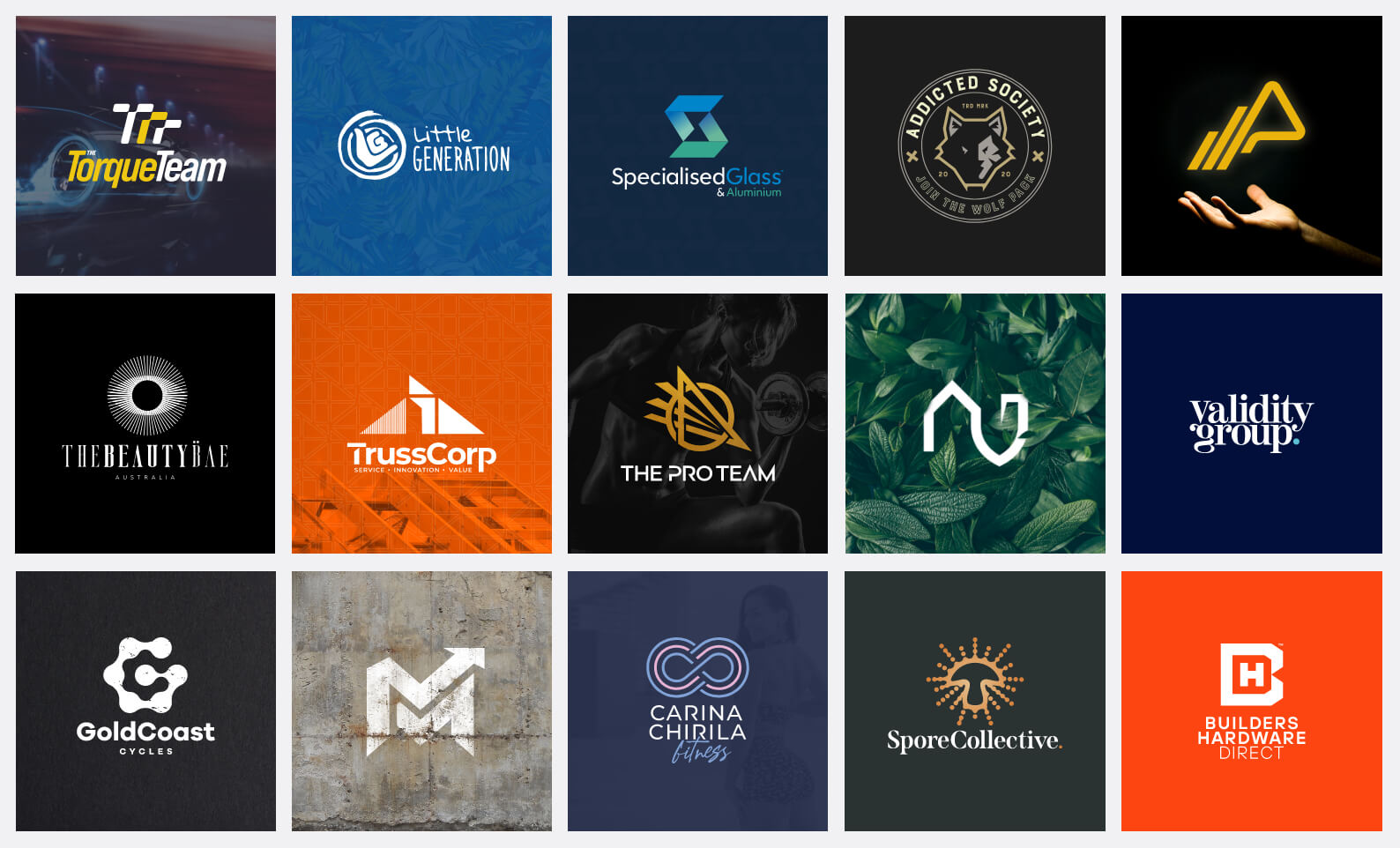
Before hiring a logo maker, ask to see their work samples.
For anyone involved in the creative industry, a portfolio is a must-have. Don’t trust anyone who says otherwise.
Use the portfolio to assess the individual’s creativity and capability. To do that effectively, ask yourself these questions:
Take a keen look at the samples they’ve included in their portfolio. Ideally, their work should show strong, high-resolution logos for different brands.
While every designer has an individual style, a good one will be able to adapt their style to meet the needs of different clients.
It’s not uncommon for beginner designers to include logos they’ve created for fictional clients in their portfolios.
Fake logos don’t offer an accurate representation of a designer’s ability to deal with the demands of real-life clients.
Real logos for real clients prove that a designer can problem-solve to create a logo that meets the client's unique needs.
If undisclosed, ask the designer if they have any “fake” logos in their portfolio.
At Red Kite, we give you access to a range of case studies from some of our past projects.
You will get to see how we make a logo - from concept to creation, and what they look like in the real world.
The process to create a logo isn’t like making a quick and easy sandwich. Great designs, like great meals, take experience.
A high-quality custom logo takes a great deal of research, thought, care and technique. To create a high-quality custom logo, you need to invest in an experienced designer.
A poorly-created logo is likely to cost you in the long run. Think about all the money you will spend paying for corrections or a new logo. Not to mention how much your business stands to lose as a result of poor branding!
Before getting started, ask the designer about their create-a-logo process. This will tell you a lot about their attention to detail during logo design.
It also reveals how dedicated they are in making sure to create not only an aesthetically appealing design but to provide you with an appropriate custom logo for your business.
A competent logo creator will have an in-depth “design-a-logo” process. This ensures that they understand the client’s brand, even before they start to create a logo design.
We have a tried-and-tested process that ensures we create the perfect logo for each of our clients.
Here’s a brief overview of our logo creation process:
Our clients submit an enquiry via a quick and easy quote form.
Include your contact details, a summary of your business, your logo requirements and budget where possible.
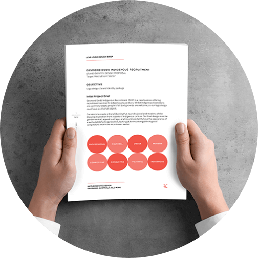
We take the time to gather as much information about your business as possible.
You’ll have an in-depth chat with a member of our team, who will collect relevant information about your business.

Before pen is put to paper, our expert logo design team will analyse your responses to our questions to better understand your needs.
Our goal is to have an inside-out understanding of your business before we create anything. This way, every design decision will be made with deliberation, highlighting unique details about your brand.
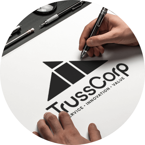
After generating a mood board, it’s time to create your logo design.
We sketch the initial concepts of your logo design and refine promising ideas for the next stage in the process.
We work with Adobe Illustrator, which helps to construct vector-based artwork. This means that the artwork is scalable and high-quality.
Next comes an incubation period, during which we step back from the design work. This gives our team time to refer to initial objectives and consider fresh ideas. This period is necessary to ensure the final logo design meets your objectives.
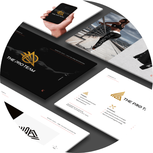
In this stage, we put together a PDF document to present to you. This document demonstrates how we arrived at the final logo design concepts and why they will work for your business.
We showcase each design in both full colour and black and white. This demonstrates the designs' versatility.
Additionally, we provide real-world examples of how your logo would look in situ.
We then let you decide if you’d like any modifications before settling on a final logo design.
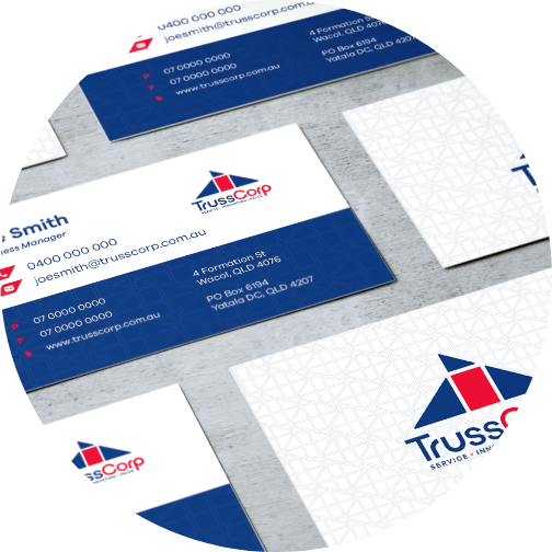
When both parties are happy with the modifications, we have a final logo design!
The last step in the process is to hand over the completed work to the client. You will receive the final logo files in all industry-standard file formats.
Before settling on a professional logo creator, ask yourself what you expect at the end of the project.
Most professionals will give you different packages to choose from. The more you pay, the more comprehensive your logo package.
Beware of cheap or free online logo designs. The truth is, you always get exactly what you pay for!
A cheap or free logo design is likely to be low quality and generic. It’s also unlikely that the logo maker will provide all the required formats to ensure the versatility of their design.
This means you will have to pay for additionals or a new logo design sooner or later...which doesn’t come cheap.
Also, be wary of people offering large numbers of logos to choose from.
Quantity over quality is never a good solution. It is better to have one perfect logo than ten average logos with no thought or time put into them.
We offer comprehensive logo packages that cater to businesses and organisations at all stages.
We use a value-based pricing system for all packages. We believe in quality over quantity, ensuring that we deliver each client the best value for their money.
Our starter set comes with:
Other packages include:
Finally, take time to find out what past clients and colleagues have to say about the logo maker.
You can find testimonials on their website and social media pages.
Check the validity of testimonials and reviews. You can do this by looking for a web address or even by emailing the company.
Red Kite has verifiable 5 star Google reviews.
Take a glimpse at what our past clients have to say:


After trying several designers that weren't quite hitting the mark, I was so happy I was referred to Chris. He was the first one who took the time to pick up a call and get a solid understanding of what I was looking to achieve, communicated openly and professionally throughout the whole process and worked efficiently to get a beautiful job done in only a couple of weeks. And that's with my slow responses as I couldn't decide what I liked, due to everything he produced being fabulous. Not a bad problem to have lol. Highly recommend investing in a professional service like Chris' - worth every penny.
Carina - Carina Chirila Fitness
Client Testimonial

TrussCorp employed the services of RedKite to help us with a complete re-brand of all our material over the last six months. Working with Chris has been a pleasure and the results are spectacular. We could not recommend him more highly. His skill, creativity and speed are all amazing and he couldn’t be more accommodating or helpful.
Rob - TrussCorp
Client Testimonial

A big thank you to Chris for all of his hard work, guidance, support and patience. I came to him with a small vision and he really ran with it and went above and beyond. Chris made the whole process run smoothly and nothing was too much trouble. I really enjoyed working with Chris and would highly recommend him to others.
Lauren - Little Generation
Client TestimonialNow that you know what to look for when hiring someone to create a logo, it’s time to get the ball rolling!
Red Kite meets all the requirements listed and more.
We create unique, memorable, high-resolution and industry-appropriate logos.
Whether you’re a start-up looking for your first logo design or an existing business keen on rebranding, Red Kite’s got your back. We will create a high-quality logo design that speaks to your target audience.
We also offer full identity design and brand strategy services. This helps businesses create and maintain memorable, appropriate, and successful identities.
Give your business an edge over the competition by choosing Red Kite.
Don’t wait any longer. Request a free logo quotation to realise your logo dreams today.
“Who are you?”
A fairly easy-to-answer question when met by a stranger on the street or a new acquaintance at a party.
Quite a different matter when asked about your business by a customer or supplier.
What’s your brand identity?
Here at Red Kite Design, brand identity is one of the most important things we do, and this guide will help you understand it. Here’s what you’ll learn:
Your Visual Brand Identity
Your Brand’s Personality
A Strong Brand Identity Starts with Red Kite
Let’s get going.
Ever notice how some people have a “signature” style? From Elton 'Rocket Man' John's iconic glasses and suits, to Keith Urban’s mop of hair, to Margot Robbie’s apparent lack of a personal style? Celebrities tend to find one thing that makes them stand out.
Their chosen visual style soon becomes synonymous with themselves. And the same becomes true of your brand’s visual identity, too.
Your brand’s visual identity is its walk, its wardrobe, its hair, and its makeup. Its style, and charisma, and what catches the customers’ eyes.
Imagine a walk down the street.
You see a woman strutting her stuff in a red dress. Gold heels click on the pavement, and a stark white leather jacket keeps off the chill.
There’s also a grey-haired gent on the next block in a tailored suit with Italian leather shoes and a fancy watch.
And then, you run into a group of teens with purple, pink, and blue hair, nose rings, and ripped denim.
What impressions go through your mind? Does the lady ooze glamour? The gent, power? The teens, rebellion?
A strong visual brand identity should elicit the same instinctive response, the same type of strong first impression. It should include:
Let’s break these down a bit.
There’s a branch of science called colour psychology. It purports that specific colours create certain perceptions in our minds as soon as we see them. The following chart explains a bit about what colours can mean to customers.
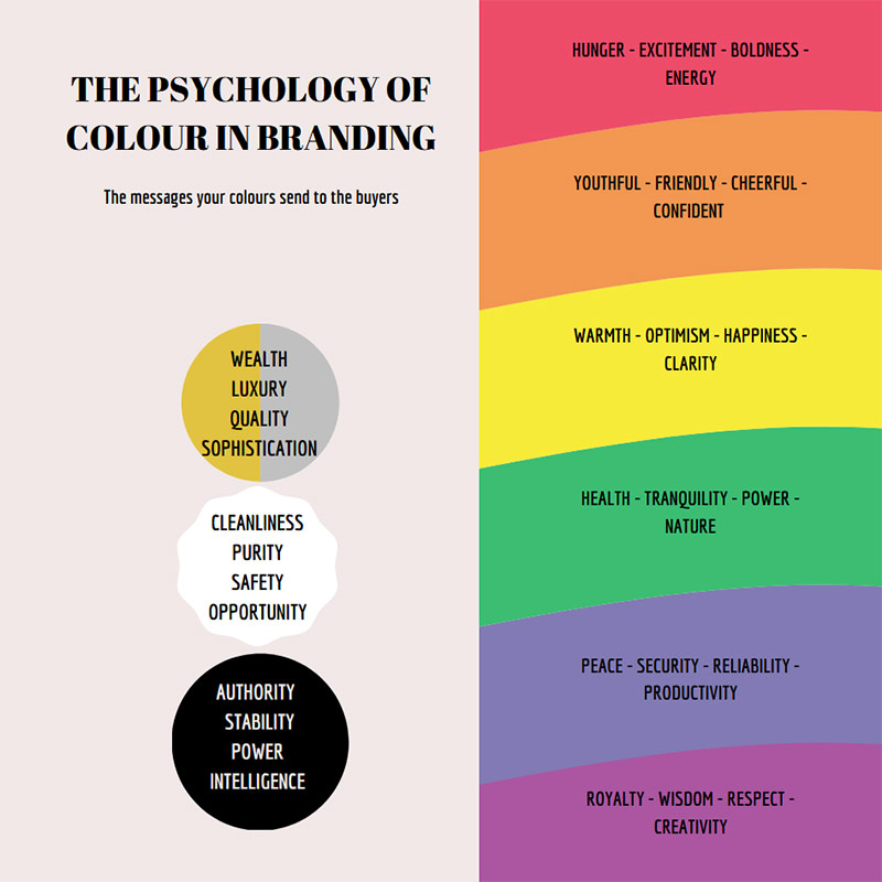
You can see why restaurants often use red as part of their brand image, design, and logo. Or why gold and silver represent so many high-ticket brands, like Lexus and Versace (can you imagine a Lamborghini or Gucci logo in green? I can’t).
When setting about to create a brand identity, start with your colours and what you want them to say about your product or service.
Just like Cate’s suits, your brand’s design style forms part of its identity.
Remember, your brand design style is like the clothing it wears every day. You have to make sure that you dress your business appropriately.
From your business cards to your logo, your website to your social media images, your brand’s particular design style will say a lot about you, your products, and your buyers, too.
Match the style to the impression you want to project. Match it to your brand’s personality (something we’ll get to in a bit). And make it consistent.
When you think of a famous logo, what comes to mind? Nike’s swoop? Nando’s chicken? Qantas’s roo?
Every widely recognised logo comes to symbolise its brand or the brand’s products or services and experiences associated with the brand itself.
You see a swoop, and you think fitness, athleticism, and “Just do it.”
You notice that red chicken and your thoughts turn to a quick, tasty lunch.
And the roo? That depends on whether you remember your trip to Fiji for the gorgeous beaches, or for how long it took for your bags to catch up with you.
A logo sends a strong message about the experiences your customers can and will have with your brand, making it an integral part of your visual branding.
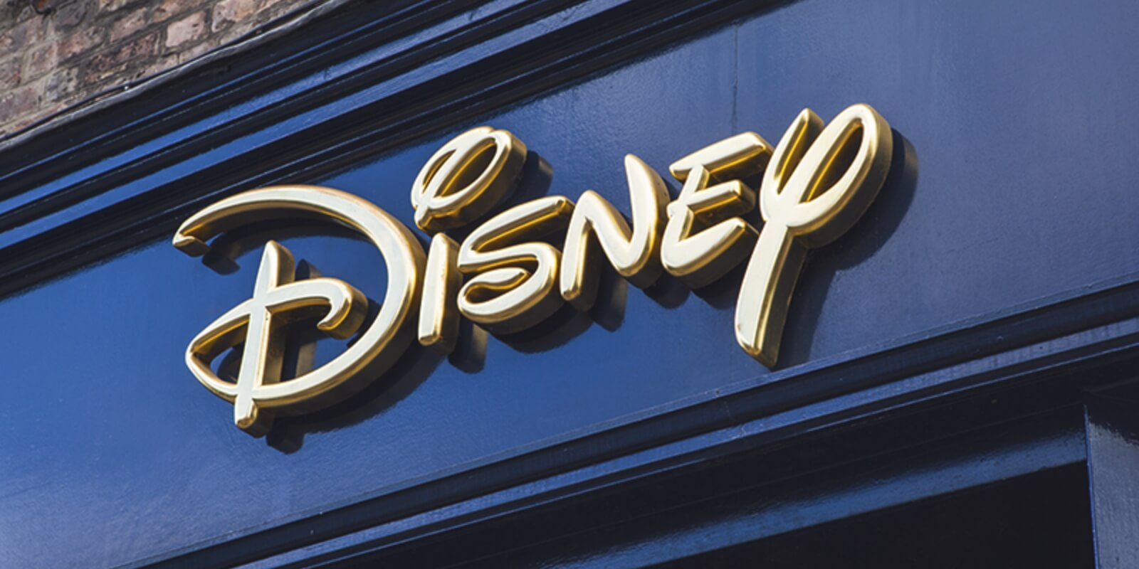
The fonts and typefaces you choose for your brand are another part of building your visual identity.
Which fonts you choose should depend on several factors such as:
In regards to emotions, some fonts scream “fun” or “serious”. Others, like the one above, evoke a sense of nostalgia. Still, others are modern and clean — almost minimalistic.
Your business’s nature and what message you want to send should help guide which letterings you choose. Are you a plain Jane sans serif, or an elegant italic?
Don’t be afraid to choose more than one font, either. A mixture of typefaces can create a stylish wardrobe to dress your brand in.
When it comes time to choose images for your brand, consistency is just as important to brand identity as visual appeal.
Look at some of our images here on the Red Kite blog, for example.
You’ll notice we like to use colourful images, and “action shots” showing our design teams and their work members. We get your attention, but we never stray from our brand identity in the process.
We’re all about action for our customers, and we know design, brand identity, and all that “stuff” that we do very well.
We’re proud to show it off, even though it may just be an image in a blog post like this one.
You can do the same for your small business, too. Just make sure you choose images that stay true to who you are, to what you do, and to the identity you’ve created for yourself.
Ever meet a good looking person at a party and find yourself attracted to them? And then you meet them, hear them talk, and realise that all they are is an empty shell without much to add to their looks?
That’s not what you want for your brand.
Customers don’t just associate with a brand’s visuals, products, or services. They associate with its personality, too.
From the way you present your business on social media to the choices you make in your visual branding, you are creating a person as real as if you were creating a character in a novel.
This analogy isn’t far off — you have a story to tell about your company. And to do that, you need a voice. You need a character. You need to become a trusted friend to your customers.
You sit down with your mates and chat over drinks. You have lovely dinners with your family. You can talk for hours with that “special someone” in your life.
You avoid the annoying bloke down the hall in your office like he’s the plague. You try to make yourself scarce when your in-laws come around. And you wouldn’t be caught dead near that obnoxious neighbour next door.
In short, you associate with the people you like, and you don’t associate with those who provoke negative emotions in you.
Your brand is the same way. Your brand identity is based as much on your brand’s personality as your social life is based on yours.
Your brand is an extension of you.
If you are creative and a bit of fun, so too will your brand identity include those elements. If you’re more the buttoned-down type, we’d expect a certain seriousness and soberness in your choice of brand identity design.
Your customers need to have this persona, this personality, attached to your brand. All business, as they say, is human to human, regardless of its nature. Your buyers and prospects need your brand to have its human qualities, its human nature.
You create that for them through your brand’s personality and by incorporating that into your brand identity.
As we said, here at Red Kite, we’re all about brand identity. One of the most important things we do is help you create a brand style guide.
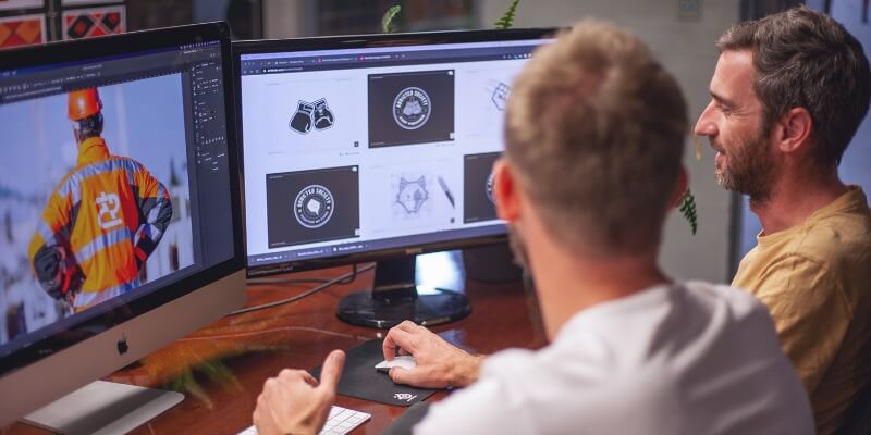
We take all that “stuff” that makes you you and compile it into one unique document. It helps us create just what you want and need when it comes to design and branding.
Contact us today to get started on creating a perfect brand identity for you and your business. There’s a world out there waiting to meet you.