
Just like there’s a process you should take to come up with your brand name, there’s also a process to follow when designing your new company logo.
As with any design project, there’s a lot of variables to choose from. Things that may come into consideration include industry standards and best practices (ie. common colours and fonts), as well as personal style and designer preferences – but this may not get you to where you need to be.
You may want to like your business’s logo, but more importantly, your logo needs to meet the requirements of your business, be appropriate for your industry and resonate with your target audience. Here’s the right process to follow when designing your new company logo.
Your logo is the first impression people have of your business, and therefore an important visual brand asset. And while it’s not just a tick box activity, it does need to tick a few boxes. For starters, it needs to set you apart from your competitors and resonate with your audience. When done well, designing your company logo should be seen as an opportunity, as it can help your business achieve its goals and be more profitable.
After an initial workshop about business and strategy, the company logo is the first item on our list when we take on new clients. It’s the development of the logo that guides the rest of your visual identity – the first piece of the puzzle that forms your unique business identity.
If you’re starting from scratch, you’ll be looking to develop a new logo. But if you already have something developed (maybe it was made by a family member, or has been in place for a while but is now dated), you might be wondering if a new logo is the right approach.
Unpacking the reason why you want a new logo is important, to ensure that you get the desired result for your logo and branding project.
For example, you may think you need a new logo because your business or marketing is not performing as expected – but it could be that your logo is not the problem. In reality, it may be that your brand messaging is inconsistent or disjointed. You might be fishing in the wrong pond, by marketing to the wrong audience. Maybe your website is dated and not converting. Maybe the logo is good, but the rest of the brand identity hasn’t been given the same amount of attention.
If you are unsure, it’s worth going back to your strategy to diagnose what the problem is and figure out how to address it. In many cases, your visual identity is something that needs to be addressed, and this starts with your logo. But not always.
Chatting with us about strategy can help you diagnose what the problem is and where your time, energy and budget could best be utilised. Sometimes a logo just needs some small adjustments, or to be brought up to date. If you have a brand and logo that is well recognised, it makes sense to maintain that hard-earned brand recognition. But sometimes, you might need to start again to help realign with your audience or reposition your company in the market.
You might think that your logo is all about you and your company, but actually the most important consideration is not your personal preference or design style – it’s what will appeal to your customer. Knowing your target audience is incredibly important, so you can make sure your logo design and brand name resonate with them.
It’s essential to check out what your competitors are doing to make sure you avoid repetition or being too similar. For example, a landscaper might choose the colour green and a tree as their logo – but that would put them in the same box as every other landscaper in their suburb. Think outside the box and stand out.
If you work in a serious industry, in most cases it would make sense for your logo to follow suit. You don’t want Comic Sans as your font if your business is a doctor’s surgery, because you wouldn’t gain customer trust and wouldn’t be taken seriously. (Side note: no one should be using Comic Sans – just so we’re clear.) Be different, but make sure it’s still industry-appropriate. Find the balance.
The requirements of your logo will vary depending on the type of business you’re operating and the industry you’re in. For example, if your business is e-commerce, most of the requirements of your brand would be digital.
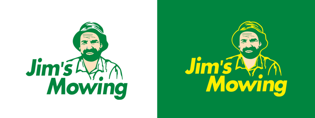
But for Jim’s Mowing, business cards, invoices and car (or trailer) decals are the primary places the logo will be shown. It doesn’t sound like much, but this will influence how versatile you need your company logo to be, and whether or not a wordmark or custom graphic is applicable or relevant. Keeping it simple will ensure that your logo ages gracefully.

Quick case study: Take the Jim’s Mowing logo, for example. It’s a simple wordmark with a silhouette of a man (presumably Jim). The company has stuck with industry-relevant colours – green and yellow. And while it’s pretty uncommon to have a face in your logo, it makes sense in this application as the brand name is so human-centric. Jim’s Mowing has a local neighbourhood vibe and that’s reflected in the logo design.
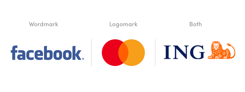
Logo designs vary widely from simple text (Facebook) to custom illustration (Mastercard) to both (ING).

An accountant or lawyer may use a wordmark, as it is appropriate for that industry, whereas a daycare centre may want a more playful symbol that people associate with them.
So it depends on your industry, but can also depend on how long you’ve been in business. For example, Mastercard didn’t launch with just a symbol as its brand. But over time, the awareness grew of its logo mark and consistent use of brand colours, to the point where the brand realised it could drop its name altogether and still be recognised. Apple’s in the same basket.
Whichever you choose, the success will be in the execution. A logo is a part of a wider brand and suite of assets which become touch points with your customer on a day-to-day basis. Getting this right from the get-go will serve your business for years to come.
Read next: How Do I Trademark a Logo in Australia, And Should I Do It?

Article by:
Chris brings over a decade of industry experience to Red Kite working at design agencies in both the UK and Australia. Over the years he has accumulated a wealth of graphic design, strategic identity design and marketing experience. Chris is a hugely passionate identity designer endeavouring to offer the highest quality branding and logo design Brisbane and Australia wide. Chat to Chris about your branding.
We would love to hear more about your design project and how we could help bring your vision to life. Simply hit the button below to get started with a free quotation.
GET A FREE QUOTE