One of the main aspects of establishing a brand entity in a given market is customer recognition. In terms of strategic branding, a logo is, literally, worth a thousand words.
Much like the man himself, the iconic Barack Obama logo needs no introduction. Drawing inspiration from his surname, a rising sun and the American flag, it promised optimistic change.
Now a symbol of the Obama Foundation, this design was among the most popular political brand logos in the 2008 U.S. presidential elections. It was also used in his reelection campaign.
Creative director Sol Sender was the lead designer for the team behind the Obama logo. He sums it up with one critical truth for all successful brands, products or services:
“The strongest logos tell simple stories.”
Every company has a particular story tied to a singular logo. This is how customers begin relating to brands and their products. A well-designed logo can indicate the nature of a business even without the business name.
Symbols are an effective method of communicating what your company ethos is all about. A logo is, therefore, a priority branding investment in your business.
Brand positioning is all about being strategic in a globally competitive market. A brand represents the relationship a business has with its consumers.
Whether a company is a budding start-up, an SME or a large enterprise, differentiating the brand from others is critical to your business survival.
The logo is the foundational pillar on which a brand’s identity is based upon.
From the business website, e-newsletters, office stationery to promotional materials, a well-designed logo ties it all in and gives brands a prominent public face.
Most long term marketing efforts are anchored on brand Identity. Branding strategy requires a critical look at what it takes to create and maintain a strong brand name.
People often mix up the meanings of two of the most popular marketing terms: "brand" and logo". While a logo is the primary symbol or image of a business, it doesn’t form a brand on its own.
Rather, the creation of a company logo is simply the first step towards the development of a powerful brand identity.
The logo remains critical to a company’s value proposition. It is still the most recognisable feature of the business. It has to be a cohesive part of all branding efforts.
Brand identity refers to all the visible elements consumers recognise. It is different from the brand image. Brand identity refers to a company’s intent and the image that it wants to maintain in the consumer’s conscious.
Brand identity thus defines:
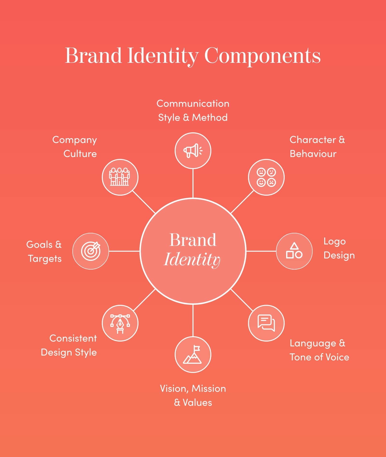
Well designed brand identity doesn't only make a company memorable; it makes them authoritative in the market.
Establishing and maintaining consistency over time develops credibility. It also instils trust among stakeholders, competitors and customers.
Online relatability is the best way to make sure a company’s brand messaging reaches today’s digital consumer.
Part of this brand strategy process is social media marketing. This is a big driver of consumer perception.
Being informative, professional and memorable online is not as simple as it seems. But the initial creation of a social media kit can completely alter a company’s brand positioning. A strong brand strategy involves compelling visuals supported by unique and simple messaging.
There are key steps that a design team would follow to create the right logo and brand identity for a company including:
Insightful research
Brand strategies map out how a product or service fits in with the intended audience. This is something that happens long before any marketing collateral rolls out. The same applies to build a long term brand. It needs research time.
The best way to actualise a company’s brand strategy is through flawless visual execution. So the design team really digs in to make sure they understand each brand they work with.
The design team would need a clear sense of a client’s brand positioning in comparison to their competition. This information allows us to frame our design concept for any logo.
Using current and relevant design trends plus the in-depth research of a company’s value proposition archives a simple goal. The design team will have a baseline from which to set the brand logo’s tone.
Font selection
The font used in the design of a logo is just as important as the imagery.
Picking the right font is not an arbitrary affair. How fonts interact with different colours and brand strategy should be top of mind.
A well thought out font highlights the key strengths of both a company’s brand and logo. Poor font selection could result in distrust or misinterpretation by the consumers.
The strategy for the best font is an emphasis on:
Overall composition
Because they are such an important part of brand identity and marketing, logo design will always require careful strategy. In terms of the overall composition of a logo, a design team may refer to some simple rules:
Brand taglines
Brand taglines contribute greatly to consumer buy-in. Take the classic one from Nike: Just Do It.
Even without the iconic Nike “swoosh” a worldwide customer base would instantly know who is being referenced as soon as those simple three words are uttered. This is one example of a priceless brand foundation.
As part of initial marketing research, a company will no doubt conduct a lexicon analysis. They will also know what language resonates with their customers. This information helps the design team craft the right brand style for the tagline.
In some cases, logos are designed to stand-alone, or to include the tagline. It all depends on the business’s branding preferences.
The most important thing is to leverage good design with creative implementation in ongoing strategies of branding.
Colour selection
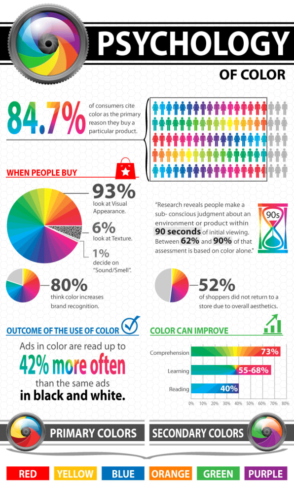
Many marketing and brands consumer studies reflect on the powerful, and often psychological impact of colours to branding.
Colours have the potential to evoke instant emotion. They can induce trust or even spur anger. Design teams consider this during logo design, given how colours can harm or boost branding reception.
“Design is the silent ambassador of your brand”
Paul Rand
The key to a solid branding and marketing strategy is to focus entirely on consumer needs. This is the best way to ensure unwavering long term market share.
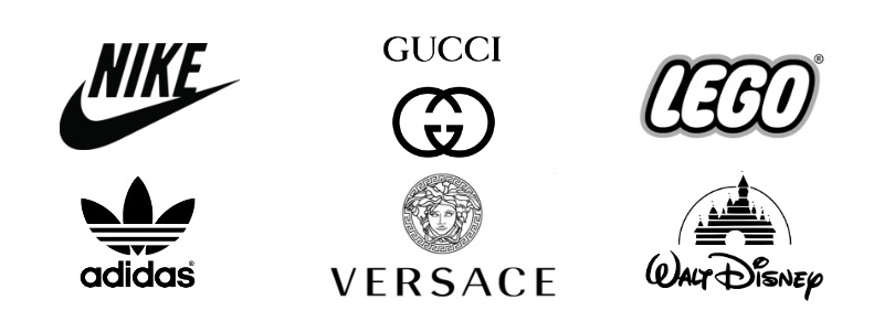
Did you know that a logo’s symmetrical or asymmetrical features can have an effect on the brand entity? No wonder some of the world’s most iconic and unforgettable brand logos are unbelievably simple.
Take the distinctive McDonald ‘M’, the Netflix ‘N’, Apple’s sophisticated ‘bite’, Coca Cola’s curvy lettering or Twitter’s soaring blue bird. These are examples of brand strategy done masterfully.
There’s no arguing about each of these brands’ recognisability. Even people who don’t use their products or services know exactly who is behind the branding. Even if you have never been a customer, there’s no doubting which business each brand logo represents.
Considering the above, it’s time to have a look at the features that make brands and their logo design stand out. They include:
In the end, a logo serves as a brand’s primary visual representation.
It should share a little information about the company. Its final composition should convey a sense of importance about the organisation and the industry it represents. These are the most important points to note in a brand strategy.
Brand strategy is driven by human behaviour. Marketing strategy is informed by the anticipated decisions consumers will be making. In today’s world, these decisions are no longer based on pricing.
Each strategy factors in the varied and often complex psychological and emotional motives that drive human beings. Most brands look at the audience as a key motivator.
All these things point to how a brand logo is designed. Every company has to ask itself these specific questions:
All the logo design elements and motivations discussed here impact consumer behaviour. Studies have found that investor decisions on a particular company can be influenced by how simple or how complex their logo is.
Considering all these factors may seem complicated, but they are all part of a brand strategy. Case studies have found that a successful marketing strategy looks critically at today’s customer.
Brands or Brand managers target audiences from their pain points. Successful strategy meets the consumer in the middle - teaching and uplifting while selling.
Excellently designed logos contribute to a business’s objectives, goals and marketing efforts. They are part of:
Every waking moment, we witness numerous brands either as consumers or companies.
A brand identity gives everyone a sense of belonging. Backed by a great product, this identity creates goodwill and makes the customer your advocate.
The best logos follow the customer home long after the sale is done. You want a design team that understands your brand strategy and creates for longevity.
The alarm clock that gets people up daily is part of a brand strategy. The toothpaste they use is part of a successful brand strategy. The coffee they have will likely be part of a recognisable chain. The newspaper they read will have a few well-designed adverts.
The question is: is your brand strategy in the right hands? Is it backed by a beloved, memorable and timeless logo?
The right logo design can catapult your business exponentially.
Our team would be honoured to be part of your brand strategy journey. No matter how simple or grand your vision is, our team is here to bring it to life.
Whether you need a brand new logo, a media kit, a social media kit, or a complete rebrand, our team is here to help.
Create a new brand identity with us today.
Photo by: rawpixel
If you've heard the terms logos and branding used interchangeably, you're not alone. More often than not, people treat them as though they're synonymous. Though they are related and work together, they're distinct concepts.
Logo and identity design, as well as a brand strategy, are part of a larger plan to help grow a business.
This article examines frequently asked questions about brand design, logos and brand identity. Read on to better understand their similarities, differences and role they play in taking your business to the next level.
Many businesses are yet to understand what identity design is and how it can help them achieve more success.
Identity design entails developing a personality for your company. As humans, uniqueness comes from a set of traits, attributes and value systems that define us.
Think of your company as a person. It wants to reach out to different groups. It has aspirations and set objectives. It wants to draw people's attention, and lead them to take action in its favour.
To do this, your company needs to send specific information to its audience to help them resonate with its identity. Identity design helps you achieve this through the creation of a distinct look and feel.
Done right, identity design helps your company stand out. It creates tangible assets that your target consumers can easily identify anywhere. From your website to your social media and even your business cards and letterhead.
Click here to learn more about identity design and formulate yours today.
"Design is the silent ambassador of your brand."
Paul Rand
Identity design is crucial for your business. Without it, your business is just one of many that more or less offer similar products and services available on the market.
Identity design helps form a solid definition of who you are and what you do. When you clearly define the identity of your business, every communication you undertake is bound together by a unifying core element.
If you run a law firm, for instance, what should everything you put out communicate about the firm? That you are professional. You have the expertise. You're authoritative. You understand the law. And you can translate this into winning a client's case or offering them sound legal counsel.
To do this, your firm needs to present itself in a manner that demonstrates all of the above. As such the values that shape your approach, the language you use in your messaging and the visual content you use help create the desired perception in the mind of your clients.
"Brand identity is the outward expression of a brand, including its trademark, name, communications, and visual appearance."
Marty Neumeier
There's more to a brand than just a name. Or a logo. Or a slogan. Or a visual style. Determining your brand's identity requires you to take time building what you want to convey. This could be about your company or particular products or services you offer.
Many companies spend immense resources on advertising and marketing without much payoff. This may be a result of having an underdeveloped brand identity or lacking one altogether.
Advertising messages and marketing endeavours are communication. But without an understanding of who you are, you are at a loss of how to communicate this to your customers.
This highlights the difference between branding and identity. Perceptions that people have of you make up your brand. Your attempts to shape and influence these perceptions should stem from your determined brand identity.
"Brand is the holistic sum of customers experiences, composed of visual, tonal and behavioural brand components, many of which are shaped by interaction design."
Kate Kaplan
To determine your brand's identity, you need to take several steps:
When trying to build a brand, you may have come across complex and interesting material. However, at the end of it all you're left with the question, "how can I make this work for my brand?".
That's what an actionable brand strategy is all about.
An actionable brand strategy is a plan that has steps to take in each process of building and growing your brand.
Let's take social media for instance. You want to boost your brand by improving your digital presence.
An actionable brand strategy could look like this:
"People will try to tell you that all the great opportunities have been snapped up. In reality, the world changes every second, blowing new opportunities in all directions, including yours."
Ken Hakuta
We live in a world of rapid change. After getting accustomed to doing things a certain way, something comes along and shakes everything up. 2020 has shown just how disruptive change can be.
As such, adapting your brand strategy is not only encouraged, it's crucial.
Without a flexible plan, your brand may find itself on the losing end. Failure to adapt has brought many down in the past, so don't hesitate to embrace change.
The upside of change is that new opportunities come your way.
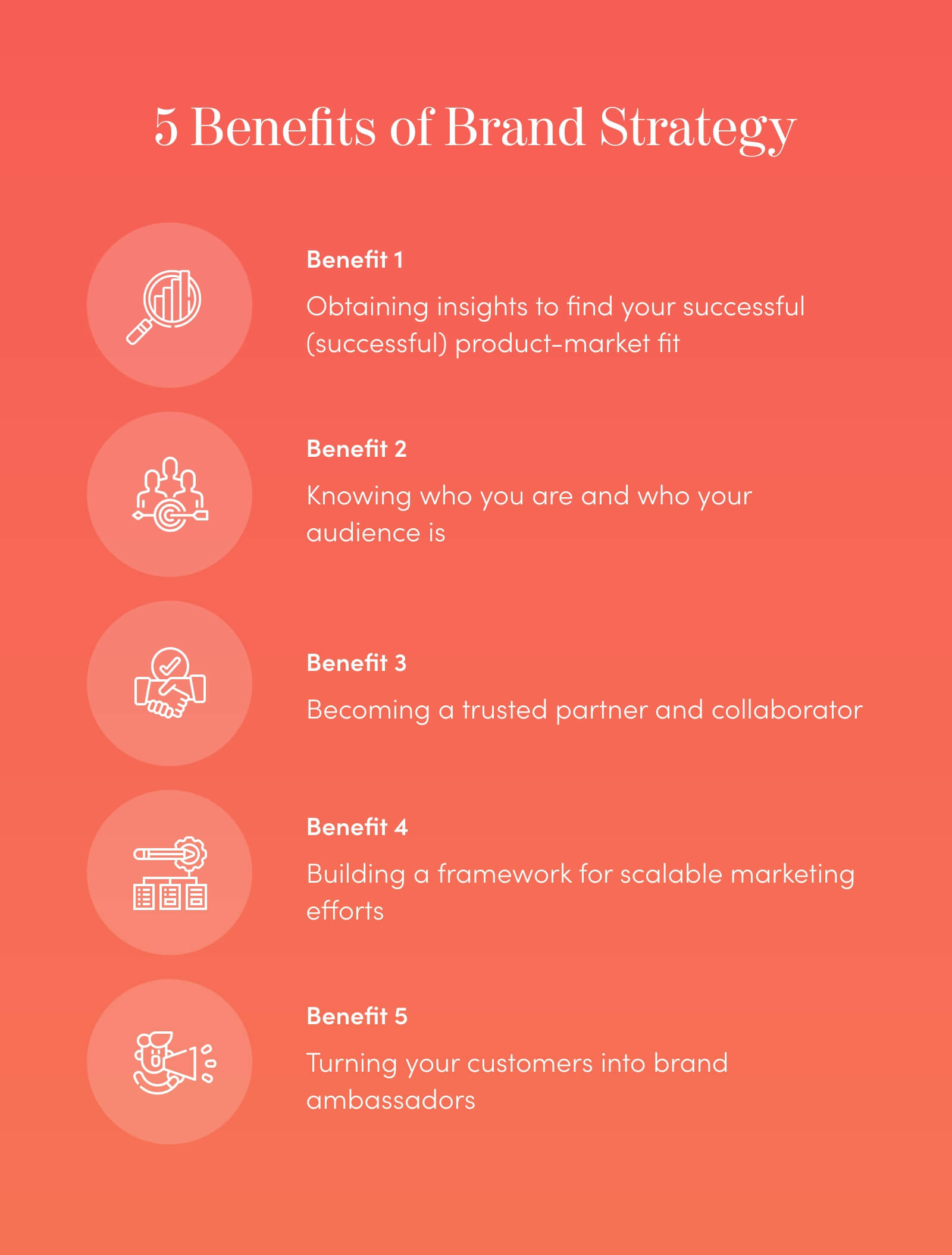
Having a brand strategy is vital for several reasons:
A logo is easily the most identifiable aspect of a brand. This explains why people often think that they’re one and the same.
A logo, however, is a mark, symbol or wording that serves as a trademark, unique to a specific brand.
People strongly identify brands with logos as they are the element of brands that are frequently and prominently seen. In this regard, a logo impacts your business by affecting its visibility. A good logo is easy to pick out and leads to quick recall of your brand.
A professional logo matters because it makes your brand more credible.
Studies have shown that logos draw people for more than just aesthetic appeal. They shape perceptions about brands, such as which ones are credible and which ones aren't.
A well-designed logo communicates that your brand is credible, whatever your industry. It does this by telling a story about who you are and your approach. If your logo doesn't align with the identity you've created, this can make you look less believable.
Credibility determines whether you receive goodwill and support or not.
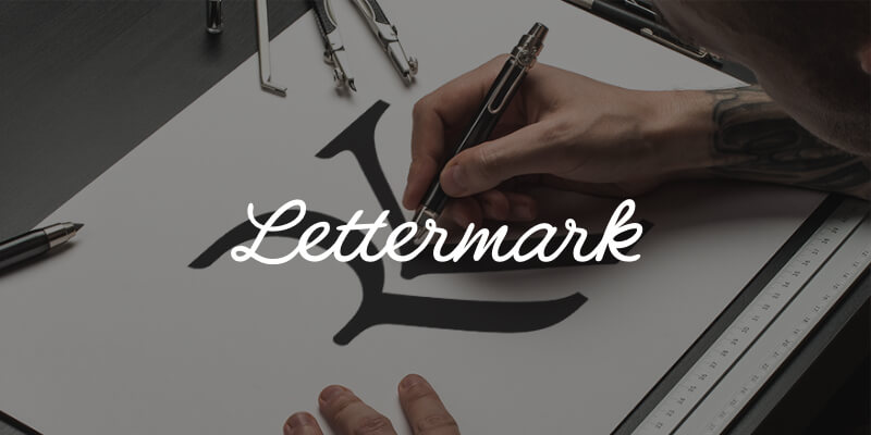
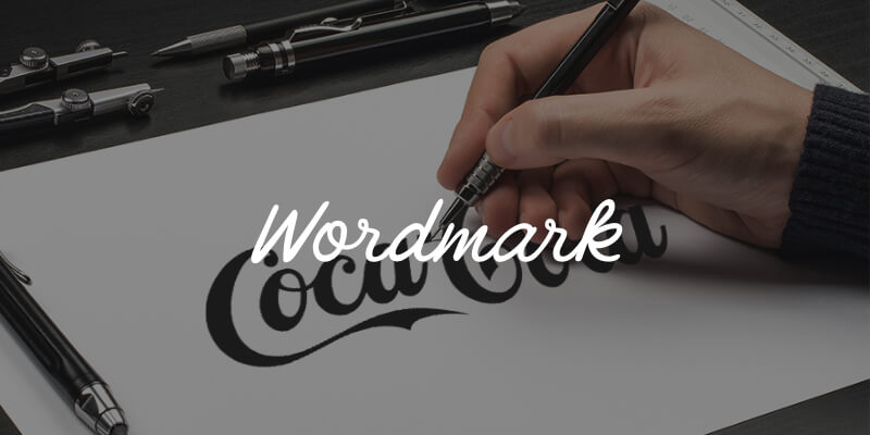
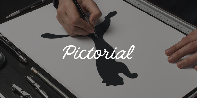
There are seven different types of logos. Before choosing one for your brand, you need to understand each type and what it's best suited for.
| 1. Lettermark | An abbreviation of the company name, using the first letter of each name. | When condensing long business names. When the logo needs to get replicated severely in varying sizes. |
|
| 2. Wordmark | A font-based logo design consisting of an organisation's name and no accompanying symbol. | When a company is new and wants to become more notable. When the company name is short and captivating. |
|
| 3. Pictorial | A pictorial logo consists of an icon or graphic of a recognisable item or object alone. It has no accompanying text. | For well-established brands that are easily recognisable. When a company has international operations and using its name in full won't work. To modernise a brand's logo. |
|
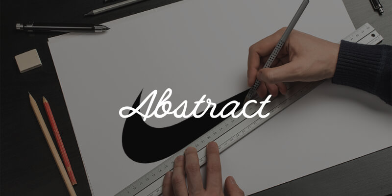
| 4. Abstract | Like a pictorial logo, an abstract features an image or icon. However, this isn't a recognisable object or item. Rather, it is unique to the company. | For a company with global operations that needs a logo unaffected by differences in culture. When a company exists in a crowded market and needs to stand out. |
|
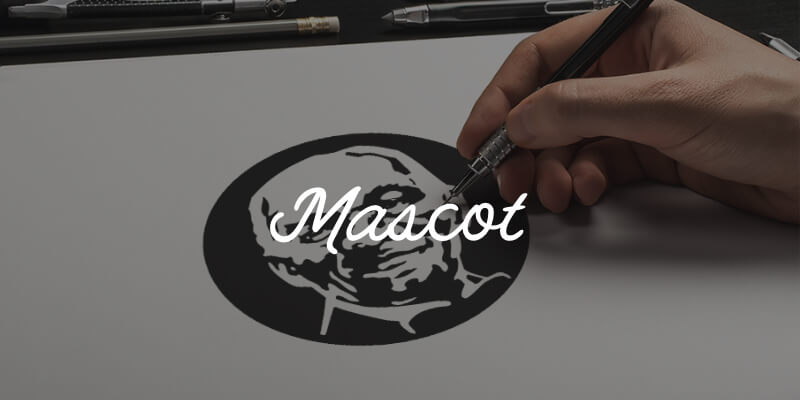
| 5. Mascot | This type of logo uses a character or spokesperson associated with the brand. | When creating a wholesome brand image. For companies targeting families. When encouraging customers to interact with the company. |
|
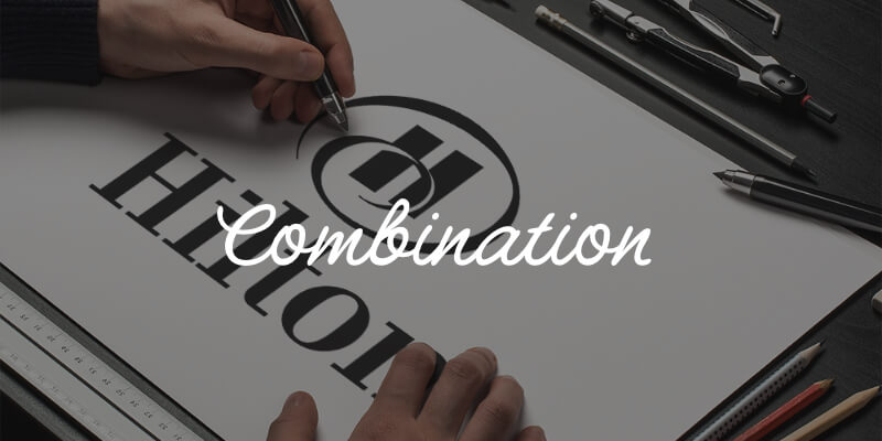
| 6. Combination | Combines lettermarks or wordmarks with any of the visual logos. | For versatility and easy brand recognition. | |
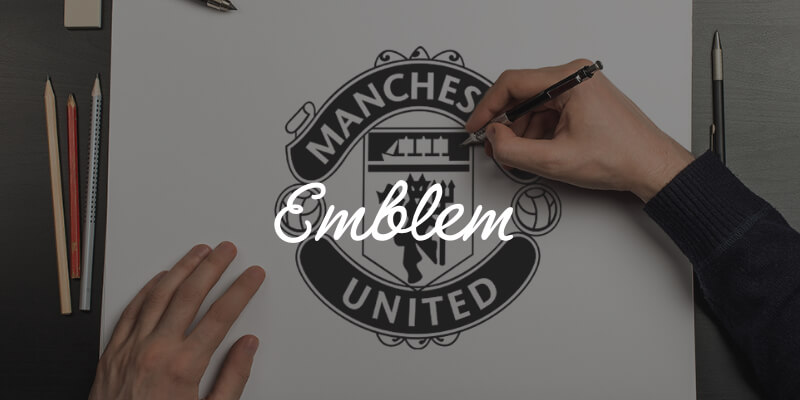
| 7. Emblem | A font is set within a symbol or an icon, for a more traditional look. | When going for a professional or more formal look. For businesses in crowded sectors that wish to stand out. |
To learn more on what makes a great logo read more here.
For a product, company or individual to stand out, they may opt to brand themselves. This will help draw customers who will take action in favour of the brand. This could be purchasing goods and services offered by a company, for instance.
To do this, they need to create an identity which helps their target audience resonate with them. Their identity helps influence a brand's perception in a positive way.
A logo is an important tool that makes brands easier to recall while making an impression and reinforcing brand values.
Anyone can make a logo. At Red Kite Design we build brands. We are set apart by our willingness and ability to be:
Don't take our word for it. We receive wonderful feedback from our esteemed clients:
I really enjoyed working with Chris and would highly recommend him to others
A big thank you to Chris for all of his hard work, guidance, support and patience. I came to him with a small vision and he really ran with it and went above and beyond. Chris made the whole process run smoothly and nothing was too much trouble. I really enjoyed working with Chris and would highly recommend him to others.
Lauren - Little Generation


Working with Chris has been a pleasure and the results are spectacular
TrussCorp employed the services of RedKite to help us with a complete re-brand of all our material over the last six months. Working with Chris has been a pleasure and the results are spectacular. We could not recommend him more highly. His skill, creativity and speed are all amazing and he couldn’t be more accommodating or helpful.
Rob - TrussCorp
If you'd like a powerful logo and impactful brand identity design, let us help you achieve it. Get in touch with us for more information or a free quote here.
Photo by: flickr
Whether you’re a fledgling start-up or a long-standing corporate, investing time and money in a logo design may seem pretty low on the list of priorities. As a new business owner you may be thinking “I have so many factors to consider, do I even need a logo at all?”, or an existing business owner “I have a logo we created years ago, why would I do it again?”.
The power of a logo is often underestimated, for many businesses an after-thought, and sometimes maybe even considered completely optional. In actual fact a logo is one of the most important, valuable and integral assets every business should have. Almost as important as the products and services themselves! “But why?” I hear you say, “It’s just a little symbol”. Read on to find out exactly why a logo is so important, and a worthwhile investment for any business, new or old.
![]()
In the modern marketplace shoppers are spoilt for choice. We are bombarded by advertising everywhere we look, and modern consumers have adapted to making snappy decisions and ignoring everything that doesn’t immediately grab their attention. Now more than ever making a great first impression is extremely important.
When shopping, a potential customer takes less than 3 seconds to decide if they will invest any more time in a company's products or services. There is limit to what can be digested in 3 seconds. A logo sits front and centre on almost all marketing collateral, and will therefore play a considerable role in the decision of whether or not a consumer chooses to engage or continue browsing.
It can be very frustrating for business owners that people are so quick to judge a book by its cover. You may offer a far superior service but because a competitor has invested heavily in their aesthetics, potential customers will often choose them instead. On holiday, when tossing up between two adjacent lunch spots - one that looks a little tired and dated, and one with a fresh, attractive exterior - which one would you choose? The locals might know the food at the older looking establishment is far better than the other, but those who don’t make a decision based on what they can see in front of them; the logo and branding.
It’s never too late to change that first impression, and your logo is the best place to start.
![]()
As mentioned above, in most market sectors there is more choice available to consumers than ever before. For business owners this means not only do we need to worry about local competition, but with the ever-increasing popularity of online shopping, national and even international competitors are just as big a threat. Making sure you stand out in this growing crowd is the best way to keep your competitors at bay.
Whether browsing the internet, walking the high-street or flicking through a catalogue, you want to draw in your potential customers at first glance. Your logo is the first point of contact, and greatest asset to encourage consumers to stop and engage with your business over another.
Stand out from the others around you - don’t just blend in. A well-designed logo should be unique, but most importantly, instantly connect with your target audience, giving them a reason to pause, continue to read, or enter your establishment. Dare to be different! As Marty Neumeier says, “When everybody zigs, zag.”
A logo is a way to differentiate, to stay a step ahead of the competition and draw the spotlight in a crowded marketplace. Ensuring your business has a logo that is appropriate, simple and distinctive is giving yourself the best possible chance to grab the attention of prospective clients ahead of your competitors.
![]()
When done well, a good logo is the first and most important building block of a company’s entire brand. A successful brand conveys a story to its audience, with the goal of forming an emotional connection, creating a long lasting impression that keeps people coming back again and again. A logo may be considered a tiny part of this big picture, but a well designed mark sets the tone that the rest of the brand is built on - colours, fonts, voice, personality, patterns, and direction for all future marketing collateral.
If a company’s logo design is outdated it can be extremely challenging, and sometimes completely unachievable, to change consumer perception through simply attempting to alter other assets. Changing the look of a website, advertising and marketing materials, without first rebranding the logo can lead to a disconnect between different parts of a business, and confusion for customers. Similarly, a new business using a logo that is inappropriate for its sector or target market, can steer the rest of the company's branding in the wrong direction from the get go.
Making sure that first building block is perfectly suited to your business and target audience gives a solid and reliable foundation for a business to tell its story the way it should be told. All elements of a business's branding should be consistent and cohesive. The best way to ensure this is to start from the logo up!
![]()
A logo is designed to identify, not to communicate as is often assumed. It doesn’t need to show what you do, it should simply be unique enough to be easily recalled by anyone who sees it. Unfortunately, it is likely that people will forget your business name, but visual cues are easier to remember. If a customer associates your logo with a positive memory, and even better, a positive feeling, they are even more likely to remember you and seek you out again. Having a well designed, distinctive mark gives your audience a lasting visual cue to associate with your business.
As your business grows, more people will come into contact with your logo. Your mark should be on everything you produce, from products to marketing collateral. The more widespread your logo becomes, the more it is ingrained into people’s memory. McDonald’s now have upwards of 35,000 restaurants in 119 countries, and almost anyone on the planet could tell you what their logo looks like. When someone seeks out a golden arch they know what to expect when they find it. Regular sightings of a logo helps establish a business as being trustworthy, reliable and successful.
A good logo encourages people to interact, but also keeps them coming back. It is a key factor in establishing brand loyalty. Once trust is established people will seek you out. Your logo is their way-finder!
![]()
When starting a business from scratch, investing capital into designing a logo may seem like an inconvenient and unnecessary expenditure. Equally, rebranding an existing business may feel like an expensive and avoidable undertaking. On the contrary, going with a quick fix, or sticking with a poorly designed or inappropriate logo may in fact lead to costs in the future that could have been avoided.
A key feature of any good logo should be versatility. As the marketing landscape changes with digital and emerging technologies, so to do the requirements of a business’s logo. Your logo should look great wherever it is applied, remaining clear, consistent and legible. A mark that may have only been required on stationery initially, could now be needed digitally in formats not originally anticipated.
A logo that is overly detailed may not translate well to increasingly common smaller applications, such as app icons, website favicons, pins and badges. Logos which are too large or have unusual dimensions may not fit well in a website header, digital ads or other marketing material, potentially dragging down brand collateral on all client-facing touch points. A mark which doesn’t work in a single colour, limits its use over images, patterns and video, hindering a brands ability to adapt and stay current. In order to ensure your brand is well received across all applications, time and money must be invested into fixing these issues. A well-designed logo should lend easily to all mediums and hold potential for your brand to easily adapt to unforeseen future applications.
A poorly designed logo may also be responsible for a substantial shortfall in potential revenue. If your mark is not memorable, is lost in the crowd or just doesn’t resonate well with your target audience, it may be selling the company short.
Should a business change direction in the future, a logo designed with little foresight could become immediately inappropriate. For example, a company offering scenic cruises who opt for a boat as their logo, later expand into aviation. The boat symbol is no longer a fitting mark, but a more universal symbol for travel such as a compass could have prevented the need for a complete rebrand.
Investing in a professional logo design process should help uncover these future pitfalls early, enabling the designer to create a well-considered mark that can stand the test of time. A logo that is highly versatile and ready for anything will prevent headaches further down the line, saving time and money in the long run.
![]()
A logo is an important credibility anchor for any business. Whatever the industry, a logo shows that a company is professional and well established. To not have a logo at all can give the opposite impression, that a business is disorganised, inexperienced or even untrustworthy.
A well designed mark can be used to communicate more than just professionalism. Depending on the sector and the target audience, a logo design can create validity by communicating more of a business’s story. A transport company whose safety features are second to none can infer this through a strong and powerful symbol. A cafe who specialise in free range healthy produce can convey their ethos through a delicate and organic brand mark.
In the modern marketplace a great logo design is expected of a business, and is something we actively seek. Consumers make decisions between one brand or another based purely on a logo. Given the choice of two identical plain t-shirts, one with a nike label, and one unbranded, 99% of us would opt for the swoosh, a familiar stamp of quality.
We seek companies out using their logos, for instance when browsing price comparison websites, or business directories.
We remember companies by their logos. “Can you grab me a coffee from...I can’t recall the name but the cup had a mermaid on it”.
We stay with a company because of a logo. In an electronics store you may see a product you know absolutely nothing about, but if it has an Apple logo it’s a safe bet, so purchase it anyway.
People expect a logo. It is the first thing they look for on any product or communication as an identifier; business cards, flyers, billboards, apparel, merchandise. A logo is a big stamp of credibility. To not have a logo is missing out on these golden opportunities to connect with, and maintain, your target audience. A logo is an opportunity, not an obligation.
If you didn't have time to read the full blog, or want a take-away, check out this easy to digest infographic version!
Red Kite Design Infographic - Why is a logo so important?
Well there you have it! Whether you’re a new business on the block deciding whether or not a logo is a worthwhile investment, or an established organisation wondering if a rebrand is a good idea, we hope this has helped you to see that a great logo design is an integral asset to the success of any business. It may seem low on the priority list, but it shouldn’t be. A good logo forms the foundation for a strong and cohesive brand, and when done correctly, will make a business more profitable.
At Red Kite Design we endeavour to help businesses avoid these pitfalls, and set the stage for future success. We design logos and identity systems to suit every client's unique requirements, making sure all the boxes are ticked! If you’re interested in us creating a logo for your business, get in touch to discuss your project. Drop us a line at [email protected], or request a quote.
Choosing the perfect logo for your business is never a simple task.
Selecting the correct type of logo is an important first step when creating or refreshing your company's identity.
To help distinguish between these different types of logos and understand which may be most appropriate for you, we have broken these into 7 key categories.
Continue reading for a closer look at the 7 types of logo, when each is most suitable to use, and examples of well known companies that utilise each style and why.
AKA: Monogram
Type: Typographic
Description:
A lettermark logo is an abbreviation of a company's name using the first letter of each word, otherwise known as an initialism. The letters are pronounced separately, for example the BBC (British Broadcasting Corporation).
Monograms can be a clear and simple solution to communicate your identity, especially common with organisations whose names are lengthy. Condensing it into a bite-sized symbol can make a company's brand more memorable and easier to talk about.
Lettermarks are generally clean, clear and simple in nature, lending themselves well to use on many applications of all shapes and sizes. Our own ‘RK’ monogram was chosen for this very reason!
When using a lettermark, it is important to be scrupulous with the design. Be sure to use a typeface that is in keeping with your brand. A good logo is unique and unforgettable, so to simply type out the letters in a popular font could leave it open to replication. Customising the characters in some way will make a monogram much more distinctive, helping it stand out from the crowd and appeal to a wider audience.
Best Used:
Examples:
![]() London Symphony Orchestra (LSO) is a good example of an organisation using a lettermark to shorten a long-winded name. The unique custom font is very distinctive, and gives the impression of a conductors flowing hand movements.
London Symphony Orchestra (LSO) is a good example of an organisation using a lettermark to shorten a long-winded name. The unique custom font is very distinctive, and gives the impression of a conductors flowing hand movements.
![]() H&M is in fact short form for ‘Hennes & Maurtiz’. As the full name is so rarely used, most people wouldn’t know it, however, the H&M mark is so iconic on its own that the brand is even stronger because of it.
H&M is in fact short form for ‘Hennes & Maurtiz’. As the full name is so rarely used, most people wouldn’t know it, however, the H&M mark is so iconic on its own that the brand is even stronger because of it.
![]() NY is seen on caps and merchandise all over the globe, despite the Yankees being a sports team from New York. This beautifully designed monogram is so successful, it has become a hugely popular fashion icon worldwide.
NY is seen on caps and merchandise all over the globe, despite the Yankees being a sports team from New York. This beautifully designed monogram is so successful, it has become a hugely popular fashion icon worldwide.
![]() Yves Saint Laurent uses an elegant font well suited to the fashion industry. The interesting arrangement of letters makes it memorable, and using an initialism helps the french language name become more easily digestible in a global marketplace.
Yves Saint Laurent uses an elegant font well suited to the fashion industry. The interesting arrangement of letters makes it memorable, and using an initialism helps the french language name become more easily digestible in a global marketplace.
AKA: Logotype
Type: Typographic
Description:
Wordmarks are font based logo designs consisting of an organisation's name alone, and no accompanying symbol.
Much like monograms, logotype logos work well when they are modern and minimal. Their clean and uncomplicated nature makes them highly versatile, allowing a wordmark to be replicated effortlessly across many mediums and busy backgrounds.
For new businesses, such as start-ups, a wordmark can be better than a lettermark alone as it helps to get the full name out into the world. They are therefore better suited to companies whose names are short (often one word), distinctive and memorable in their own right.
Because there is no symbol to hide behind, it is essential to make sure your wordmark logo uses a well chosen typeface that resonates with your target audience. Be distinctive, but stay on brand; don’t just be different for the sake of it. Also, make sure you are aware of competitors in your space, being careful not to use a mark too similar to another. Having a professional customise a typeface will ensure it is one of a kind, and help a wordmark stand out from the crowd.
When done well, having the company name in a well chosen and beautifully customised font can be one of the most favourable logos for ensuring your brand is remembered. Your audience will recall the name itself rather than recognising a symbol and trying to connect the dots to which company it is associated with.
Best Used:
Examples:
![]() Google have a logo seen by billions of people across the planet on a daily basis. They went as far as creating their own custom typeface, ‘Product Sans’, ensuring their wordmark is unique, modern and in keeping with the technology sector.
Google have a logo seen by billions of people across the planet on a daily basis. They went as far as creating their own custom typeface, ‘Product Sans’, ensuring their wordmark is unique, modern and in keeping with the technology sector.
![]() The Disney logo is a great example of a custom font tailored to their sector. It’s fun, quirky and cartoon-like features speak volumes about what they do and who their audience is, whilst remaining versatile and easy to read.
The Disney logo is a great example of a custom font tailored to their sector. It’s fun, quirky and cartoon-like features speak volumes about what they do and who their audience is, whilst remaining versatile and easy to read.
![]() Etsy’s mark is another example of a clean, clear and modern logo. Their choice of a customised serif typeface gives it an air of elegance, vintage and traditionalism; a subtle nod to the company's ethos and arts and crafts origins.
Etsy’s mark is another example of a clean, clear and modern logo. Their choice of a customised serif typeface gives it an air of elegance, vintage and traditionalism; a subtle nod to the company's ethos and arts and crafts origins.
![]() FedEx is a syllabic abbreviation of the company's original air division, Federal Express. Now its own brand, this logotype looks clean and simple at first glance, but the hidden arrow between the ‘E’ and ‘X’ make it an iconic mark worldwide.
FedEx is a syllabic abbreviation of the company's original air division, Federal Express. Now its own brand, this logotype looks clean and simple at first glance, but the hidden arrow between the ‘E’ and ‘X’ make it an iconic mark worldwide.
AKA: Brand Mark, Logo Symbol
Type: Picture / Symbol
Description:
A pictorial logo is the opposite of the aforementioned typographic marks and consist of an icon or graphic of a recognisable item or object alone, with no accompanying text.
Logo symbols use an emblem that represents a company. This does not necessarily mean it is a literal depiction of what a business does, or the services they provide. Brand marks can draw inspiration from many places, and so long as the chosen symbol is appropriate for your sector, resonates with your target audience, and is unique and not over-complicated, they will work well.
Some organisations chose to use a graphic that literally depicts their name, such as Target or Apple. Others may use a symbol which literally illustrates what they do, such Major League Baseball’s batter silhouette. Communicating what you do using a recognisable symbol can be a great way to combat a long or complicated name, and can also transcend boundaries such as language or cultural differences.
Contrary to these more literal representations, it is becoming increasingly common to diversify by devising a brand mark with a deeper meaning. A business’s history, location or unique characteristics are excellent sources of inspiration, and can be used to create a distinctive and memorable symbol that tells your audience a little more about your organisation and its values.
The challenge of creating a good pictorial logo design is to take recognisable everyday objects and turn them into a stylised symbol unique to your business. It can sometimes be difficult for new companies to establish their identity in the market using a brand mark, as it is purely an image. Before you truly have brand recognition, people may struggle to remember who you are.
Best Used:
Examples:
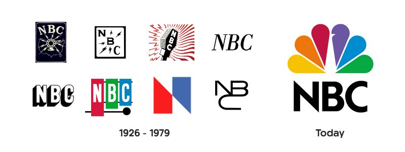
![]() NBC’s colourful peacock is an iconic symbol the world over. Whilst it does not immediately communicate that they are a national broadcasting network, it is modern and memorable. The colours in fact represent their revolutionary switch to colour programming, and the different divisions of the organisation.
NBC’s colourful peacock is an iconic symbol the world over. Whilst it does not immediately communicate that they are a national broadcasting network, it is modern and memorable. The colours in fact represent their revolutionary switch to colour programming, and the different divisions of the organisation.
![]() Apple’s logo began as a complicated emblem, evolved to the multi-coloured apple and has gone through several colour and style variations in its history. The bigger the company became, the simpler the logo, the plain black apple silhouette now one of the most distinguishable symbols on the planet.
Apple’s logo began as a complicated emblem, evolved to the multi-coloured apple and has gone through several colour and style variations in its history. The bigger the company became, the simpler the logo, the plain black apple silhouette now one of the most distinguishable symbols on the planet.
![]() Major League Baseball’s brand mark is an example of a long name being condensed into a clear, simple and attractive graphic. It is highly distinguishable as a symbol and clearly depicts what the organisation are about, spreading recognition for MLB on merchandise across the globe.
Major League Baseball’s brand mark is an example of a long name being condensed into a clear, simple and attractive graphic. It is highly distinguishable as a symbol and clearly depicts what the organisation are about, spreading recognition for MLB on merchandise across the globe.
![]() WWF’s (World Wildlife Foundations) negative space panda icon is a stand alone symbol for the organisation. Inspired by Chi-Chi the Panda in residence at London Zoo in 1961 when they were formed, this highly distinctive symbol was the perfect mark to communicate what they stand for and overcome language barriers.
WWF’s (World Wildlife Foundations) negative space panda icon is a stand alone symbol for the organisation. Inspired by Chi-Chi the Panda in residence at London Zoo in 1961 when they were formed, this highly distinctive symbol was the perfect mark to communicate what they stand for and overcome language barriers.
AKA: -
Type: Picture / Symbol
Description:
An abstract logo is much like a pictorial logo, using a stand-alone icon or graphic as a symbol for an organisation. Unlike a brand mark however, an abstract logo does not comprise of a recognisable object, but is instead an impressionistic symbol exclusive to that company’s identity.
Where Apple’s icon is a clear pictorial representation of the fruit, Pepsi’s coloured bands do not embody anything as literal. The swirling red, white and blue sphere is purely a custom abstract icon with no direct connotations, yet has become one of the world’s most recognisable brand identities.
Using an abstract logo mark allows a business to condense their brand into a single identifiable and truly unique mark, with far less chance of similarity to, or confusion with, a competitor.
Choosing an impressionistic symbol rather than literal representation may also allow for greater flexibility in the long run, especially if there is a chance a businesses direction or services may change. If a company was to start out exclusively in charter yachts, but later expanded and specialised in aviation, having a boat in their logo may no longer be suitable.
Your mark can still convey what your company does symbolically, through the use of colour and form, and without cultural implications that can often be tied to well known items and objects. The universal appeal of an abstract logo can make it a great choice for businesses wanting to stand out from the crowd and transcend international boundaries.
Understanding how to communicate certain ideas purely through the use of colour, shape and structure can be a challenge, and requires a solid knowledge of the core design principles. To make sure an abstract mark is the right fit for your company and its goals, using a design professional is a wise choice.
Best Used:
Examples:
![]() Nike’s swoosh is an abstract mark loosely resembling a check/tick icon. Its dynamic form is well suited to the sporting sector, implying movement, freedom and positivity, tying in perfectly with their ‘Just Do It’ slogan.
Nike’s swoosh is an abstract mark loosely resembling a check/tick icon. Its dynamic form is well suited to the sporting sector, implying movement, freedom and positivity, tying in perfectly with their ‘Just Do It’ slogan.
![]() Mastercard only recently decided to completely strip back their logo, leaving just the two simple interlocking red and yellow circles. This symbol of security, trust and confidence is powerful and recognisable, despite its simplicity.
Mastercard only recently decided to completely strip back their logo, leaving just the two simple interlocking red and yellow circles. This symbol of security, trust and confidence is powerful and recognisable, despite its simplicity.
![]() Chase Bank’s iconic octagon is an abstract mark, yet still has an interesting backstory tied to their history. Originally named ‘The Bank of the Manhattan Company’, their mission was to deliver fresh water to New Yorkers. The shapes symbolise the original wooden water pipes laid in the late 1800s, and the company's lesser known origins.
Chase Bank’s iconic octagon is an abstract mark, yet still has an interesting backstory tied to their history. Originally named ‘The Bank of the Manhattan Company’, their mission was to deliver fresh water to New Yorkers. The shapes symbolise the original wooden water pipes laid in the late 1800s, and the company's lesser known origins.
![]() The Adidas ‘trefoil’ is a mark that is worn on apparel around the globe. Loosely resembling a leaf, the three points are said to represent the company's three core values; diversity, power and growth. Above all, it is a unique and beautiful mark that transcends boundaries and appeals to a diverse target audience.
The Adidas ‘trefoil’ is a mark that is worn on apparel around the globe. Loosely resembling a leaf, the three points are said to represent the company's three core values; diversity, power and growth. Above all, it is a unique and beautiful mark that transcends boundaries and appeals to a diverse target audience.
AKA: -
Type: Picture / Symbol
Description:
A mascot logo uses a character or spokesperson who represents the face of the brand. Depending on the business and its target audience, the style and inspiration for this mascot can vary from a completely fictitious character, to a real person who is an icon of the company, for example the founder.
Mascots are most commonly seen in sectors such as food and beverage, sports and the entertainment industry. Companies who wish to appeal to families and young children will often use this style of branding as it resonates well with their clientele and offers great opportunities to connect with their audience on a more personal level.
Having an ambassador for your business who you can communicate your brand values through is a great tool for use in advertising, social media campaigns and even at events. Almost every sports team has a mascot which is a fantastic way for clubs to engage with young families as well as their adult fanbase.
As an illustrated character, the style can differ from colourful, cartoonish and fun when appealing to families, to a more sophisticated interpretation aimed at an older market. Whichever direction is chosen, a mascot logo design is only ever one part of a successful brand. The detailed nature of a mascot logo does not always lend well to every application, especially those of smaller resolutions.
Best Used:
Examples:
![]() Family restaurant KFC’s illustration of Colonel Sanders, their iconic founder, is a great example of an extremely successful Mascot logo. His highly distinguishable features make him the perfect man for the job, whilst highlighting the company's rich history and authenticity.
Family restaurant KFC’s illustration of Colonel Sanders, their iconic founder, is a great example of an extremely successful Mascot logo. His highly distinguishable features make him the perfect man for the job, whilst highlighting the company's rich history and authenticity.
![]() Captain Morgan Rum is an example of a company using a mascot logo within the food and beverage sector, however, aimed at a very adult market. Named after a welsh privateer of the Caribbean, ‘Sir Henry Morgan’, their mascot draws on the history of the industry and authenticity of their exotic ingredients.
Captain Morgan Rum is an example of a company using a mascot logo within the food and beverage sector, however, aimed at a very adult market. Named after a welsh privateer of the Caribbean, ‘Sir Henry Morgan’, their mascot draws on the history of the industry and authenticity of their exotic ingredients.
![]() Monopoly’s ‘Rich Uncle Pennybags’ has been around since 1940. Through changes to the name of the game itself, the mascot remained the same, bar some minor moderations to the illustration style. Uncle Pennybags has truly withstood the test of time and Monopoly is still a family favourite and boardgame staple nearly 80 years on.
Monopoly’s ‘Rich Uncle Pennybags’ has been around since 1940. Through changes to the name of the game itself, the mascot remained the same, bar some minor moderations to the illustration style. Uncle Pennybags has truly withstood the test of time and Monopoly is still a family favourite and boardgame staple nearly 80 years on.
![]() Mr Muscle is an example of using a mascot in a different market sector. Their super hero character is used in their ad campaigns to clearly communicate their brand values of power and reliability. This macho man persona is synonymous with the strength of their cleaning product.
Mr Muscle is an example of using a mascot in a different market sector. Their super hero character is used in their ad campaigns to clearly communicate their brand values of power and reliability. This macho man persona is synonymous with the strength of their cleaning product.
AKA: -
Type: Typographic + Pictorial
Description:
Perhaps the most commonly used logo is the combination logo. This is comprised of a typographic mark (lettermark or wordmark) alongside a pictorial element (symbol, abstract or mascot). These components can be side by side, stacked on top of one another or even mixed together.
In this instance, the text and symbol work together to reinforce a brand, and can be a great choice for any business whether a fledgling startup or a longstanding corporate. Unlike when these elements are used in isolation, people will begin to associate the company name with a pictorial mark straight away. This can often help to grow and maintain brand recognition more than a pictorial mark alone.
Starting with a combination mark maintains the option to strip back an identity or use elements independently at a later stage, once your audience becomes more familiar with your brand. For this reason it can be a highly versatile choice for any business.
Combining a symbol with a wordmark also offers more opportunity to differentiate from competitors. A combination logo of letters and graphic elements together will often result in a more unique mark, which can also make it easier to trademark.
Best Used:
Examples:
![]() The Burger King logo is an example of a combination mark where the typographic element and symbol have been cleverly mixed to create one strong and highly unique brand identity; the typography making up the patties in the bun.
The Burger King logo is an example of a combination mark where the typographic element and symbol have been cleverly mixed to create one strong and highly unique brand identity; the typography making up the patties in the bun.
![]() Microsoft use a side by side combination mark. The four panes of the window represent the different components of the business; Windows, Office, Xbox and Surface, and is often used in isolation of the text.
Microsoft use a side by side combination mark. The four panes of the window represent the different components of the business; Windows, Office, Xbox and Surface, and is often used in isolation of the text.
![]() Amazon’s logo may at first glance appear to be a wordmark, however it is also a combination logo. Their subtle arrow from ‘A’ to ‘Z’ symbolises their huge range of products and reliable delivery service.
Amazon’s logo may at first glance appear to be a wordmark, however it is also a combination logo. Their subtle arrow from ‘A’ to ‘Z’ symbolises their huge range of products and reliable delivery service.
![]() Lacoste is one of the most recognisable clothing brands in the world. The distinctive crocodile paired with a clean and modern logotype is a classic example of a combination mark that just works.
Lacoste is one of the most recognisable clothing brands in the world. The distinctive crocodile paired with a clean and modern logotype is a classic example of a combination mark that just works.
AKA: -
Type: Typographic + Pictorial
Description:
An emblem is a specific type of combination mark where a font is displayed inside a symbol or an icon. Inspired by crests, seals and badges, these are often more traditional in appearance and are very common with schools, organisations and government agencies.
Although emblem logos have quite classic associations, this does not mean they must have a traditional appearance. Drawing inspiration from their time-honoured origins, we now see many examples of emblems being modernised to appeal to 21st century audiences.
Whilst emblems are still most common in public agencies like schools and government, they are increasingly popular in other sectors such as food and beverage. The rise of the hipster scene has inspired modern twists on emblem logos on beer labels and coffee cups around the globe.
Whilst an emblem can be a unique and highly stylised logo, the level of detail that is often involved (text and symbol intertwined) can mean that they are not always the most versatile of marks. An emblem is often a common choice for companies wishing to embroider their logo, however, this as well as any applications at small sizes, requires a fairly clean and simple approach to work well. A great emblem can form a strong identity but will often need well-designed supporting brand elements to translate effectively across all mediums.
Best Used:
Examples:
![]() Starbucks is arguably the most famous emblem on the planet. Their logo combines a clear modern typeface with the iconic twin-tailed mermaid into a modern and distinctive badge that looks great on everything from coffee cups to storefronts.
Starbucks is arguably the most famous emblem on the planet. Their logo combines a clear modern typeface with the iconic twin-tailed mermaid into a modern and distinctive badge that looks great on everything from coffee cups to storefronts.
![]() Another industry where emblem logos are commonplace is the automotive sector. Harley Davidson's clean and simple crest has changed several times over the years, but eventually reverted back to a modern take of their original 1910 emblem. The choice to maintain this mark is a clear nod to the company's rich and successful history.
Another industry where emblem logos are commonplace is the automotive sector. Harley Davidson's clean and simple crest has changed several times over the years, but eventually reverted back to a modern take of their original 1910 emblem. The choice to maintain this mark is a clear nod to the company's rich and successful history.
![]() Almost every school around the world uses an emblem style logo, often highly detailed and intricate. These marks are synonymous with words like distinction, quality, history and achievement. Hogwarts school of witchcraft and wizardry is no exception.
Almost every school around the world uses an emblem style logo, often highly detailed and intricate. These marks are synonymous with words like distinction, quality, history and achievement. Hogwarts school of witchcraft and wizardry is no exception.
![]() General Electric’s emblem is an example of a modernised and stripped back interpretation. Formed in 1891, an emblem is a great choice for any long established organisation clearly communicating authority, prestige and tradition to their audience.
General Electric’s emblem is an example of a modernised and stripped back interpretation. Formed in 1891, an emblem is a great choice for any long established organisation clearly communicating authority, prestige and tradition to their audience.
Even after breaking down the different types of logo designs and when they are best used, it can still be difficult to determine which logo would best fit your business. Some companies may be suited to more than one type of mark, and determining which will work best for you may require a deeper dive.
Who is your target audience and what would best communicate your message to that market? What is unique about your business and how can you tell your story? How can you create brand recognition whilst maintaining a unique identity?
If you would like help answering these questions, and choosing which type of logo is perfect for your business, We're here to help! Drop us a line at [email protected], or request a quote.
What makes some logo designs better than others?
At first glance this can sometimes be confusing, and this is because there are often natural misconceptions about exactly what a logo should be.
Common assumptions are: a logo should communicate exactly what a business does; it should, above all else, be pretty - after all it is a piece of visual design and a symbol for your business; and it must appeal to everyone, most importantly the business owners themselves.
None of these statements are necessarily accurate, nor are they what truly make a great logo.
At the heart of it, a great logo is comprised of 3 key ingredients:
For a logo design to be considered great it must firstly be relevant, in terms of feeling and personality, to the unique requirements of the sector which it serves. There is a reason that brand identities within the same industry ‘feel’ similar.
That particular style resonates with their consumers. To sway too far from this would be to risk losing touch with their target audience.
Sporting brands like Nike and Adidas use fonts and symbols that are bold, chunky and dynamic. On the other hand, brands in the fashion industry are naturally more elegant and subtle in their approach.
A good logo must therefore communicate a feeling in line with what your brand represents. It may communicate your values and what you stand for, but does not need to say exactly what you do. So long as it resonates with your target audience, it is achieving one of its key objectives.
A great mark is one you remember.
Although a good logo needs to be appropriate to its sector, it does not mean that it must look the same as all of the others around it. If it simply blends into the crowd it will not be a brand consumers remember above its competitors.
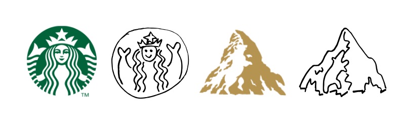
A good logo is one that is memorable, and this distinction can be achieved in different ways. Starbucks’ unusual symbol of a twin tailed siren is one you wouldn’t forget in a hurry, but still feels very much in keeping with the pictorial emblem style common within the food and beverage sector.
Look a little closer at the Toblerone logo and you might spot a bear hidden within its iconic mountain. Thinking outside the box like this is a great way to set yourself apart from the competition.
If it is distinctive enough it is more likely to stay in someone's mind after only seeing it a couple of times.
An excellent test of this is the ‘sketch test’.
Show your logo to people who have never seen it before for 10 seconds. Cover it and ask them to draw it from memory. If they can do this successfully then the logo is on the right track.
There is, however, one more factor that may influence the effectiveness of a logo and the outcome of a successful sketch test.
Perhaps the most important ingredient of all is ensuring a logo is uncomplicated. A symbol can remain simple whilst still achieving distinction. Striking a balance between these two traits is the real mark of a successful logo.
As suggested above, simplicity has a big impact on how memorable a logo is. We often only glance at a mark for a few seconds and if there is too much to take in it simply won’t be absorbed.
If we take a look at the biggest brands in the world today, you will see a definite trend towards simplicity in their identities.
The bigger the brand the simpler the logo. This is no coincidence.
There are many good reasons that this decision was made and why others should follow in their footsteps.
![]()
An important factor also influenced by a marks simplicity is its versatility.
Today more than ever, logos are required to look good over a myriad of different applications. Whether it is shrunken to the size of a mobile app icon or blown up on the side of a building, you want your logo to look it’s best, whilst preserving legibility.
A mark that is over cluttered and complicated will inevitably lose lucidity and detail, especially in instances where it is used in small sizes.
Although it may not be required in all applications now, keeping a logo simple will ensure it is future-proof and ready for anything!
![]()
As well as retaining longevity in terms of their application, simple logos have a far better chance of withstanding the test of time.
Sticking to clean and uncomplicated elements that do not follow the trends of that time will allow a mark to age gracefully. Whilst it may feel ‘plain’ or ‘boring’, simple logos can become truly iconic over time.
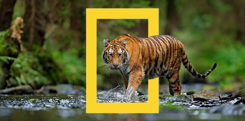
A great example of this is the National Geographic rebrand. Initially stakeholders argued that losing the globe in favour of a simple yellow rectangle was moving away from anything that represented what the organisation was about.
After some gentle persuasion, they agreed to move ahead with the new identity. It is now arguably one of the most well-recognised and iconic symbols on the planet.
In establishing these 3 ingredients for what makes a great logo, we have of course learned a great deal from those that missed the mark along the way.
Finding the sweet spot between these ingredients is a balancing act, and a difficult one. Tipping the scales a little too much in one direction can result in a logo that isn’t well received, and a wrong fit for any business.
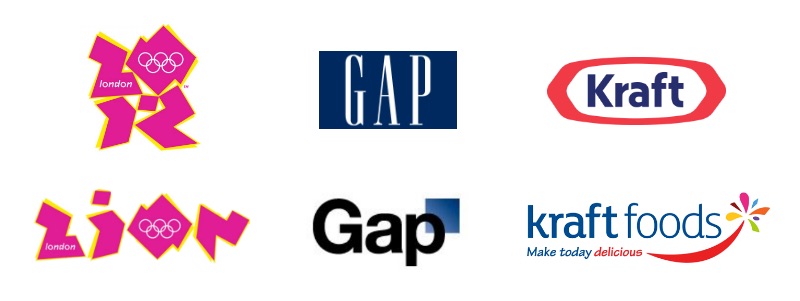
One example of this is the London 2012 Olympics logo. Whilst certainly distinctive and memorable, it was met with widespread criticism.
The public argued it was garish and illegible, whilst it even came under scrutiny at a political level for its resemblance to a swastika and the word ‘Zion’ (offending the Iranian government as an apparent pro-Israeli conspiracy). It’s safe to say this symbol was not appropriate or fit for purpose.
Another example of logo design gone wrong is the Gap rebrand. The word Gap in a serif font surrounded by blue is a symbol recognised the world over.
In 2010, the company rolled out a rebrand pairing their symbol back to a sans serif, 'Helvetica-esque' typeface and small blue box behind the ‘P’. Whilst this is the definition of simplicity, they lost what made them distinctive and upset thousands of loyal consumers in the process.
This move towards uniformity over distinction and appropriateness was a big miss, and was reverted six days later.
Contrary to Gap's rebrand, Kraft Foods went too far in the other direction. In 2009, Kraft decided to roll out a new identity, ditching their bold and well-loved blue and red symbol for a uninventive and over-complicated starburst.
Making their name longer, adding a tagline, including more colours and changing the simple border for a strange and generic firework was all unnecessary clutter and didn’t sit well with the critics. In an attempt to make themselves more distinctive, Kraft lost the simplicity that appealed to their consumers.
After a curious rework of the rebrand, and four logo designs in as many years, Kraft eventually reverted back to a variation on their original mark.
From observing these businesses at both ends of the spectrum, it is clear that not all logos are created equal.
Putting the time and resources into creating a mark that meets the unique requirements of your business is extremely important.
Striking the perfect balance of the three key ingredients; appropriateness, distinction and simplicity, will allow for the makings of a symbol you can confidently carry into the future.
If a logo design resonates with the target audience in your sector, is memorable enough to stand out from the crowd, and is intrinsically simple to allow for versatility and longevity, then you will truly have a great logo!
I hope this article has helped you distinguish between what makes a logo good, bad and great. Sometimes there is a fine line.
If you would like some help cooking up a recipe for a great logo you can call your own, Red Kite are here to help! Drop us a line at [email protected], or request a quote.
The key objectives of any logo design are to catch the eye of your target audience, stand out from your competition & be versatile enough to apply gracefully across any and all applications your business may require.
For a deeper dive into what makes the perfect logo, check out our 'What Makes a Great Logo' article.
The process of creating a logo that ticks all these boxes can be difficult and stressful, especially if you’re not familiar with the core principles of graphic design. You may have a logo that you just aren’t happy with but can’t quite put your finger on what it is that needs to change.
To help you answer that question, here is a list of my top 6 tips for how to get your brand back on track, and give you a great logo that will stay looking fresh and serving your business long into the future.
Don’t add more to your logo, strip it back!
When creating a logo it can be tempting to try to communicate as much information as possible as to what your business does and what your customers need to know about you. In actual fact, it is much more beneficial to remove as much information and as many elements as you can, leaving only a unique mark that resonates with your target audience.
You can see below this is exactly what Shell have evolved towards over their 100+ year history.
![]()
The less going on, the easier it is for people to recognise your logo at a glance and commit your brand to memory. A great test of this is the ‘Sketch Test’. Show your logo to people who have never seen it before for 10 seconds. Cover the logo and ask them to draw it from memory. If they can do this easily then you know you’re on the right track!
Every logo is different. Some elements may be integral to your brand and hard to remove. Common components that can often be simplified are:
Now that we have stripped away unnecessary elements in our logo design, we can give what is left a little room to breathe.
Giving purposeful space between the different components in your logo helps it become more digestible and easier on the eye. This is especially noticeable when we reduce a logo to smaller sizes, such as in a website header. Run your eyes over the Windows logos below and see which one is the easiest to read.
![]()
You never know what applications your mark may require in the future and keeping it clean and clear will ensure it is ready for anything!
Also worth taking into account here is that it is becoming more common to see logos used on top of busy and bold backgrounds. To do this, it is best to have a mark that works well as a silhouette (all one colour). Giving the elements of your logo room to breathe, rather than having pieces that overlap or intersect, can ensure that your brand will look instantly recognisable and attractive, even in silhouette form.
Think outside the box!
Perhaps your logo needs a little more of a shake up, rather than stripping back or simplifying what you already have. Instead, we can use the ideas above and apply them to a new symbol to represent your business.
One of the key objectives we mentioned was to make sure your logo stands out from the competition. In many sectors, there are symbols and elements that we see over and over again.
A good example is Starbucks. Many coffee chains and cafes use variations of coffee beans or cups in their logo. Starbucks well and truly bucked the trend with their iconic twin tailed mermaid.
![]()
Try to think of something that sets you apart from the rest of the pack. If everybody else is using a similar symbol, use something else instead. If everyone else is using dark colours, go bold and bright.
Of course, we still want our new logo to appeal to our target audience. Whilst we want to break from the mould, we don’t want to alienate our audience, so make sure the symbol, colours and message we communicate still meets those three key objectives!
When choosing a symbol to represent your brand it doesn’t always need to be a literal depiction of exactly what you do.
If we took some of the worlds biggest brands and showed them to a person who had no knowledge of them, they would struggle to describe what those companies did from the logo designs alone. This isn’t a bad thing. So long as your logo appeals to the desired target market and is memorable, then you are on to a winner!
Nike uses a swoosh, not a pair of running shoes.
Starbucks doesn’t incorporate a coffee cup or beans.
McDonald’s golden arches don't have a burger in sight.
![]()
Moving away from the literal can be a bit daunting. “If I’m not going to use what I do, then what do I use instead?!” is a common question I've heard many times. Step 5 may help get the creative juices flowing.
Rather than showing exactly what you do, your logo design can instead say something about your business and its values.
A great example of this evolution process in action is NBC. Their early logos feature broadcasting equipment, but later switch to a peacock, highlighting the network's then revolutionary colour programming.
Every company is unique in one way or another. Below that surface level of the service or product you provide, there is something that sets you apart from your competitors. Use that point of difference as inspiration for the symbol that represents your organisation. Some avenues to explore might be:
Communicate your brand values through a symbol that says something about your business and only your business. Use complementary colour palettes and well matched typography to help show your audience the kind of company you are, and what you represent.
When you finally have a logo design you love, you want your audience to see it looking its very best at all times.
Objective one and two are now well and truly ticked off. Your logo is clean, clear, eye catching and stands out from the crowd. Now make sure that you are always showing it in its best light.
There are many ways a mark can be used and each application can require your logo in a different file format so as not to become distorted or discoloured.
To ensure your logo is as versatile as possible, it needs to be created as a vector file using software such as Adobe Illustrator. This will allow the logo design to scale infinitely from a postage stamp to a billboard without any loss in quality or pixilation.
Keeping your brand colours consistent is also important. Make sure when providing your logo for print materials you use a version with the CMYK colour profile. For use on screens, RBG is required.
Having your mark ready to go as a vector graphic, PNG and JPEG, and in both CMYK and RGB colour profiles, should mean your logo is ready for any application!
I hope these tips have helped inspire you to see potential in your brand’s identity. Your logo is not lost, it just needs some love!
If you're still not sure exactly how to breathe life back into your logo, or would like to start afresh, we are here to help! Drop us a line at [email protected], or request a quote.


")
